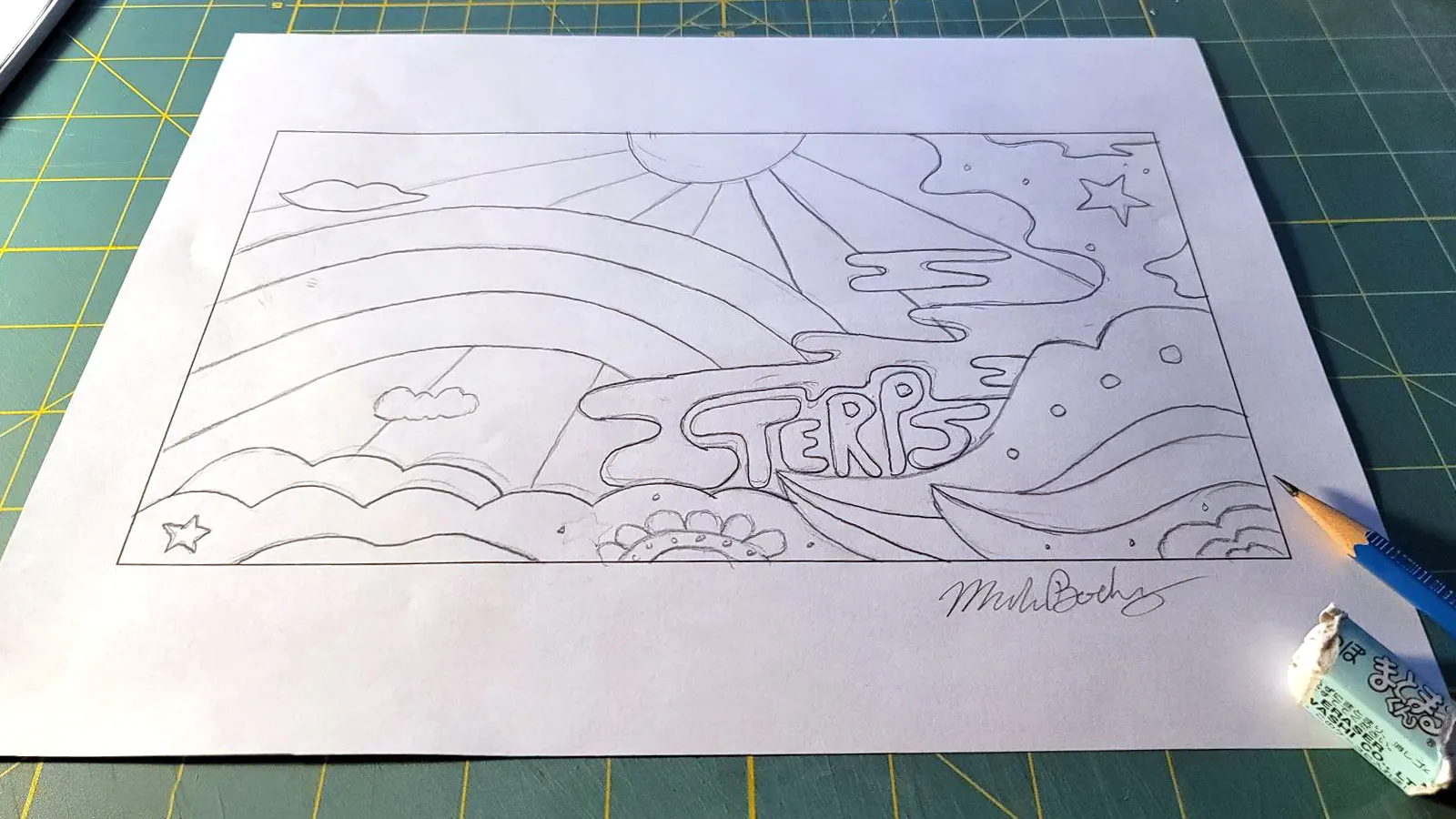
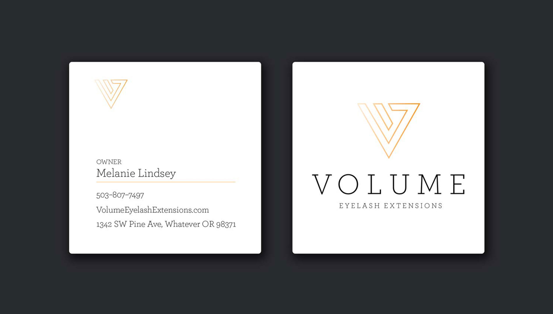
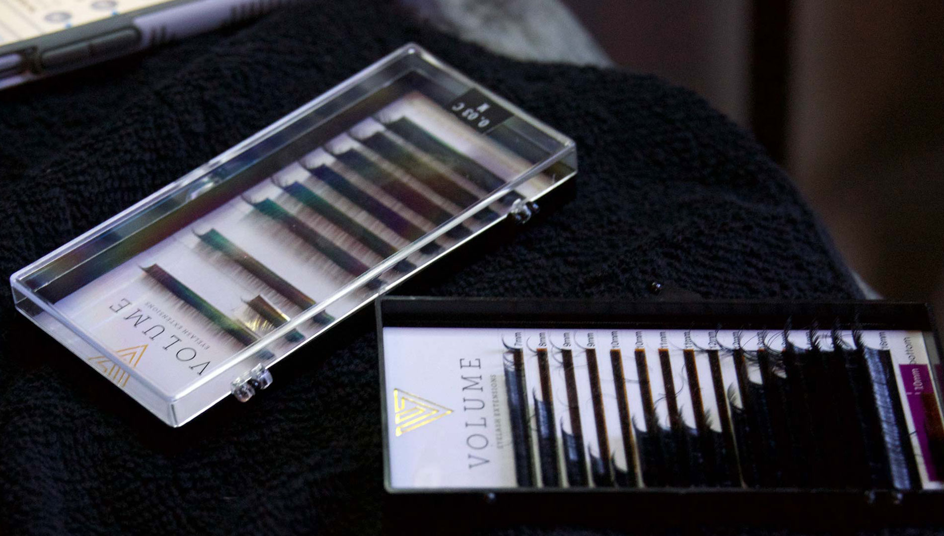
A complete rebrand for CUP of TEA in Clackamas, including new packaging, illustrations, custom icons, and a refreshed website to reflect their nature vibe.
Continue reading
A complete rebrand for CUP of TEA in Clackamas, including new packaging, illustrations, custom icons, and a refreshed website to reflect their nature vibe.
Continue reading
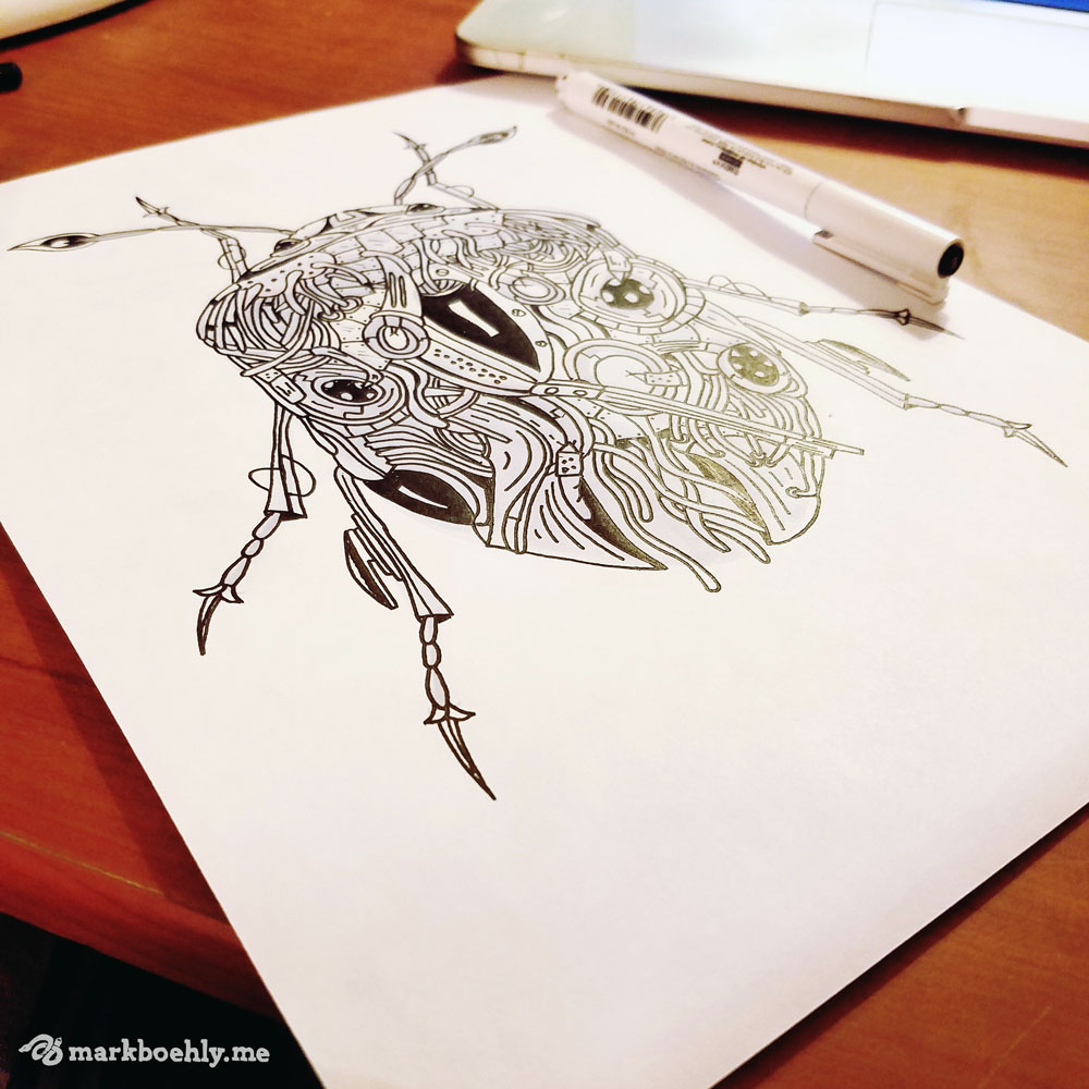
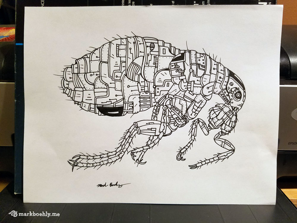
2025 Oregon Otter Beer Festival Nonprofit logo and biomechanical sea otter illustration created for the Elakha Alliance to support Oregon coastal conservation.
Continue reading