
Luna Food & Smoothies
Named after the Roman goddess of the moon, Luna Food and Smoothies launched as a vibrant vendor at the iconic Portland Saturday Market. They specialized in vegan and gluten-free options that were as healthy as they were delicious.
We worked with the team to build a visual identity from the ground up that reflected the brand’s fresh and celestial energy. The goal was to design clean and eye-catching menu signage that would stand out among the crowd and draw in hungry market-goers.
Services
Luna Food & Smoothies
Named after the Roman goddess of the moon, Luna Food and Smoothies launched as a vibrant vendor at the iconic Portland Saturday Market. They specialized in vegan and gluten-free options that were as healthy as they were delicious.
We worked with the team to build a visual identity from the ground up that reflected the brand’s fresh and celestial energy. The goal was to design clean and eye-catching menu signage that would stand out among the crowd and draw in hungry market-goers.
Strategy
The Design Challenge
Astrological Branding
Luna Food and Smoothies faced a common challenge for market vendors. They needed to communicate a complex menu of vegan and gluten-free items quickly to passing foot traffic. When we first met the client, they were primarily looking for a chalkboard-style menu. They wanted something that felt hand-drawn, approachable, and celestial to match their name.
We ran with that vision. We designed signage with custom borders featuring whimsical stars and moons. The aesthetic was engineered to feel organic and handmade to mirror the fresh ingredients used in their food.
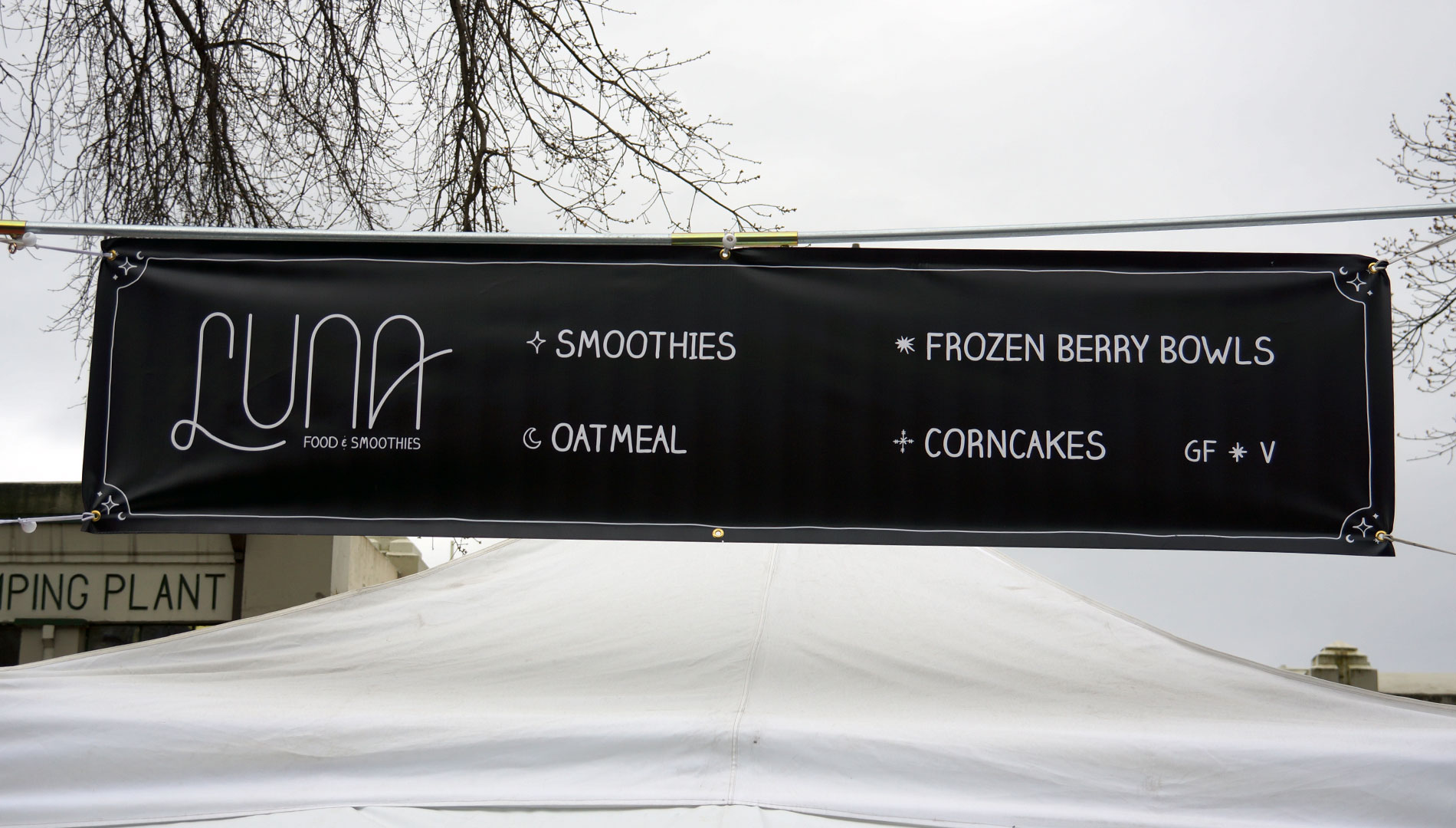

The Logo Solution
A Surprise Monoline Wordmark
Although a logo wasn’t originally part of the plan, we pitched one anyway. We developed a custom monoline wordmark featuring hand-drawn typography. The letters flow into each other with a fluid motion that mimics the mixing of a smoothie.
The client instantly connected with the design. It quickly became the centerpiece of the brand’s visual identity at the Portland Saturday Market. This logo anchored the booth and gave customers a recognizable symbol to look for amid the visual noise of the market.


Vendor Presence
Standing Out in the Crowd
The branding was engineered to help Luna Food and Smoothies capture attention in high-traffic environments. While their primary vending location was the Portland Saturday Market, the visual identity was designed to travel with the booth.
Our signage system was built to be legible from a distance. This ensured that whether they were at the historic Old Town waterfront or a pop-up event, Luna always stood out as a destination for healthy food lovers.
FAQ
What services did Graphicsbyte provide for Luna Food and Smoothies?
Graphicsbyte provided logo design, visual identity, and brand collateral for Luna Food and Smoothies over a recurring partnership from 2018 to 2023. Work included a custom monoline wordmark, chalkboard-style signage, banners, menus, and business cards built to support the brand at the Portland Saturday Market and pop-up events.
How was the Luna Food and Smoothies logo created?
The logo was not part of the original scope. Graphicsbyte pitched a custom monoline wordmark as an addition to the project and the client immediately connected with it. The design features hand-drawn typography where the letters flow into each other with a fluid motion that mirrors the mixing of a smoothie. It became the centerpiece of the brand’s visual identity at the Portland Saturday Market.
What was the design approach for the Luna Food and Smoothies signage?
The signage was designed in a chalkboard style with custom star and moon borders to create an organic and handmade aesthetic that matched the celestial meaning behind the brand name. The system was built to be legible from a distance so the booth could capture attention in the high-traffic environment of the Portland Saturday Market. All print collateral including menus and business cards used a chalk lettering typeface to keep the brand cohesive across every touchpoint.
Cohesive Brand Collateral
Chalkboard Consistency
To bring everything together, we crafted business cards and menus that matched the booth’s handmade vibe. All signage was set in a typeface that mimics chalk lettering. This gave the entire brand a cohesive and approachable presence.
By standardizing the look across large banners and small handouts, we ensured that Luna Food and Smoothies looked professional without losing its local charm.


