

Versoft Consulting
Versoft Consulting is a SaaS company supporting the investment management industry by helping clients get the most out of their portfolio management and CRM software. Their mission is to go beyond out-of-the-box installations, offering expert consultation, software updates, and streamlined workflows that improve efficiency, reporting, and client service.
Built on deep industry knowledge and a commitment to long-term relationships, Versoft empowers firms with the tools and insight they need to grow and thrive.
They came to us as a start-up in need of a complete brand launch, from identity design and print collateral to a modern, professional website. Over the years, we’ve partnered with them to evolve that brand across multiple redesigns, including three websites and logo updates that reflect their growth and expertise.
Services
- Logo Design
- Web Development
- Print Collateral
Visit Site
Engineering Identity
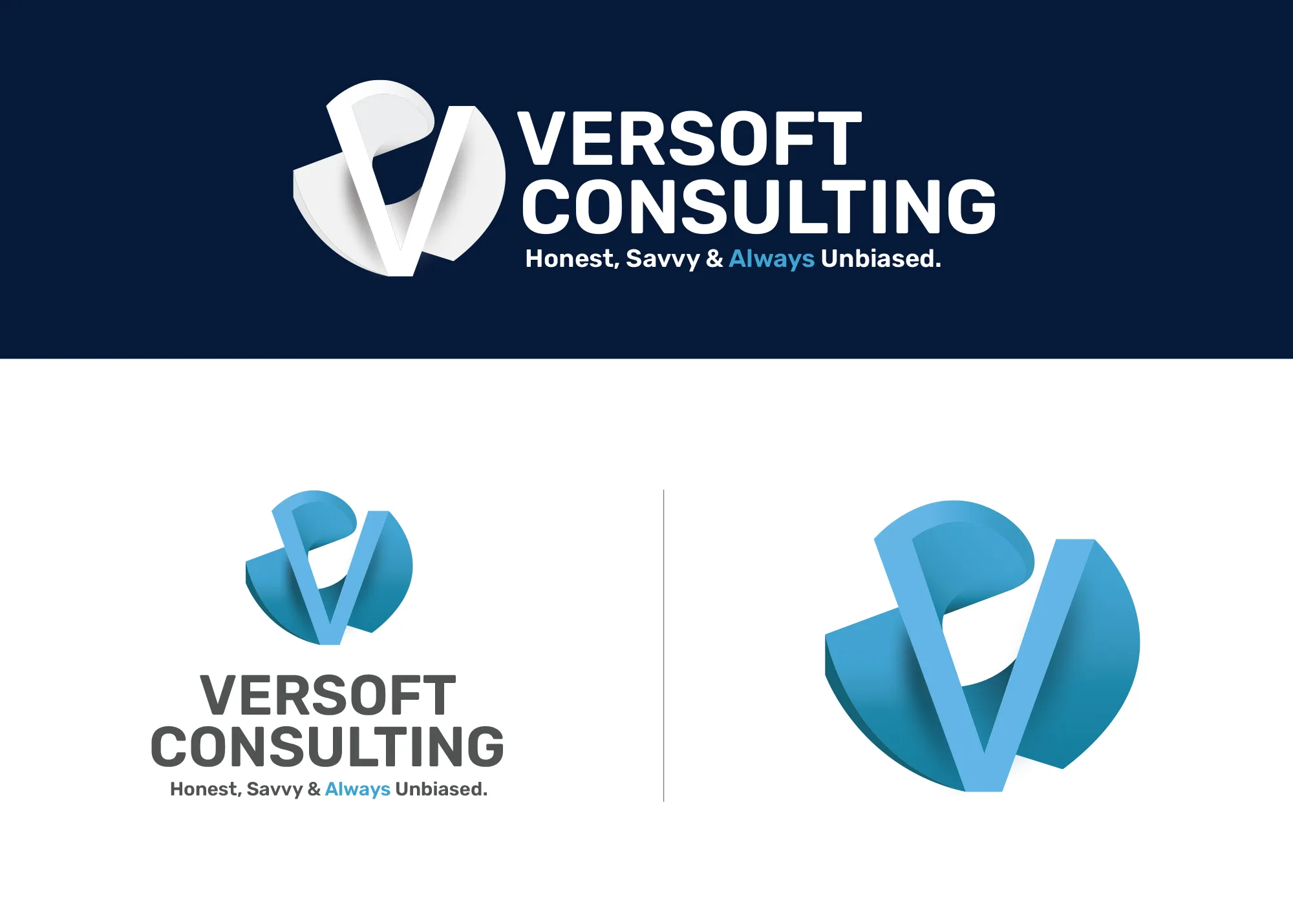
Versoft came to us inspired by the dimensionality of the wireframe Advent Software logo and challenged us to create something equally distinctive. We began with a series of wireframe concepts that explored dimension, form and motion. After days of sketching and refining, the final concept was brought to life in CAD software. At its core is a heavily stylized, uppercase “V,” inspired by the clean geometry of Helvetica but transformed to wrap within a spiral cylinder, representing innovation, momentum, and structure.
We chose a deep ocean blue as the brand’s primary color to evoke trust, intelligence, and clarity, qualities that define the Versoft team and their client relationships.
The logo wasn’t just made to look good on screen. It was engineered to exist in the real world. The 3D form has since been printed as a physical object, with a symmetrical structure that allows the “V” to be seen from either side.
In 2019, we refined the mark further for clarity, subtly opening the top of the spiral to enhance legibility and reinforce the “V” form without losing its sculptural strength. Then, in October 2025, we revisited the brand once more, this time creating the first fully vector version. The update balanced the color palette to make the “V” a more dominant feature and corrected the asymmetry of the earlier version, ensuring the form is now perfectly even and precise on all sides. The result is a brand symbol that’s both technical and timeless.


A Modern Web Presence
The Versoft Consulting website has gone through several iterations over the years, each refining the brand’s digital presence to better reflect its professionalism and industry focus. An earlier version of the site featured a dark theme with dramatic landscape photography, a bold visual direction at the time, but one that didn’t age well. As the brand matured, so did its design language.
The current website embraces a much cleaner, more timeless aesthetic. It features a streamlined color palette of blue, purple, gray, and black. The blue and purple serve as complementary accent colors, balancing trust, intelligence, and creativity, while the grayscale foundation keeps the visual hierarchy focused and professional.
Because Versoft is a SaaS company working with proprietary client software, showcasing real application screenshots was not an option. To solve this, we leaned into custom isometric illustrations. These stylized visuals introduce a playful, approachable tone without sacrificing credibility. They add depth to the site while subtly highlighting the technical nature of the company’s work, with tiny figures interacting with abstracted tech environments.
Clear communication was another major goal. The site architecture and content layout follow modern UX best practices, ensuring even complex concepts are easily understood. Thoughtfully placed CTAs throughout the site guide users toward deeper content or conversion opportunities, whether that’s expanding on service offerings or completing an intake form. Ultimately, every page is designed with one purpose in mind: to turn a curious visitor into a confident lead.
FAQ
What services did Graphicsbyte provide for Versoft Consulting?
Graphicsbyte provided a complete brand launch for Versoft Consulting, including logo design, visual identity, print collateral, and web development. Over a multi-year partnership, we also delivered three full website redesigns and two logo refinements as the brand evolved.
How was the Versoft logo designed?
The Versoft logo is built around a heavily stylized uppercase V that wraps within a spiral cylinder, inspired by the clean geometry of Helvetica but transformed into a sculptural 3D form. The mark was originally engineered in Photoshop, refined in 2019 for clarity, and fully rebuilt as a precise vector in 2025 to correct asymmetry and strengthen the V as the dominant visual element.
How did Graphicsbyte handle the website design without real software screenshots?
Since Versoft works with proprietary client software, real application screenshots weren’t an option. We solved this by developing custom isometric illustrations, stylized visuals that introduce an approachable, technical feel while keeping the site credible and professional. These illustrations add depth and communicate the nature of Versoft’s work without exposing sensitive client software.


