Cabinet Cures
Restyle • Redesign • Reface
Cabinet Cures is from Portland, Oregon. Their specialty is to transform old or worn-out cabinets into modern masterpieces. We got the chance to help shape their entire brand.
Strategy
- Research
- Brand Strategy
- Positioning
- Visual Identity
- Brand Collateral
- Website Design
Backstory
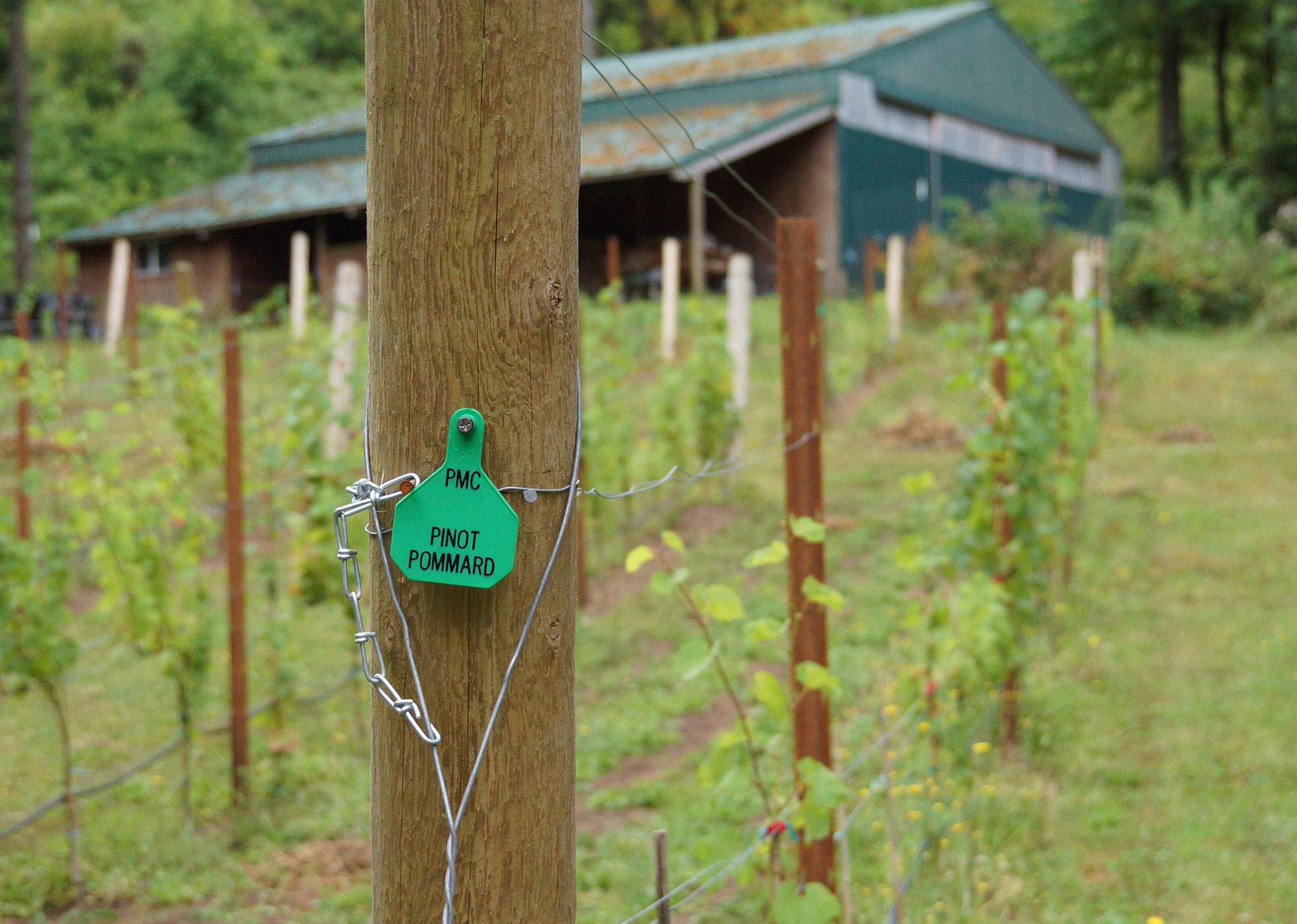
Cabinet Cures is a cabinet refacing and refinishing company. They have four locations around the United States. They are known for their custom stains and tinted liquors, with over 35 different options to choose from. Each stain is hand applied so it will never hide the natural beauty of the wood grain.
During 2014–2020 we worked with Velare Media and helped develop all the company websites, graphics, photography and various print projects. Everything below is displayed in chronological order from when it was created.

Backstory
Cabinet Cures is a cabinet refacing and refinishing company. They have four locations around the United States. They are known for their custom stains and tinted liquors, with over 35 different options to choose from. Each stain is hand applied so it will never hide the natural beauty of the wood grain.
During 2014–2020 we worked with Velare Media and helped develop all the company websites, graphics, photography and various print projects. Everything below is displayed in chronological order from when it was created.

Updating the Brand
In 2019 the owners of Cabinet Cures wanted to overhaul their brand. The old brand used a red tone with an arch over the cc initials. The client wanted to keep the same typography but update the cabinet door to something they actually sell.
We photographed raw cabinet door samples and scanned their wood grain patterns. The chosen door style is called Sussex. It’s a cherry cabinet door with a Harvest stain. The logo update became optional. Currently only two franchises and the new catalog use the updated brand.
WordPress Web Design
The first Cabinet Cures website was developed in WordPress. The site was then ported into Hubspot. In 2017 the company put in a request to be moved back to WordPress. All the franchises received a website overhaul. New photos, text and graphics were applied. This made each site more personable to their local audience. All the websites are still using this model.
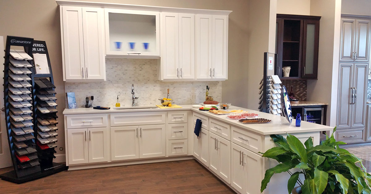
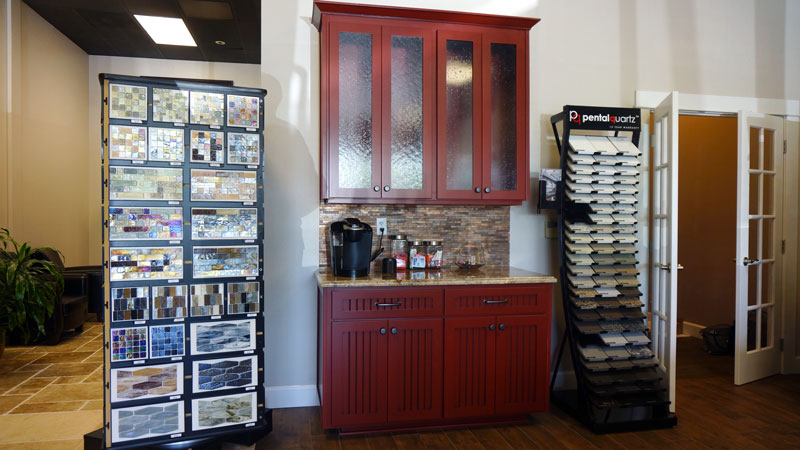
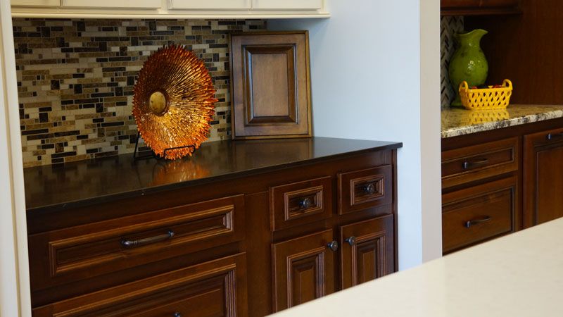
Cabinet Photography
The best way to sell a kitchen online is though high quality photography. We took several trips to the Cabinet Cures showroom and captured the wood from different angles. These photos were then applied to the Portland and Inc websites. They were also used in different social media posts. We also took photos of all the cabinet doors to show the wood grains before stains and lacquers are added.


The Catalog
Shortly after updating the brand we received another request to overhaul the company catalog. Our goal was to build a design that complemented the websites. The last catalog was used for almost a decade before receiving an update. Our design needed to be timeless!
The catalog talks about all the products Cabinet Cures has to offer. It also has client testimonials and additional info about the company. The book has 20 pages designed around negative space.

FAQ
Frequently Asked Questions
What services did Graphicsbyte provide for Cabinet Cures?
Graphicsbyte (originally under Velare Media) provided a full range of brand and web services for Cabinet Cures, including brand strategy, positioning, visual identity, cabinet photography, multi-location WordPress website design, and a complete catalog redesign.
How was the Cabinet Cures brand updated?
The brand update centered on replacing the outdated logo with one featuring a real cabinet door, the Sussex cherry door with a Harvest stain, photographed and scanned directly from Cabinet Cures samples. The update modernized the identity while retaining the original typography the owners wanted to keep.
How were the Cabinet Cures franchise websites handled?
All franchise locations received a WordPress website overhaul with new photography, graphics, and location-specific content. This gave each site a more personalized feel for its local audience while maintaining a consistent brand experience across all Cabinet Cures locations.