
A complete rebrand for CUP of TEA in Clackamas, including new packaging, illustrations, custom icons, and a refreshed website to reflect their nature vibe.
Continue reading
A complete rebrand for CUP of TEA in Clackamas, including new packaging, illustrations, custom icons, and a refreshed website to reflect their nature vibe.
Continue reading

Versoft Consulting is a SaaS company supporting the investment management industry by helping clients get the most out of their portfolio management and CRM software. Their mission is to go beyond out-of-the-box installations, offering expert consultation, software updates, and streamlined workflows that improve efficiency, reporting, and client service.
Built on deep industry knowledge and a commitment to long-term relationships, Versoft empowers firms with the tools and insight they need to grow and thrive.
They came to us as a start-up in need of a complete brand launch, from identity design and print collateral to a modern, professional website. Over the years, we’ve partnered with them to evolve that brand across multiple redesigns, including three websites and logo updates that reflect their growth and expertise.
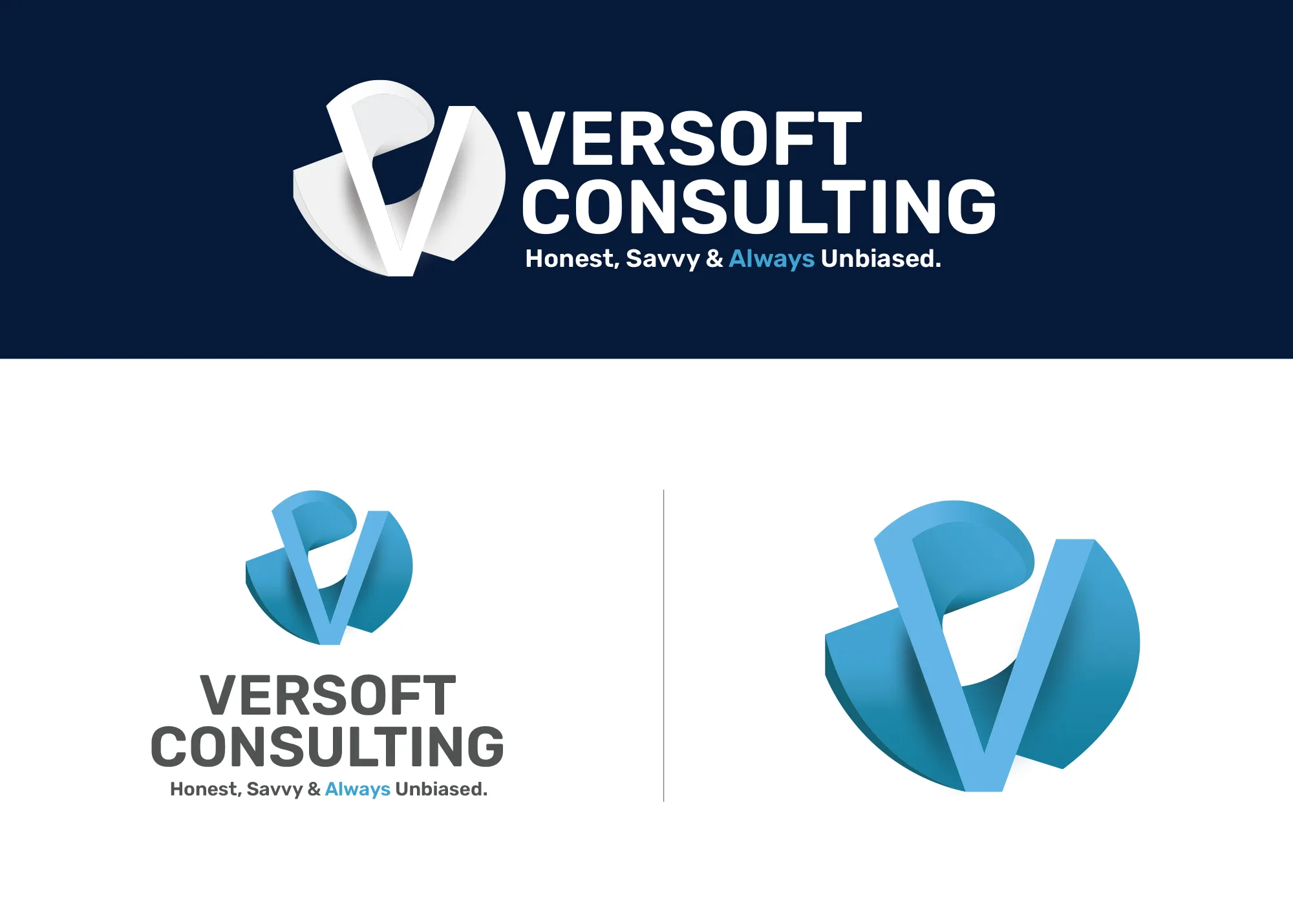
Versoft came to us inspired by the dimensionality of the wireframe Advent Software logo and challenged us to create something equally distinctive. We began with a series of wireframe concepts that explored dimension, form and motion. After days of sketching and refining, the final concept was brought to life in CAD software. At its core is a heavily stylized, uppercase “V,” inspired by the clean geometry of Helvetica but transformed to wrap within a spiral cylinder, representing innovation, momentum, and structure.
We chose a deep ocean blue as the brand’s primary color to evoke trust, intelligence, and clarity, qualities that define the Versoft team and their client relationships.
The logo wasn’t just made to look good on screen. It was engineered to exist in the real world. The 3D form has since been printed as a physical object, with a symmetrical structure that allows the “V” to be seen from either side.
In 2019, we refined the mark further for clarity, subtly opening the top of the spiral to enhance legibility and reinforce the “V” form without losing its sculptural strength. Then, in October 2025, we revisited the brand once more, this time creating the first fully vector version. The update balanced the color palette to make the “V” a more dominant feature and corrected the asymmetry of the earlier version, ensuring the form is now perfectly even and precise on all sides. The result is a brand symbol that’s both technical and timeless.


The Versoft Consulting website has gone through several iterations over the years, each refining the brand’s digital presence to better reflect its professionalism and industry focus. An earlier version of the site featured a dark theme with dramatic landscape photography, a bold visual direction at the time, but one that didn’t age well. As the brand matured, so did its design language.
The current website embraces a much cleaner, more timeless aesthetic. It features a streamlined color palette of blue, purple, gray, and black. The blue and purple serve as complementary accent colors, balancing trust, intelligence, and creativity, while the grayscale foundation keeps the visual hierarchy focused and professional.
Because Versoft is a SaaS company working with proprietary client software, showcasing real application screenshots was not an option. To solve this, we leaned into custom isometric illustrations. These stylized visuals introduce a playful, approachable tone without sacrificing credibility. They add depth to the site while subtly highlighting the technical nature of the company’s work, with tiny figures interacting with abstracted tech environments.
Clear communication was another major goal. The site architecture and content layout follow modern UX best practices, ensuring even complex concepts are easily understood. Thoughtfully placed CTAs throughout the site guide users toward deeper content or conversion opportunities, whether that’s expanding on service offerings or completing an intake form. Ultimately, every page is designed with one purpose in mind: to turn a curious visitor into a confident lead.
The Versoft logo is built around a heavily stylized uppercase V that wraps within a spiral cylinder, inspired by the clean geometry of Helvetica but transformed into a sculptural 3D form. The mark was originally engineered in Photoshop, refined in 2019 for clarity, and fully rebuilt as a precise vector in 2025 to correct asymmetry and strengthen the V as the dominant visual element.
Since Versoft works with proprietary client software, real application screenshots weren’t an option. We solved this by developing custom isometric illustrations, stylized visuals that introduce an approachable, technical feel while keeping the site credible and professional. These illustrations add depth and communicate the nature of Versoft’s work without exposing sensitive client software.

We partnered with David Tutmark and Oregon Guitar Studio to develop a brand for ‘Siempre La Guitarra’ (Spanish for ‘Always the Guitar’), their new classical guitar concert series showcasing the finest guitarists worldwide.
David wanted a brand that would attract a younger demographic to classical music. The traditional aesthetic often associated with the genre can be a barrier for some. To overcome this challenge, we introduced an illustration theme featuring a lumberjack from the Pacific Northwest with a passion for classical guitar.

For Siempre La Guitarra, we pushed the boundaries of visual harmony. The concert poster’s artwork, defined by negative space and sweeping curves, demanded a typeface to mirror its elegance. Enter our custom-designed condensed sans-serif font, a love letter to the visionary spirit of 1920s futurism. This exclusive typeface, currently offered in regular and bold weights, elevates the campaign with a touch of the avant-garde.
For Siempre La Guitarra, we pushed the boundaries of visual harmony. The concert poster’s artwork, defined by negative space and sweeping curves, demanded a typeface to mirror its elegance. Enter our custom-designed condensed sans-serif font, a love letter to the visionary spirit of 1920s futurism. This exclusive typeface, currently offered in regular and bold weights, elevates the campaign with a touch of the avant-garde.
In late 2018, we embarked on designing a memorable poster series to sell at the Siempre La Guitarra merchandise table. Drawing inspiration from the geometric, round-cornered illustrations popular in the Graphicsbyte studio at the time, we crafted a fictional landscape featuring Mt. Hood as the centerpiece.
A lone lumberjack serenades the scene, nestled amidst the natural beauty. In addition we also created photo based posters using images from each artist, further amplifying event awareness.


16″ x 24″ tour posters were created using a traditional workflow, sketched by hand, scanned into Adobe Illustrator for vectorization, and then textured in Adobe Photoshop. For each subsequent show, the core design remained, but the dates and artist information were easily swapped out. An alternative design was also created focusing more on the lumberjack. This was a popular choice among fans and was also used on t-shirts and stickers.


A new, bearded character joined the Siempre La Guitarra universe for 2020. This mountain-themed poster, crafted entirely in Illustrator, featured him cleverly positioned within the shape of an eighth note. We even hid a musical Easter egg – the bird’s song is a David original!
Learning from past years, we included the entire lineup with a space-saving icon system and location key. Though the 2020 event was canceled due to the pandemic, the poster did see action at one show. In a testament to the design’s versatility, we were even able to repurpose it for another event in late 2023.

Beyond the poster design, Graphicsbyte actively participated in the Siempre La Guitarra events, managing the merchandise table.
We also had the opportunity to showcase and sell our own prints alongside the event items.

Beyond the poster design, Graphicsbyte actively participated in the Siempre La Guitarra events, managing the merchandise table.
We also had the opportunity to showcase and sell our own prints alongside the event items.
Limited-edition prints: Both the white alternative and tour posters were available at each show. Postcards were available in 2022.
Guitar picks and stickers: Initially offered separately, these popular items were later combined into convenient guitar pick packs featuring a backstory about the iconic lumberjack.
Exclusive online merch: T-shirts and trucker hats were available exclusively through the Siempre La Guitarra website, encouraging online exploration.
Unique collectibles: In 2020, a limited run of branded glass nail files with wooden handles was created, primarily gifted to performers with a few extras available for purchase.


For the Siempre La Guitarra event series, a user-friendly website was built on WordPress to seamlessly extend the brand identity established through the event posters. The website’s design incorporates the same eye-catching color palette and captivating illustrations, creating a cohesive online experience that resonates with fans. This focus on consistency ensures a smooth transition from the visual appeal of the posters to the website’s functionality.

For the Siempre La Guitarra event series, a user-friendly website was built on WordPress to seamlessly extend the brand identity established through the event posters. The website’s design incorporates the same eye-catching color palette and captivating illustrations, creating a cohesive online experience that resonates with fans. This focus on consistency ensures a smooth transition from the visual appeal of the posters to the website’s functionality.
Beyond aesthetics, the Siempre La Guitarra website prioritizes user experience. Fans can effortlessly navigate the site to purchase tickets for upcoming shows, explore detailed biographies about the performing artists, and browse a curated selection of event merchandise. Additionally, a dedicated section caters to potential sponsors, fostering new partnerships that support the event’s continued success.
Graphicsbyte provided a complete brand system for the Siempre La Guitarra concert series, including brand strategy, positioning, logo design, a custom typeface, illustrated tour posters, merchandise design, and a WordPress website. We also managed the merchandise table at events throughout the series run from 2018 to 2023.
© 2026 Graphicsbyte, All Rights Reserved


Demla Transportation is a family-owned, Oregon-based company dedicated to delivering compassionate, reliable, and dignified transportation solutions across the Pacific Northwest. Specializing in non-emergency medical transport (NEMT) and personal rides, with a strong emphasis on wheelchair accessibility, Demla prides itself on upholding values of integrity, respect, and personalized care.
When Demla approached us, they needed a website that not only represented their commitment to service but also streamlined the ride-booking process for a diverse range of passengers. We developed a custom WordPress site centered around an intelligent intake system that calculates mileage from point A to point B and integrates with a payment gateway for upfront ride purchases.

A key feature of the new Demla Transportation website is its fully customized intake form, an intelligent tool that transforms how customers book rides. At its core is a real-time mileage calculator powered by Google Maps, allowing users to see accurate distance-based pricing between pickup and drop-off locations as they plan their trip.
What sets this form apart is its dynamic pricing engine. Every selection a user makes, starting with one-way vs. round-trip, automatically adjusts the cost in real time. Additional options such as wait times, special accommodations, and equipment needs each trigger price changes based on Demla’s service rates. This level of interactivity ensures customers receive a transparent, personalized quote tailored to their exact needs.
Integrated with a secure payment gateway, the form allows users to pay in full or choose a co-pay option if the final destination is still unknown. This flexibility keeps trips moving forward without delays, aligning perfectly with Demla’s mission to offer compassionate, accessible service without unnecessary barriers.


To support first-time riders and reduce uncertainty, we built a dedicated FAQ page designed to answer the most common questions about Demla’s NEMT (Non-Emergency Medical Transportation) and private pay services.
From payment details and cancellation policies to accessibility guidelines and ride logistics, the page helps customers understand exactly what to expect before booking.
In addition to the website, we supported Demla Transportation in setting up Google Workspace to streamline their internal communications and operations.
This foundational step helped ensure that the digital experience we created for customers was matched by reliable tools behind the scenes, making it easier for staff to manage bookings, respond to inquiries, and coordinate NEMT transportation with speed and clarity.
Graphicsbyte developed a custom WordPress website for Demla Transportation centered around an intelligent ride-booking intake form. The form features real-time Google Maps mileage calculation, a dynamic pricing engine, and Stripe payment integration. We also built a dedicated FAQ page for first-time riders and set up Google Workspace to support Demla’s internal operations.

Decimal Engineered Systems is an industrial cannabis equipment manufacturer based in Canby, Oregon. They specialize in ethanol, hydrocarbon, and CO₂ extraction systems used by professional labs and industrial cannabis processing facilities.
I was brought in mid-2022 through a referral to assist with editorial materials. That quickly evolved into a larger creative leadership role, supporting Decimal’s tradeshow marketing efforts and eventually guiding the rollout of their new brand identity.
At the time I joined, Decimal had recently transitioned from their former identity, MRX Technologies. While the new logo, color palette, and typography had been developed, the system hadn’t yet been applied across any real-world assets.
Initially, the company had hired a third-party team for creative direction, but their execution fell short. To meet tight deadlines for MJBizCon, I partnered with Marketing Director Hunter, my long-time collaborator from True Terpenes, and Marketing Manager Michael, who helped guide messaging and approvals. Together, the three of us became Decimal’s in-house marketing team.
My role expanded into Creative Director, where I helped implement and evolve the brand system, updating the visual identity, producing custom iconography, and building marketing materials across digital and print. I also developed interactive displays for trade shows and laid the creative foundation for Decimal’s new website and UI systems.

When I first joined Decimal, there was an immediate need to develop editorial sales materials. The team had a starting template for equipment cut sheets, which I expanded into a complete series covering every piece of equipment. These double-sided handouts included technical specs, selling points, and QR codes to connect customers directly to the website for more information.
During this same period, I designed standardized price sheets and letterhead assets to unify all outgoing sales materials. These updates ensured Decimal’s sales and marketing collateral felt cohesive, professional, and on brand at every touchpoint.

Decimal’s core brand colors, orange and dark gray, provided a strong foundation, but we needed to expand the palette to support a growing catalog of products. Each product line was assigned a unique color and icon to establish a clear visual hierarchy across all materials.
This system made it easier to navigate internal documents, sales tools, and client-facing materials. Everything from operation manuals to quote proposals featured these color-coded covers, bringing consistency, clarity, and professionalism to the brand.

MJBizCon is the largest cannabis industry expo in the United States, held annually in Las Vegas. As part of Decimal’s marketing team, I was responsible for developing custom creative assets to support their presence at the show. This included booth graphics, promotional materials, and interactive elements to help attract and engage visitors on the show floor.
Decimal had an existing business card template, but the team wasn’t satisfied with its execution. They invited me to reimagine it while preserving meaningful elements from the original. The prior design included dotted patterns inspired by the dimples found on Decimal’s extraction equipment, a clever nod I chose to retain. From there, I reworked the layout for a stronger hierarchy and impact, running the company name along the card’s edge to make creative use of negative space.
For the production finish, I specified raised spot gloss on key areas to add a subtle tactile effect, resulting in a professional, memorable card that connected back to the brand’s industrial roots.

In addition to the business cards and equipment cut sheets, I wanted to give Decimal something extra to truly stand out. The idea was to create double-sided, custom die-cut cards shaped like their flagship machines. I designed two of these, featuring the new 5.HX Hydrocarbon Extractor and the 40.EX Ethanol Centrifuge.
The front showcased a realistic render of each machine, while the back included product details and a QR code for further exploration. Since the equipment was still in production, I worked with the team to source CAD renders, a challenge that required leveraging a high-end gaming graphics card to handle the heavy render loads and achieve crisp, high-resolution output.


As another memorable leave-behind, I designed double-sided stickers to hand out during the trade show. The peel-off backing carried the company name and booth location, while the front showcased the Decimal brand icon.
Beyond being a fun giveaway, these stickers were integrated into social media content and interactive moments with attendees, helping to drive engagement and reinforce the brand during the event.


As the event approached, I was invited to attend MJBizCon for the first time. While the team traditionally wore branded polos on the show floor, I saw an opportunity to highlight some of the new line-art illustrations I had been developing. I designed a set of custom T-shirts and hoodies featuring the Decimal logo on the front, with detailed equipment artwork printed on the back.
These double-sided designs promoted Decimal’s products while adding a creative, memorable edge. The team and customers responded enthusiastically, and this line-art style eventually became a signature element of Decimal’s brand illustration system.


Leveraging my background in IT, I developed custom code for Decimal’s email signatures to ensure consistent branding across Outlook’s global signature system. I also made the signatures responsive for mobile devices, providing a seamless experience across platforms.
Once the code was in place, I designed banner images that could be easily swapped out to promote upcoming trade shows and events, keeping both the team and customers informed and engaged.


For international shows like ICBC, where booth space is often limited, Decimal needed a more compact and portable display solution. We designed a 10×10 collapsible backdrop wall that could easily travel overseas and quickly set up on-site. This smaller footprint allowed the team to showcase compact machines while maintaining a bold, branded presence that aligned with their larger exhibits.
Stickers became a creative way to expand the Decimal brand and connect with audiences on a more playful, collectible level. Many of the designs were created around major holidays and cannabis industry dates like 4/20 and 7/10, using the company emblem as a foundation for bold visual riffs. These limited-edition designs gave the brand room to show personality while maintaining consistency across channels.
Other stickers were designed specifically for tradeshows like MJBizCon and ICBC, offering memorable takeaways for booth visitors. One standout was a pin featuring our illustrated 5.HX Hydrocarbon Extractor, a fan favorite that doubled as a conversation starter and branded keepsake.
Beyond print and traditional collateral, I also supported Decimal in designing an interactive touchscreen experience to serve as a digital product catalog. I collaborated closely with the Electrical/R&D Manager, who typically develops the interactive displays for the company’s equipment. I led the visual design while my teammate handled the programming, working through challenges like font compatibility, for instance, the standard Decimal typeface (Transducer) did not render properly in the software. I sourced a new typeface, Bai Jamjuree, that complemented the brand while working reliably across all interactive systems, ultimately becoming the official display font for Decimal’s touchscreens.
For MJBizCon, the interactive display used three core layouts. The first was a cover screen featuring a series of custom icons, each acting as a button. When a visitor selected one, the screen transitioned to a bright orange loading view with the Decimal logo before fading into the equipment page. On these pages, visitors could explore clickable dots with animated pulses overlaid on product images. These hotspots opened pop-ups with details about specific parts of the equipment, a practical solution for showcasing additional products that couldn’t physically fit in the booth.
Beneath each equipment view, supplementary product details were displayed, along with a persistent footer menu featuring certification and spec information. Hidden navigation buttons were also included to allow the sales team to quickly access educational content and jump between sections on demand, making the experience both a customer showcase and a versatile sales tool.
This dynamic animation serves as a signature element in all Decimal Engineered Systems video content. It showcases the custom Transducer typeface, a stencil font characterized by its uniform horizontal gap, brought to life through motion.
An orange line elegantly traces the contours of each letter, emphasizing precision, before settling smoothly into the decimal point. The result is a playful yet refined motion signature that reinforces Decimal’s identity and adds instant recognizability to every piece of content.


At the start, Decimal’s photography library was limited, so a series of graphic-forward posts was developed using available product renders and existing photos. The goal was to strike a balance between playful and educational, building early audience engagement.
Following the success of MJBizCon, our team prioritized creating more original content across all platforms. Social media evolved into a more dynamic space for the brand, with engaging reels, equipment highlights, and design-driven storytelling. I focused on the graphic side, developing custom posts for holidays, industry events, and key cannabis moments like 4/20 or 7/10. These visuals helped reinforce the brand identity while giving the company a consistent and professional voice online
Stickers became a creative way to expand the Decimal brand and connect with audiences on a more playful, collectible level. Many of the designs were created around major holidays and cannabis industry dates like 4/20 and 7/10, using the company emblem as a foundation for bold visual riffs. These limited-edition designs gave the brand room to show personality while maintaining consistency across channels.
Other stickers were designed specifically for tradeshows like MJBizCon and ICBC, offering memorable takeaways for booth visitors. One standout was a pin featuring our illustrated 5.HX Hydrocarbon Extractor, a fan favorite that doubled as a conversation starter and branded keepsake.


As part of our effort to build brand energy beyond traditional formats, I designed a specialty sticker called Cyber Decimal, a biomechanical illustration that blends my signature art style with Decimal’s identity. Built around the D emblem, the artwork tells a layered visual story of a beautiful yet functional machine, just like the equipment Decimal manufactures.
Inside the emblem, a premium hemp field grows beneath a transparent panel. At its core, a cockpit houses a figure in a welding mask, overseeing the internal systems. The surrounding structure features tubes, conduits, and paneling, evoking a futuristic yet grounded sense of engineering. It’s a story within a story, a surreal homage to the complexity and precision behind every Decimal product.

Decimal’s original one-page scrolling site provided basic access to product information, but it didn’t offer a full view of the catalog. It relied on a carousel of downloadable cut sheets, which made it harder for customers to quickly explore and compare equipment.
In mid-2023, we launched a fully custom WordPress website that expanded the digital experience and showcased the complete product line. The new site features interactive navigation, modular anchor-linked sections, and high-impact visuals. From bold brand graphics to custom photography, every element was designed to bring Decimal’s identity to life.
The site architecture plays off the brand’s signature rounded square motif, creating a cohesive and recognizable visual language. Each main product page includes dynamic video reels that draw users into the experience, making even complex machinery feel approachable and engaging.
To cover the wide selection of products, Category pages were put in place to act as hubs for the different product lines. These pages gave customers a brief description of what the genre was about and they could easily find all the machines starting from the smallest to the largest to fit their facility.


To cover the wide selection of products, Category pages were put in place to act as hubs for the different product lines. These pages gave customers a brief description of what the genre was about and they could easily find all the machines starting from the smallest to the largest to fit their facility.

Each product page was designed as an interactive spec sheet, built to educate and convert. The header features a cinematic reel that gives users a dynamic walkaround of the machine. As visitors scroll, they encounter an interactive hotspot section, mirroring the experience of our touchscreen tradeshow display, which highlights key machine features by name.
The page continues with an overview of the product, followed by supporting imagery, feature highlights, and a detailed specifications table. A dedicated highlights section further breaks down what sets each machine apart.
To generate leads, downloadable equipment cut sheets were gated behind intake forms, ensuring the site collects valuable customer data. Tailored CTAs at the bottom of each page guide users to relevant content elsewhere on the site, with messaging customized to each product.
For MJBizCon, the largest cannabis industry expo in the United States, Graphicsbyte produced booth graphics, equipment cut sheets, business cards, custom die-cut product cards shaped like Decimal’s flagship machines, double-sided stickers, branded apparel featuring line-art equipment illustrations, and an interactive touchscreen display that served as a digital product catalog with animated hotspots and clickable equipment pages.


Cabinet Cures is from Portland, Oregon. Their specialty is to transform old or worn-out cabinets into modern masterpieces. We got the chance to help shape their entire brand.
Cabinet Cures is from Portland, Oregon. Their specialty is to transform old or worn-out cabinets into modern masterpieces. We got the chance to help shape their entire brand.
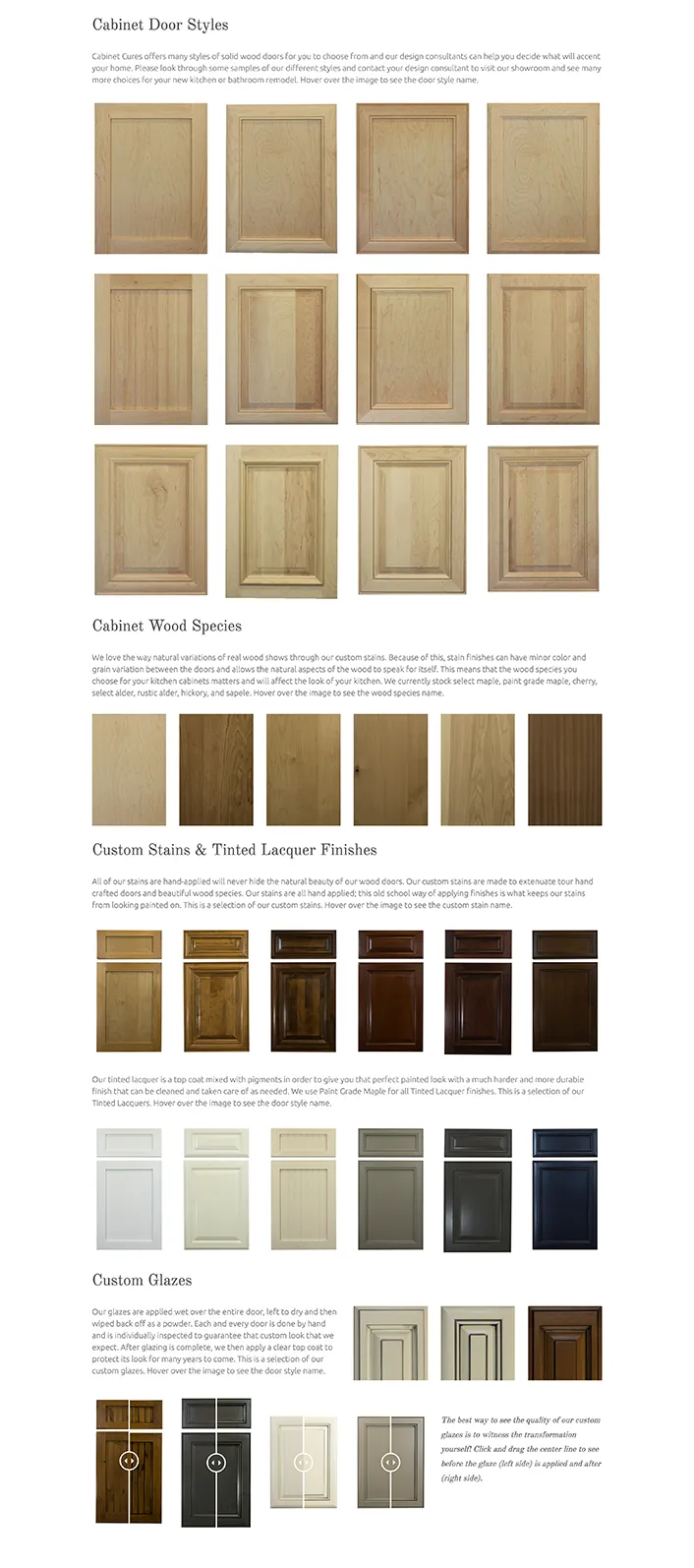
Cabinet Cures is a cabinet refacing and refinishing company. They have four locations around the United States. They are known for their custom stains and tinted liquors, with over 35 different options to choose from. Each stain is hand applied so it will never hide the natural beauty of the wood grain.
During 2014–2020 we worked with Velare Media and helped develop all the company websites, graphics, photography and various print projects. Everything below is displayed in chronological order from when it was created.

In 2019 the owners of Cabinet Cures wanted to overhaul their brand. The old brand used a red tone with an arch over the cc initials. The client wanted to keep the same typography but update the cabinet door to something they actually sell.
We photographed raw cabinet door samples and scanned their wood grain patterns. The chosen door style is called Sussex. It’s a cherry cabinet door with a Harvest stain. The logo update became optional. Currently only two franchises and the new catalog use the updated brand.
The first Cabinet Cures website was developed in WordPress. The site was then ported into Hubspot. In 2017 the company put in a request to be moved back to WordPress. All the franchises received a website overhaul. New photos, text and graphics were applied. This made each site more personable to their local audience. All the websites are still using this model.
The first Cabinet Cures website was developed in WordPress. The site was then ported into Hubspot. In 2017 the company put in a request to be moved back to WordPress. All the franchises received a website overhaul. New photos, text and graphics were applied. This made each site more personable to their local audience. All the websites are still using this model.
The best way to sell a kitchen online is though high quality photography. We took several trips to the Cabinet Cures showroom and captured the wood from different angles. These photos were then applied to the Portland and Inc websites. They were also used in different social media posts. We also took photos of all the cabinet doors to show the wood grains before stains and lacquers are added.
The best way to sell a kitchen online is though high quality photography. We took several trips to the Cabinet Cures showroom and captured the wood from different angles. These photos were then applied to the Portland and Inc websites. They were also used in different social media posts. We also took photos of all the cabinet doors to show the wood grains before stains and lacquers are added.


Shortly after updating the brand we received another request to overhaul the company catalog. Our goal was to build a design that complemented the websites. The last catalog was used for almost a decade before receiving an update. Our design needed to be timeless!
The catalog talks about all the products Cabinet Cures has to offer. It also has client testimonials and additional info about the company. The book has 20 pages designed around negative space.

Graphicsbyte (originally under Velare Media) provided a full range of brand and web services for Cabinet Cures, including brand strategy, positioning, visual identity, cabinet photography, multi-location WordPress website design, and a complete catalog redesign.
The brand update centered on replacing the outdated logo with one featuring a real cabinet door, the Sussex cherry door with a Harvest stain, photographed and scanned directly from Cabinet Cures samples. The update modernized the identity while retaining the original typography the owners wanted to keep.
All franchise locations received a WordPress website overhaul with new photography, graphics, and location-specific content. This gave each site a more personalized feel for its local audience while maintaining a consistent brand experience across all Cabinet Cures locations.

AcueTex is a family-owned injection molding company. We spiced up their brand and built them a website.
AcueTex is a family-owned injection molding company. We spiced up their brand and built them a website.
Acue-Tex Inc is located in Hubbard Oregon. They have thirteen machines on the floor specializing in injection molding, insert molding, and tool & die manufacturing. The company is known for building parts for the medical, dental, and veterinary industries.
Working with Nathan was great. He knew exactly want he wanted and all our meetings were straight to the point. Our mission was to build an eye catchy logo, business cards, and a company website.

Acue-Tex has been established for many years but their brand was almost non-existent. They tried out many fonts and had a drawing of a plastic injection molding machine. They just needed professional help building the vision. We almost knocked it out of the park after presenting the first draft of ideas. One concept was a line logo based on a plastic injection molding machine. This design was more realistic and was in line with the current company sketch. Since Acue-Tex builds a lot of medical equipment we thought it would be a nice touch to make one of the parts in the machine resemble a medical cross icon.
Our other direction was more abstract and it focused on the viewing window inside the plastic molding machine. The icon uses a neutral color palette and the gold shape represents plastic that is about to be molded. An innovative logo needs a timeless typography so we went with Futura. It was a hard decision but this design was chosen to represent Acue-Tex. The next step was to build matching business cards.

When searching for Acue-Tex Inc. back in 2019, it was difficult to find a clear, informative online presence. While several industrial directory listings existed, none provided a strong sense of who the company was or the industries they served. That’s because Acue-Tex didn’t yet have a dedicated website.
We designed and developed a custom WordPress one-page scroll site to introduce Acue-Tex to the digital world. The site clearly communicates the company’s identity, services, and the industries it supports. It’s fully mobile responsive, adapting seamlessly to phones and tablets for a clean, user-friendly experience across devices.
Due to limited access to original photography, we focused on building the site around Acue-Tex’s updated brand identity, leveraging a refreshed color palette, clean typography, and custom icons to convey professionalism and consistency throughout the design.
Graphicsbyte provided logo design, visual identity, business card design, and a custom one-page WordPress website for Acue-Tex Inc. The project established the company's first professional brand identity and dedicated online presence.
The chosen logo concept is built around the viewing window inside a plastic injection molding machine. The icon uses a neutral color palette with a gold shape representing plastic in the molding process. Futura was selected as the typeface to complement the abstract mark with a timeless, professional feel.
The one-page WordPress scroll site was designed to give Acue-Tex their first dedicated online presence, clearly communicating the company's identity, services, and the medical, dental, and veterinary industries they serve. The site is fully mobile responsive and built around the updated brand identity using a refreshed color palette, clean typography, and custom icons.

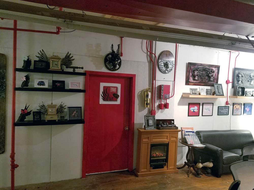
Have you ever wanted to visit an alien world full of metal? Truax Designs is an experience where people not only interact with sculpture but take a piece home.
Have you ever wanted to visit an alien world full of metal? Truax Designs is an experience where people not only interact with sculpture but take a piece home.
Several years before Graphicsbyte was formed Mark Boehly took a sculpture class at Clackamas Community College. In the class, he met a student named Christopher Truax. The two became good friends but eventually lost contact. In 2013 the two randomly reconnected at an art gallery in Portland. The show featured Christopher’s metal sculpture. He had articulated robots, tall animals inspired by Salvador Dali, a robotic DJ, and even a flying toaster. As a solo act, it was nice to see an old friend living the dream as a master sculptor.
The gallery event took place a few weeks after Mark graduated from Portland State University. This was a good time to look for new opportunities. He agreed to build Christopher a website and a logo. The payment was a trade for a custom piece of sculpture. Before the website and brand were finished Christopher shared a prototype where objects were infused in metal. The sculpture looked like it came straight out of a science fiction movie. Instantly Mark knew this was something worth exploring. Mark decided to join the team and learn how to build his own sculptures. He then agreed to market the new product know known as “Karbon Kast.” (The sign in the photo on the left uses this process.) Together Christopher and Mark formed a creative friendship and still continue to produce new works of art to this day.
In Early 2014 Truax Designs reveled a new product called Karbon Kast at the AFRU Gallery in Portland. It was an instant hit. Over 60 items sold on the opening night and a dozen more throughout the week. When the event was over Mark and Chris started to produce hundreds of sculptures. They were preparing for their next show at the Portland Expo called America’s Largest Christmas Bazaar.
This event was also a huge success. Karbon Kast attracted dozens of new fans and this was when we presented the company logo for the first time.
The brand was designed after a robotic angel named Lily. She is fully articulated and was built for stop-motion animation. Mark designed an enclosure logo that showcases the robots most iconic features. Red became the brands primary color because it matches Lily’s brother Apollo who is also an articulated robot in the series. The physical color of the two robots together are both light and dark. This formed a Yin & Yang in the color palette.
A condensed san serif typeface was created to fit in the enclosures negative space. Today that type has become the brand’s main focal point. Wings are a common element found in the brands metal sculptures. So it only made since to add graphic wings to print media such as business cards and flyers.


Truax Designs has gone through several website iterations as the studio has grown. The earliest versions served as a portfolio for co-founder Christopher Truax, focusing on his individual metal sculpture work. As the team expanded and the brand matured, the website evolved to reflect a broader, more collaborative identity.
The most recent version of the website is centered around e-commerce and engagement. While Etsy remains the primary sales platform, the site now includes a shop for direct purchases, especially for higher-end sculptures. Visitors can also submit intake forms to request custom pieces, making the site a tool for both sales and commissions.
A major feature of the new site is the Karbon Kast case study, which showcases the success of our cast resin product line. This section highlights the growing impact of the brand, including celebrity collectors and media recognition, positioning Karbon Kast as a standout offering within the Truax Designs portfolio.
The homepage also includes a section to browse upcoming shows and events, allowing visitors to connect with the team in person and experience the work firsthand.
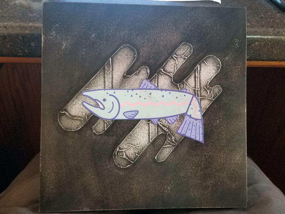
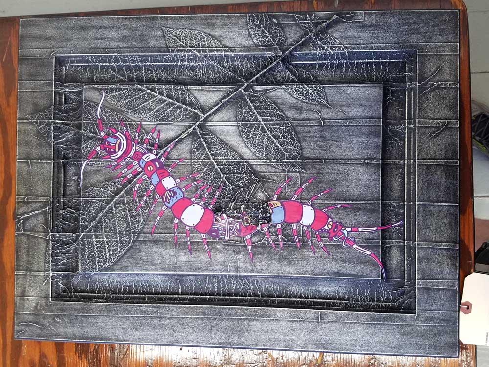
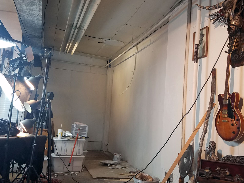
Creating the art is one of the best perks of working with Truax Designs. In 2017 we started to create 3D printed prototypes. These prints were infused in the metal and turned into success stories at events like Comic Con. We also created some mixed-media hybrids using Graphicsbyte art as the focal point. The Karbon Kast was then used as a secondary texture.
Creating the art is one of the best perks of working with Truax Designs. In 2017 we started to create 3D printed prototypes. These prints were infused in the metal and turned into success stories at events like Comic Con. We also created some mixed-media hybrids using Graphicsbyte art as the focal point. The Karbon Kast was then used as a secondary texture.


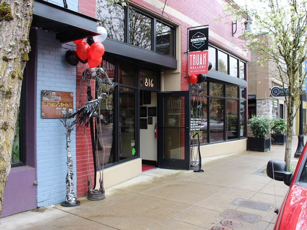
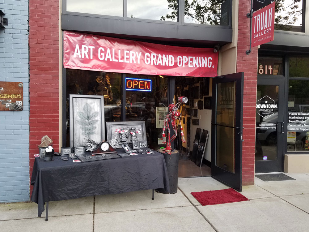
Towards the end of 2017 Truax Designs created a pop up gallery in Oregon City called Truax Gallery. Mark and Chris spent a year here selling metal sculptures to the general public. About three months into the project we needed another line of art. Graphicsbyte received an opportunity to sell prints and sticker packs. This added a splash of color to the gallery and attracted a different audience.
Towards the end of 2017 Truax Designs created a pop up gallery in Oregon City called Truax Gallery. Mark and Chris spent a year here selling metal sculptures to the general public. About three months into the project we needed another line of art. Graphicsbyte received an opportunity to sell prints and sticker packs. This added a splash of color to the gallery and attracted a different audience.


Even though the Oregon City gallery was short lived the experience was everything the artists hoped for. The following year the crew packed up and moved to West Linn. The new location had a storefront connected to the same building the Truax Designs workshop is in. This move was going to speed up production… Soon as we were getting ready to officially launch the second chapter of the gallery Coivid-19 came to Oregon. We were forced to cancel the project. Truax Designs still has a workshop in the West Linn building but it’s not open to the public.
Even though the Oregon City gallery was short lived the experience was everything the artists hoped for. The following year the crew packed up and moved to West Linn. The new location had a storefront connected to the same building the Truax Designs workshop is in. This move was going to speed up production… Soon as we were getting ready to officially launch the second chapter of the gallery Coivid-19 came to Oregon. We were forced to cancel the project. Truax Designs still has a workshop in the West Linn building but it’s not open to the public.


Everdrone is a drone services company specializing in aerial footage and equipment inspection. From capturing stunning visuals to identifying wear and tear on hard-to-reach infrastructure.
We were brought on to create a full brand identity, including a logo, custom icon set, and a modern website.
Everdrone is a drone services company specializing in aerial footage and equipment inspection. From capturing stunning visuals to identifying wear and tear on hard-to-reach infrastructure.
We were brought on to create a full brand identity, including a logo, custom icon set, and a modern website.
The future of inspections is through drone flight using infrared and HD cameras. Everdrone creates and executes streamlined workflows for image and data gathering for in-depth analysis of heavy equipment. Integrated with cloud-based software, they produce 3D maps, compare current data with projected data, and acquire educated insights.
While working with Velare Media the client approached us in need of a full brand identity and website to market their startup inspection business. We worked closely with their team to craft a voice to the ideas behind Everdrone and create a comprehensive website showcasing their workflows and analysis abilities. They needed a company logo, website, and marketing materials that can be handed out in trade shows.
Everdrone is a cutting-edge aerial company that uses drones to inspect heavy machinery. When the company first approached us they wanted their brand to look timeless and “military.” But overall they were very open-minded. We used the DJI website to find high-quality images of the Zenmuse X series cameras. These are the same cameras onboard the client’s aircraft.
We designed a hexagon line logo that is loosely based on the Zenmuse X45 camera. It was important to give this logo some personality so the we made the focal point of the lense resemble an eye that looks directly at the camera. The diagonal wings were then added to be a reference towards the Airforce brand.
After building the brands visual identity we pushed the hierarchy father with a series of custom icons. Each icon represents a service that Everdrone specializes in. The icons are used on the company website, business cards and promotional materials.
After building the brands visual identity we pushed the hierarchy father with a series of custom icons. Each icon represents a service that Everdrone specializes in. The icons are used on the company website, business cards and promotional materials.


4K image capture and video are key components of drone inspections. The website showcases these areas in great detail. We worked with Velare Media and helped capture some of the videos and images for the site.
4K image capture and video are key components of drone inspections. The website showcases these areas in great detail. We worked with Velare Media and helped capture some of the videos and images for the site.
To help spread the word Everdrone participates in trade shows and drone conferences around the country. They wanted promotional materials that could be given away. Stickers were the first thing we created and these are currently being used on the company UAV’s, hard hats and other equipment. We also created several t-shirt designs, and 3D printed keychains.
To help spread the word Everdrone participates in trade shows and drone conferences around the country. They wanted promotional materials that could be given away. Stickers were the first thing we created and these are currently being used on the company UAV’s, hard hats and other equipment. We also created several t-shirt designs, and 3D printed keychains.


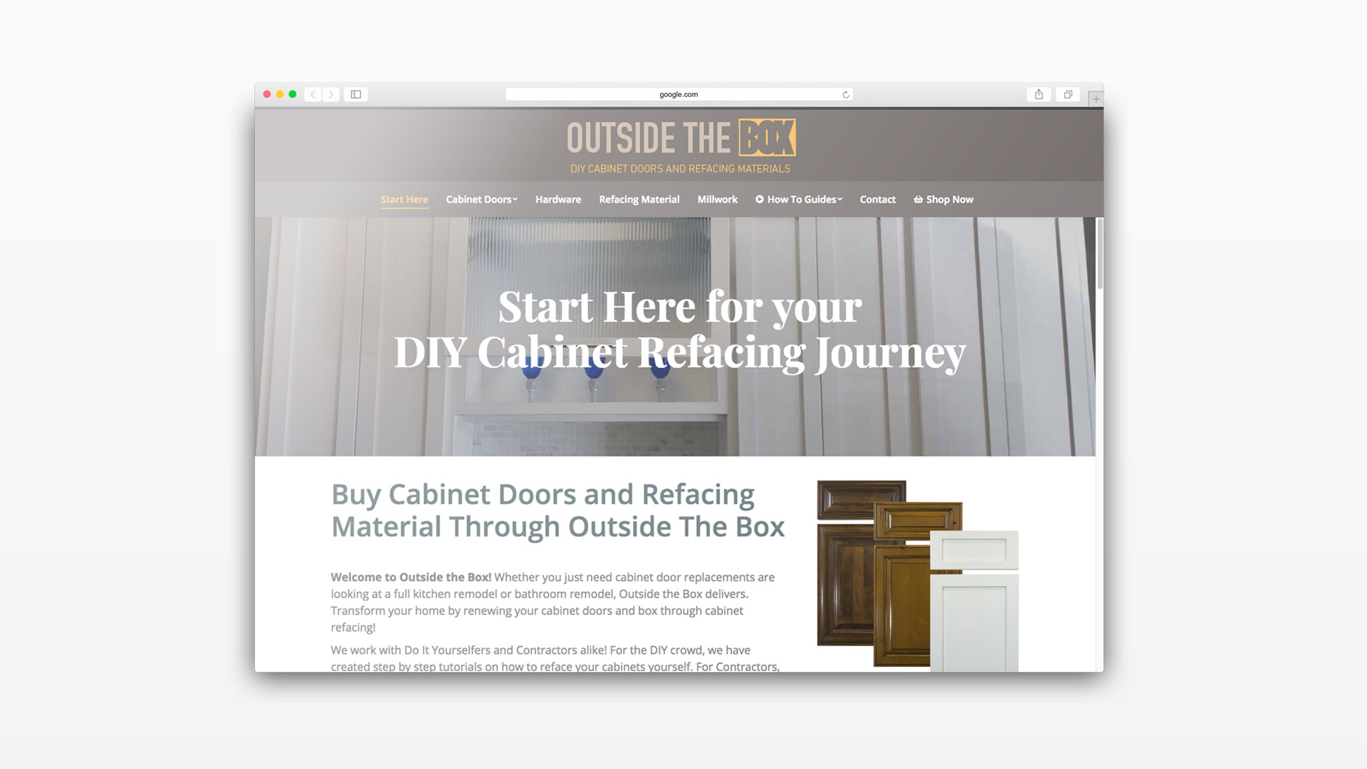
Outside The Box (OTB) was an eCommerce brand built for contractors and DIY enthusiasts specializing in cabinetry. The goal was to make custom cabinet doors more accessible through a streamlined online shopping experience.
We developed a comprehensive Cabinet Door Web Design solution that allowed customers to browse, customize, and order raw doors, stains, lacquers, and specialty finishes all in one place. We turned a complex ordering process into a simple digital path.
The DIY scene is in full force. The founder, Jamie, approached us with her brainchild. She saw an opportunity to provide a hassle-free experience for users to pursue DIY cabinet refacing. Already knowledgeable in the trade herself, she wanted to create a start-to-finish learning center and shop.
Our Cabinet Door Web Design strategy focused on education first. We engineered a web experience to accomplish Jamie’s goals. It taught all the skills needed for cabinet refacing via a video series while stocking their quality custom doors and supplies.
Outside the Box wanted the website to focus on the high quality of the product they produced. They needed to showcase everything from solid wood doors to their hand-applied stains and glazes.
We scheduled multiple photoshoots to capture the manufacturing process. We worked alongside the production team to take photos during each stage of the build. We highlighted these high-resolution images in the product information sections of the site to build trust with the customer.

Content was a major component of this Cabinet Door Web Design project. Outside the Box had previously created a video series to teach inexperienced Do-It-Yourselfers and the Maker community how to reface their cabinets.
We transcribed each video and added additional information to the pages. By combining text, photos, and video, we created complete step-by-step tutorials accessible straight from the website.

We sat down with the Outside the Box team to construct a detailed product tree. The challenge was building complex dropdown options that catered to the specific needs of DIY cabinet refacing.
We utilized flexible platforms like Bigcommerce to manage these variables. The user was able to choose exactly what they needed for their project, including wood species, door style, door size, stain or tinted lacquer, and hinge prep. This intelligent system ensured that different wood species only showed the compatible stains and lacquers, preventing user error during the ordering process.
Outside The Box had an existing video series teaching DIY cabinet refacing. Graphicsbyte transcribed each video and added additional written content and photography to create complete step-by-step tutorials accessible directly from the website. By combining text, photos, and video, the site became a start-to-finish learning center that educated customers before and during the ordering process.

Steampunk Maniacs needed a logo that captured their unique identity, blending Victorian elegance with industrial grit.
We developed a memorable mark that reflected the brand’s steampunk aesthetic and helped them stand out in a niche market. To support their growing presence, we also designed a matching website that functioned as both a portfolio and an eCommerce shop.
Our client creates one-of-a-kind costumes and accessories that look like they’ve stepped out of a science fiction world, rich with gears, brass, and ornate detailing. Steampunk, inspired by 19th-century industrial steam-powered machinery, is equal parts function and fantasy.
To reflect the genre’s Neo-Victorian charm, we crafted a logo that blends filigree, clockwork, and old-world elegance. Two contrasting ornate typefaces were combined, intentionally clashing, to evoke a bold, vintage-meets-retro aesthetic that feels both handmade and theatrical.


The client came to us with an existing website, but it lacked the flexibility and function they needed. We redesigned the entire layout with a fully responsive structure and improved user experience. Custom icons were created to represent each shop category, reinforcing the brand’s distinct visual style.
To simplify shop management, we integrated the site with their Etsy store, making product updates seamless. We also added dedicated galleries to showcase past leatherwork, props, and custom costumes, transforming the site into both a storefront and portfolio.

The existing website was fully redesigned with a responsive layout and improved user experience. Custom icons were created for each shop category to reinforce the brand’s visual style. The site was integrated with the client’s Etsy store to make product updates seamless, and dedicated galleries were added to showcase past leatherwork, props, and custom costumes, turning the site into both a storefront and a portfolio.

Nestled in the trees of Parrett Mountain, this scenic wine-tasting lodge offers visitors a serene escape into Oregon wine country. After several on-site photography sessions capturing the natural beauty and rustic charm of the space, we helped develop a website that reflects the warmth and elegance of the brand, inviting guests to explore wines, events, and more.
Nestled in the trees of Parrett Mountain, this scenic wine-tasting lodge offers visitors a serene escape into Oregon wine country. After several on-site photography sessions capturing the natural beauty and rustic charm of the space, we helped develop a website that reflects the warmth and elegance of the brand, inviting guests to explore wines, events, and more.
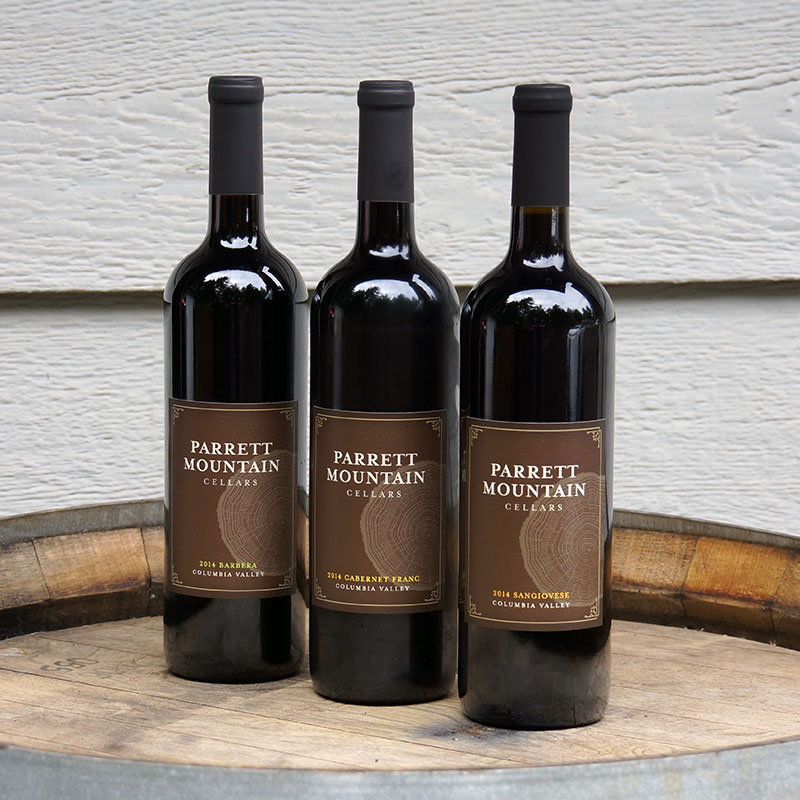
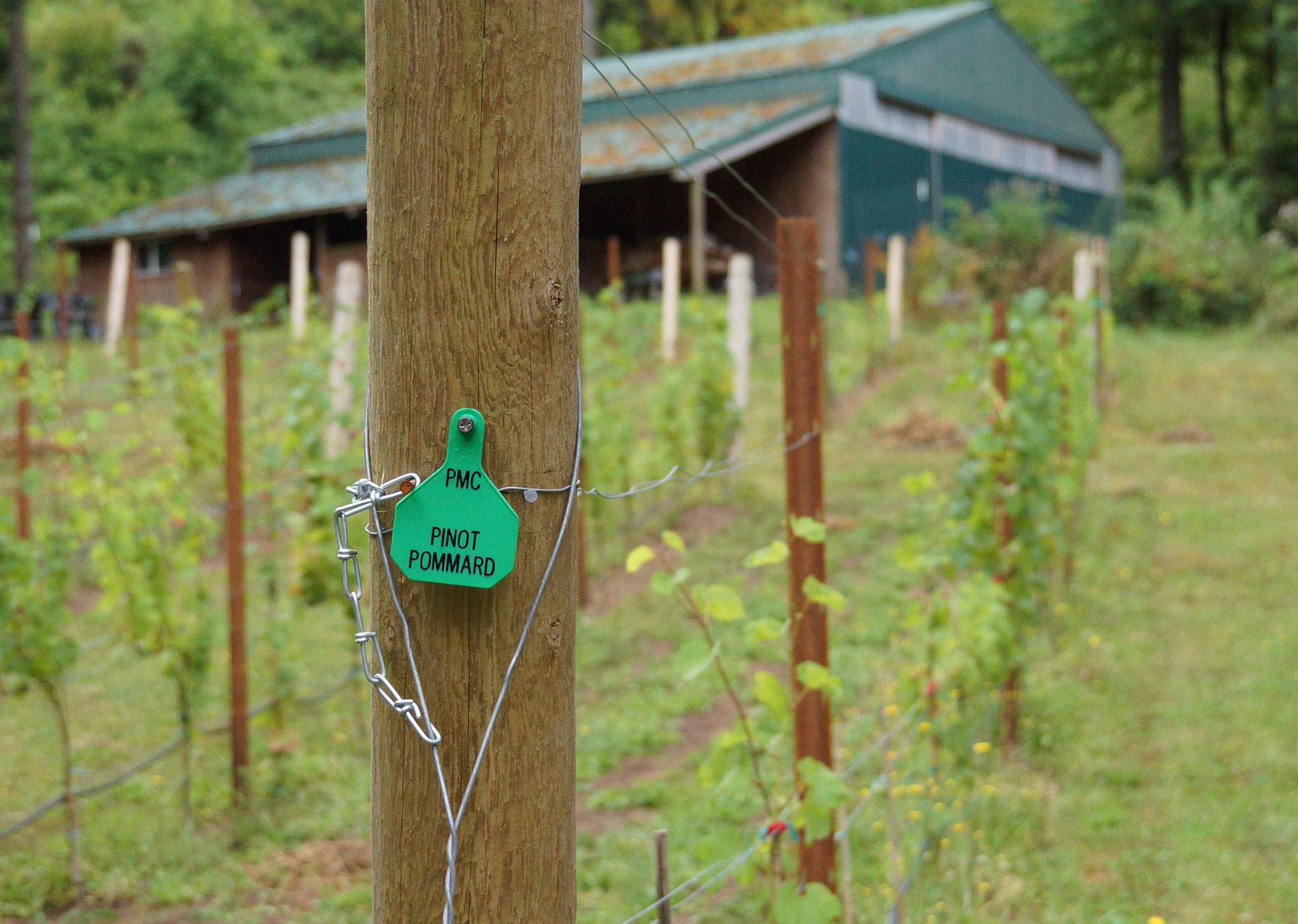
Parrett Mountain Cellars is a small-batch winery and tasting room run by a husband-and-wife duo in Oregon wine country. Specializing in bold reds and Pinot Noir, their wines are produced in limited annual runs. When we first connected, their new lodge-style tasting room was still in its early stages of construction, and they were preparing to grow their brand presence.
Winemaking is their labor of love, and they needed a website that reflected the care and craftsmanship behind every bottle. In collaboration with Velare Media, we transformed their DIY GoDaddy site into a fully custom WordPress experience, built to showcase their wines, promote events, and grow with their future.
When we began the project, Parrett Mountain Cellars had very few photos—most were low-resolution and not usable for a professional website. To elevate their visual presence, we scheduled an on-site shoot at their original tasting room and winery. We captured updated imagery of their wines, small vineyard, and the tasting room environment.
At the time, the new lodge was still under construction, so these photos served as a crucial foundation for their updated brand and online presence.


Parrett Mountain Cellars sells a significant portion of their wine directly through their website, so we built a fully integrated eCommerce experience using WooCommerce. The storefront allows visitors to browse and purchase bottles with ease while maintaining the rustic charm of the brand.
We also developed a built-in wine club with Silver and Gold membership tiers, offering exclusive benefits and seasonal shipments. The entire system is designed to be easy for the client to manage and seamless for customers to join, shop, and stay connected.

Conrad Lumber Co is a family-owned retail lumberyard based in Sherwood, Oregon. They specialize in providing quality wood products for local contractors and homeowners. We partnered with them to execute a complete lumberyard web design overhaul.
The goal was to create a modern and user-friendly experience. We wanted to highlight their extensive inventory while honoring their longstanding reputation in the Pacific Northwest community.
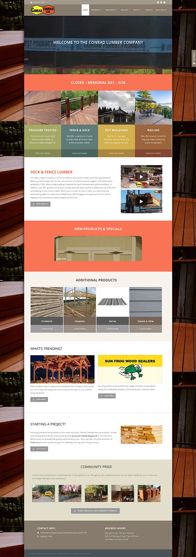
Conrad Lumber Co occupies a unique niche. They specialize in decking and fencing materials and serve as the only factory-direct supplier of treated wood products in the Portland area. As the Northwest sales hub for their parent company, Conrad Forest Products, they needed a digital presence that reflected their specific local focus.
They approached us to help develop a distinct identity separate from the parent corporate entity. Together we crafted a strategic plan for a robust information-driven website. The new site was designed to showcase their specialized inventory and resonate with both DIY homeowners and professional contractors.
A lumberyard web design project requires organizing a massive amount of data. Conrad Lumber covers a wide range of categories including top fence materials, railing systems, windows, composite decking, outdoor buildings, and wood siding.
We structured the site to act as a comprehensive digital catalog. We created clear navigation paths that allow users to find specific wood treatments or accessories quickly. By prioritizing product education, we ensured that customers arrive at the yard informed and ready to buy.
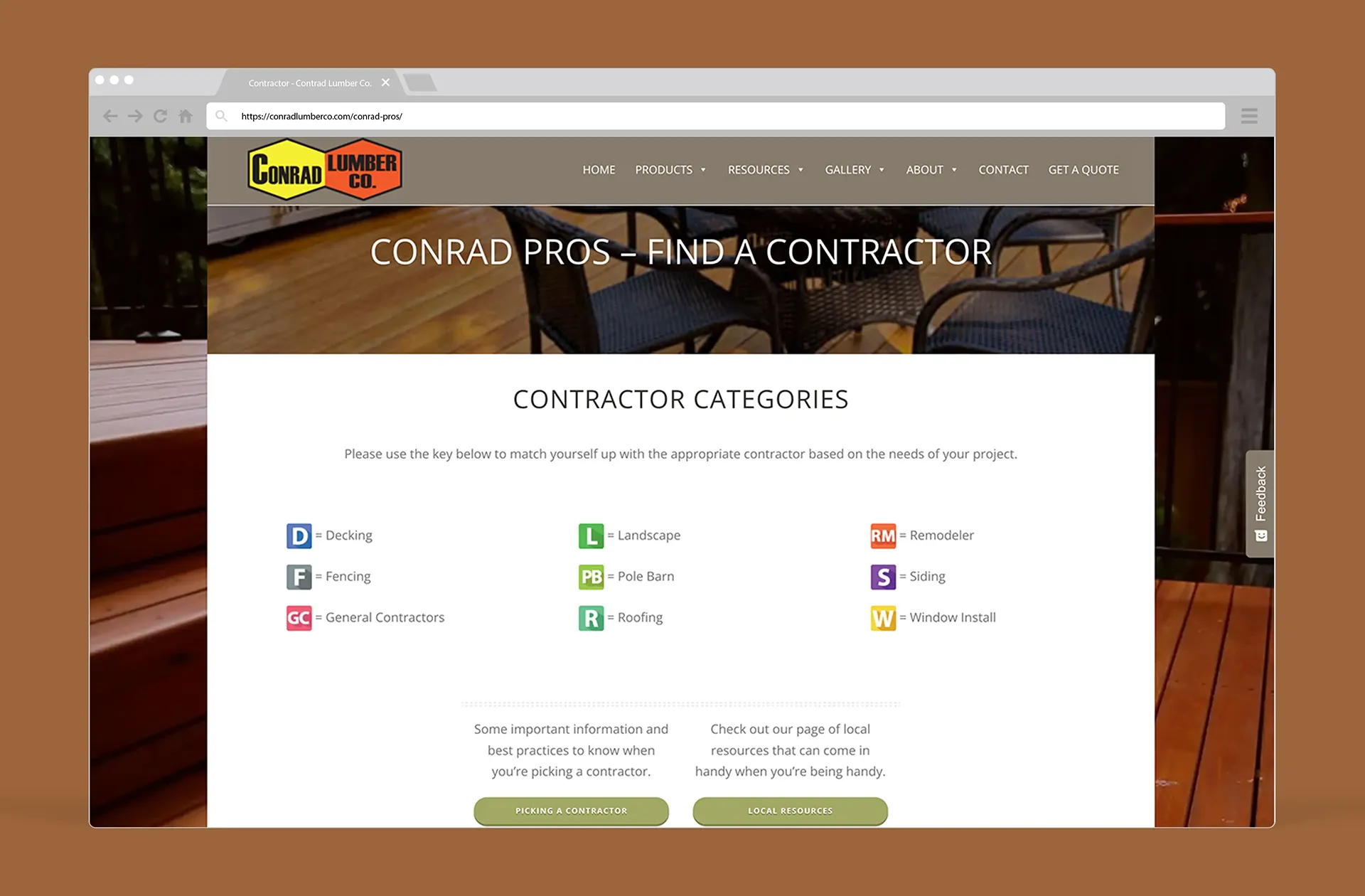
One of the standout features of the business is their deep connection to the local trade industry. To highlight this, we developed the “Conrad Pros” section of the website.
This dedicated directory highlights trusted contractors that Conrad Lumber works with and recommends for different home remodel jobs. It serves as a lead generation tool for their partners and a resource for homeowners who need help installing their new deck or fence. This feature reinforces the brand’s position as a community hub rather than just a retail store.
This is an older website that has stood the test of time. We have been working with Conrad Lumber Co since 2015 to keep their digital presence sharp.
Because they frequently launch monthly specials and update vendor lists, the site requires a flexible foundation. We built the site on WordPress to allow for easy content updates. We continue to perform monthly maintenance and security checks to ensure the site remains fast and secure for every visitor.

Western Industrial Ceramics Inc specializes in advanced thermal management solutions for high-temperature environments. They serve industries that demand precision and performance such as aerospace, foundries, and power generation.
We were brought in to redesign their outdated website. The goal was to capture custom photography that better reflected their capabilities, materials, and scale of operation. While the company was recently acquired by Zar-Tech, the visual foundation we built remains a testament to their legacy as a leader in refractory contracting.

Western Industrial Ceramics Inc is an industry leader in thermal management and refractory solutions for high-temperature applications. Since 1971 they have expanded to serve clients across ten Western states in the U.S.
With locations in Portland, Oregon and Los Angeles, California they offer comprehensive refractory contracting, manufacturing, and stocking services. To communicate this level of authority, they needed a digital presence that moved beyond a simple brochure site.

The original Western Industrial Ceramics Inc website relied on a stark black, red, and white color scheme. It was paired with low-resolution imagery that didn’t fully convey the company’s scale. When rebuilding the site we saw an opportunity to create a more immersive and organized experience.
We introduced a muted mustard yellow as the foundation of a new and intentional color system. We then used supporting tones of orange, blue, green, and red to represent specific service categories across the site:
Orange: Refractory installation services
Blue: Solid refractory products and supplies
Yellow: Soft refractory products like textiles
These colors were layered over hero imagery and assigned to key content sections. This provided both visual structure and clarity to transform the site into a cohesive brand experience.


To bring authenticity to the new website we conducted a custom photography session at the Western Industrial Ceramics Inc facility in Sherwood, Oregon. We were granted full access to the warehouse and production areas.
We used post-processing tools like Adobe Photoshop to color-grade the images, matching the industrial mustard tones of the new brand palette. The resulting photography highlighted the company’s advanced capabilities in thermal management and helped communicate the story of a business built on expertise and scale.
A Cinematic Easter Egg
As a fun detail for developers and film fans, we hid a reference to the film Aliens in the site’s code. Since the facility had such a rugged industrial look, we named the main file for the contact page image “Power Loader Controls From Aliens.” It was a subtle nod to the sci-fi aesthetic that inspired the mood of the shoot.


Following our redesign, the company was acquired by Zar-Tech. While the new ownership has made updates to the site content, the core structure and photography we produced continue to serve the brand. We are proud of the work we accomplished for WIC and remain available to help Zar-Tech maintain the high aesthetic standards established during this project.

Ricks Printing was a cutting-edge trade printer located in Portland, Oregon. They were known for quality, expertise, and incredibly fast turnarounds. Their team delivered high-volume print solutions with precision and pride.
To match their reputation, we developed a website that not only reflected their capabilities but also captured the energy of their shop. Through custom photography and thoughtful design, we built a visual experience that showcased their craft, speed, and commitment to excellence.

Founded in 2001, Ricks Printing was a trusted trade printer in Portland. They built long-standing relationships largely through word of mouth. However, as the industry evolved and new competitors emerged, the one area they needed to catch up was their online presence.
We partnered with their team to design and develop a sharp and modern website. The goal was to reflect the precision and professionalism of their print work. The new site highlighted their capabilities, streamlined the user experience, and reinforced the brand’s commitment to quality at every level.

The client came to us with a barebones website and a clear request to keep it simple. They didn’t want to stray far from what was already familiar to their clients. They just wanted a smarter and sharper version of it.
We proposed a streamlined Single Page website design. This layout delivered everything a customer needed at a glance without forcing them to click through multiple menus.
The new scrolling website layout put their industrial printers front and center. It featured bold images, key machine stats, and a looping intro video that showed their equipment in action. It was clean, direct, and built for speed just like their print work.
To bring the story of Ricks Printing to life, we conducted an on-site photoshoot at their Portland printshop off Mississippi Avenue. The goal was to capture the energy of the crew, the scale of the equipment, and the precision behind every print job.
We photographed their team in action and highlighted the details of their offset presses. We used post-processing tools like Adobe Photoshop to color grade the images, ensuring the industrial greys and vibrant inks popped on the screen. This documented the day-to-day hustle that defined their operation.


