
Partnering with the Elakha Alliance on coastal restoration. We designed the 2025 Oregon Otter Beer Festival nonprofit logo and a custom sea otter illustration.
Continue reading
Partnering with the Elakha Alliance on coastal restoration. We designed the 2025 Oregon Otter Beer Festival nonprofit logo and a custom sea otter illustration.
Continue reading
We partnered with David Tutmark and Oregon Guitar Studio to develop a brand for ‘Siempre La Guitarra’ (Spanish for ‘Always the Guitar’), their new classical guitar concert series showcasing the finest guitarists worldwide.
David wanted a brand that would attract a younger demographic to classical music. The traditional aesthetic often associated with the genre can be a barrier for some. To overcome this challenge, we introduced an illustration theme featuring a lumberjack from the Pacific Northwest with a passion for classical guitar.

For Siempre La Guitarra, we pushed the boundaries of visual harmony. The concert poster’s artwork, defined by negative space and sweeping curves, demanded a typeface to mirror its elegance. Enter our custom-designed condensed sans-serif font, a love letter to the visionary spirit of 1920s futurism. This exclusive typeface, currently offered in regular and bold weights, elevates the campaign with a touch of the avant-garde.
For Siempre La Guitarra, we pushed the boundaries of visual harmony. The concert poster’s artwork, defined by negative space and sweeping curves, demanded a typeface to mirror its elegance. Enter our custom-designed condensed sans-serif font, a love letter to the visionary spirit of 1920s futurism. This exclusive typeface, currently offered in regular and bold weights, elevates the campaign with a touch of the avant-garde.
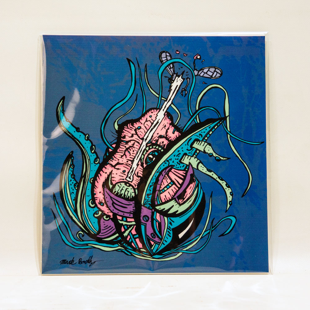
In late 2018, we embarked on designing a memorable poster series to sell at the Siempre La Guitarra merchandise table. Drawing inspiration from the geometric, round-cornered illustrations popular in the Graphicsbyte studio at the time, we crafted a fictional landscape featuring Mt. Hood as the centerpiece.
A lone lumberjack serenades the scene, nestled amidst the natural beauty. In addition we also created photo based posters using images from each artist, further amplifying event awareness.


16″ x 24″ tour posters were created using a traditional workflow, sketched by hand, scanned into Adobe Illustrator for vectorization, and then textured in Adobe Photoshop. For each subsequent show, the core design remained, but the dates and artist information were easily swapped out. An alternative design was also created focusing more on the lumberjack. This was a popular choice among fans and was also used on t-shirts and stickers.


A new, bearded character joined the Siempre La Guitarra universe for 2020. This mountain-themed poster, crafted entirely in Illustrator, featured him cleverly positioned within the shape of an eighth note. We even hid a musical Easter egg – the bird’s song is a David original!
Learning from past years, we included the entire lineup with a space-saving icon system and location key. Though the 2020 event was canceled due to the pandemic, the poster did see action at one show. In a testament to the design’s versatility, we were even able to repurpose it for another event in late 2023.

Beyond the poster design, Graphicsbyte actively participated in the Siempre La Guitarra events, managing the merchandise table.
We also had the opportunity to showcase and sell our own prints alongside the event items.

Beyond the poster design, Graphicsbyte actively participated in the Siempre La Guitarra events, managing the merchandise table.
We also had the opportunity to showcase and sell our own prints alongside the event items.
Limited-edition prints: Both the white alternative and tour posters were available at each show. Postcards were available in 2022.
Guitar picks and stickers: Initially offered separately, these popular items were later combined into convenient guitar pick packs featuring a backstory about the iconic lumberjack.
Exclusive online merch: T-shirts and trucker hats were available exclusively through the Siempre La Guitarra website, encouraging online exploration.
Unique collectibles: In 2020, a limited run of branded glass nail files with wooden handles was created, primarily gifted to performers with a few extras available for purchase.


For the Siempre La Guitarra event series, a user-friendly website was built on WordPress to seamlessly extend the brand identity established through the event posters. The website’s design incorporates the same eye-catching color palette and captivating illustrations, creating a cohesive online experience that resonates with fans. This focus on consistency ensures a smooth transition from the visual appeal of the posters to the website’s functionality.

For the Siempre La Guitarra event series, a user-friendly website was built on WordPress to seamlessly extend the brand identity established through the event posters. The website’s design incorporates the same eye-catching color palette and captivating illustrations, creating a cohesive online experience that resonates with fans. This focus on consistency ensures a smooth transition from the visual appeal of the posters to the website’s functionality.
Beyond aesthetics, the Siempre La Guitarra website prioritizes user experience. Fans can effortlessly navigate the site to purchase tickets for upcoming shows, explore detailed biographies about the performing artists, and browse a curated selection of event merchandise. Additionally, a dedicated section caters to potential sponsors, fostering new partnerships that support the event’s continued success.
Graphicsbyte provided a complete brand system for the Siempre La Guitarra concert series, including brand strategy, positioning, logo design, a custom typeface, illustrated tour posters, merchandise design, and a WordPress website. We also managed the merchandise table at events throughout the series run from 2018 to 2023.
© 2026 Graphicsbyte, All Rights Reserved

Decimal Engineered Systems is an industrial cannabis equipment manufacturer based in Canby, Oregon. They specialize in ethanol, hydrocarbon, and CO₂ extraction systems used by professional labs and industrial cannabis processing facilities.
I was brought in mid-2022 through a referral to assist with editorial materials. That quickly evolved into a larger creative leadership role, supporting Decimal’s tradeshow marketing efforts and eventually guiding the rollout of their new brand identity.
At the time I joined, Decimal had recently transitioned from their former identity, MRX Technologies. While the new logo, color palette, and typography had been developed, the system hadn’t yet been applied across any real-world assets.
Initially, the company had hired a third-party team for creative direction, but their execution fell short. To meet tight deadlines for MJBizCon, I partnered with Marketing Director Hunter, my long-time collaborator from True Terpenes, and Marketing Manager Michael, who helped guide messaging and approvals. Together, the three of us became Decimal’s in-house marketing team.
My role expanded into Creative Director, where I helped implement and evolve the brand system, updating the visual identity, producing custom iconography, and building marketing materials across digital and print. I also developed interactive displays for trade shows and laid the creative foundation for Decimal’s new website and UI systems.

When I first joined Decimal, there was an immediate need to develop editorial sales materials. The team had a starting template for equipment cut sheets, which I expanded into a complete series covering every piece of equipment. These double-sided handouts included technical specs, selling points, and QR codes to connect customers directly to the website for more information.
During this same period, I designed standardized price sheets and letterhead assets to unify all outgoing sales materials. These updates ensured Decimal’s sales and marketing collateral felt cohesive, professional, and on brand at every touchpoint.

Decimal’s core brand colors, orange and dark gray, provided a strong foundation, but we needed to expand the palette to support a growing catalog of products. Each product line was assigned a unique color and icon to establish a clear visual hierarchy across all materials.
This system made it easier to navigate internal documents, sales tools, and client-facing materials. Everything from operation manuals to quote proposals featured these color-coded covers, bringing consistency, clarity, and professionalism to the brand.

MJBizCon is the largest cannabis industry expo in the United States, held annually in Las Vegas. As part of Decimal’s marketing team, I was responsible for developing custom creative assets to support their presence at the show. This included booth graphics, promotional materials, and interactive elements to help attract and engage visitors on the show floor.
Decimal had an existing business card template, but the team wasn’t satisfied with its execution. They invited me to reimagine it while preserving meaningful elements from the original. The prior design included dotted patterns inspired by the dimples found on Decimal’s extraction equipment, a clever nod I chose to retain. From there, I reworked the layout for a stronger hierarchy and impact, running the company name along the card’s edge to make creative use of negative space.
For the production finish, I specified raised spot gloss on key areas to add a subtle tactile effect, resulting in a professional, memorable card that connected back to the brand’s industrial roots.

In addition to the business cards and equipment cut sheets, I wanted to give Decimal something extra to truly stand out. The idea was to create double-sided, custom die-cut cards shaped like their flagship machines. I designed two of these, featuring the new 5.HX Hydrocarbon Extractor and the 40.EX Ethanol Centrifuge.
The front showcased a realistic render of each machine, while the back included product details and a QR code for further exploration. Since the equipment was still in production, I worked with the team to source CAD renders, a challenge that required leveraging a high-end gaming graphics card to handle the heavy render loads and achieve crisp, high-resolution output.


As another memorable leave-behind, I designed double-sided stickers to hand out during the trade show. The peel-off backing carried the company name and booth location, while the front showcased the Decimal brand icon.
Beyond being a fun giveaway, these stickers were integrated into social media content and interactive moments with attendees, helping to drive engagement and reinforce the brand during the event.


As the event approached, I was invited to attend MJBizCon for the first time. While the team traditionally wore branded polos on the show floor, I saw an opportunity to highlight some of the new line-art illustrations I had been developing. I designed a set of custom T-shirts and hoodies featuring the Decimal logo on the front, with detailed equipment artwork printed on the back.
These double-sided designs promoted Decimal’s products while adding a creative, memorable edge. The team and customers responded enthusiastically, and this line-art style eventually became a signature element of Decimal’s brand illustration system.


Leveraging my background in IT, I developed custom code for Decimal’s email signatures to ensure consistent branding across Outlook’s global signature system. I also made the signatures responsive for mobile devices, providing a seamless experience across platforms.
Once the code was in place, I designed banner images that could be easily swapped out to promote upcoming trade shows and events, keeping both the team and customers informed and engaged.


For international shows like ICBC, where booth space is often limited, Decimal needed a more compact and portable display solution. We designed a 10×10 collapsible backdrop wall that could easily travel overseas and quickly set up on-site. This smaller footprint allowed the team to showcase compact machines while maintaining a bold, branded presence that aligned with their larger exhibits.
Stickers became a creative way to expand the Decimal brand and connect with audiences on a more playful, collectible level. Many of the designs were created around major holidays and cannabis industry dates like 4/20 and 7/10, using the company emblem as a foundation for bold visual riffs. These limited-edition designs gave the brand room to show personality while maintaining consistency across channels.
Other stickers were designed specifically for tradeshows like MJBizCon and ICBC, offering memorable takeaways for booth visitors. One standout was a pin featuring our illustrated 5.HX Hydrocarbon Extractor, a fan favorite that doubled as a conversation starter and branded keepsake.
Beyond print and traditional collateral, I also supported Decimal in designing an interactive touchscreen experience to serve as a digital product catalog. I collaborated closely with the Electrical/R&D Manager, who typically develops the interactive displays for the company’s equipment. I led the visual design while my teammate handled the programming, working through challenges like font compatibility, for instance, the standard Decimal typeface (Transducer) did not render properly in the software. I sourced a new typeface, Bai Jamjuree, that complemented the brand while working reliably across all interactive systems, ultimately becoming the official display font for Decimal’s touchscreens.
For MJBizCon, the interactive display used three core layouts. The first was a cover screen featuring a series of custom icons, each acting as a button. When a visitor selected one, the screen transitioned to a bright orange loading view with the Decimal logo before fading into the equipment page. On these pages, visitors could explore clickable dots with animated pulses overlaid on product images. These hotspots opened pop-ups with details about specific parts of the equipment, a practical solution for showcasing additional products that couldn’t physically fit in the booth.
Beneath each equipment view, supplementary product details were displayed, along with a persistent footer menu featuring certification and spec information. Hidden navigation buttons were also included to allow the sales team to quickly access educational content and jump between sections on demand, making the experience both a customer showcase and a versatile sales tool.
This dynamic animation serves as a signature element in all Decimal Engineered Systems video content. It showcases the custom Transducer typeface, a stencil font characterized by its uniform horizontal gap, brought to life through motion.
An orange line elegantly traces the contours of each letter, emphasizing precision, before settling smoothly into the decimal point. The result is a playful yet refined motion signature that reinforces Decimal’s identity and adds instant recognizability to every piece of content.


At the start, Decimal’s photography library was limited, so a series of graphic-forward posts was developed using available product renders and existing photos. The goal was to strike a balance between playful and educational, building early audience engagement.
Following the success of MJBizCon, our team prioritized creating more original content across all platforms. Social media evolved into a more dynamic space for the brand, with engaging reels, equipment highlights, and design-driven storytelling. I focused on the graphic side, developing custom posts for holidays, industry events, and key cannabis moments like 4/20 or 7/10. These visuals helped reinforce the brand identity while giving the company a consistent and professional voice online
Stickers became a creative way to expand the Decimal brand and connect with audiences on a more playful, collectible level. Many of the designs were created around major holidays and cannabis industry dates like 4/20 and 7/10, using the company emblem as a foundation for bold visual riffs. These limited-edition designs gave the brand room to show personality while maintaining consistency across channels.
Other stickers were designed specifically for tradeshows like MJBizCon and ICBC, offering memorable takeaways for booth visitors. One standout was a pin featuring our illustrated 5.HX Hydrocarbon Extractor, a fan favorite that doubled as a conversation starter and branded keepsake.


As part of our effort to build brand energy beyond traditional formats, I designed a specialty sticker called Cyber Decimal, a biomechanical illustration that blends my signature art style with Decimal’s identity. Built around the D emblem, the artwork tells a layered visual story of a beautiful yet functional machine, just like the equipment Decimal manufactures.
Inside the emblem, a premium hemp field grows beneath a transparent panel. At its core, a cockpit houses a figure in a welding mask, overseeing the internal systems. The surrounding structure features tubes, conduits, and paneling, evoking a futuristic yet grounded sense of engineering. It’s a story within a story, a surreal homage to the complexity and precision behind every Decimal product.

Decimal’s original one-page scrolling site provided basic access to product information, but it didn’t offer a full view of the catalog. It relied on a carousel of downloadable cut sheets, which made it harder for customers to quickly explore and compare equipment.
In mid-2023, we launched a fully custom WordPress website that expanded the digital experience and showcased the complete product line. The new site features interactive navigation, modular anchor-linked sections, and high-impact visuals. From bold brand graphics to custom photography, every element was designed to bring Decimal’s identity to life.
The site architecture plays off the brand’s signature rounded square motif, creating a cohesive and recognizable visual language. Each main product page includes dynamic video reels that draw users into the experience, making even complex machinery feel approachable and engaging.
To cover the wide selection of products, Category pages were put in place to act as hubs for the different product lines. These pages gave customers a brief description of what the genre was about and they could easily find all the machines starting from the smallest to the largest to fit their facility.


To cover the wide selection of products, Category pages were put in place to act as hubs for the different product lines. These pages gave customers a brief description of what the genre was about and they could easily find all the machines starting from the smallest to the largest to fit their facility.

Each product page was designed as an interactive spec sheet, built to educate and convert. The header features a cinematic reel that gives users a dynamic walkaround of the machine. As visitors scroll, they encounter an interactive hotspot section, mirroring the experience of our touchscreen tradeshow display, which highlights key machine features by name.
The page continues with an overview of the product, followed by supporting imagery, feature highlights, and a detailed specifications table. A dedicated highlights section further breaks down what sets each machine apart.
To generate leads, downloadable equipment cut sheets were gated behind intake forms, ensuring the site collects valuable customer data. Tailored CTAs at the bottom of each page guide users to relevant content elsewhere on the site, with messaging customized to each product.
For MJBizCon, the largest cannabis industry expo in the United States, Graphicsbyte produced booth graphics, equipment cut sheets, business cards, custom die-cut product cards shaped like Decimal’s flagship machines, double-sided stickers, branded apparel featuring line-art equipment illustrations, and an interactive touchscreen display that served as a digital product catalog with animated hotspots and clickable equipment pages.


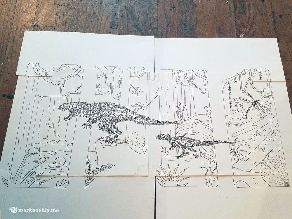
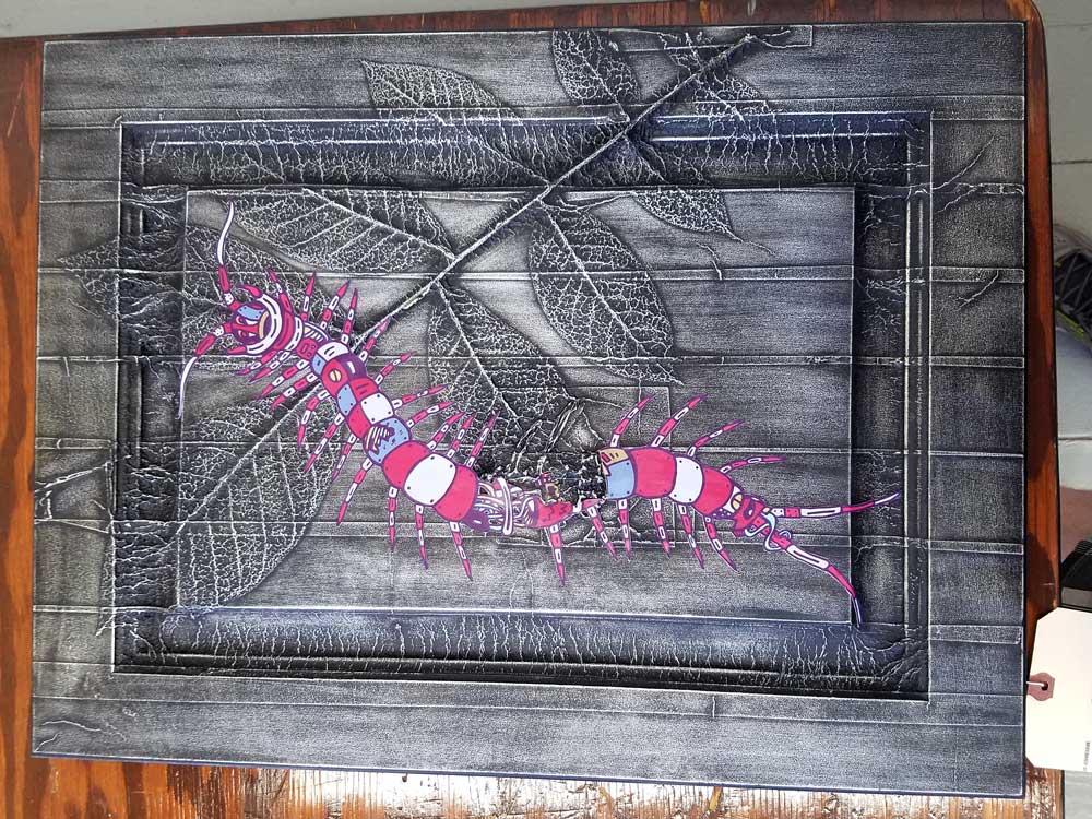
The Creature Collection is an illustrated study of biomechanical insects and animals, blending custom patternwork with science fiction-inspired design.
The Creature Collection is an illustrated study of biomechanical insects and animals, blending custom patternwork with science fiction-inspired design.
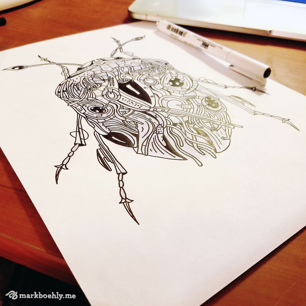
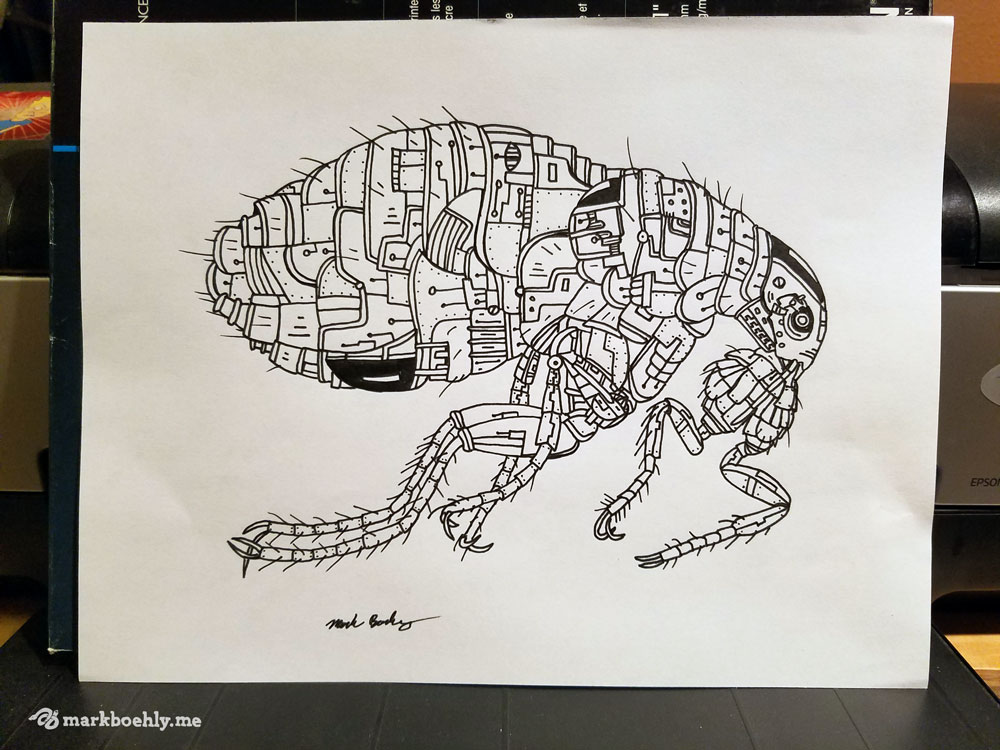
In 2016 we developed an illustrative series known as the “Creature Collection.” The purpose of the series is to explore biomechanical patterns influenced by science fiction and zentangles. Each design is hand-drawn, digitally colored, and uses eye-catchy color palettes. New creatures are still being added to the series on a monthly basis.
Terms:


Reptiles have played a major role in the Graphicsbyte brand. From 2013–17 a viper was used as the studio icon. Many different skins were available on stickers, clothing and business cards. Towards the end of 2017 the viper was retired and the brand was repurposed for the Creature Collection sticker packs.
Reptiles have played a major role in the Graphicsbyte brand. From 2013–17 a viper was used as the studio icon. Many different skins were available on stickers, clothing and business cards. Towards the end of 2017 the viper was retired and the brand was repurposed for the Creature Collection sticker packs.

The first product we developed were insect sticker packs. These were inspired by real bug specimens. Each pack features five insects and the viper brand logo. The pack also has a promo code for a downloadable poster. Currently the series is a limited run and we have two volumes available.
The first product we developed were insect sticker packs. These were inspired by real bug specimens. Each pack features five insects and the viper brand logo. The pack also has a promo code for a downloadable poster. Currently the series is a limited run and we have two volumes available.
Selling limited edition prints is another great way to get the work into the wild. Everything is signed and numbered by Mark Boehly. On occasion the most popular designs make their way onto clothing and accessories.
Selling limited edition prints is another great way to get the work into the wild. Everything is signed and numbered by Mark Boehly. On occasion the most popular designs make their way onto clothing and accessories.

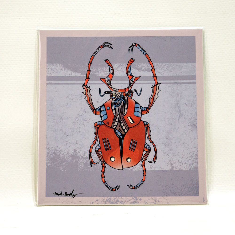
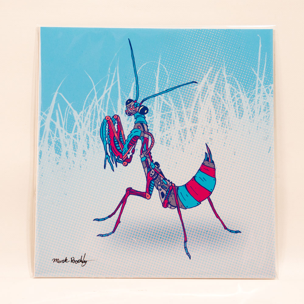
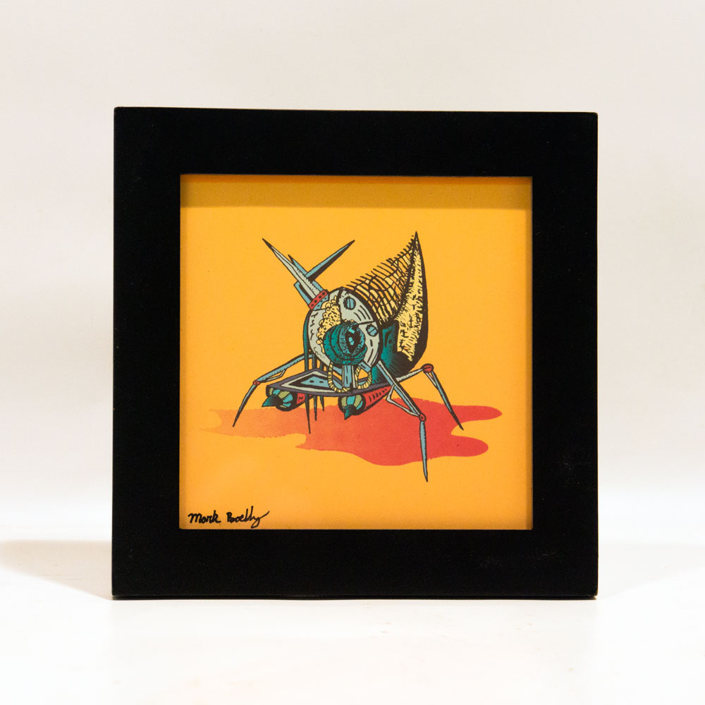


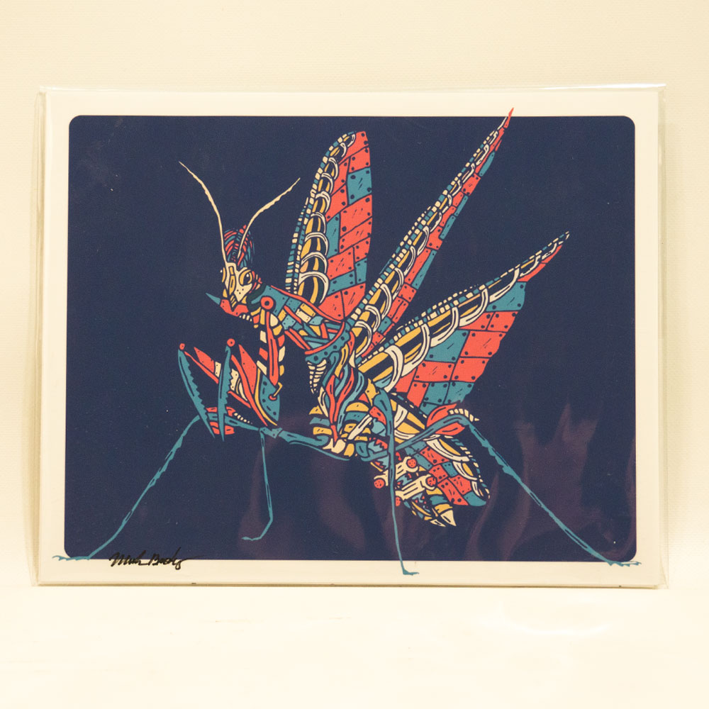

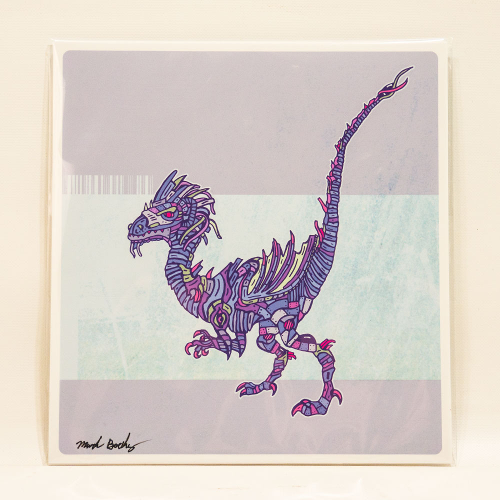


The Creature Collection is an original illustrated series by Mark Boehly, owner of Graphicsbyte, launched in 2016. Each piece explores biomechanical design, a cross between organic tissue and machine, blending custom zentangle patternwork with science fiction-inspired aesthetics. Every creature is hand-drawn and digitally colored. New designs are added to the series monthly.
Creature Collection designs are available as limited edition stickers and prints in the Graphicsbyte shop. Current products include individual creature stickers, insect sticker packs, and vinyl sticker packs. All prints are signed and numbered by Mark Boehly. New products are added as the series grows. Browse the full collection at graphicsbyte.com/shop/custom-stickers.

Centered Water is a start-up CBD brand out of the Pacific Northwest. Their lineup features +99% CBD isolate, doggy treats, and massage oil. But their most popular item is CBD water. In 2018 the client reached out and was looking for a label redesign. They gave us full creative control and they were open to many new ideas.
After pitching the idea of creating an illustrated label one of the co-owners said he has Hawaiian heritage and thought it would be funny if the brand had a Hawaiian mascot. We decided to run with this idea and Joe the cartoon was born.
One of the owners from Centered Water drew a raindrop icon. This was used on the old labels. The logo didn’t have a designated font and the brand needed some touch-ups. After some cleanup work and a critique, the font Chalet London Nineteen Seventy was chosen to represent the brand. The icon was recreated and for the first time the client now owns a vector copy of their brand.
One of the owners from Centered Water drew a raindrop icon. This was used on the old labels. The logo didn’t have a designated font and the brand needed some touch-ups. After some cleanup work and a critique, the font Chalet London Nineteen Seventy was chosen to represent the brand. The icon was recreated and for the first time the client now owns a vector copy of their brand.

The starting lineup features three flavors. Each flavor has a different illustrated scene. We thought this would be a fun opportunity to tell the story of Joe living in the PNW. The first label we designed was the Cantaloupe flavor. We added a series of trees to fill the landscape and created a custom texture for the background. This paved a path for all future designs.
The next thing we did was illustrate the character. After several different attempts we found something everyone was happy with. The client mentioned they wanted to see Joe in a hammock. We felt the cantaloupe flavor would be the perfect opportunity for this.


The next label we designed was Pear. We continued the tree landscape and created a different background texture to resemble clouds. This was another opportunity to add humor to the product. This scene shows a fruit stand where Joe is sharing his pears with the community of forest animals.
The next label we designed was Pear. We continued the tree landscape and created a different background texture to resemble clouds. This was another opportunity to add humor to the product. This scene shows a fruit stand where Joe is sharing his pears with the community of forest animals.

The old CBD water labels featured a mountain so we wanted to bring some of that language into the third label. We created a background texture that resembles part of a mountain. Then we added an A-frame at the base. The flavor is called Original and the scene is where Joe lives. We felt that the label need a little more variety so this scene takes place at night.
The old CBD water labels featured a mountain so we wanted to bring some of that language into the third label. We created a background texture that resembles part of a mountain. Then we added an A-frame at the base. The flavor is called Original and the scene is where Joe lives. We felt that the label need a little more variety so this scene takes place at night.
Each of the three flavors has its own illustrated scene featuring Joe. The Cantaloupe label shows Joe relaxing in a hammock surrounded by trees. The Pear label features a fruit stand where Joe shares pears with forest animals. The Original label depicts Joe’s A-frame home at the base of a mountain, set at night with a mountain texture in the background.

Have you ever wanted to visit an alien world full of metal? Truax Designs is an experience where people not only interact with sculpture but take a piece home.
Have you ever wanted to visit an alien world full of metal? Truax Designs is an experience where people not only interact with sculpture but take a piece home.
Several years before Graphicsbyte was formed Mark Boehly took a sculpture class at Clackamas Community College. In the class, he met a student named Christopher Truax. The two became good friends but eventually lost contact. In 2013 the two randomly reconnected at an art gallery in Portland. The show featured Christopher’s metal sculpture. He had articulated robots, tall animals inspired by Salvador Dali, a robotic DJ, and even a flying toaster. As a solo act, it was nice to see an old friend living the dream as a master sculptor.
The gallery event took place a few weeks after Mark graduated from Portland State University. This was a good time to look for new opportunities. He agreed to build Christopher a website and a logo. The payment was a trade for a custom piece of sculpture. Before the website and brand were finished Christopher shared a prototype where objects were infused in metal. The sculpture looked like it came straight out of a science fiction movie. Instantly Mark knew this was something worth exploring. Mark decided to join the team and learn how to build his own sculptures. He then agreed to market the new product know known as “Karbon Kast.” (The sign in the photo on the left uses this process.) Together Christopher and Mark formed a creative friendship and still continue to produce new works of art to this day.
In Early 2014 Truax Designs reveled a new product called Karbon Kast at the AFRU Gallery in Portland. It was an instant hit. Over 60 items sold on the opening night and a dozen more throughout the week. When the event was over Mark and Chris started to produce hundreds of sculptures. They were preparing for their next show at the Portland Expo called America’s Largest Christmas Bazaar.
This event was also a huge success. Karbon Kast attracted dozens of new fans and this was when we presented the company logo for the first time.
The brand was designed after a robotic angel named Lily. She is fully articulated and was built for stop-motion animation. Mark designed an enclosure logo that showcases the robots most iconic features. Red became the brands primary color because it matches Lily’s brother Apollo who is also an articulated robot in the series. The physical color of the two robots together are both light and dark. This formed a Yin & Yang in the color palette.
A condensed san serif typeface was created to fit in the enclosures negative space. Today that type has become the brand’s main focal point. Wings are a common element found in the brands metal sculptures. So it only made since to add graphic wings to print media such as business cards and flyers.


Truax Designs has gone through several website iterations as the studio has grown. The earliest versions served as a portfolio for co-founder Christopher Truax, focusing on his individual metal sculpture work. As the team expanded and the brand matured, the website evolved to reflect a broader, more collaborative identity.
The most recent version of the website is centered around e-commerce and engagement. While Etsy remains the primary sales platform, the site now includes a shop for direct purchases, especially for higher-end sculptures. Visitors can also submit intake forms to request custom pieces, making the site a tool for both sales and commissions.
A major feature of the new site is the Karbon Kast case study, which showcases the success of our cast resin product line. This section highlights the growing impact of the brand, including celebrity collectors and media recognition, positioning Karbon Kast as a standout offering within the Truax Designs portfolio.
The homepage also includes a section to browse upcoming shows and events, allowing visitors to connect with the team in person and experience the work firsthand.
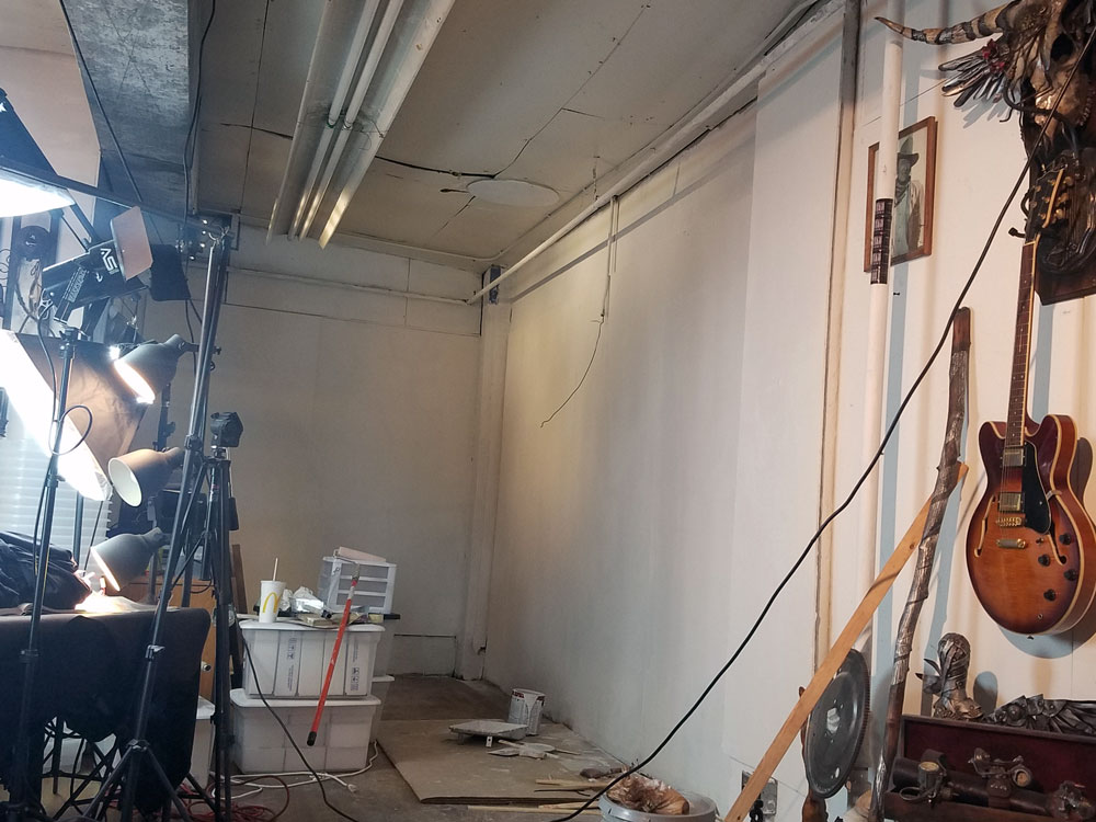
Creating the art is one of the best perks of working with Truax Designs. In 2017 we started to create 3D printed prototypes. These prints were infused in the metal and turned into success stories at events like Comic Con. We also created some mixed-media hybrids using Graphicsbyte art as the focal point. The Karbon Kast was then used as a secondary texture.
Creating the art is one of the best perks of working with Truax Designs. In 2017 we started to create 3D printed prototypes. These prints were infused in the metal and turned into success stories at events like Comic Con. We also created some mixed-media hybrids using Graphicsbyte art as the focal point. The Karbon Kast was then used as a secondary texture.


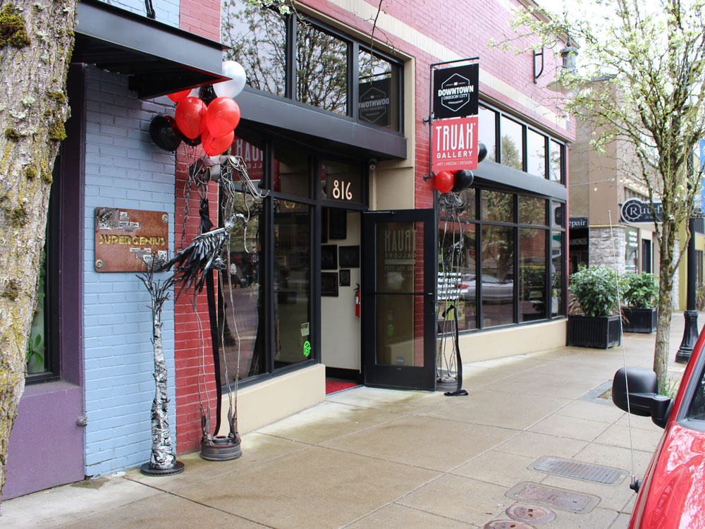
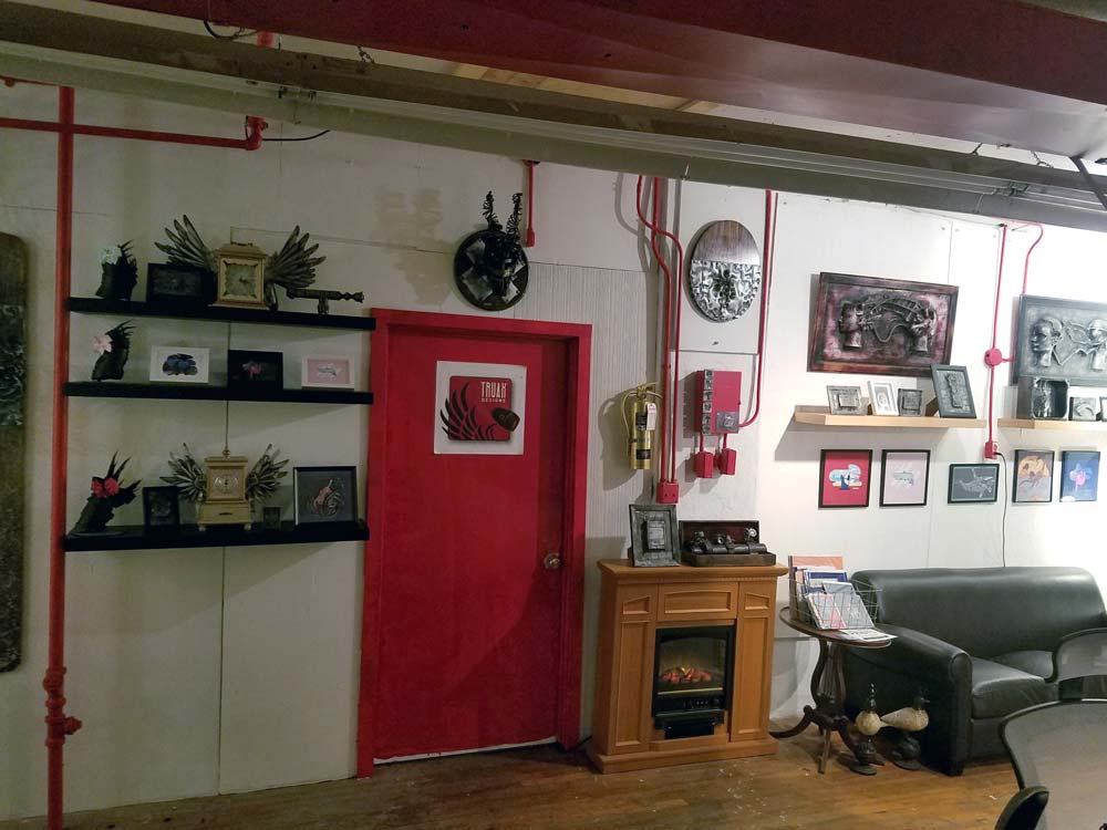
Towards the end of 2017 Truax Designs created a pop up gallery in Oregon City called Truax Gallery. Mark and Chris spent a year here selling metal sculptures to the general public. About three months into the project we needed another line of art. Graphicsbyte received an opportunity to sell prints and sticker packs. This added a splash of color to the gallery and attracted a different audience.
Towards the end of 2017 Truax Designs created a pop up gallery in Oregon City called Truax Gallery. Mark and Chris spent a year here selling metal sculptures to the general public. About three months into the project we needed another line of art. Graphicsbyte received an opportunity to sell prints and sticker packs. This added a splash of color to the gallery and attracted a different audience.


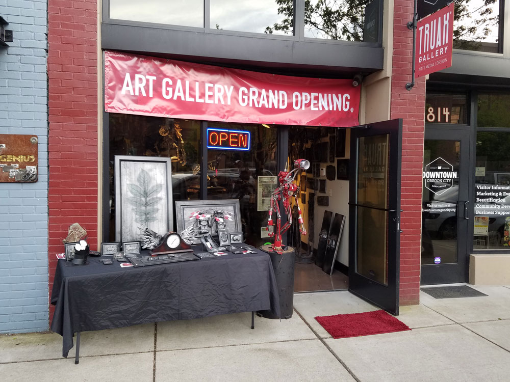


Even though the Oregon City gallery was short lived the experience was everything the artists hoped for. The following year the crew packed up and moved to West Linn. The new location had a storefront connected to the same building the Truax Designs workshop is in. This move was going to speed up production… Soon as we were getting ready to officially launch the second chapter of the gallery Coivid-19 came to Oregon. We were forced to cancel the project. Truax Designs still has a workshop in the West Linn building but it’s not open to the public.
Even though the Oregon City gallery was short lived the experience was everything the artists hoped for. The following year the crew packed up and moved to West Linn. The new location had a storefront connected to the same building the Truax Designs workshop is in. This move was going to speed up production… Soon as we were getting ready to officially launch the second chapter of the gallery Coivid-19 came to Oregon. We were forced to cancel the project. Truax Designs still has a workshop in the West Linn building but it’s not open to the public.


Luna Food and Smoothies received chalkboard-style branding with logo, signage, and menus from Graphicsbyte for their launch at the Portland Saturday Market.
Continue reading
Imperial Martial Arts Academy was a family-owned school that needed a brand to honor their unique curriculum. They taught a specialized blend of Kenpo which is rooted in both Chinese and Japanese mixed martial arts traditions.
We were brought on to design a unified visual identity. The goal was to create a logo that could bridge these diverse cultural influences while working effectively across uniforms, print materials, and exterior signage.

The academy taught a blend of American, Japanese, and Chinese styles. Their elite students belonged to a group called the “Order of the Phoenix,” so the client requested a phoenix logo to serve as the school mascot. Our task was to create a modern and eye-catching crest that could tie together three different cultures into a single uniform patch.
We wanted to make sure the bird was the primary focus of the crest. We added rays from a rising sun in the background to symbolize Eastern traditions. However, to give the design a distinctly American twist, we utilized a bold red, white, and blue color scheme.
Typography Strategy
To balance the sharp points of the bird’s feathers, we selected the typeface Versailles. The strong serif angles of this font complemented the aggressive geometry of the illustration.
The dojo was located in the Willamette neighborhood of West Linn, Oregon. This specific street is known for its old western theme where every building facade must match the era.
We designed a storefront sign that utilized a realistic wood grain texture to blend with the historic aesthetic of the town. The phoenix logo made a subtle appearance on the main sign and was also applied prominently to the front door of the school to welcome students.


The uniform patch was the anchor of this entire project. The owner loved the design so much that he allowed us to expand the brand into various print materials.
Auction Tickets: We designed premium black tickets for a local West Linn school auction. These were printed on cardstock with a heavy toothy texture to give them a tactile and high-value feel.
Merchandise: We created branded t-shirts sold at the front desk alongside seasonal postcards. Each card was double-sided and featured an illustrative touch that played off the mixed martial arts theme.


