
A complete rebrand for CUP of TEA in Clackamas, including new packaging, illustrations, custom icons, and a refreshed website to reflect their nature vibe.
Continue reading
A complete rebrand for CUP of TEA in Clackamas, including new packaging, illustrations, custom icons, and a refreshed website to reflect their nature vibe.
Continue reading
Fueled by the 2018 Hemp Farming Bill, which removed CBD from the list of controlled substances and marked a significant milestone for Oregon, musician Trevor Green, who spent years touring the Northwest, noticed a surge of cannabis businesses. Inspired by nature and his musical background, he sought to create Green Room Naturals, a brand with a deep connection to both.

Fueled by the 2018 Hemp Farming Bill, which removed CBD from the list of controlled substances and marked a significant milestone for Oregon, musician Trevor Green, who spent years touring the Northwest, noticed a surge of cannabis businesses. Inspired by nature and his musical background, he sought to create Green Room Naturals, a brand with a deep connection to both.

When Trevor approached us he wanted his new brand to have a deep connection with nature and spiritual energy. We achieved that by building the brand’s color palette around the seven chakras. The logo represents growth and healing in the form of a lotus flower/ cannabis leaf. To give the brand more personality we tied in an abstract Native American feather to be the focal point. This is a tribute to the owner’s musical background.
When Trevor approached us he wanted his new brand to have a deep connection with nature and spiritual energy. We achieved that by building the brand’s color palette around the seven chakras. The logo represents growth and healing in the form of a lotus flower/ cannabis leaf. To give the brand more personality we tied in an abstract Native American feather to be the focal point. This is a tribute to the owner’s musical background.

Inspired by the “Get Pitted!” philosophy, we crafted the Green Room Naturals packaging to reflect the brand’s commitment to nature and clean ingredients. This meant embracing minimalism, placing a central focus on the brand’s iconic plant symbol.
To further amplify the message of freshness and confidence, we opted for the Futura typeface. Its condensed style exudes both clarity and modern elegance, ensuring the packaging speaks volumes even at a glance.
The color scheme itself plays a subtle yet crucial role. Black packaging signifies deodorants infused with CBD, while white indicates classic, CBD-free formulas. This clear visual distinction allows consumers to easily identify the product that best suits their needs.

The color scheme itself plays a subtle yet crucial role. Black packaging signifies deodorants infused with CBD, while white indicates classic, CBD-free formulas. This clear visual distinction allows consumers to easily identify the product that best suits their needs.

Building on the success of the deodorant launch, we designed labels for a new range of CBD-infused pain relief products including Recovery Cream, CBD Roll-On, Tinctures, and Lip Balms. This has expanded the brand’s focus on wellness. An off-centered watermark and different font weights were also added to help with hierarchy.
Building on the success of the deodorant launch, we designed labels for a new range of CBD-infused pain relief products including Recovery Cream, CBD Roll-On, Tinctures, and Lip Balms. This has expanded the brand’s focus on wellness. An off-centered watermark and different font weights were also added to help with hierarchy.


Graphicsbyte provided a complete brand identity and packaging design system for Green Room Naturals, including logo design and packaging for deodorants, recovery creams, CBD roll-ons, tinctures, and lip balms. The brand system was built around the seven chakras, Native American symbolism, and the founder’s musical background.
The logo combines a lotus flower and cannabis leaf to represent growth and healing, with an abstract Native American feather as the focal point, a tribute to founder Trevor Green’s musical background touring the Pacific Northwest. The brand’s color palette was built around the seven chakras to reflect the brand’s deep connection to nature and spiritual energy.
The deodorant packaging uses a minimalist design centered on the brand’s plant symbol and the Futura typeface. A clear color-coding system distinguishes product variants, black packaging indicates CBD-infused deodorants while white indicates CBD-free formulas. The expanded wellness product line uses an off-centered watermark and varied font weights to create visual hierarchy across creams, roll-ons, tinctures, and lip balms.
© 2026 Graphicsbyte, All Rights Reserved

True Terpenes is a B2B flavor company dedicated to the science of terpenes and terpenoids. Terpenes are compounds found in all plants responsible for fragrance. While other brands may offer a wider range of products, this brand excels in the field of cannabis terpenes.
True Terpenes is a B2B flavor company dedicated to the science of terpenes and terpenoids. Terpenes are compounds found in all plants responsible for fragrance. While other brands may offer a wider range of products, this brand excels in the field of cannabis terpenes.
In August 2021, Mark Boehly joined True Terpenes as a full-time freelance graphic designer. The role was supposed to last for a few weeks but ended up with several extensions that went on for 11 months.
The position was in a collaborative environment assisting the Marketing team. Duties included: the creation of on-time deliverables such as advertisements, custom label design, packaging, editorial documents, marketing material, branding, sales collateral, tradeshow signage, and much more.


During the fall of 2021 Mark helped design the signage and print materials for the True Terpenes booth at MJBizCon. This event was held at the Las Vegas Convention Center. The show features vendors from around the world, giving the latest insights about cannabis culture, products, trends, etc.
This year the company had a backlit tower, four desks, and four podium stands. Almost every surface was covered in designed imagery. The podiums also had diffusers on them, so anyone walking by would be pulled in by a unique terpene aroma.


It took several months of design in order to prepare all the moving pieces for this event. Posters, business cards, table tents, and social imagery were developed. The main focal point of the booth was the tower. It featured the companies latest product lines, Live Resin and Live Alchemy.
The tower was also accompanied by a seamless pattern of illustrated assets. These call-outs are part of the brand and represent ingredients found within the two product lines. Written facts about the brand were also displayed on all four sides.

Info cards and Terp wheels were created to accompany every product on the website. The purpose was to educate the customer about the main terpenes throughout the various product lines. The card on the left shows the flavor, strain, effects and primary terpene information. Then the card on the right shows a top percentage breakdown of the main terpene ingredients. Additional information cards were also developed and applied to all the product pages.
Info cards and Terp wheels were created to accompany every product on the website. The purpose was to educate the customer about the main terpenes throughout the various product lines. The card on the left shows the flavor, strain, effects and primary terpene information. Then the card on the right shows a top percentage breakdown of the main terpene ingredients. Additional information cards were also developed and applied to all the product pages.


Each month Mark worked on campaigns that promoted the release of new terpene products. One of the first themed campaigns Mark was a part of was Cyber Monday. This was a vintage IBM computer with terpene bottles on the screen. Teaser images such as a loading bar were displayed on social media. This gave customers something to look forward to days before the event.
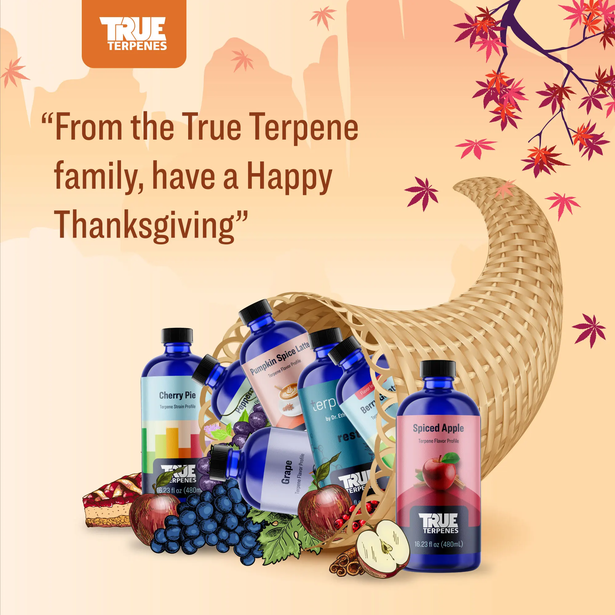
Other holidays like Thanksgiving, Christmas, and the New Year also had custom social posts and themed campaigns.
Each month Mark worked on campaigns that promoted the release of new terpene products. One of the first themed campaigns Mark was a part of was Cyber Monday. This was a vintage IBM computer with terpene bottles on the screen. Teaser images such as a loading bar were displayed on social media. This gave customers something to look forward to days before the event.
Other holidays like Thanksgiving, Christmas, and the New Year also had custom social posts and themed campaigns.


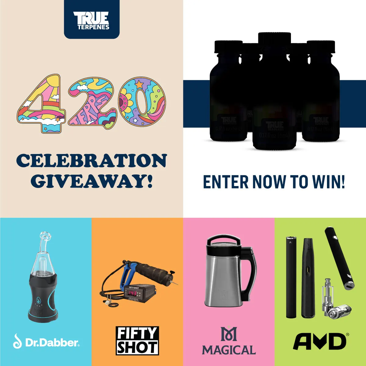
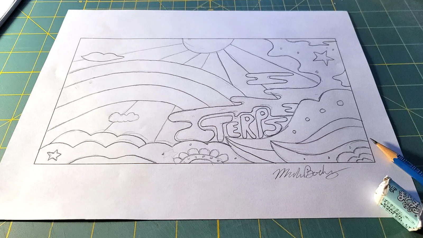
April is a big month not just because of April Fools, but in the cannabis industry, 420 is practically a holiday. During April 2022 the company released a blog post about the origins of 420. The backstory took place in the 70s. So to fit the vibe, Mark illustrated a 1970’s themed 420 logo.
A background image was also illustrated so it could be used on the website and to asset the rest of the campaign imagery. April was also a big month for product releases. A social media giveaway went into effect. The 420 imagery took on many shapes to help promote the event.


The final campaign Mark was involved in was called Summer of Flavor. Instead of using illustrations, Mark told a visual story of summer through his color palette and subtle use of icons.
The final campaign Mark was involved in was called Summer of Flavor. Instead of using illustrations, Mark told a visual story of summer through his color palette and subtle use of icons.


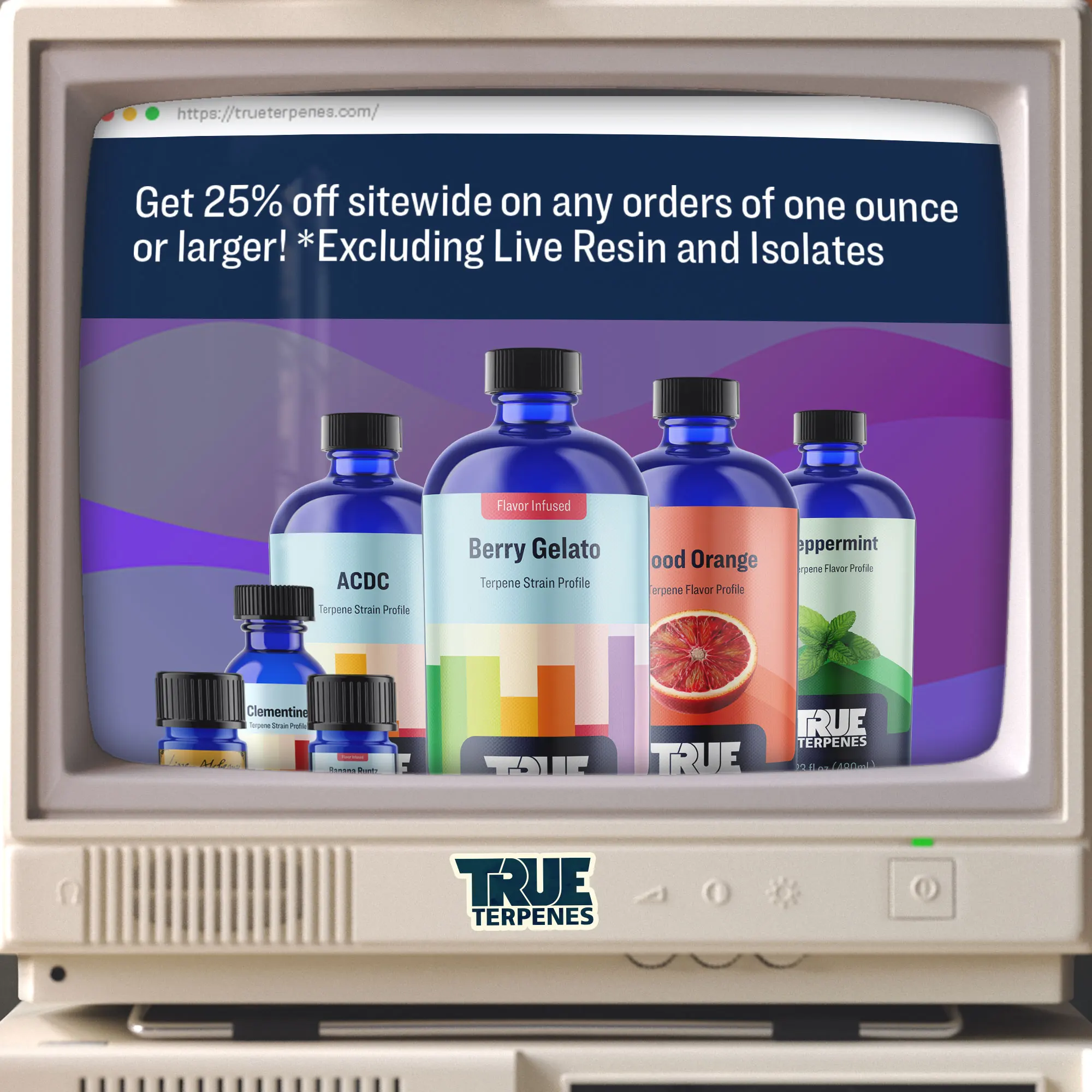
When new products were released this provided a creative opportunity for the labels. Each product line has a different theme but there is always a unique visual that changes.
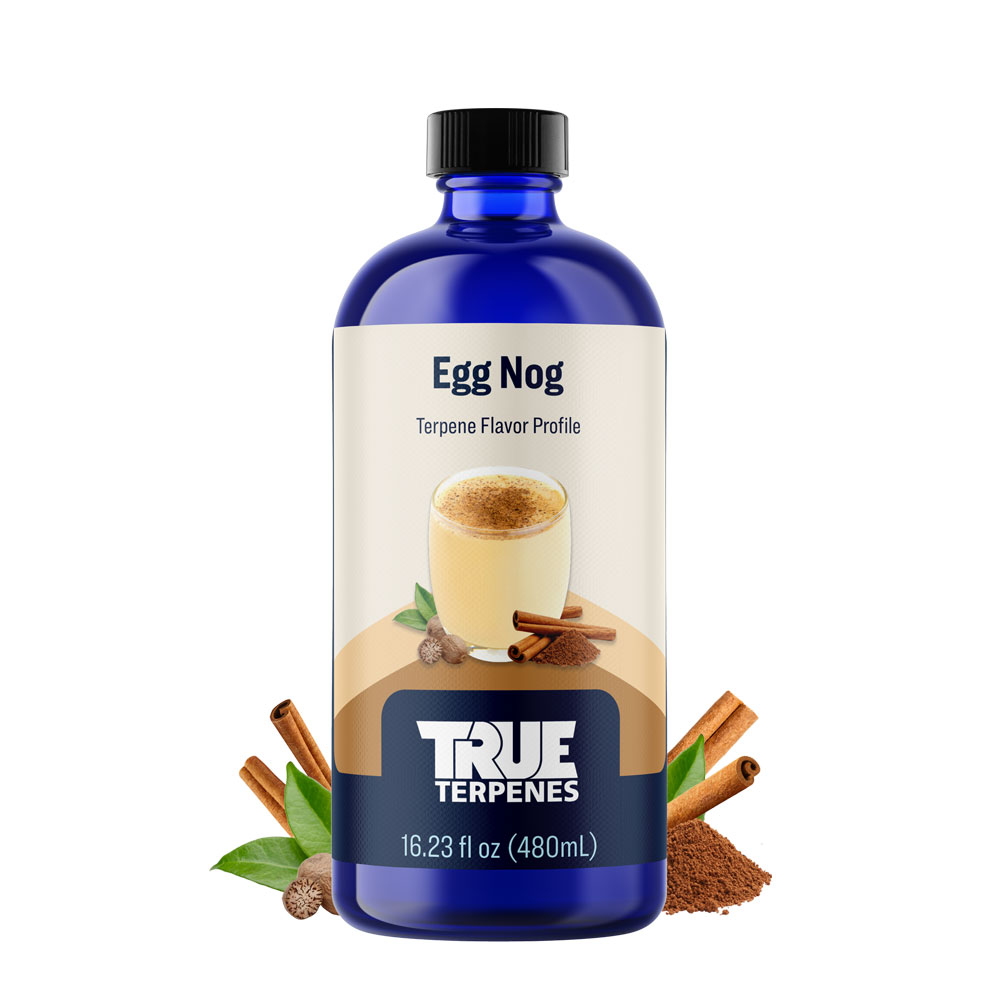
Mark created dozens of labels in different sizes. The 16oz bottle was commonly used on the website. Additional images showing illustrations of the ingredients were also developed. This helped describe the product’s aroma.
When new products were released this provided a creative opportunity for the labels. Each product line has a different theme but there is always a unique visual that changes.
Mark created dozens of labels in different sizes. The 16oz bottle was commonly used on the website. Additional images showing illustrations of the ingredients were also developed. This helped describe the product’s aroma.


At the end of May, Mark created content for a new tradeshow called CWCBExpo which was held in New York. The booth was a 10×10 inline display using a branded table, two-floor roll-out signs, and a backdrop.
The signs used a contemporary style to promote the Live Resin product line. Vertical postcards were also created as handout material.


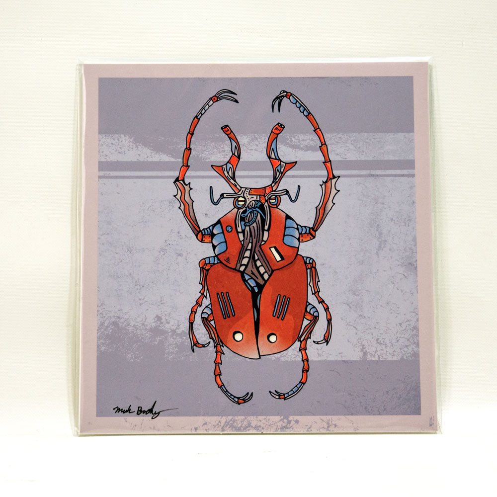
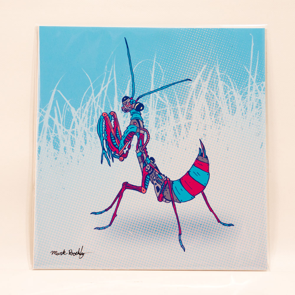
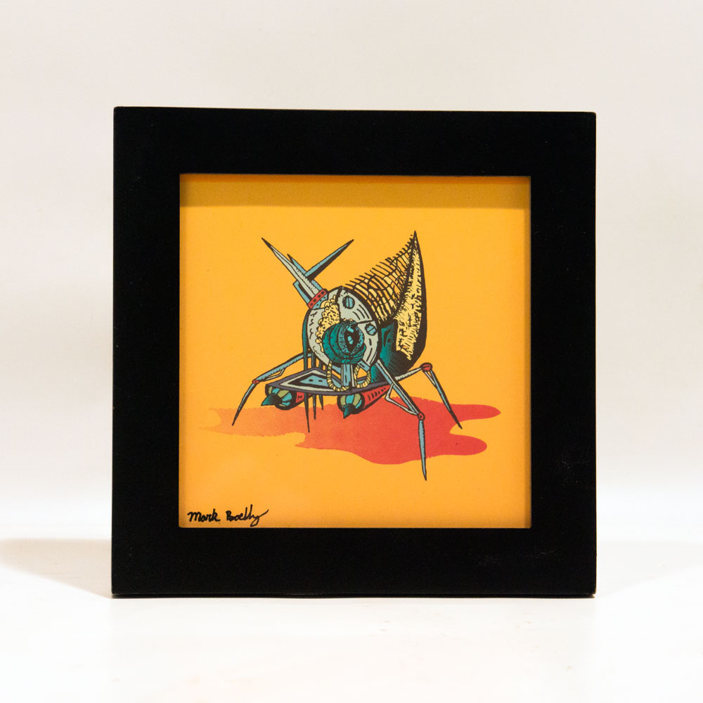
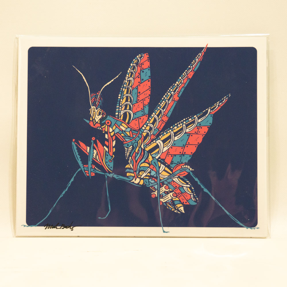
The Creature Collection is an illustrated study of biomechanical insects and animals, blending custom patternwork with science fiction-inspired design.
The Creature Collection is an illustrated study of biomechanical insects and animals, blending custom patternwork with science fiction-inspired design.
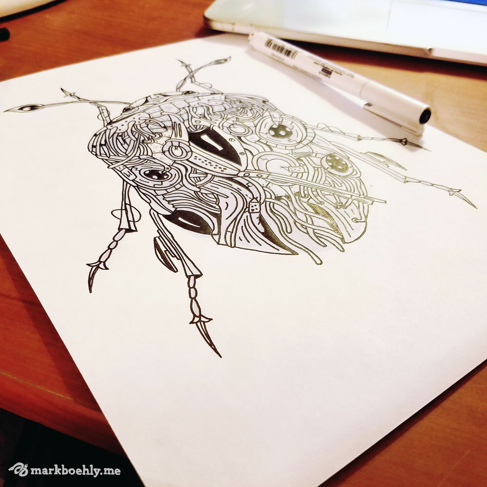
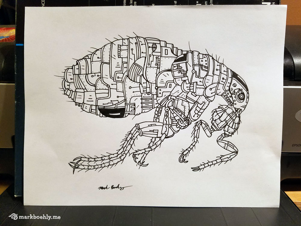
In 2016 we developed an illustrative series known as the “Creature Collection.” The purpose of the series is to explore biomechanical patterns influenced by science fiction and zentangles. Each design is hand-drawn, digitally colored, and uses eye-catchy color palettes. New creatures are still being added to the series on a monthly basis.
Terms:


Reptiles have played a major role in the Graphicsbyte brand. From 2013–17 a viper was used as the studio icon. Many different skins were available on stickers, clothing and business cards. Towards the end of 2017 the viper was retired and the brand was repurposed for the Creature Collection sticker packs.
Reptiles have played a major role in the Graphicsbyte brand. From 2013–17 a viper was used as the studio icon. Many different skins were available on stickers, clothing and business cards. Towards the end of 2017 the viper was retired and the brand was repurposed for the Creature Collection sticker packs.

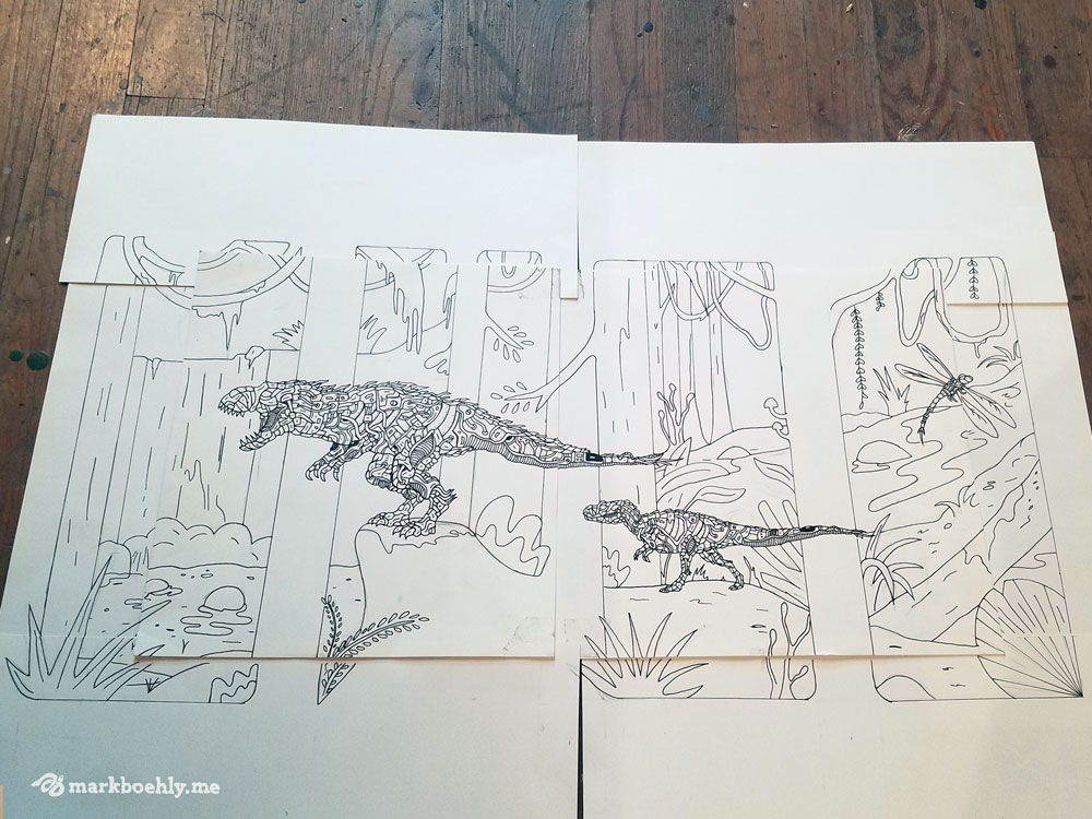
The first product we developed were insect sticker packs. These were inspired by real bug specimens. Each pack features five insects and the viper brand logo. The pack also has a promo code for a downloadable poster. Currently the series is a limited run and we have two volumes available.
The first product we developed were insect sticker packs. These were inspired by real bug specimens. Each pack features five insects and the viper brand logo. The pack also has a promo code for a downloadable poster. Currently the series is a limited run and we have two volumes available.
Selling limited edition prints is another great way to get the work into the wild. Everything is signed and numbered by Mark Boehly. On occasion the most popular designs make their way onto clothing and accessories.
Selling limited edition prints is another great way to get the work into the wild. Everything is signed and numbered by Mark Boehly. On occasion the most popular designs make their way onto clothing and accessories.


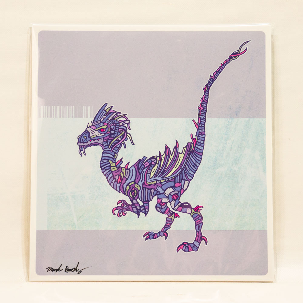

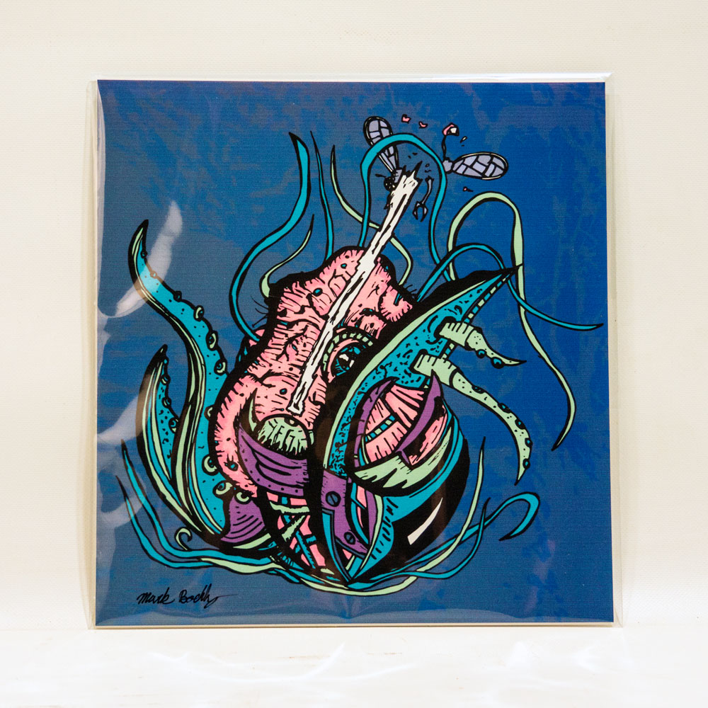

The Creature Collection is an original illustrated series by Mark Boehly, owner of Graphicsbyte, launched in 2016. Each piece explores biomechanical design, a cross between organic tissue and machine, blending custom zentangle patternwork with science fiction-inspired aesthetics. Every creature is hand-drawn and digitally colored. New designs are added to the series monthly.
Creature Collection designs are available as limited edition stickers and prints in the Graphicsbyte shop. Current products include individual creature stickers, insect sticker packs, and vinyl sticker packs. All prints are signed and numbered by Mark Boehly. New products are added as the series grows. Browse the full collection at graphicsbyte.com/shop/custom-stickers.

Centered Water is a start-up CBD brand out of the Pacific Northwest. Their lineup features +99% CBD isolate, doggy treats, and massage oil. But their most popular item is CBD water. In 2018 the client reached out and was looking for a label redesign. They gave us full creative control and they were open to many new ideas.
After pitching the idea of creating an illustrated label one of the co-owners said he has Hawaiian heritage and thought it would be funny if the brand had a Hawaiian mascot. We decided to run with this idea and Joe the cartoon was born.
One of the owners from Centered Water drew a raindrop icon. This was used on the old labels. The logo didn’t have a designated font and the brand needed some touch-ups. After some cleanup work and a critique, the font Chalet London Nineteen Seventy was chosen to represent the brand. The icon was recreated and for the first time the client now owns a vector copy of their brand.
One of the owners from Centered Water drew a raindrop icon. This was used on the old labels. The logo didn’t have a designated font and the brand needed some touch-ups. After some cleanup work and a critique, the font Chalet London Nineteen Seventy was chosen to represent the brand. The icon was recreated and for the first time the client now owns a vector copy of their brand.

The starting lineup features three flavors. Each flavor has a different illustrated scene. We thought this would be a fun opportunity to tell the story of Joe living in the PNW. The first label we designed was the Cantaloupe flavor. We added a series of trees to fill the landscape and created a custom texture for the background. This paved a path for all future designs.
The next thing we did was illustrate the character. After several different attempts we found something everyone was happy with. The client mentioned they wanted to see Joe in a hammock. We felt the cantaloupe flavor would be the perfect opportunity for this.


The next label we designed was Pear. We continued the tree landscape and created a different background texture to resemble clouds. This was another opportunity to add humor to the product. This scene shows a fruit stand where Joe is sharing his pears with the community of forest animals.
The next label we designed was Pear. We continued the tree landscape and created a different background texture to resemble clouds. This was another opportunity to add humor to the product. This scene shows a fruit stand where Joe is sharing his pears with the community of forest animals.

The old CBD water labels featured a mountain so we wanted to bring some of that language into the third label. We created a background texture that resembles part of a mountain. Then we added an A-frame at the base. The flavor is called Original and the scene is where Joe lives. We felt that the label need a little more variety so this scene takes place at night.
The old CBD water labels featured a mountain so we wanted to bring some of that language into the third label. We created a background texture that resembles part of a mountain. Then we added an A-frame at the base. The flavor is called Original and the scene is where Joe lives. We felt that the label need a little more variety so this scene takes place at night.
Each of the three flavors has its own illustrated scene featuring Joe. The Cantaloupe label shows Joe relaxing in a hammock surrounded by trees. The Pear label features a fruit stand where Joe shares pears with forest animals. The Original label depicts Joe’s A-frame home at the base of a mountain, set at night with a mountain texture in the background.


