How I Redesigned the Graphicsbyte Brand from the Ground Up
Every growing business eventually faces a critical moment of disconnect, a feeling that their brand identity no longer reflects who they’ve become. This is the moment to consider a rebrand. But what does a professional rebranding process actually look like?
In this deep-dive case study, I’m pulling back the curtain on my own brand identity redesign for Graphicsbyte in 2019. It’s a real-world example of the strategic journey I guide my clients on, from initial uncertainty to a clear, confident new brand.
01. Recognizing the Disconnect: When It’s Time for a Rebrand
Graphicsbyte had gone through several logo transitions since I graduated in 2013. While the early designs had a consistent reptile theme, they never felt truly connected to what the brand was about. By 2017, I was feeling a major disconnection. I was growing as a designer, but my brand felt out of place.
This is the first and most important step in any rebranding process: acknowledging that your current brand is holding you back. My temporary sticker business cards were a fine placeholder, but I knew a deeper, strategic change was needed.
02. Building the New Rebranding Strategy
The foundation of a successful rebrand isn’t a sketch; it’s a strategy. I turned my own client discovery process on myself, asking the hard questions:
What makes my company unique?
Why should someone hire me?
Who is my target audience?
After answering these, I created a mind map and distilled the brand into four core words: Passion, Leadership, Boldness, and Innovation. This became the North Star for the entire rebranding process.
03. The Creative Design Process: From Story to Symbol
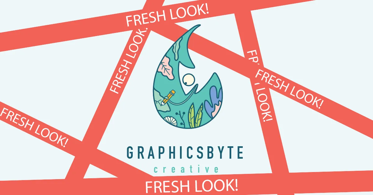
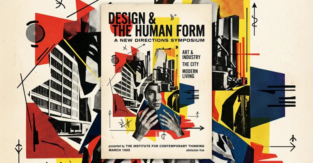
With a clear strategy, the design phase could begin. One thing Graphicsbyte never did in the past was tell a story. This new brand would be different. The concept starts with a single raindrop (an idea) containing a chameleon (an artist who can adapt to any environment), who uses his tongue as a magic pencil to draw his own habitat.
Finding the right typeface was the next challenge. After exploring many options, I landed on DIN Engschrift, a condensed German typeface originally designed for legibility on 19th-century railroads. Its clean look and rounded corners were a perfect fit. The final touch was adding the word “Creative” back to the name, a small risk that created the perfect balance.
04. The Launch: Rolling Out the New Brand Identity
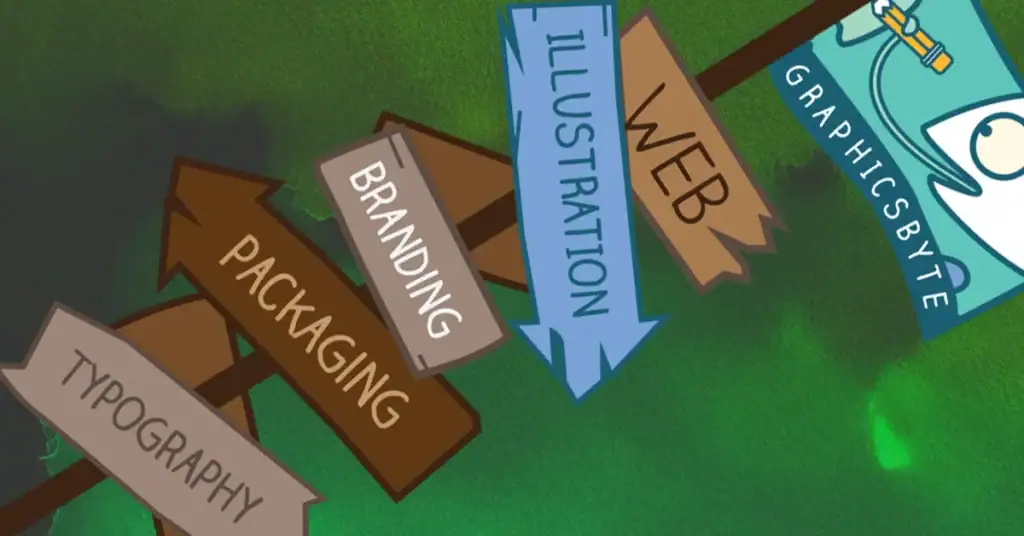
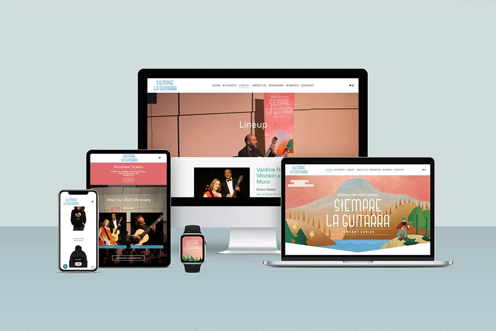
The final step in the rebranding process is the rollout. The new logo was printed on business cards, with a fun illustration on the back. This was followed by updating all signage and, eventually, a completely redesigned website. My shop was also updated with a fresh collection of illustrative work. This phased rollout ensured a smooth and consistent transition to the new brand identity.
Conclusion
This brand identity redesign was more than a cosmetic update; it was about aligning my business’s visuals with its core values and vision. It’s the same thoughtful and strategic rebranding process I bring to every client project, ensuring the final result is not just a new look, but a powerful tool for growth.