Skip to content
Cannabis Logo Design_Granny's Attic Brand Design by Graphicsbyte - Mark Boehly

Granny’s Attic: The Viral Cannabis Logo Design

Table of Contents

What happens when a fake brand becomes too real?

In 2016, right as Oregon legalized recreational use, we created a cannabis logo design called Granny’s Attic. It started as a playful experiment and an inside joke. However, the design was so effective that it took on a life of its own. It eventually became one of our most “borrowed” pieces of art.

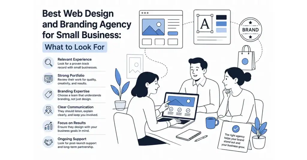
If you are looking for a case study on the power of modern branding, look no further. This is the story of a visual identity that was designed for a fictional app but ended up being used by real companies across the country.

The Origin Story

A Peek into the Past

The concept began during a pivotal time in the Pacific Northwest. We originally developed the brand for a cannabis budgeting app. When that project was shelved, we realized the visual identity was too strong to archive.

The name “Granny’s Attic” emerged as an inside joke that inspired a full narrative. The idea was simple. When you step into an attic, you uncover pieces of a past life. In this case, Granny was a free-spirited hippie. The brand serves as a peek into her stash of psychedelic memories and forgotten treasures.

Granny's Attic Brand Design by Graphicsbyte Creative - Mark Boehly

Visual Strategy

Modern Geometry

The core of any great cannabis logo design is distinguishing yourself from the clutter. We wanted to avoid the gritty, stoned aesthetic that was common in 2016.

We designed the logo around a modern lotus form. Layered ovals intersect to create a stylized cannabis leaf. It is an abstract and timeless mark that plays with transparency and depth. The overlapping shapes hint at hidden leaves within to reinforce the theme of discovery.

We developed four color variations to represent different strains. This gave the brand the flexibility to expand into packaging or product lines easily. This color system laid the foundation for merchandise, including a line of t-shirts and sticker packs sold in various dispensaries. We dubbed these sticker sets “Dime Bags” as a nod to classic $10 weed sacks. This further extended the nostalgic and irreverent personality of the brand.

The Pinterest Problem

A Lesson in Copyright

We knew this design was modern, clean, and likely to be popular. In an effort to share our work, we uploaded the project to Pinterest.

The response was immediate and chaotic.

The logo was pinned and shared thousands of times. Unfortunately, it was also infringed upon more than 16 times. We found legitimate businesses using our cannabis logo design for their own branding. We even discovered a dispensary in Eugene, Oregon, using our exact logo in a printed newspaper advertisement.

While copyright infringement is frustrating, it served as a validation of our work. It proved that this specific aesthetic, clean, geometric, and modern, was exactly what the market was craving.

Dime Bag sticker packs - Granny's Attic designed by Graphicsbyte Creative - Mark Sheldon Boehly

The Legacy of Granny's Attic

Today, Granny’s Attic remains a staple in our portfolio. It captures a sense of retro charm with a contemporary twist. It is a visual identity rooted in storytelling and built for fun.

It also serves as a reminder to our clients. If you want a cannabis logo design that is so good people try to steal it, you know who to call.

Frequently Asked Questions (FAQ)

What is Granny's Attic?

Granny’s Attic is a conceptual cannabis brand created by Graphicsbyte in 2016. It was originally designed for a budgeting app but evolved into a standalone visual identity and merchandise line known for its modern lotus-shaped logo.

A modern cannabis logo often moves away from realistic leaf illustrations. Instead, it uses geometric shapes, abstract forms, and clean typography. For Granny’s Attic, we used intersecting ovals to create a stylized leaf that looks professional rather than gritty.

The design was uploaded to Pinterest where it went viral. Because the aesthetic was unique and versatile, many unauthorized businesses scraped the image and used it for their own branding. This highlights the importance of professional trademarking.

Yes. We specialize in creating unique, legally compliant branding for the cannabis and CBD industries. We focus on creating distinct visual identities that stand out on dispensary shelves.

Miss Something? See what else were writing about

Browse all logos for sale!