Table of Contents
Before anything else there is a line
Every illustration I have made started the same way. A pencil on paper, one line following another, building a form from nothing. No color blocking, no texture, no digital shortcuts. Just the line and what it is willing to do.
Monoline illustration is the discipline I return to constantly. It is where I am most comfortable and where I am most honest about what I can actually do. It is also the style I find most useful because it is the one that translates to the widest range of applications. A monoline illustration can become a sticker, a logo, an engraving, a stained glass panel, a tattoo, a shirt print, or a mosaic. The line is the universal language of mark-making and if you can control it everything else follows.
This post covers what monoline and line art actually means as a discipline, how it shows up across a decade of work from the Graphicsbyte studio, and why I think it is the style best suited for work that is meant to outlast the project that commissioned it.
What Monoline Illustration Actually Is
Monoline means the line has a consistent weight throughout. No tapering at the ends, no thick-to-thin variation based on pressure, no calligraphic swells. The stroke is the same width from start to finish.
That sounds like a constraint and it is. But constraints are where discipline develops. When you cannot use line weight variation to create depth or emphasis you have to find other ways. Spacing, density, direction, overlap, negative space. The composition has to do more work because the line itself is giving you less to work with.
Line art more broadly refers to illustration built primarily from outlines rather than filled areas, gradients, or painterly techniques. A line art illustration can have color fills but the structure is always the line. Remove the color and the piece still reads clearly. That is the test.
The two are related but distinct. Monoline is a subset of line art with a specific technical constraint. Not all line art is monoline. All monoline work is line art.
Looking for an Illustrator for Your Next Project?
Why It Is Harder Than It Looks
The most common misconception about clean line art is that simplicity means ease. The opposite is true. A complex rendered illustration can hide compositional weaknesses behind detail and texture. A clean line art piece has nowhere to hide. Every decision is visible. Every proportion mistake, every awkward curve, every line that does not quite resolve sits there in the open for anyone to see.
Monoline illustration specifically requires understanding how to create the illusion of depth, dimension, and weight using only a consistent stroke. The tools for doing this are all compositional. Overlapping forms to suggest depth. Varying the density of lines within an area to suggest shadow. Leaving negative space to suggest light. Letting the direction of lines describe surface contour.
None of that is automatic. It is learned through repetition and through a lot of drawings that do not work before the ones that do.
The control required also means that every piece takes longer than it looks like it should. A clean monoline illustration of a single figure might represent hours of rework on individual curves that would not be visible at thumbnail size but matter enormously when the piece is printed at scale.
How Monoline Shows Up in the Work
The Creature Collection
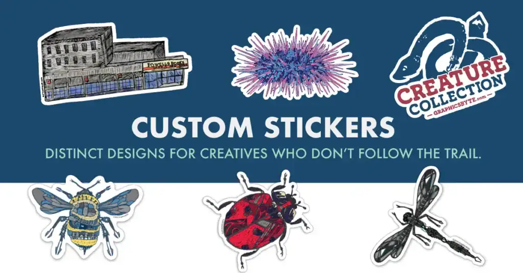
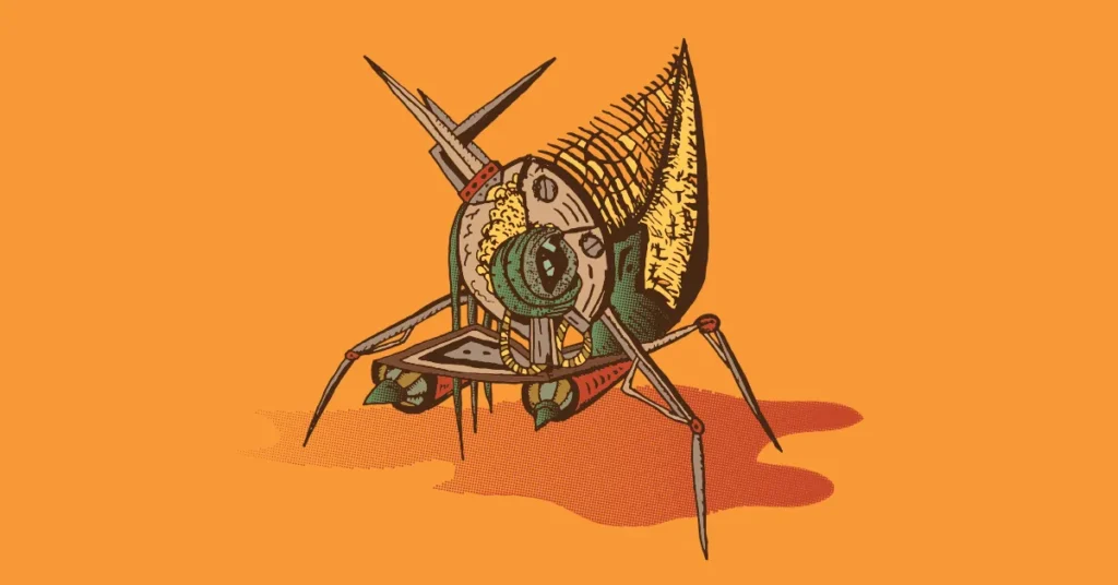
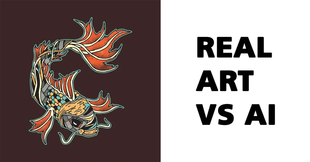
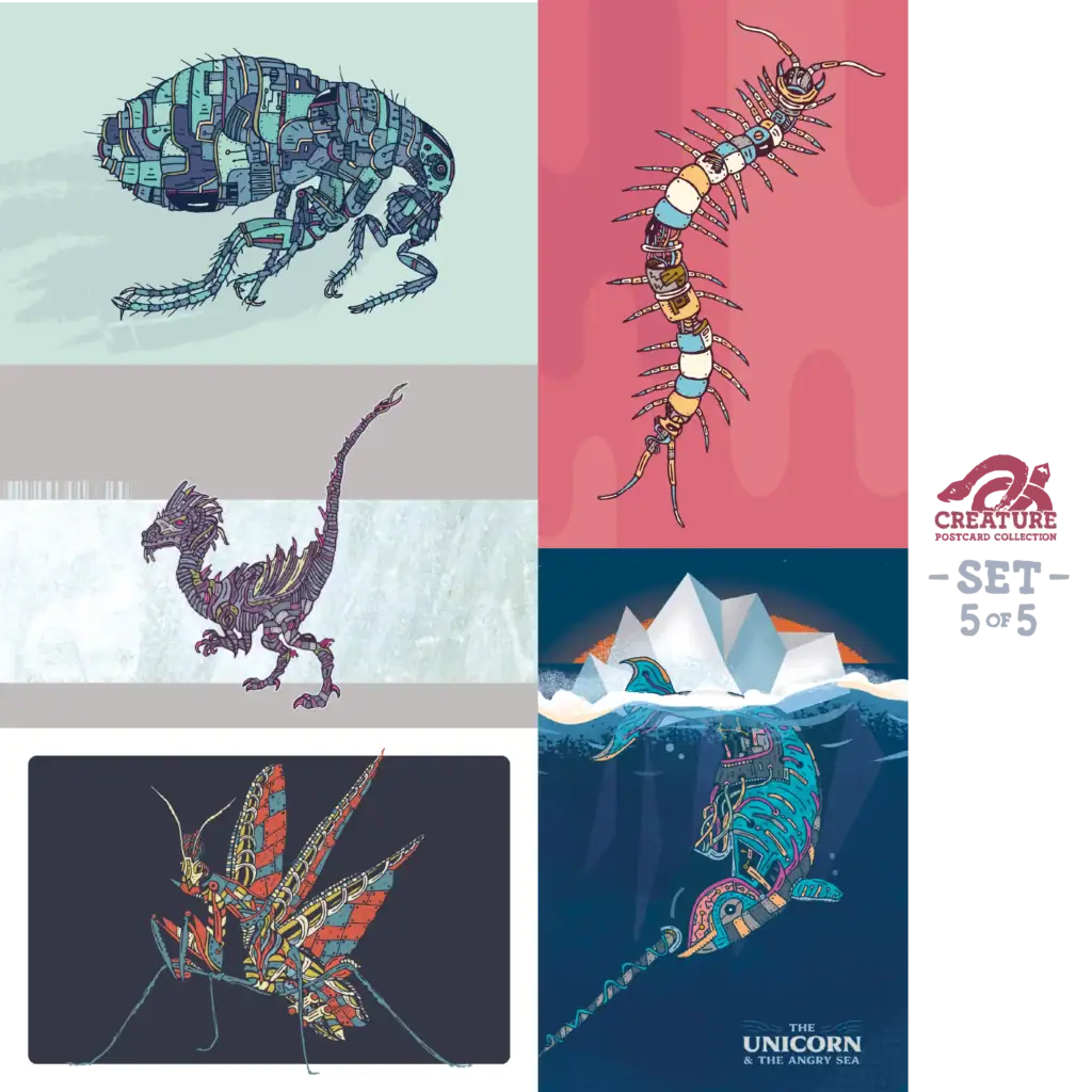
The biomechanical creatures in the Creature Collection are built on monoline foundations. The mechanical anatomy, the exposed structures, the overlapping plates and gears all start as clean pencil line work. The consistency of the stroke weight across each creature is what gives them their precision. They look engineered because the lines are controlled.
When those drawings get scanned and refined in Illustrator the first step is always cleaning the line to a consistent weight before any other detail gets added. The monoline foundation is what makes the creatures readable as sticker singles at small sizes and as postcard art at full bleed.
Siempre La Guitarra
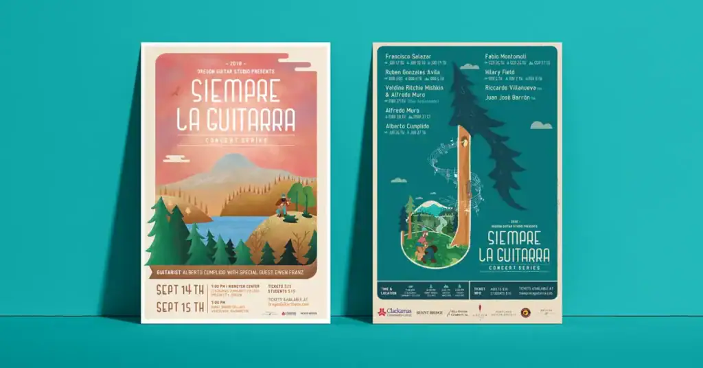
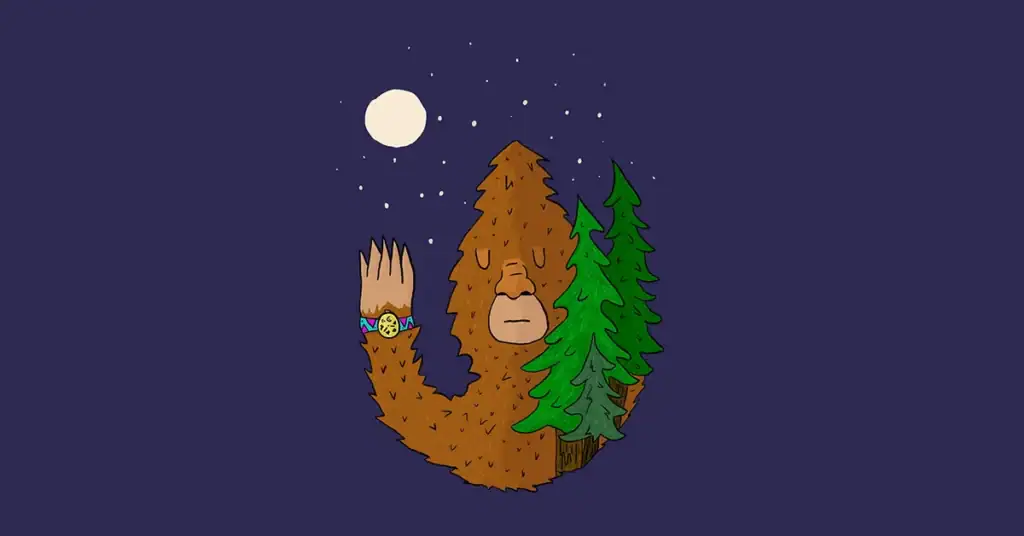
The lumberjack character and the concert poster series for Siempre La Guitarra are built on the same discipline. The character’s outlines are clean and consistent. The Pacific Northwest landscapes in the poster backgrounds use line density and direction to describe terrain without relying on gradient fills or photographic texture.
That approach meant the posters could be reproduced at any size from a small sticker to a 16 by 24 inch print without losing integrity. Monoline scales. Painterly illustration often does not.
Luna Food and Smoothies: Monoline as Brand Identity
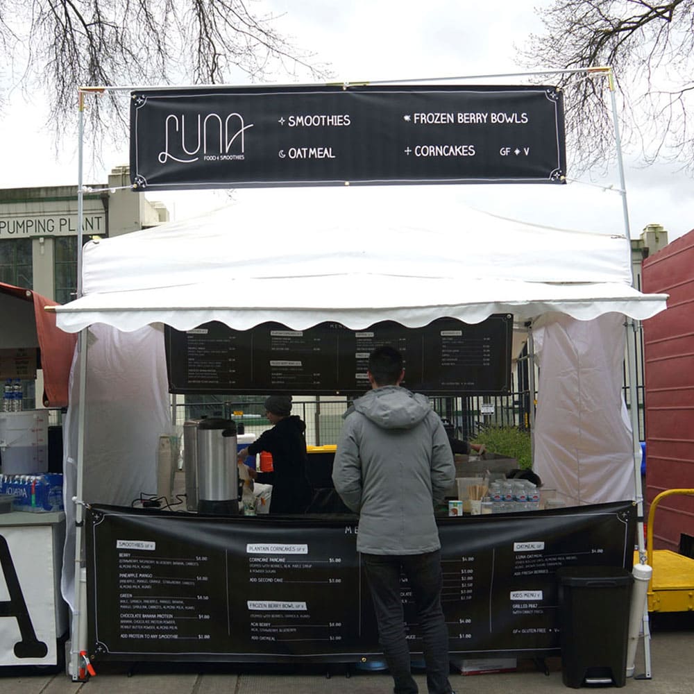
The Luna Food and Smoothies project started as a signage job. A vendor at the Portland Saturday Market needed chalkboard-style menus and booth signage that could communicate a complex menu of vegan and gluten-free items quickly to passing foot traffic.
A logo was not part of the original scope. One got pitched anyway.
The custom monoline wordmark developed for Luna has letters that flow into each other with a fluid motion that mirrors the mixing of a smoothie. The line is consistent throughout. No thick-to-thin variation, no calligraphic swells. Just a controlled single-weight stroke that gives the mark its hand-drawn energy while remaining clean enough to reproduce at any size the market booth required.
The client connected with it immediately. It became the centerpiece of the brand’s visual identity at the Portland Saturday Market and anchored every piece of collateral that followed. Business cards, banners, menus. All built from the same monoline foundation.
That project is a clean example of what monoline does well in a brand context. It reads as handmade and approachable at the human scale of a market booth. It reproduces cleanly at the small scale of a business card. It holds up at the large scale of booth signage. One style, every application.
Logo Work
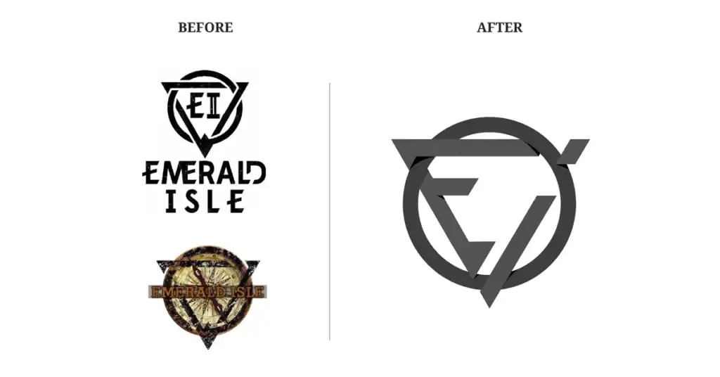
Monoline is one of the most practical styles for logo design because logos need to work at extreme scales, on dark and light backgrounds, in embroidery, on signage, and in contexts that were not anticipated at the time of design. A logo built on clean line art adapts to all of those contexts. A logo built on gradients, textures, or complex fills does not.
Several logos in the Graphicsbyte collection use monoline construction for exactly this reason. The discipline is not just aesthetic. It is practical.
Where Monoline Goes That Other Styles Cannot
This is the part of the conversation I find most interesting.
Monoline and clean line art illustration translates to fabricated media in a way that most illustration styles do not. When an illustration needs to become something physical beyond a printed surface, the line is what survives the translation.
Engraving and etching: The line is the medium. A monoline illustration translates directly to an engraved plate or a laser-etched surface without requiring any interpretation or adaptation. The illustration and the fabrication method speak the same language.
Embroidery: Thread follows a path. A monoline illustration provides that path cleanly. Complex gradient illustrations have to be redrawn for embroidery. A monoline piece often requires minimal adaptation.
Stained glass: The lead came that separates glass panels in traditional stained glass follows the outlines of the design. A strong monoline illustration produces strong came lines which produce strong structural integrity in the finished panel. The better the line drawing the better the glass.
Tattooing: The needle follows the line. Fine line tattoo work is essentially monoline illustration applied to skin. The discipline transfers directly.
Mosaic and tile work: The grout lines follow the outlines of the design. Same principle as stained glass. The line defines the structure.
Signage and wayfinding: Clean line art reproduces accurately at large scale, in single color, in cut vinyl, in dimensional letters, and in contexts where multi-color illustration would be impractical or cost-prohibitive.
The permanence applications are the ones I think about most. Work that gets built into a building, fired into glass, cut into stone, or woven into fabric is work that outlasts the designer, the client, and the brief that produced it. That is a different conversation than a brand refresh every five years.
Monoline is the illustration style that belongs in permanent work because it was built on the same principles that permanent craftwork has always used. Control, precision, and the honest line.
Available for Illustration Projects
The monoline and line art discipline is available for client projects across a range of applications. Brand marks and logos, poster work, packaging illustration, character design, architectural illustration, and long-term permanent installation concepts.
If you are a creative director, architect, designer, or organization thinking about illustration work that needs to last reach out at graphicsbyte.com/contact. All inquiries receive a response within one business day.
Miss Something? See what else were writing about