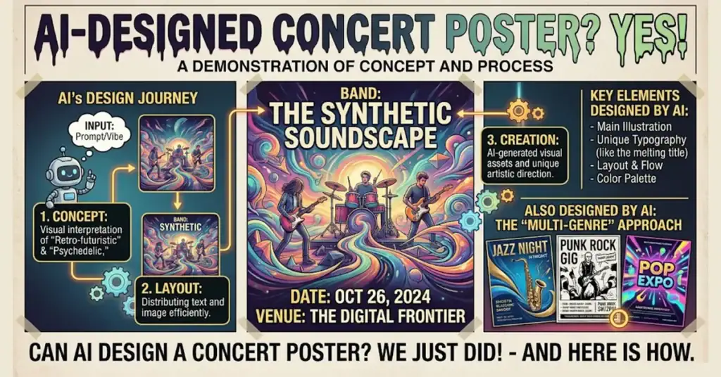
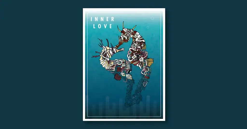
Concert poster illustration is a hierarchy and storytelling problem. Here is what five years of work taught me about solving it.
Concert poster illustration has one job. Get the right information to the right person at the right moment in a way that makes them want to show up. That sounds simple. In practice it requires solving a communication problem under real constraints. A single image. A fixed size. An audience that may be seeing it from across a room, on a phone screen, or stapled to a telephone pole in the rain.
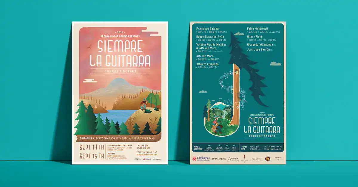
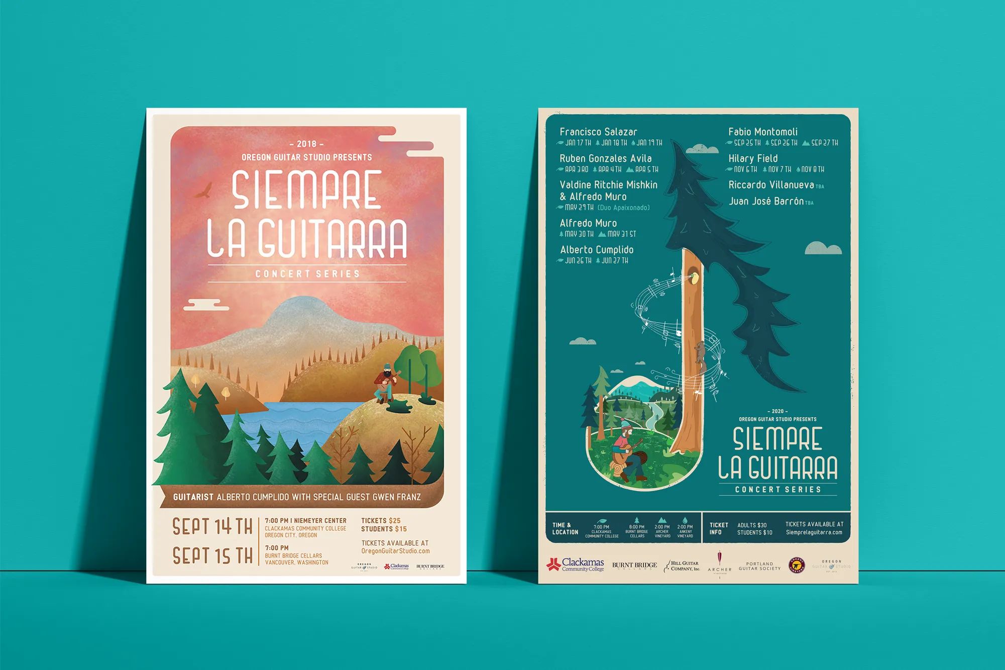
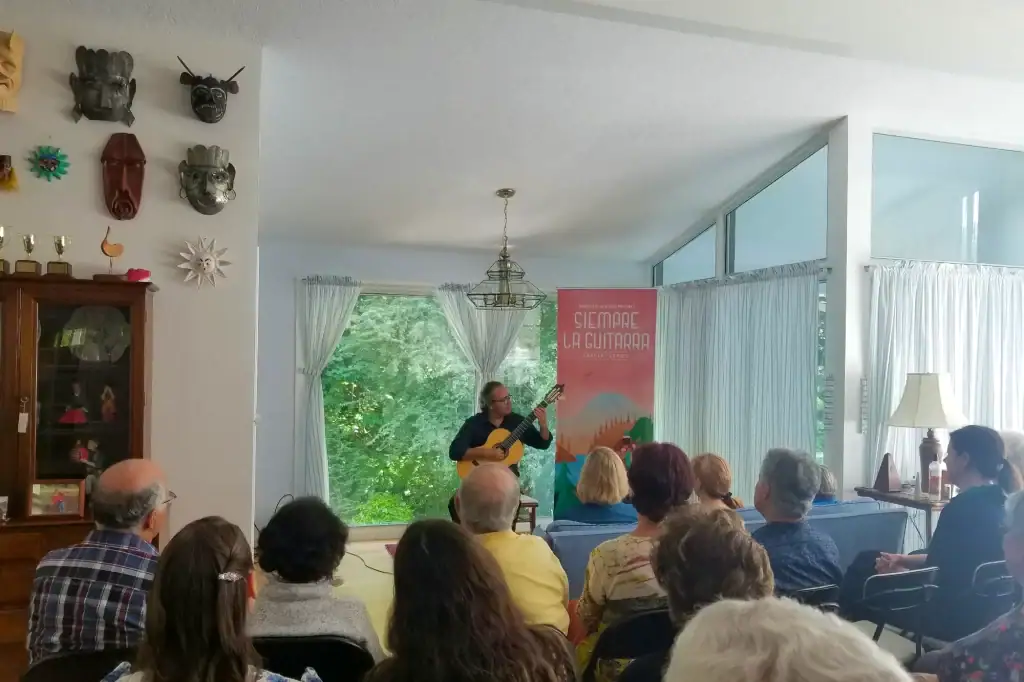
The Siempre La Guitarra concert series ran from 2018 to 2023 in Portland Oregon. Each year produced a new poster for a classical guitar concert featuring guest musicians from around the world. The challenge was consistent across all five years. Make classical guitar feel accessible and exciting to an audience that might not have considered attending. Do it with illustration, typography, and a character that audiences came to recognize year after year.
The five principles below came directly from that work.
01. Build a Story
A concert poster is not an announcement. It is a story compressed into a single image. The viewer should feel something before they read anything.
For the Siempre La Guitarra concert poster illustration the story started with a character. A Pacific Northwest lumberjack with a passion for classical guitar. That character was unlikely by design. Classical guitar carried associations of formal concert halls and European tradition. A lumberjack in the Oregon wilderness suggested something rougher and more immediate. The collision between those two worlds was the story. It made audiences curious before they read the musician’s name or the venue.
The story does not have to be literal. It does not have to be explained. It just has to create a feeling that makes the viewer want to know more.
02. Capture That Story in the Design
Once the story is defined every visual decision becomes a test. Does this color serve the story? Does this typeface serve the story? Does this illustration choice make the story stronger or does it just look interesting?
For a classical guitar concert the concert poster illustration decision was to use a rough hand-drawn style rather than a clean digital aesthetic was a story decision. The imperfection in the linework suggested something human and immediate. The music is intimate. The poster needed to feel the same way.
Every color choice, every typographic decision, and every compositional element either reinforces the story or dilutes it. The discipline is knowing the difference.
03. Create a Cohesive Brand, Not a One-Off Flyer
A single poster for a single event is a flyer. A poster that is part of a larger visual identity is a brand asset.
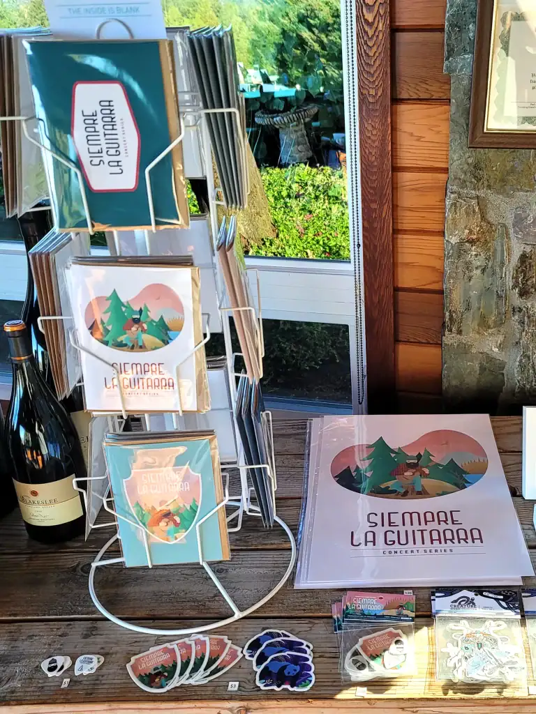
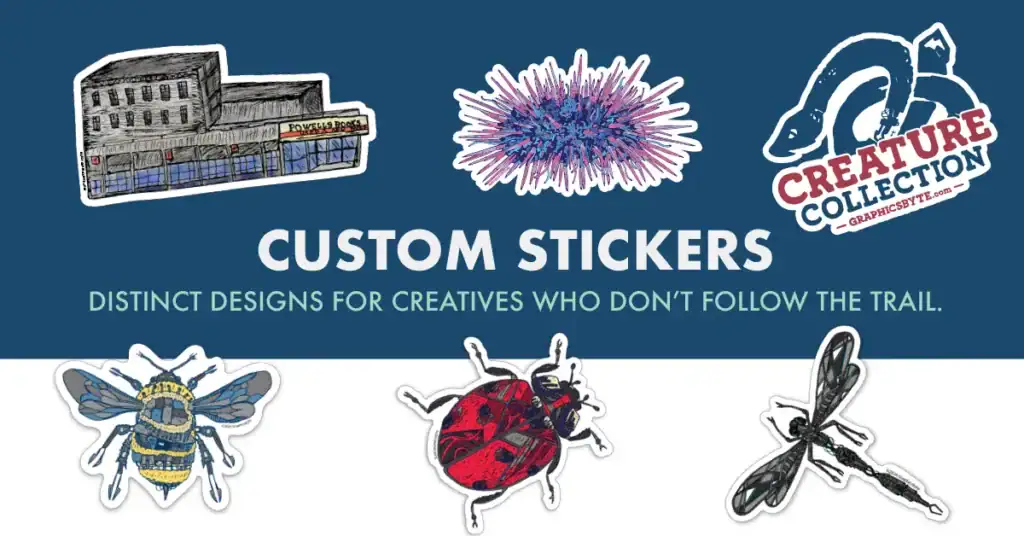
The Siempre La Guitarra series built a visual language across five years around a single character. A Pacific Northwest lumberjack who became the mascot of the series and appeared across the main brand identity and every piece of merchandise sold at the shows. Stickers, postcards, guitar pick packs, and apparel all pulled from the same illustrated universe.
The series also featured established guitarists who needed to be introduced to the audience each year. That created a second poster format. Portrait-based event posters centered on the featured musician’s face with supporting mountain graphics that connected visually to the lumberjack universe without competing with it. Those posters were designed to be recycled across promotional materials throughout the season while the character-based poster anchored the series identity.
Two distinct poster formats. One cohesive brand. The discipline was making both feel like they came from the same place without making them look identical.
04. Produce Custom Concert Poster Illustration Assets
Stock photography and generic typefaces produce generic posters. Concert poster illustration earns its value through custom illustration, custom lettering, and original graphic elements that cannot be reproduced by a competitor using the same tools.
Every year of Siempre La Guitarra involved original concert poster illustration work. The lumberjack character was drawn fresh each year. The backgrounds were original. The typographic elements were custom. The guitar pick stickers were original illustrations. Nothing was lifted from a stock library.
That commitment to custom assets is what gave the series its collectible quality. Custom assets take longer and cost more to produce. They also cannot be replicated by the next designer who inherits the account.
Who is this poster for and what does that person need to feel before they will decide to buy a ticket?For Siempre La Guitarra the target audience included both longtime classical guitar enthusiasts and people who had never attended a classical concert. The design needed to lower the barrier for newcomers without condescending to regulars. The lumberjack character solved that problem. He was approachable and unexpected enough to attract new audiences while being paired with genuinely respected musicians that existing fans would recognize and trust.Knowing the audience is not just demographics. It is understanding what that person needs to feel at the moment they encounter the poster and what decision you are asking them to make.
Concert Poster Illustration for Events
Original poster design, seasonal campaign illustration, and event brand assets for music organizations, venues, and performing arts groups. Every project starts with the story.
The Brand Behind the Guitar
The Siempre La Guitarra series grew out of a longer creative relationship with classical guitarist David Tutmark. Oregon Guitar Studio is his teaching and performance studio, and the brand was developed at Graphicsbyte to carry the same spirit as the concert series into a permanent identity.
Like what you read? Add Graphicsbyte as a preferred source to see more web design, branding, and illustration posts in your Google results.
Frequently Asked Questions (FAQ)
What makes a good concert poster design?
A strong concert poster illustration tells a story before the viewer reads a single word of information. It communicates the mood and identity of the event through visual decisions that serve the narrative. Hierarchy, typography, and illustration all work together to deliver essential information in the right order to a viewer who may be encountering the poster from a distance or in a crowded environment.
Should concert posters use photography or illustration?
Custom illustration gives a concert poster a visual identity that photography cannot replicate. An illustrated poster has a character and personality that feels specific to the event. For series work where the poster needs to evolve year after year while remaining recognizable, illustration provides more creative flexibility than photography.
How much does concert poster design cost?
Concert poster design ranges from a typographic layout at the lower end to fully illustrated original artwork at the higher end. The cost reflects the complexity of the illustration, the number of asset variations required, and whether the poster is a standalone piece or part of a larger campaign that includes merchandise and digital formats. Reach out directly for a quote based on your specific project.
What information needs to be on a concert poster?
Every concert poster needs the event name or featured musicians, the date, the time, and the venue. Beyond those essentials the hierarchy of additional information depends on the event. A ticketed concert needs a clear path to purchase. A series event needs enough brand identity to connect to the broader visual language established across previous seasons.
Can Graphicsbyte design concert posters for events outside Portland Oregon?
Yes. Graphicsbyte is based in Gladstone Oregon just outside Portland and works with performing arts organizations and music venues nationally. The design process works remotely with direct communication throughout.