Table of Contents
Can AI design a concert poster? Five platforms answered that question. One of them made a poster instead of answering. That poster is the most honest response of the five.
Can AI design a concert poster? At the surface level yes. At the level that actually matters for a real event the answer is more complicated. We asked five major AI platforms the same question and documented every response. Then we looked at what one of them actually produced and compared it to what six years of real concert poster work looks like.
Mark Boehly is a designer and illustrator based in Gladstone Oregon just outside Portland. The Siempre La Guitarra concert series ran for six consecutive seasons of original poster design. The Portland Youth Philharmonic has been a creative partnership for three consecutive seasons of text-heavy concert campaigns that have appeared in Portland newspapers, movie theater ads, and digital venue displays across the city. That is the proof of work behind the perspective in this post.
What We Asked and What Five AI Tools Said
The same question was asked across five major AI platforms. Can AI design a concert poster? The responses were documented as given.
Platform: Claude
Summary: Yes at the surface level. The design problem AI has not yet figured out is hierarchy, negative space, and the communication task underneath the imagery.
Can AI design a concert poster? At this point in its development AI generated concert poster work shares a recognizable set of characteristics. The imagery tends toward density and detail. Negative space gets filled. Typography approximates letterforms without being based on any real typeface a designer could license or specify. The result has a look that most working designers recognize immediately. It is competent at the surface and uncertain underneath.Concert poster design is not primarily an image generation problem. It is a hierarchy and communication problem. A concert poster needs to deliver specific information in a specific order to a viewer who is often seeing it from a distance, in motion, or in a crowded visual environment. Band name. Date. Venue. Supporting acts. Ticket information. Each piece of information has a weight and a position determined by what the viewer needs to know first, second, and third. AI generates imagery that captures the aesthetic surface of concert poster design. The underlying communication task is a different problem and one the machine has not yet learned to solve.
Platform: ChatGPT
Summary: Yes at the concept stage. The design work is still left afterward.
Yes. AI can design a concert poster, especially at the concept and exploration stage. It can generate compositions, typography treatments, illustration directions, color palettes, textures, and even fairly polished poster artwork.
Where it still struggles is the part a designer usually cares about most: precision and intentionality. AI-generated posters often have problems with typography, hierarchy, alignment, symmetry, repeated details, logos, and print-ready construction. It may produce something visually exciting at first glance while falling apart when you inspect the actual design decisions.
A stronger workflow is usually:
Concept → AI exploration → designer refinement → final production
For example, you could give AI the artist, venue, genre, mood, era, and visual references and have it generate 10 radically different poster directions. Then take the strongest idea into Illustrator or Photoshop, rebuild the typography, correct the composition, redraw elements where necessary, and prepare the final print file.
So the more interesting question probably isn’t “Can AI design a concert poster?” It’s “What happens when you ask AI to design a concert poster, and how much design work is still left afterward?”
Platform: Grok
Summary: Yes with a list of strengths followed by limitations buried underneath.
Yes. AI can design concert posters and often does so effectively.Modern image-generation models can produce polished, eye-catching concert poster designs from a text prompt. They handle typography, composition, color schemes, atmospheric lighting, genre-appropriate aesthetics (rock, electronic, classical, hip-hop, etc.), and visual storytelling.What AI is good at:Creating striking key art, backgrounds, and lighting
Matching a specific mood or genre
Rapid iteration (try many variations quickly)
Combining elements that would be time-consuming by handWhat usually still needs human input:Exact, legible typography and hierarchy (dates, venue, ticket info)
Brand consistency or licensed artist likenesses
Final layout refinements and print-ready specifications
Legal and copyright considerations
Platform: Copilot
Summary: Enthusiastically yes. Twice. Both times ending with an offer to make one right now.
Absolutely — AI can design a concert poster, and it can do it with surprising range, speed, and style. Think of AI as a creative assistant that can generate layouts, typography ideas, color palettes, and full visual compositions based on whatever vibe you want.
Here’s the short version: yes, AI can design a concert poster, and it can do it in minutes.
What AI can do for a concert poster:
Generate concepts — bold, minimal, psychedelic, retro, grunge, neon, anything you can imagine
Create full artwork — backgrounds, illustrations, lighting effects, textures
Incorporate text — band names, dates, venues, taglines
Match a theme — genre-based styles like metal, indie, EDM, jazz
Produce variations — multiple options so you can pick your favorite
What you might want to decide next. To design a poster, I’d need a few essentials:
Band or artist name
Date and venue
Style or mood (e.g., neon cyberpunk, vintage rock, dreamy indie)
Any required colors or imagery
If you want, you can give me those details and I’ll create the poster.
Platform: Gemini
Summary: Generated an image instead of answering.
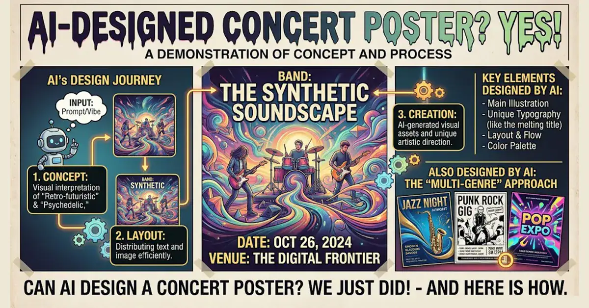
Gemini skipped the written response entirely and produced a poster. No explanation. No caveats. Just an image.
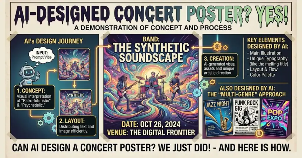
That image is the most revealing response of the five. The poster Gemini made to prove that AI can design a concert poster is itself the clearest demonstration of what AI generated concert poster work actually looks like. Multiple competing font styles with no hierarchy. Event information, process diagrams, gear icons, thought bubbles, and three separate mini-posters crammed into a single composition. Almost no negative space anywhere. The design explains itself in text because the visual language cannot carry the message on its own.
The poster answers the question without meaning to.
What Five Platforms Agree On
Every platform said yes. The disagreement is at the margins. Whether AI is useful for brainstorming all five say yes. Whether AI produces a finished print-ready concert poster that works as professional event communication most platforms acknowledge it falls short without substantial human refinement.
Gemini’s image makes that acknowledgment visual rather than verbal.
What AI Generated Concert Poster Work Actually Looks Like
At this point in its development AI generated concert poster work shares a set of recognizable characteristics that most working designers identify immediately.
The density problem. AI interprets empty space as something to fill. Negative space in poster design is not empty. It is deliberate. It gives information room to breathe, creates visual hierarchy, and controls where the eye goes first. A poster that fills every available area with detail communicates everything simultaneously which means it communicates nothing clearly.
The early 2000s problem. The training data that shapes AI image generation skews heavily toward older content by volume. There is simply more of it. A decade of concert poster design from the early 2000s represents a larger body of training material than the last two or three years of contemporary work. The result is imagery that has a datedness to it. Not deliberately retro. Just behind.
The geometry and font problem. The model sees one half of an image and generates what it expects the other half to be. That produces distortion in symmetrical compositions. Fonts are approximations of letterforms rather than actual typefaces a designer could license, specify, and use consistently. The text on an AI generated poster often looks right from a distance and wrong up close.
The surface versus soul problem. AI generated imagery has a recognizable aesthetic. Highly detailed, often with a concept art quality, using complex shapes and visual density to signal craft. What it lacks is what comes from a practicing artist whose visual thinking developed through years of physical making, iteration, and failure. That kind of thinking produces work with a specific point of view. The machine produces work that resembles a point of view without having one.
This is not a permanent ceiling. AI is early in its development. The robotics programs in progress, the sensory tools being built, the physical world interaction that is coming will eventually give the machine more of what it currently lacks. At this point in time it has not yet had those experiences.
Concert Poster Design and Event Illustration
Original concert poster design, event campaign illustration, and seasonal brand assets for music organizations, venues, and performing arts groups. Every project starts with understanding what the poster needs to communicate and who it needs to reach.
What Real Concert Poster Work Requires
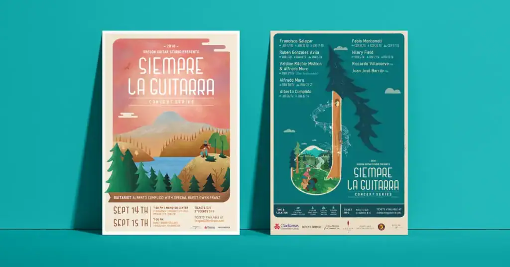
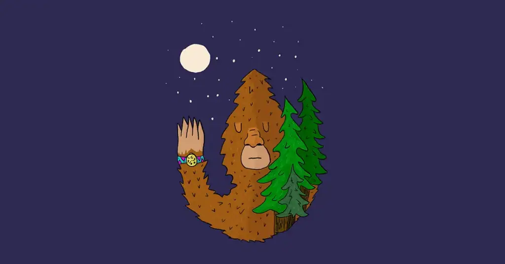
The Siempre La Guitarra concert series ran for five years. Each season produced a new poster built around the same fictional Pacific Northwest lumberjack character. The poster needed to feel connected to the seasons before it while signaling something new about the current season. That continuity required understanding what the audience expected and how to use that expectation deliberately.
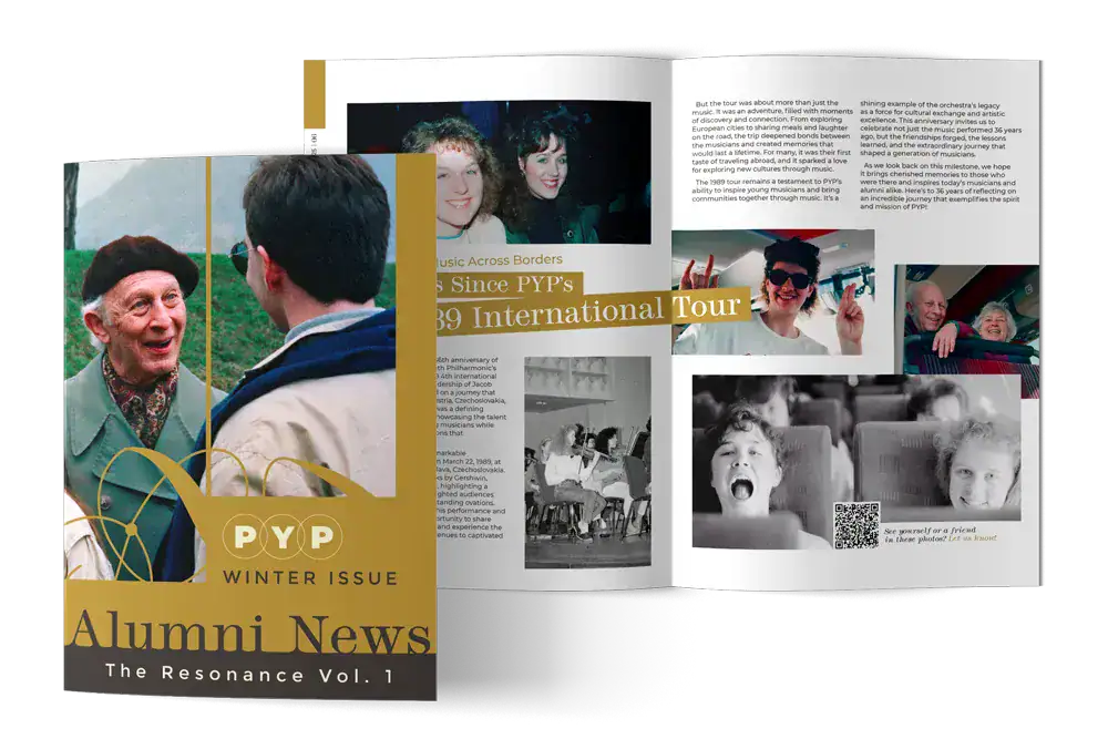
The Portland Youth Philharmonic concert campaigns are a different design problem entirely. Text-heavy posters at 11 by 17 inches where the challenge is making dense event information feel considered and elegant rather than cramped. Multiple concert titles, conductor names, soloist credits, dates, venues, and sponsor information all competing for space on the same surface. The design discipline required is typographic and hierarchical. The imagery serves the information rather than the other way around.
AI cannot replicate either of those approaches because both require understanding what the poster needs to communicate to a specific audience in a specific context developed through a real ongoing relationship with the organization behind the event.
Like what you read? Add Graphicsbyte as a preferred source to see more web design, branding, and illustration posts in your Google results.
Can AI design a concert poster?
At the surface level yes. AI can generate imagery that resembles a concert poster and at this point in its development the results share recognizable characteristics. Dense composition, approximated typography, strong visual detail, and a tendency to fill negative space rather than use it deliberately. Whether that output functions as professional event communication that delivers specific information in a clear hierarchy to a real audience is a different question. Most AI platforms acknowledge that substantial human refinement is required before the output is print-ready or genuinely functional as poster design.
What does AI generated concert poster work typically look like?
AI generated poster work tends toward visual density and detail. Negative space gets filled because the model interprets empty areas as something to correct. Typography approximates letterforms without being based on actual licensed typefaces. The overall aesthetic often has a quality that working designers associate with early 2000s design sensibility, reflecting training data that skews toward older content by volume. The imagery can be visually striking at first glance and uncertain in its design decisions when inspected closely.
What does a professional concert poster designer do that AI cannot yet do?
A professional designer understands the communication hierarchy behind the poster. Which information needs to land first, second, and third for the specific audience in the specific context. They understand negative space as a deliberate tool rather than an area to fill. They work with actual licensed typefaces that can be specified consistently across a brand system. And for sustained seasonal work they understand the visual language that has developed across previous seasons and how to evolve it intentionally. At this point in AI development the machine has not yet had the experiences that build that kind of visual thinking.
Is AI useful at any stage of concert poster design?
Yes. AI is genuinely useful in the early exploration stage. Generating a range of visual directions quickly, testing color combinations, exploring stylistic references. Several platforms noted that the strongest workflow uses AI for concept generation then brings a designer in for refinement, production, and final print preparation. The exploration value is real. The finished deliverable still requires human creative direction and technical execution.
How long has Graphicsbyte been designing concert posters?
The Siempre La Guitarra concert series ran for five years of original poster design. The Portland Youth Philharmonic creative partnership has been running for three consecutive seasons of concert campaigns including event posters, mailer brochures, and materials appearing in Portland newspapers, movie theater ads, and digital venue displays across the city. That sustained multi-season work is the proof of practice behind the perspective in this post.