Portland Youth Philharmonic
Orchestrating a Brand Legacy
In June of 2024, Mark began a strategic partnership with the Portland Youth Philharmonic (PYP). Founded in 1924, PYP holds the distinction of being the oldest youth orchestra in the nation. They offer premier musical training for young musicians and frequently perform at the historic Arlene Schnitzer Concert Hall.
We were brought in by Hunter S., the PYP Marketing & Communications Director and a longtime friend, to serve as a key design partner for major seasonal initiatives. While the internal team manages the day-to-day brand operations, Mark was tasked with executing the high-complexity print and digital campaigns that define the season. We worked collaboratively to produce the Season 101, 102, and 103 Program Books, direct mailers, and holiday event identities, ensuring these flagship assets elevated the orchestra’s public image.
Color Strategy & Hierarchy
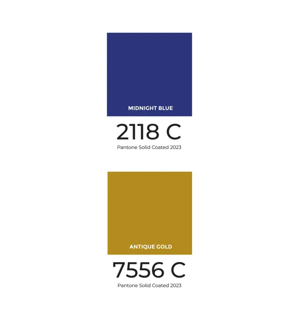
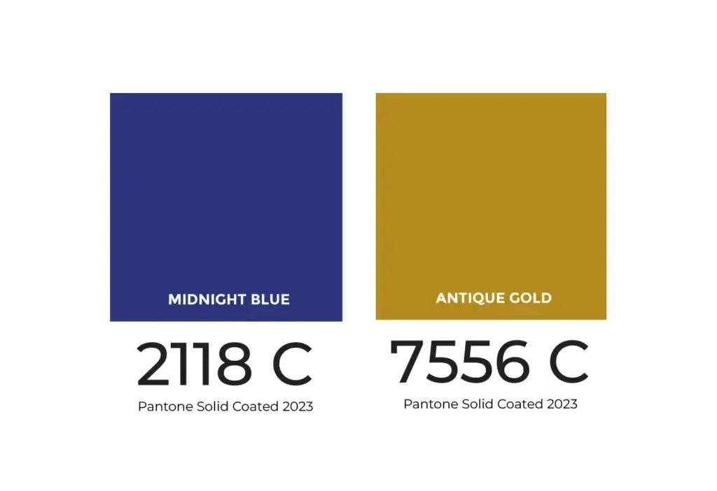
Standardizing "Midnight Blue" & "Antique Gold"
Before any design work began, we analyzed the existing system with the Marketing & Communications Director. We identified a critical weakness in color consistency. The brand relied on Hex values that frequently shifted when converted for print. Most notably, the primary “Midnight Blue” often took on an unwanted purple tint.
To solve this, we needed to lock in specific spot colors. This presented a unique challenge as Adobe had recently removed Pantone libraries from Creative Cloud. We tracked down the Solid Coated 2023 Pantone library to regain access to industry standards. We matched the closest Pantone swatch to the original Hex value. This established a chemically consistent “Midnight Blue” as the brand’s anchor.
We also formalized the accent palette. The retired Season 100 Anniversary logo had introduced a gold banner over the main mark. We wanted to preserve that sense of legacy. We identified a specific tone from that banner but needed it to pop more in print. Using the same 2023 library, we found a match that was slightly brighter and more vibrant. This new color, officially named “Antique Gold,” was adopted as the permanent historic accent. It is now used primarily to brand The Resonance, distinguishing the alumni materials from the modern season assets.
Print Campaigns
Season 101 & 102 Mailers
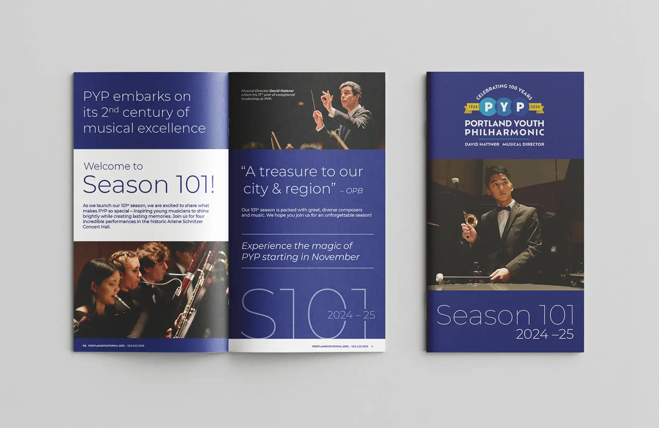
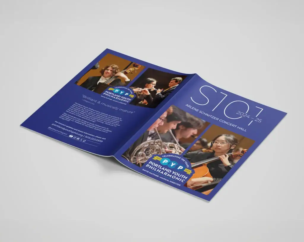
Our first major project was the Season 101 (2024–2025) introductory mailer booklet. We utilized negative space layouts to make the images and titles pop. Since the brand uses circles as a primary element, we developed a custom bullet point system using outlined circles and rounded corner callouts for quotes.
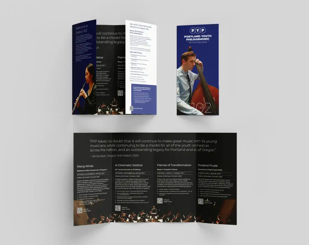
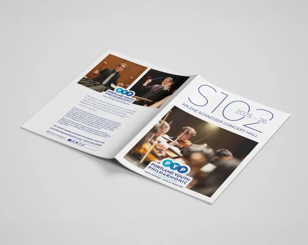
For the Season 102 (2025–2026) kickoff, we pivoted the format. We replaced the multi-page booklet with an accordion quadfold brochure. This condensed the information and significantly saved on print costs without sacrificing the premium aesthetic.
Merchandise Design
Seasonal Apparel
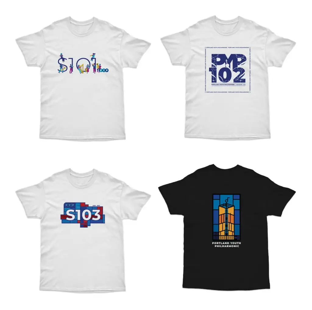
Each season a custom graphic was developed for the official PYP season shirt. These designs were printed on clothing and tote bags and sold at the merch booth during concerts throughout the year.
The Season 101 shirt featured colorful musicians interacting with the Season 101 logo. Season 102 took a different direction with a custom logo built around 1970s PYP throwback graphics to capture a vintage aesthetic.
Season 103 introduced two separate shirt designs. The season shirt features S103 set against an abstract stained glass background, a nod toward the stained glass windows in the Central Lutheran Church concert hall that PYP now calls home. A second shirt was created to celebrate the building acquisition, featuring an abstract graphic of the church tower.
Merchandise Design
Collector Items
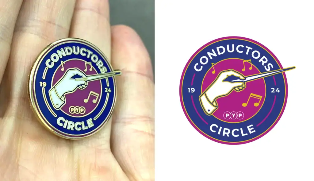
The Conductors Circle Pin was designed exclusively for PYP’s top investors. A limited run of 50 utilizing specific highlight colors from the brand palette.
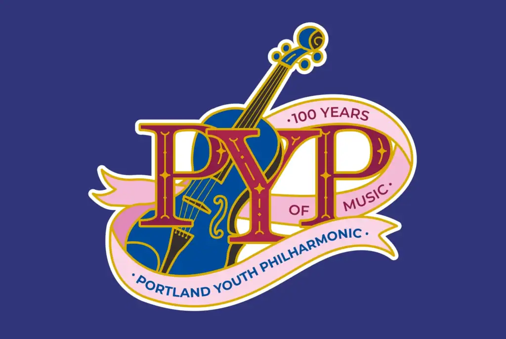
The 100 Years of Music graphic was originally conceived as an enamel pin but evolved into a holographic sticker. It became a popular secondary handout distributed at concerts throughout the season.
The Program Book
A Season-Long Companion
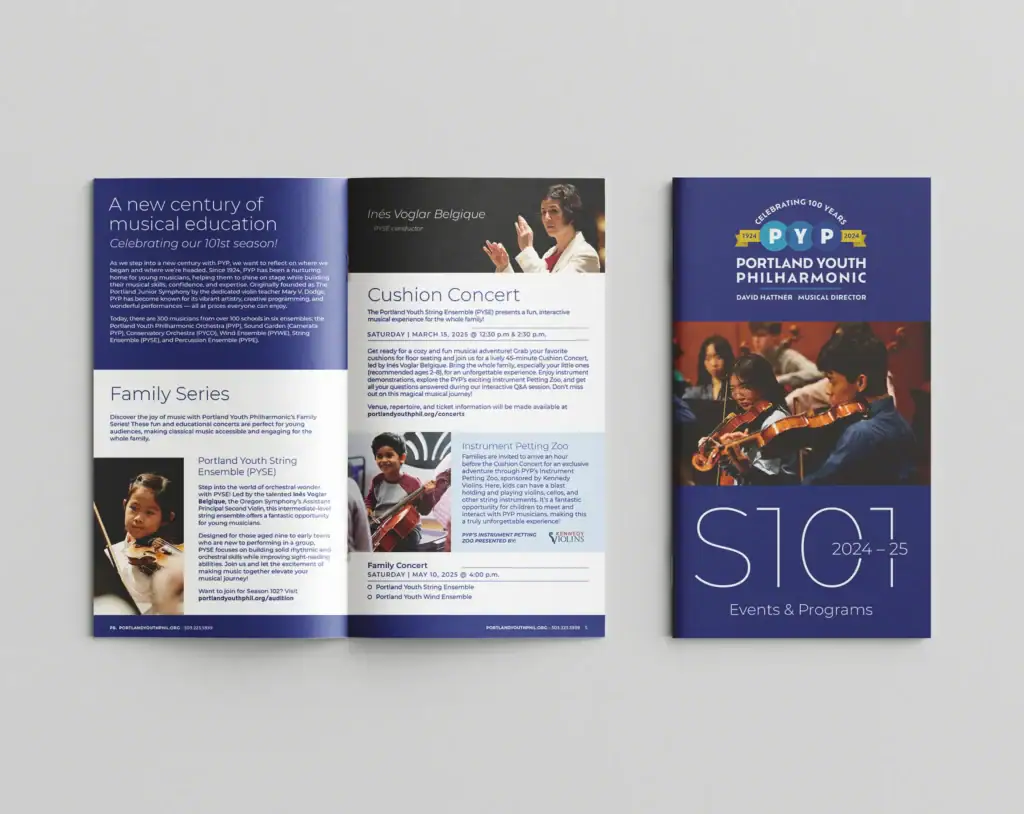
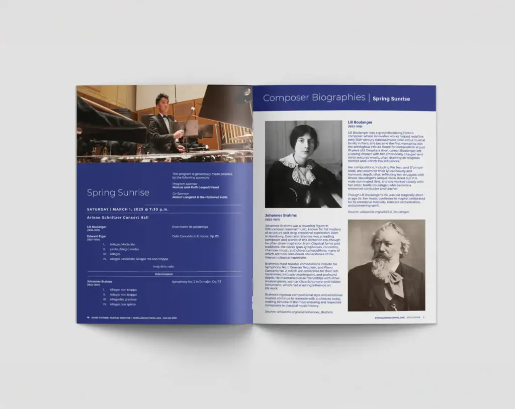
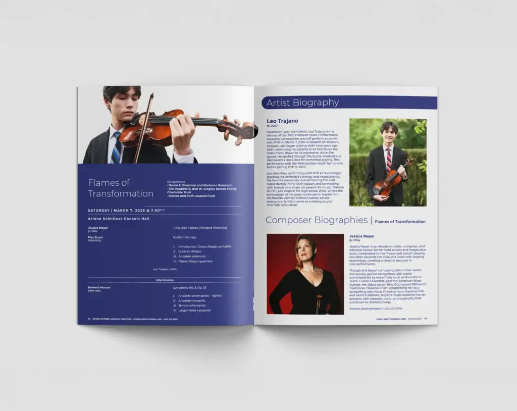
The most substantial deliverable of the year is the 48-page Program Book. We designed two complete editions to date for Season 101 (2024–2025), and Season 102 (2025–2026). Season 103 (2026–2027) is currently in the works.
This document is more than a simple brochure. It is designed to act as a season-long guide. Parents and patrons keep the same book and bring it with them from concert to concert throughout the entire year. It houses everything from full concert schedules and conductor bios to musician highlights and sponsor advertisements.
Typography & Hierarchy
Concert Campaigns
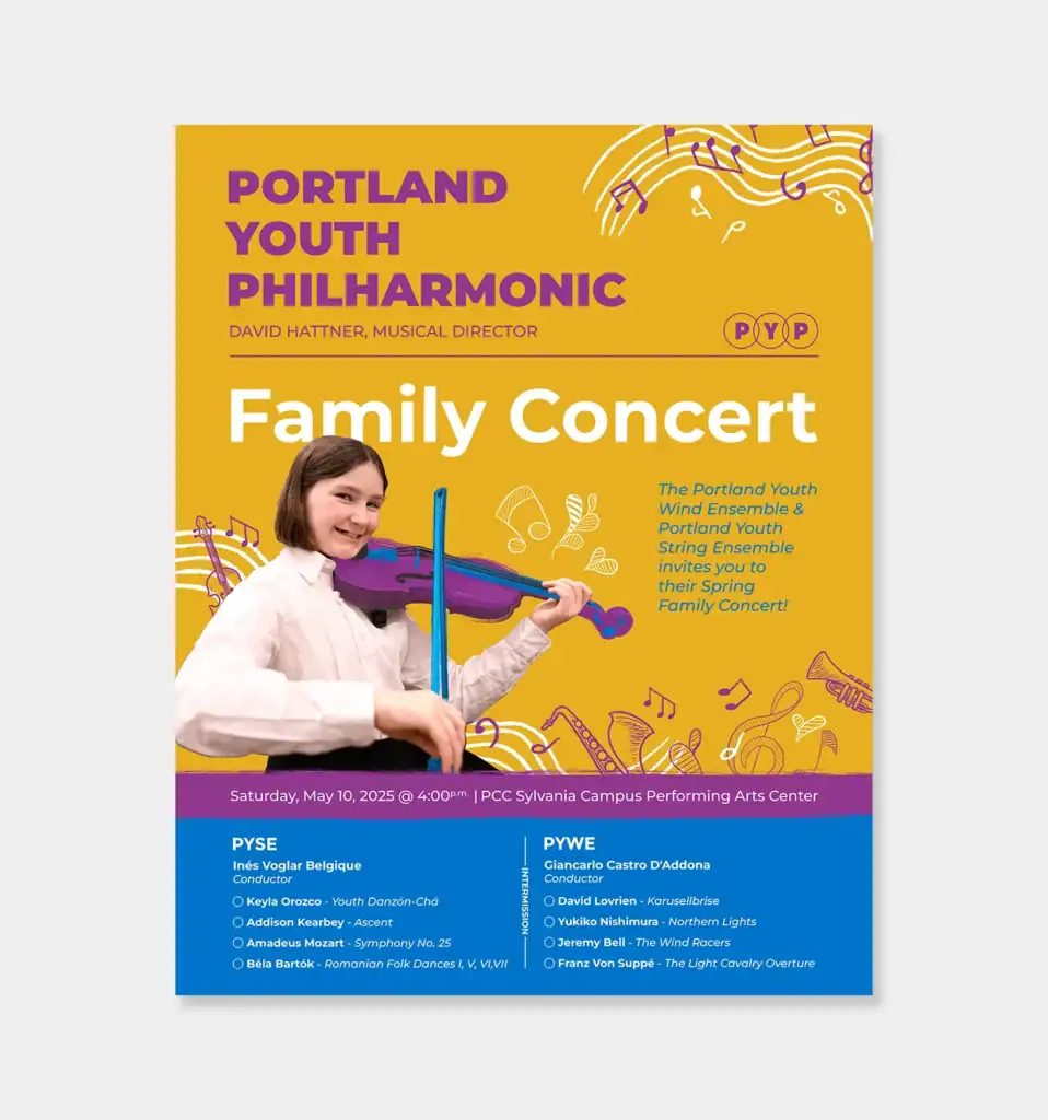
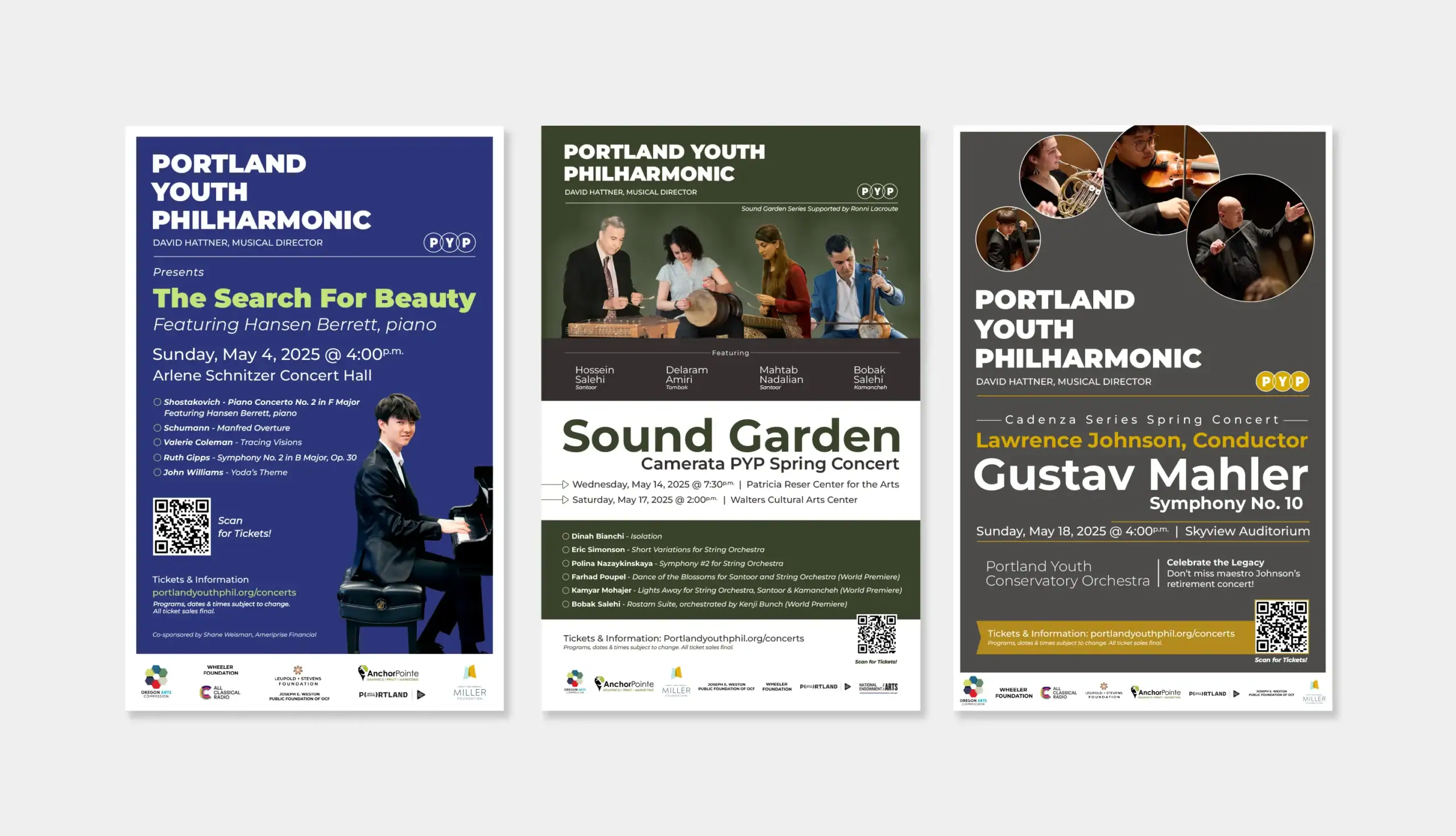
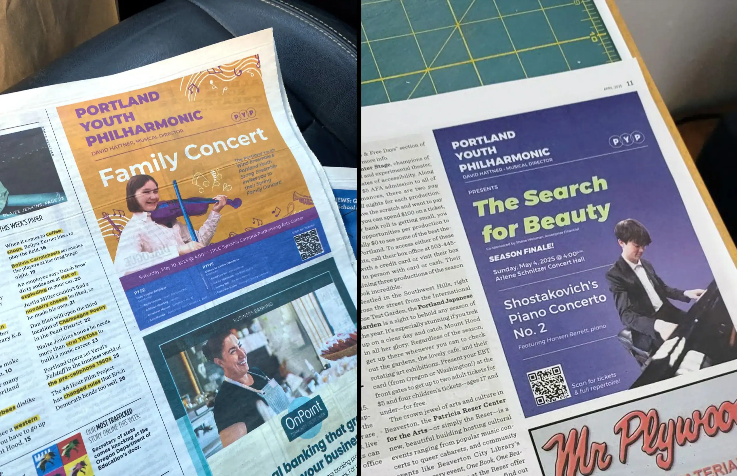
Each season features a handful of themed concerts highlighting specific musicians or groups. These campaigns require a massive suite of assets, ranging from 11×17 posters and 8.5×11 flyers to double-sided mailers and magazine ads.
To manage this density of information, we leaned heavily on the existing brand typeface, Montserrat. We maximized the font family by utilizing contrasting weights. We paired bold, heavy headers with light, clean details. This approach allowed us to create clear visual hierarchy across every layout to ensure that dates, times, and soloists stood out even on text-heavy posters.
Award-Winning Recognition
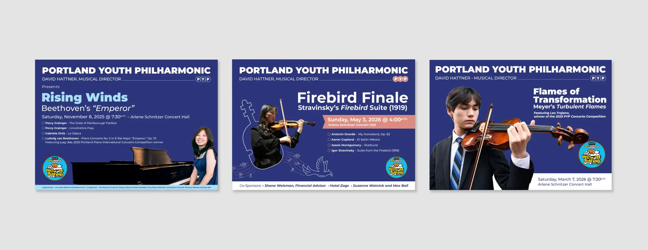
The hard work resonated with the community. During Season 102 & 103, PYP won the “Best of Portland ’25” and 26″ award via a Willamette Week readers poll. We proudly integrated this award seal into all subsequent campaign materials.
Holiday Campaigns
Concert-At-Christmas Evolution
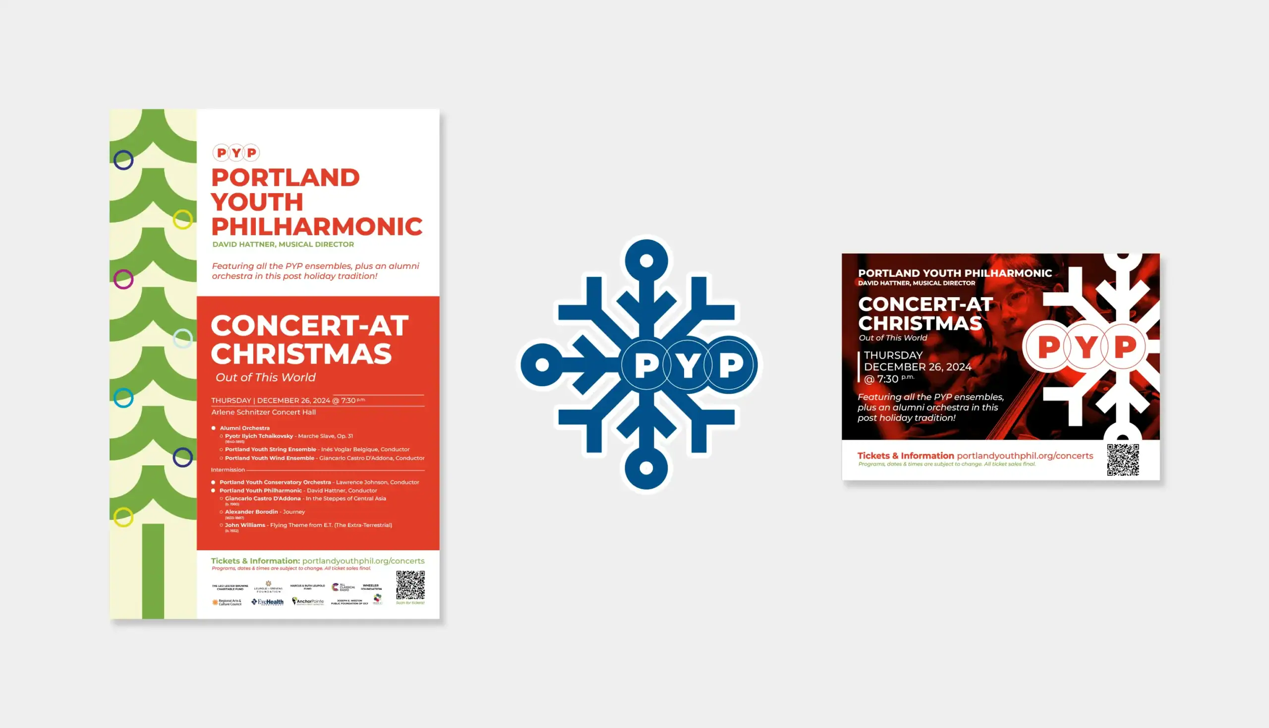
The annual “Concert-At-Christmas” is a cornerstone event. We worked to ensure the branding evolved distinctly each year.
Season 101: Geometric Tradition
We created a minimalist geometric poster utilizing an 11×17 layout. The focus element was a stylized Christmas tree built from the brand’s signature circle elements running parallel along the edge. We expanded this asset into custom snowflake stickers and color-coded postcards handed out at the event.
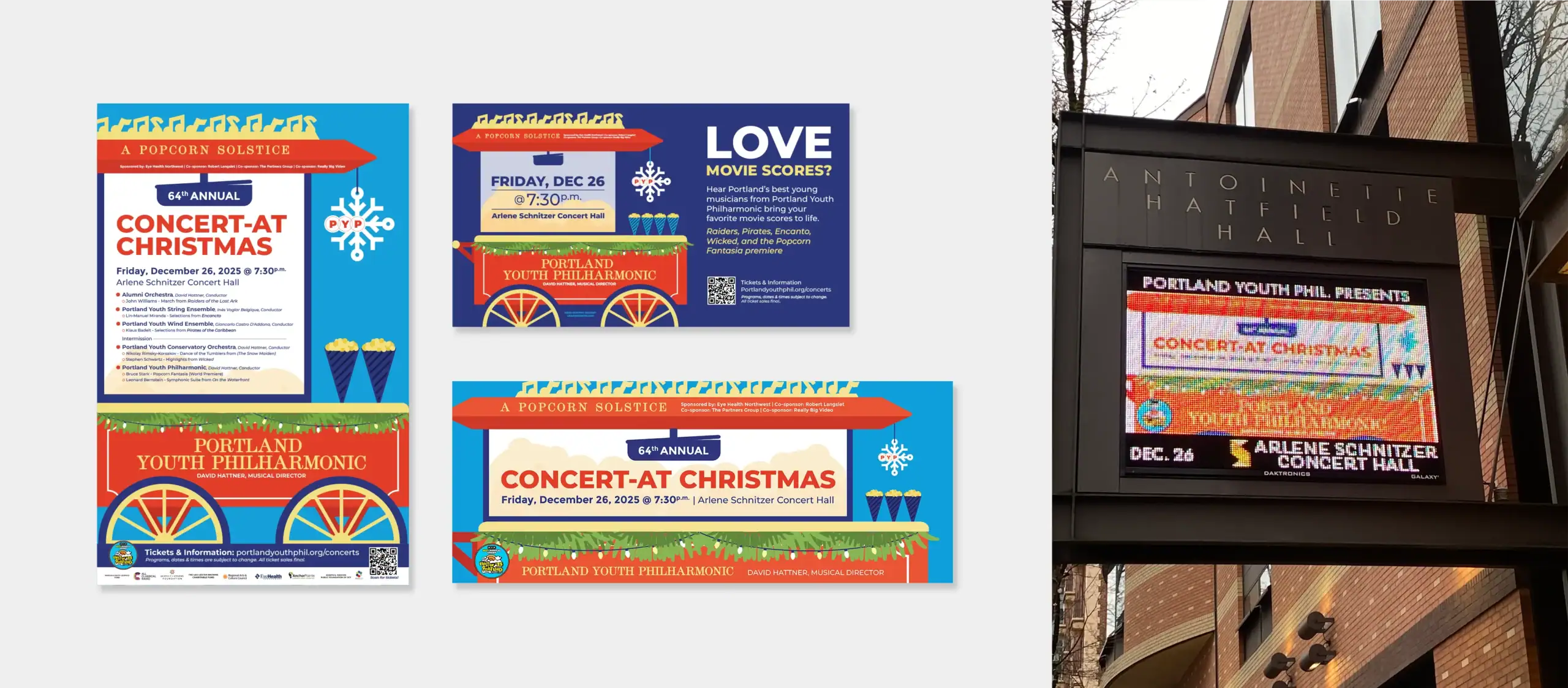
Season 102: A Popcorn Solstice
For the next season, the event took a creative turn with the title “A Popcorn Solstice.” We developed a playful popcorn cart theme that blended modern and vintage typography to make the event stand out. The campaign expanded significantly to include digital billboards at Antoinette Hatfield Hall and advertisements at the Hollywood Theatre.
Season 103: Classical Top 10
This season, the theme is a jukebox leaning into the classical music vibe. This design is currently in the works.
Digital & Social Strategy
Branding Beyond Print
A modern orchestra lives online as much as it does in the concert hall. We adapted the print campaigns into a robust digital system. We created a suite of assets for Google Display Ads and social media channels.
The Resonance Newsletter
Reviving the Archive
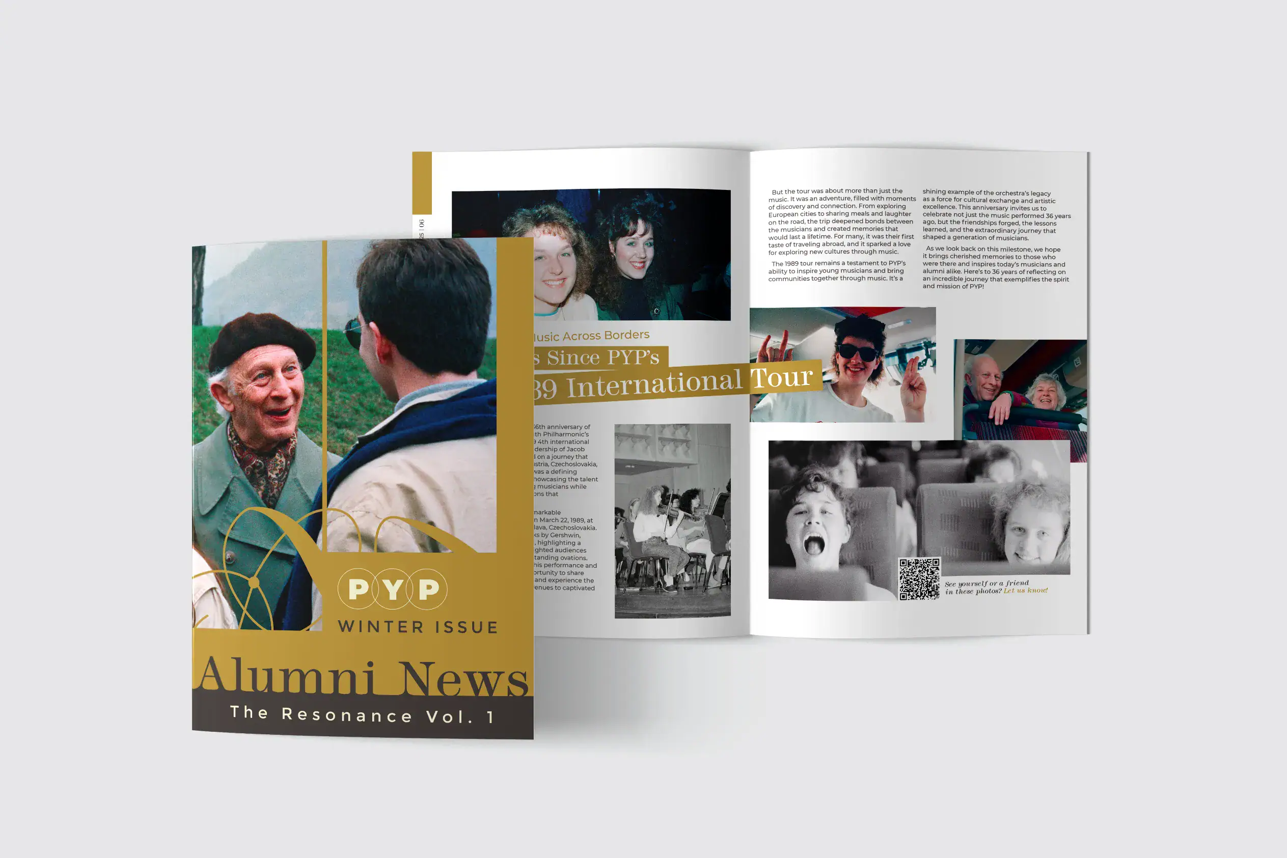
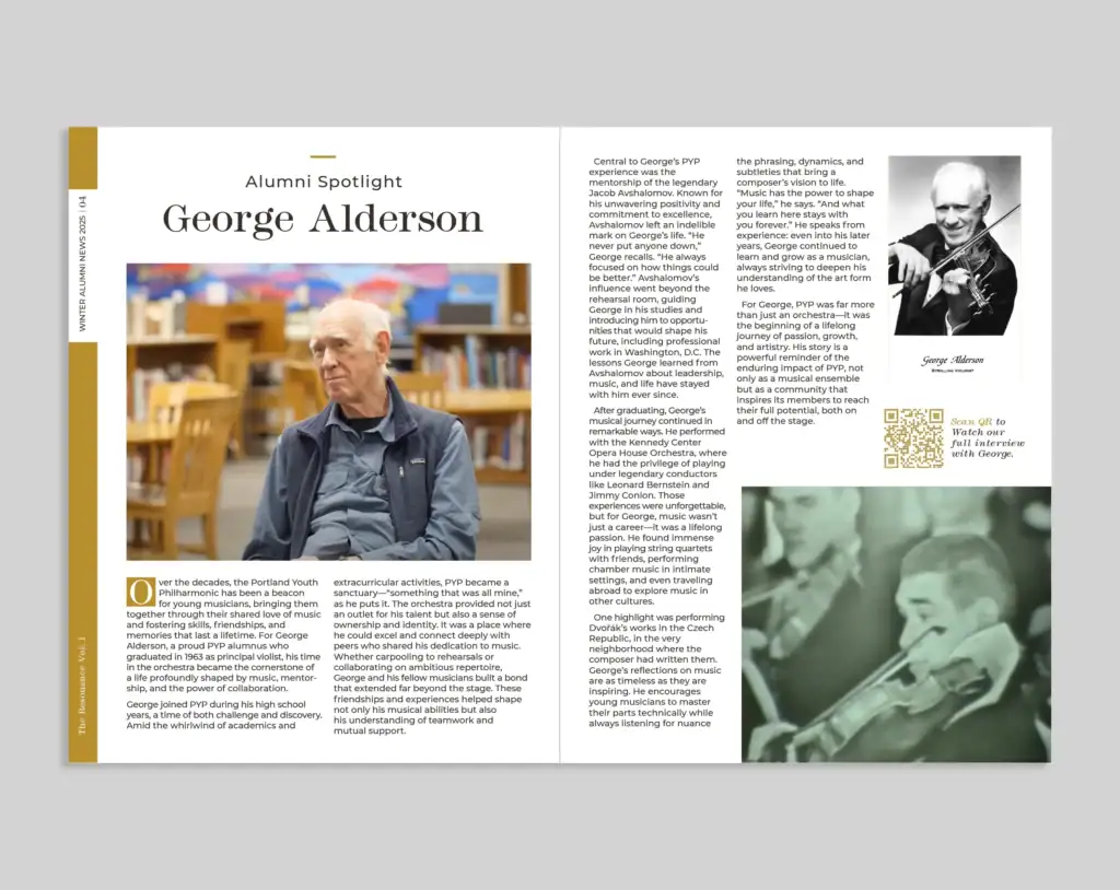
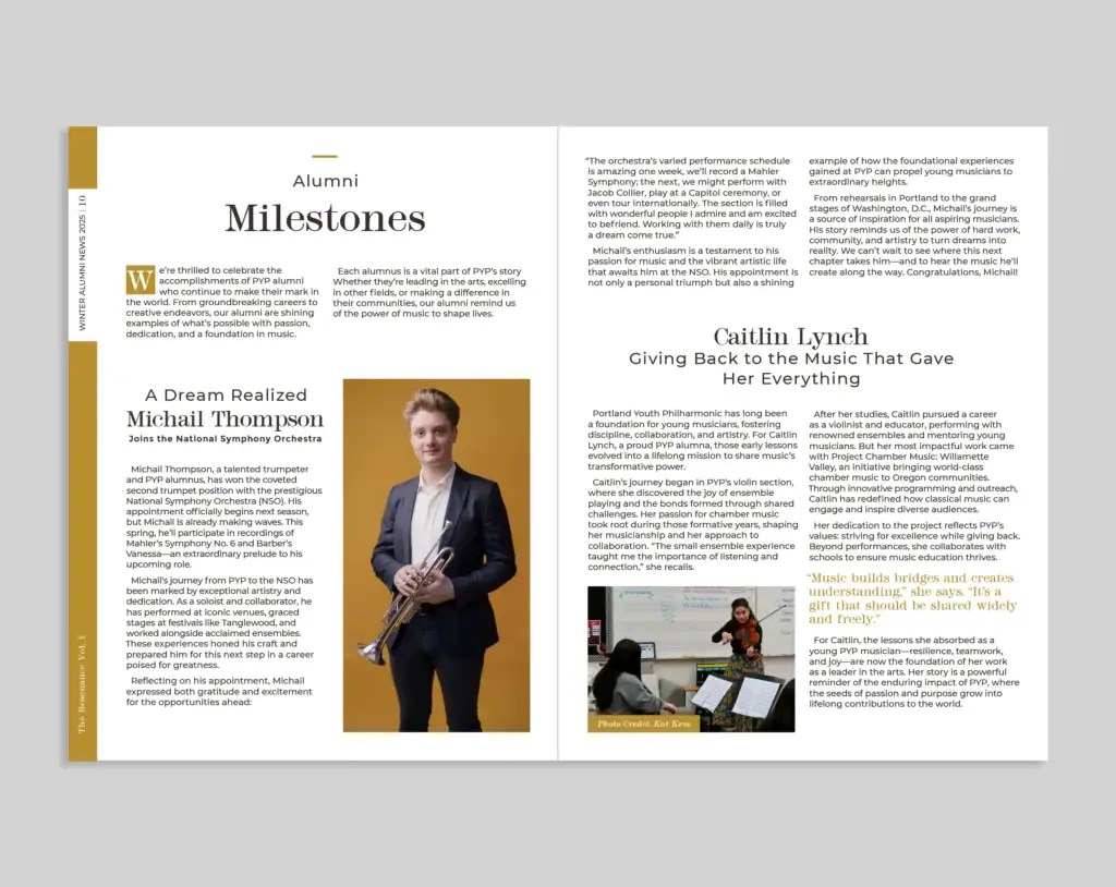
A major highlight of Season 101 was launching a new alumni publication titled “Alumni News: The Resonance.”
Vol 1 (Winter Issue)
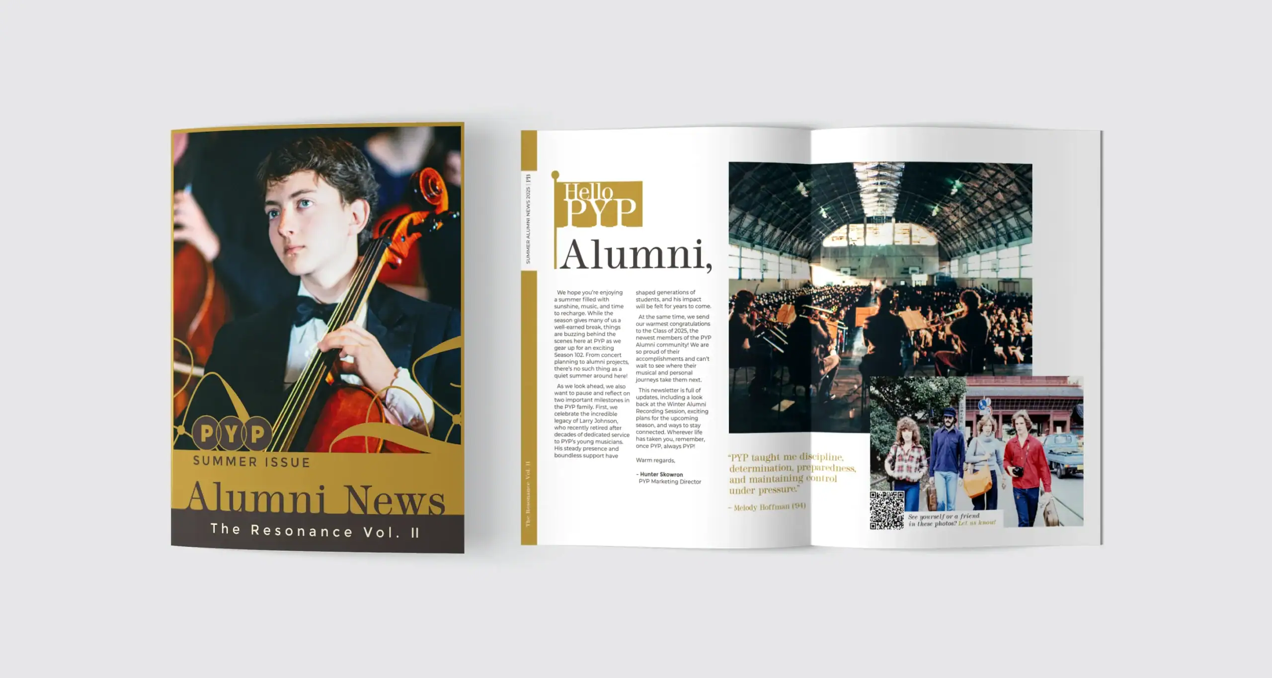
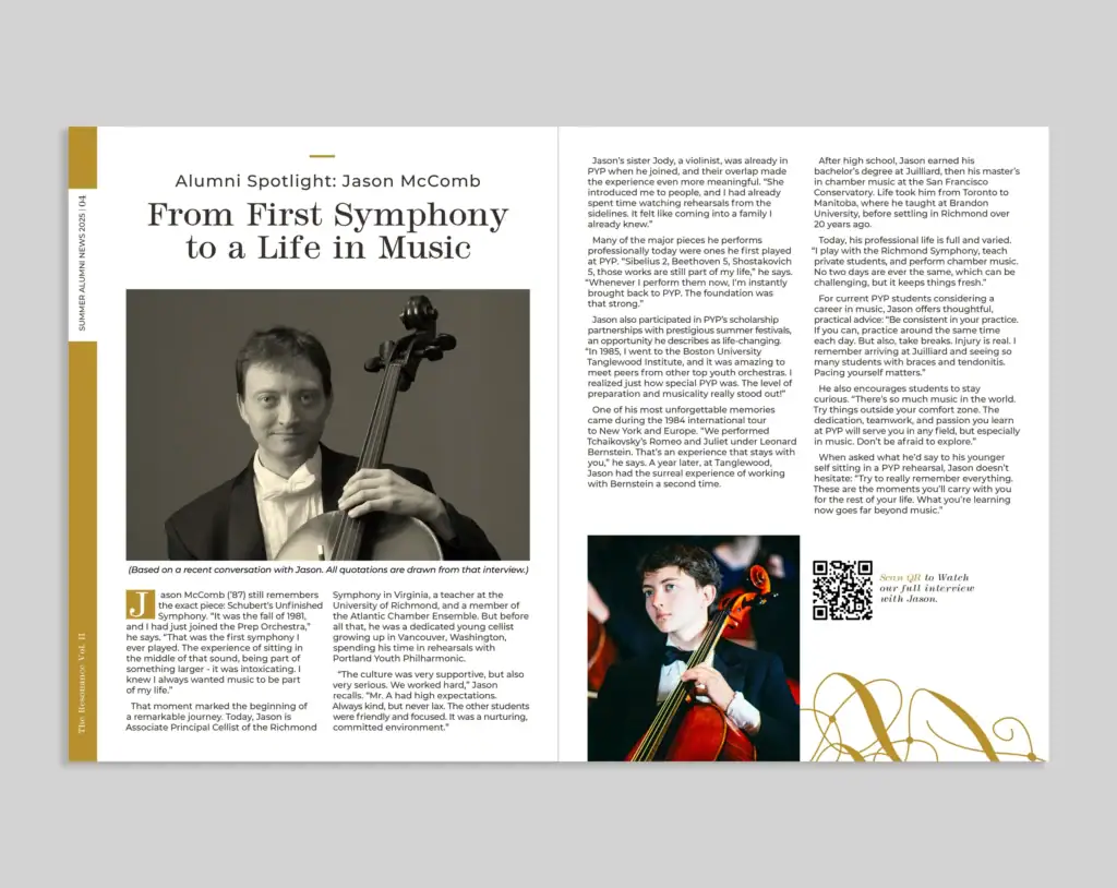
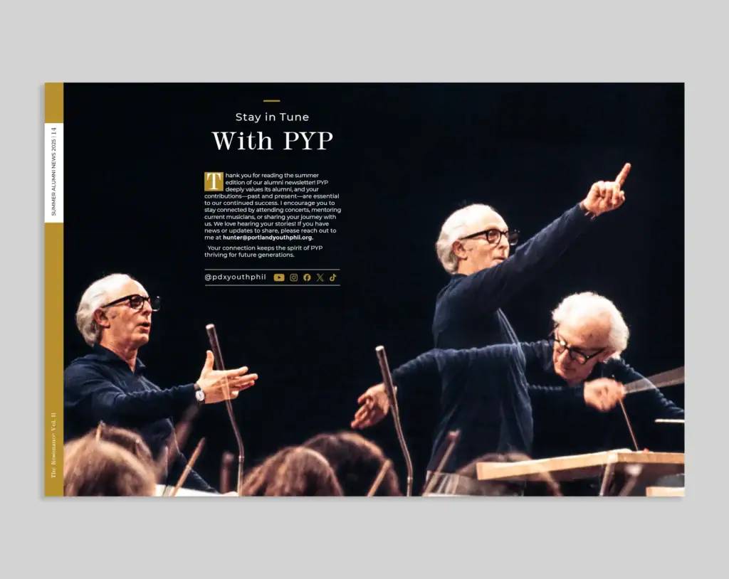
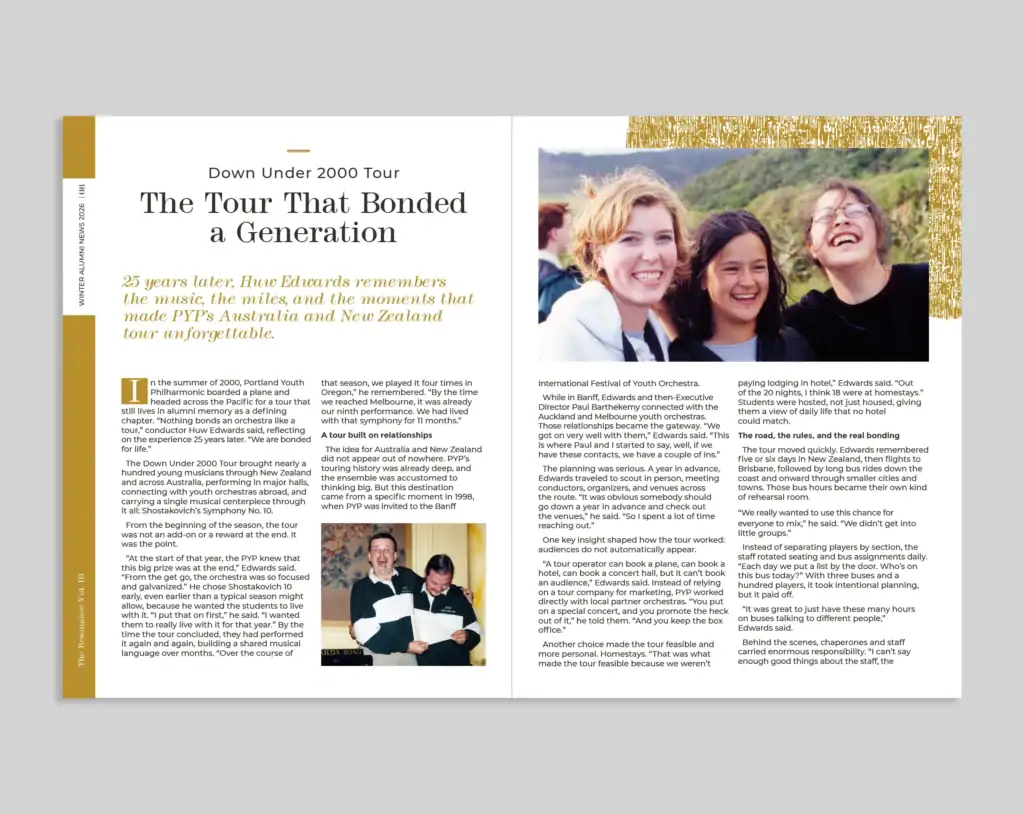
This project was a deep collaboration. The Marketing & Communications Director, who has an extensive background in photography, revived archival film photos from the PYP vault. We designed the newsletter to honor these restored images. We assigned the official “Antique Gold” to the publication to immediately signal that this document represents history. We also introduced the typeface Modern No. 216, a font historically used in older PYP documents, and engineered a contemporary page numbering system running along the left edge.
Vol 2 (Summer Issue)
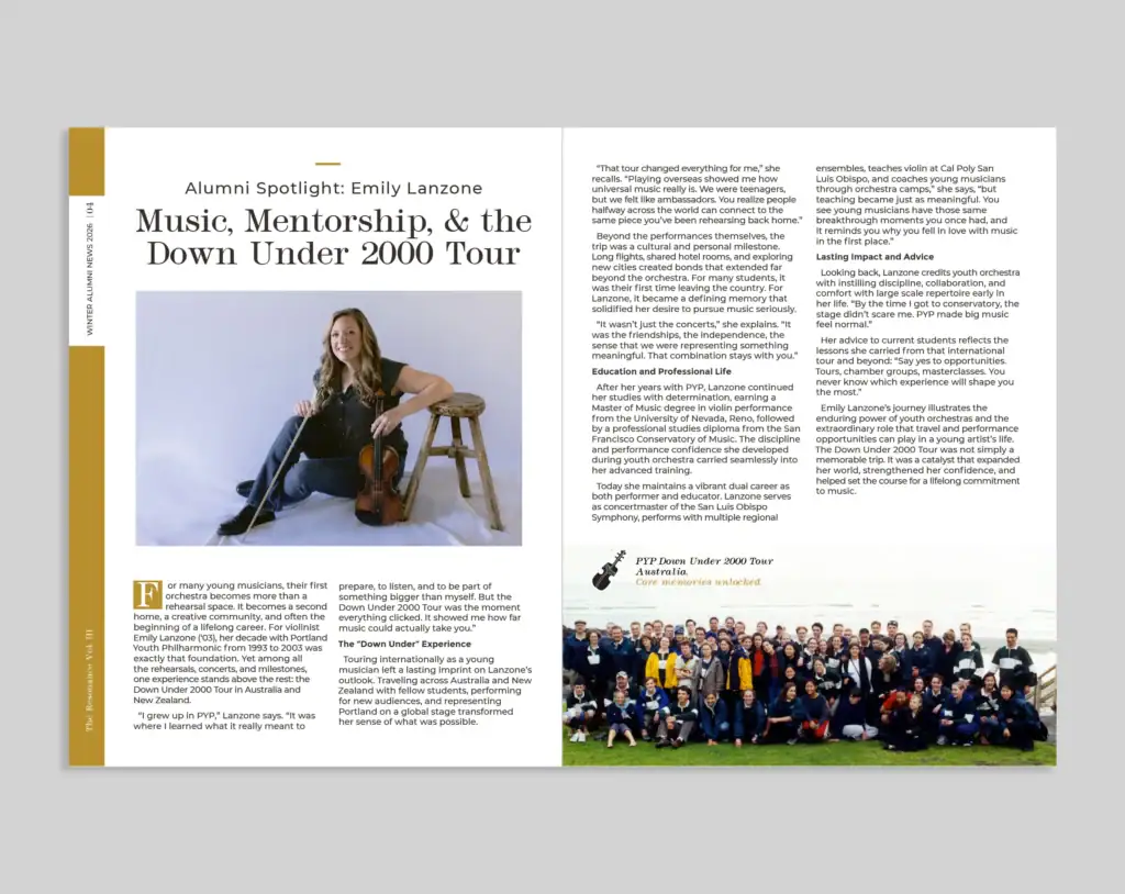
For the second volume, we maintained the format but adjusted the image and text layouts to fit the new content. The vibe remained consistent to cement the newsletter as a window into the past.
Vol 3 (Spring Issue)
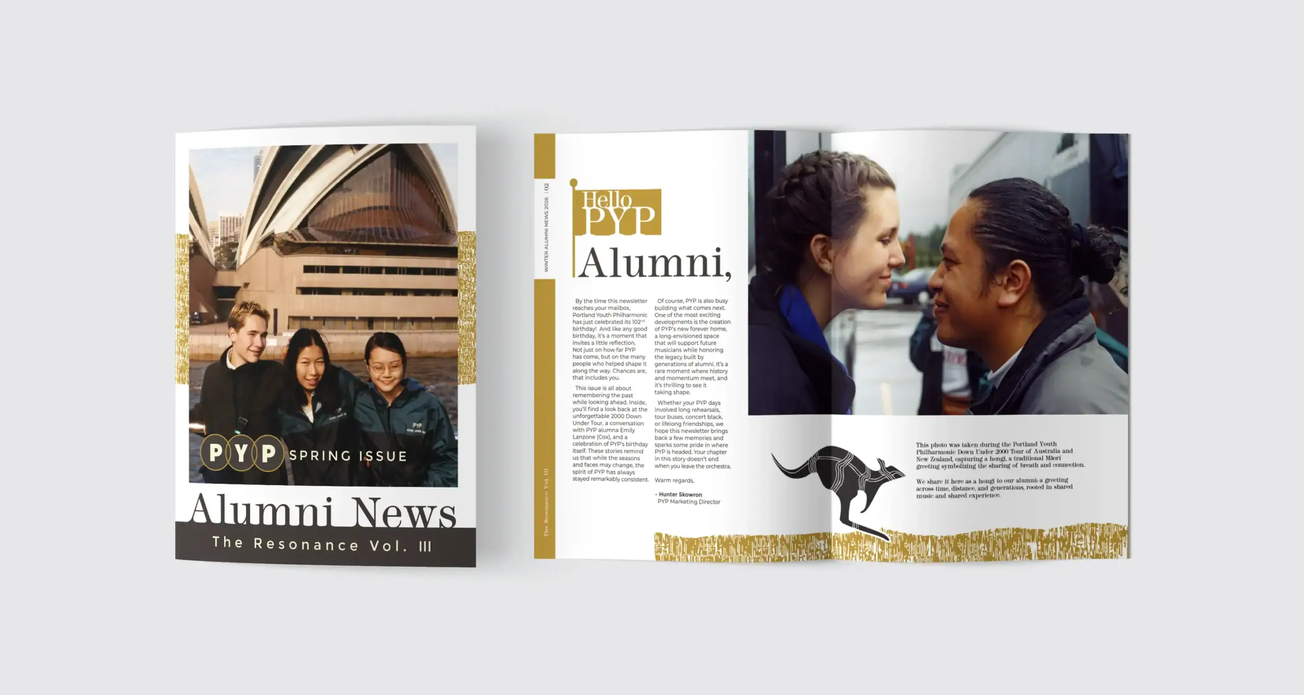
For this volume, we recycled some old Austrialien print assets and worked them into the theme. The book also focused on recent graduates and had some promotional information about the new PYP building.
A New Chapter
The Historic Building Purchase
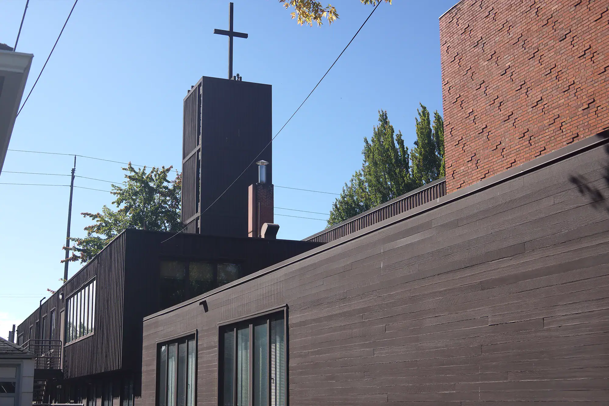
In the fall of 2025, Portland Youth Philharmonic purchased the historic Central Lutheran Church designed by renowned architect Pietro Belluschi. This marked a monumental shift as they finally secured their own concert hall.
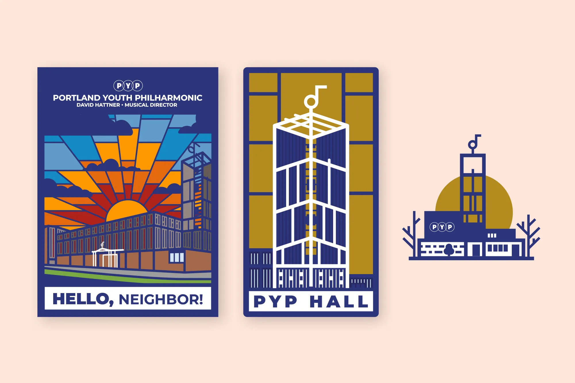
We developed the press kit graphics to announce this acquisition.
- The Stained Glass Sun: An illustration referencing the concert hall’s windows.
- The Tower: A vertical concept designed for future seasonal merchandise.
- The Icon: A clean line-art logo of the building’s distinctive architecture.
We also developed large-format investor slides to showcase the building’s features during donor presentations.
Graduation Certificate
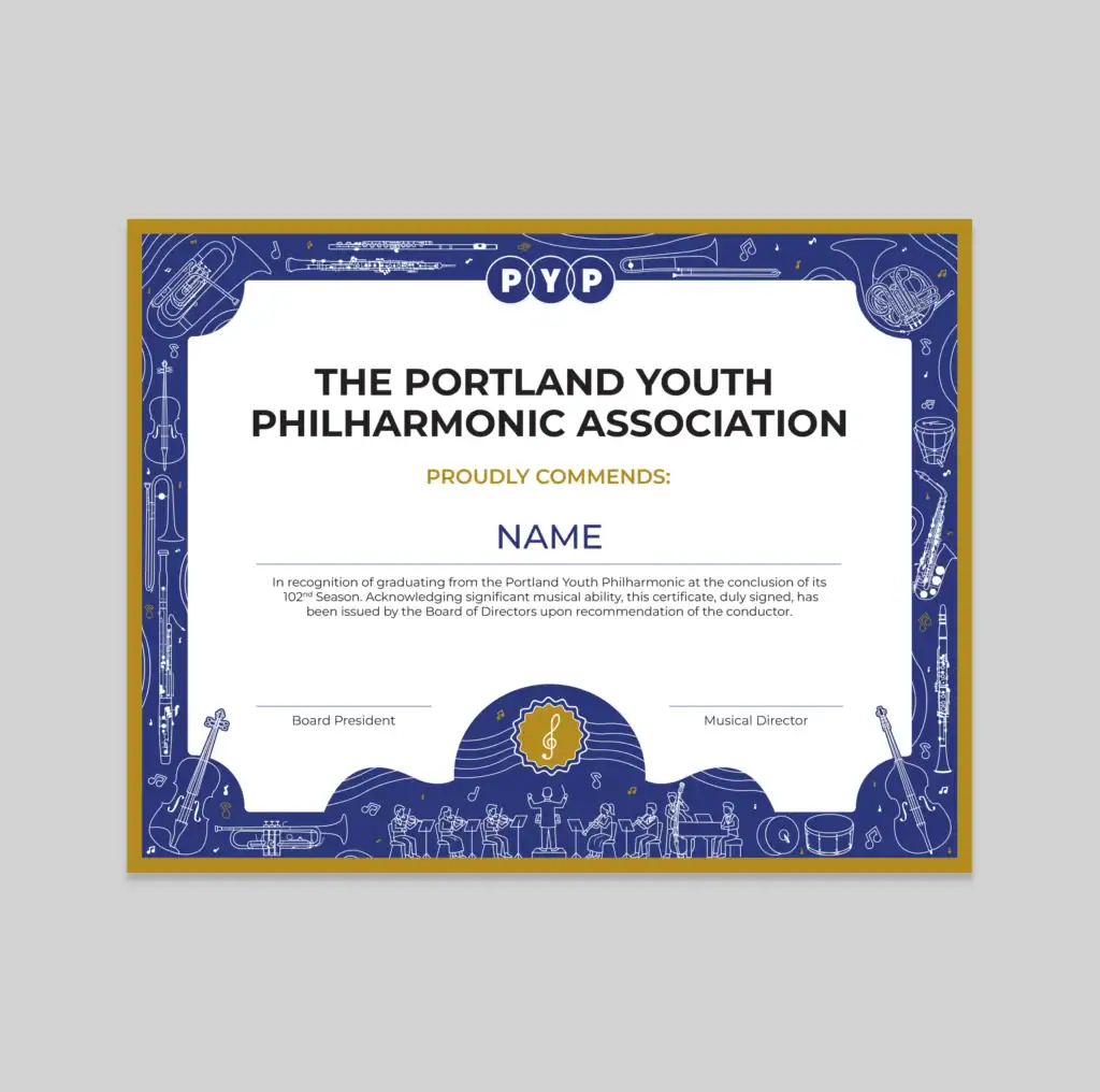
Graduation is a significant milestone for any young musician. The previous certificate felt dated and no longer reflected the quality of the PYP brand. A new design was needed that students would feel proud to receive and display.
The new certificate features a custom line art illustration that runs as a border around the document. The scene depicts the different orchestral instruments and characters performing together, telling a small visual story within the frame. Antique Gold was pulled in as an accent color to add warmth and contrast while keeping the design connected to the broader brand system.
FAQ
What is the Portland Youth Philharmonic?
Founded in 1924, PYP is the oldest youth orchestra in the United States. They provide premier musical training and performance opportunities for young musicians across the Pacific Northwest, performing regularly at the historic Arlene Schnitzer Concert Hall in Portland Oregon.
What branding services did Graphicsbyte provide for PYP?
Graphicsbyte provided brand strategy, visual identity design, print collateral including program books, mailers, and posters, custom illustration, merchandise design, and investor presentation materials across Season 101, 102, and 103.
How did Graphicsbyte modernize the PYP brand?
The color palette was consolidated around a primary Midnight Blue with Antique Gold introduced as a historic accent. A negative space layout style was established across all print materials to give the designs a more contemporary feel. Typography hierarchy was refined using the Montserrat font family to manage the high density of information across concert campaigns and program books.
Did Graphicsbyte design the PYP merchandise?
Yes. Custom apparel graphics were developed for three consecutive seasons along with a limited edition enamel pin for the Conductors Circle donor program and a holographic sticker celebrating 100 Years of Music. Additional items continue to be developed as the partnership evolves.
What is The Resonance?
The Resonance is the PYP alumni newsletter launched during Season 101. Graphicsbyte designed the publication to honor archival photography from the PYP vault. It uses the Antique Gold color and the historic typeface Modern No. 216 to signal that the newsletter represents the organization’s history and legacy.
What is the Central Lutheran Church connection to PYP?
In fall 2025 Portland Youth Philharmonic purchased the historic Central Lutheran Church, a building designed by renowned Portland architect Pietro Belluschi. This acquisition gave PYP its own dedicated concert hall for the first time. Graphicsbyte developed the press kit graphics, building icon, and investor presentation materials to support the announcement and donor campaign.