
Visual Identity Design in Wilsonville
Wilsonville Is Growing. Build a Brand That Grows With It.
Wilsonville has attracted serious investment and a growing business community that is not slowing down. Whether your company serves the local corridor or uses Wilsonville as a base for a regional reach, the market here is competitive enough that a scattered visual presence costs you. Customers decide quickly, and brands that present consistently are the ones that get chosen.
Graphicsbyte builds visual identity systems for Wilsonville businesses that communicate clearly and consistently across every channel. A complete logo system, color palette, typography, and usage guidelines that give your brand a defined presence whether you are reaching local customers or operating at a regional scale.
See More Identity Systems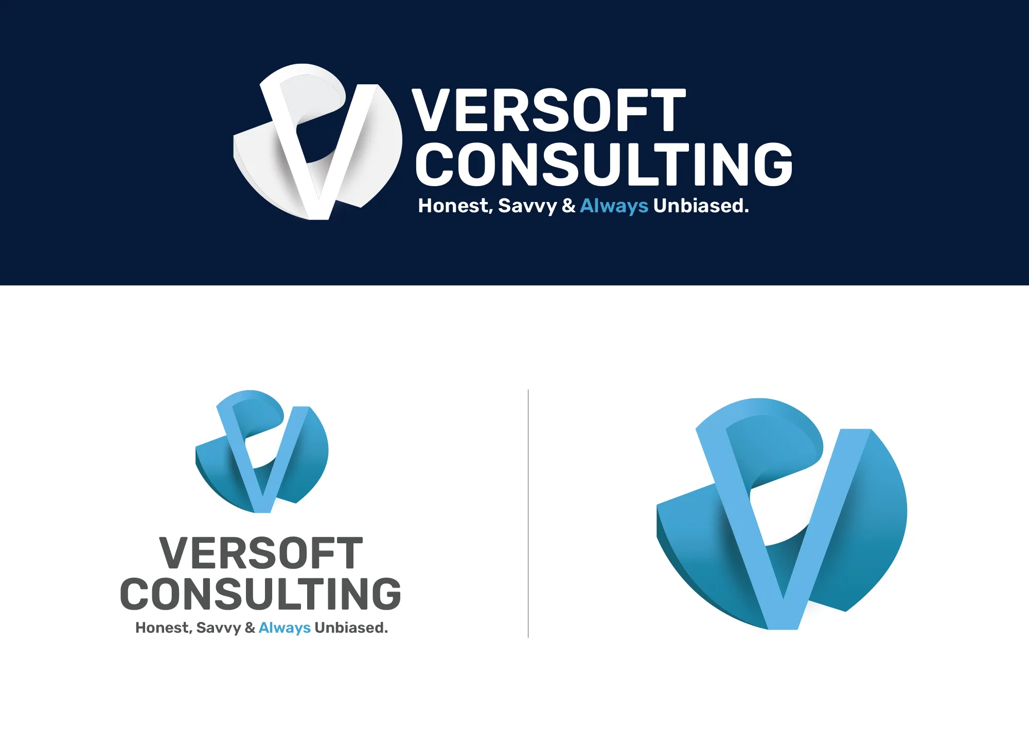
Visual Strategy
Versoft Consulting
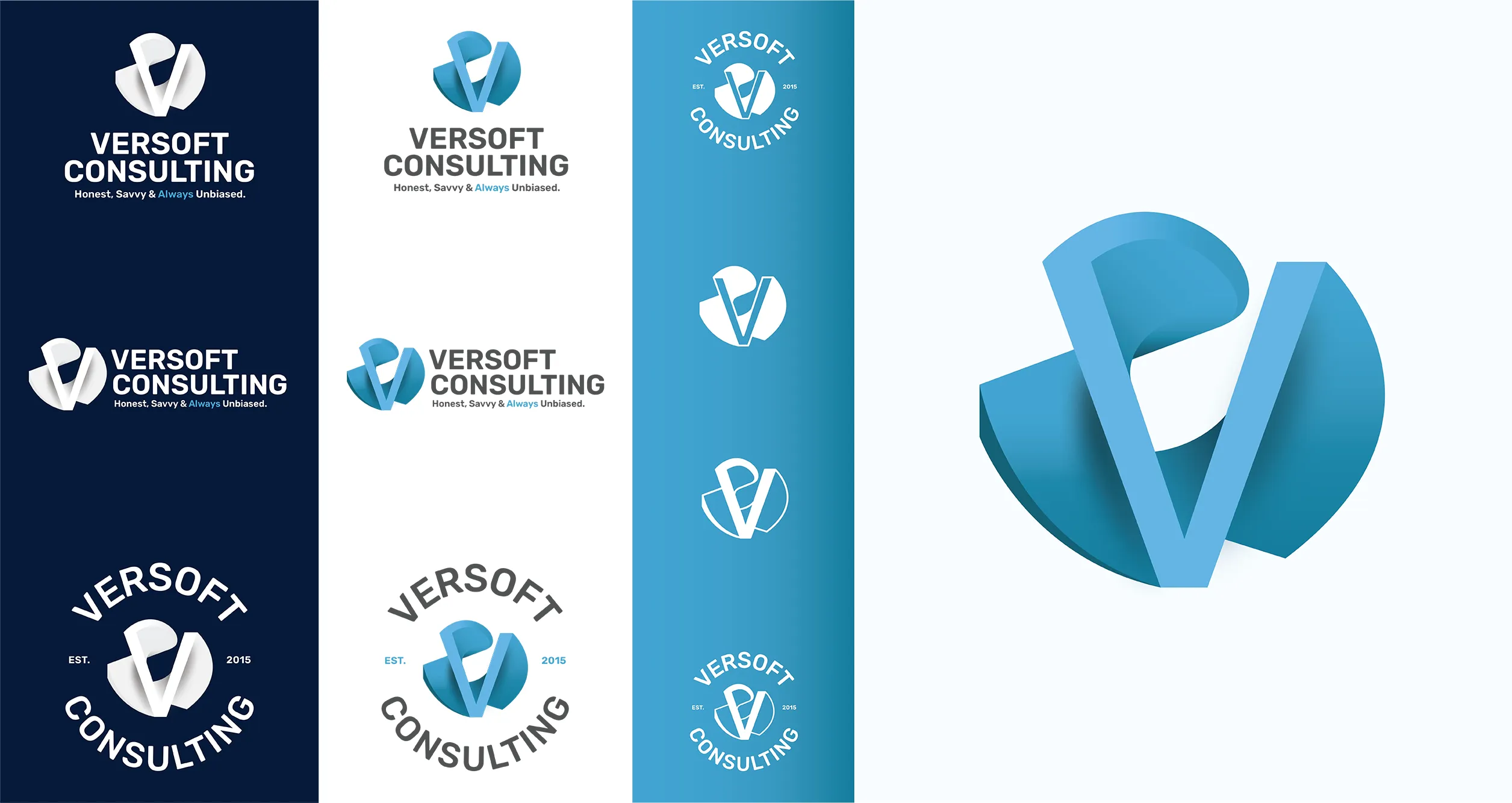
Versoft Consulting required a brand capable of performing across a range of professional contexts without being redesigned for each one. The dimensional V mark draws from architectural geometry to establish credibility and precision, the qualities their target clients expect to see before they agree to a first meeting.
We extended that mark into a system with real operational range. Flat versions for laser etching on hardware and corporate gifts, circular badge configurations for apparel, and a full set of lockups that handle every print, digital, and merchandise application Versoft encounters in the course of regular business.
View Project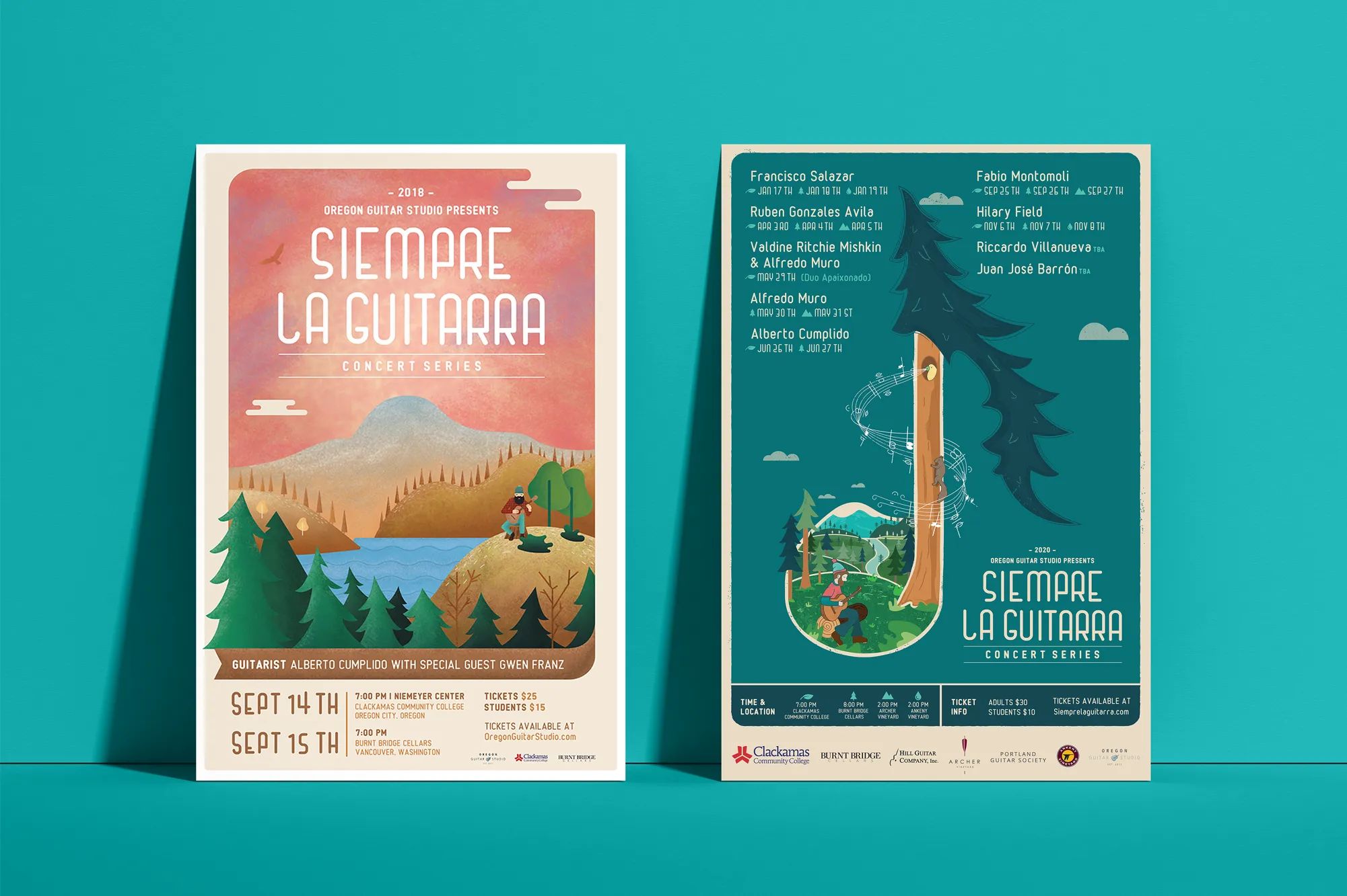
Music Visual Identity
Siempre La Guitarra
Siempre La Guitarra runs a classical guitar concert series whose Pacific Northwest following has grown season by season. That loyalty deserved an identity built with the same care as the performances. We built it on custom illustration, creating a visual language that reflects artistic intent rather than falling back on generic brand elements.
We structured the system for longevity and seasonal adaptability. Each season brings a new visual expression within the Siempre framework, with illustration and color adapting to each performer while the underlying identity keeps the series recognizable across years of programming. The system extended into a full merchandise line including concert posters, apparel, guitar picks, and nail files.
View ProjectWhy Wilsonville Businesses Need a Defined Brand System
A visual identity system gives your Wilsonville business a brand infrastructure that supports growth without requiring you to rebuild every time your reach expands.
- Establish Presence in a Competitive Corridor: Wilsonville attracts businesses and customers from both the Portland metro and the south corridor. A consistent visual identity ensures your brand registers clearly in both markets.
- Support Regional Growth: If your Wilsonville business serves clients beyond the immediate area, a polished and cohesive visual identity signals that you operate at a regional level, not just a local one.
- Make Marketing More Efficient: A defined brand system means your team, vendors, and partners all work from the same visual source. Every new campaign, asset, or channel application draws from established guidelines rather than starting from scratch.
Tea Visual Identity
Cup of Tea
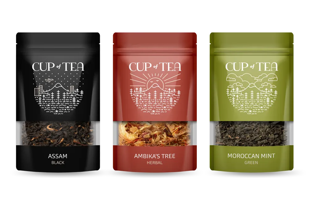
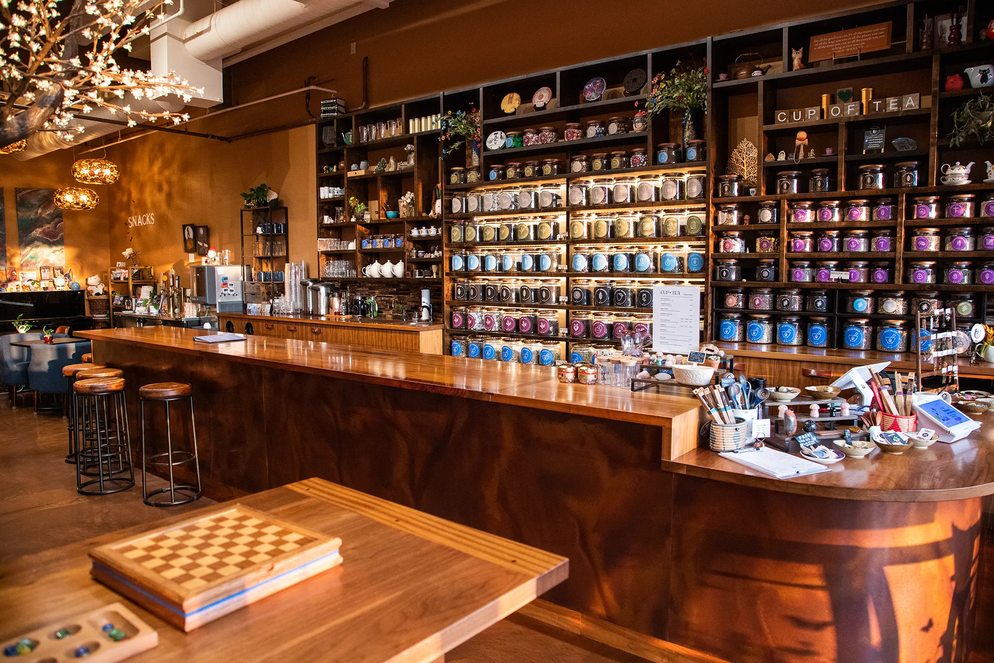
Cup of Tea carries a product line that would challenge any visual system to remain coherent: over 150 loose-leaf tea varieties across a wide range of origins, processing methods, and flavor profiles. We addressed that complexity with a 9-color identity architecture, assigning each hue to a specific category of tea and embedding the navigation system directly into the brand.
A custom icon set extended the system, translating individual tea characteristics into visual language customers could read without explanation. Retail packaging applied the full color architecture to every product label in the shop. Apparel carried the brand into the community. The result is a visual system that functions as a wayfinding tool without losing its identity as a lifestyle brand.
View ProjectOur Visual Identity Process
We take a holistic approach to design. We do not just pick colors that look nice. We build a system that works in the real world for Wilsonville businesses and beyond.
01.
Visual Audit & Discovery
We start by looking at what you have and where you want to go. We analyze your competitors and discuss the mood you want to evoke. We define the aesthetic direction before we design a single pixel.
02.
System Development
We build the complete toolkit. Primary and secondary color palettes that pass accessibility standards. Typography that is legible and distinct. Supporting elements like icons, patterns, and photography guidelines that add depth.
03.
The Deliverable: Brand Guidelines
We package everything into a comprehensive Brand Style Guide. This is your brand's instruction manual. It explains exactly how to use your logo, which fonts to use, and how to apply your colors so anyone who touches your brand stays on track.
Frequently Asked Questions
Ready to Look the Part?
Let's Chat