
Visual Identity Design in Happy Valley
Happy Valley Is Growing Fast. Your Brand Needs to Keep Up.
Happy Valley is one of the fastest-growing cities in Oregon, and that growth brings competition. New businesses are opening. Established ones are expanding. In a market moving this quickly, the brands that build a consistent visual identity early are the ones that get remembered. Showing up with a disjointed look while the market fills in around you is a missed window.
Graphicsbyte builds visual identity systems for Happy Valley businesses that establish a clear, consistent presence from the start. A complete brand system, not just a logo, so that every channel your customers use to find you tells the same story.
See More Identity Systems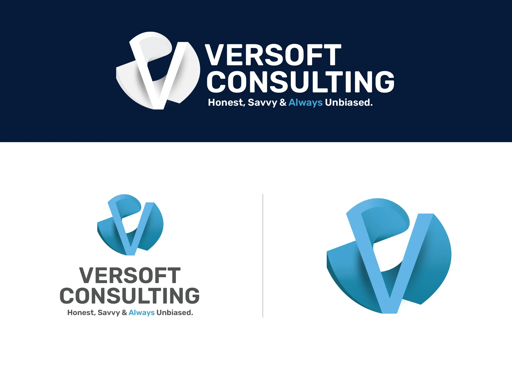
Visual Strategy
Versoft Consulting
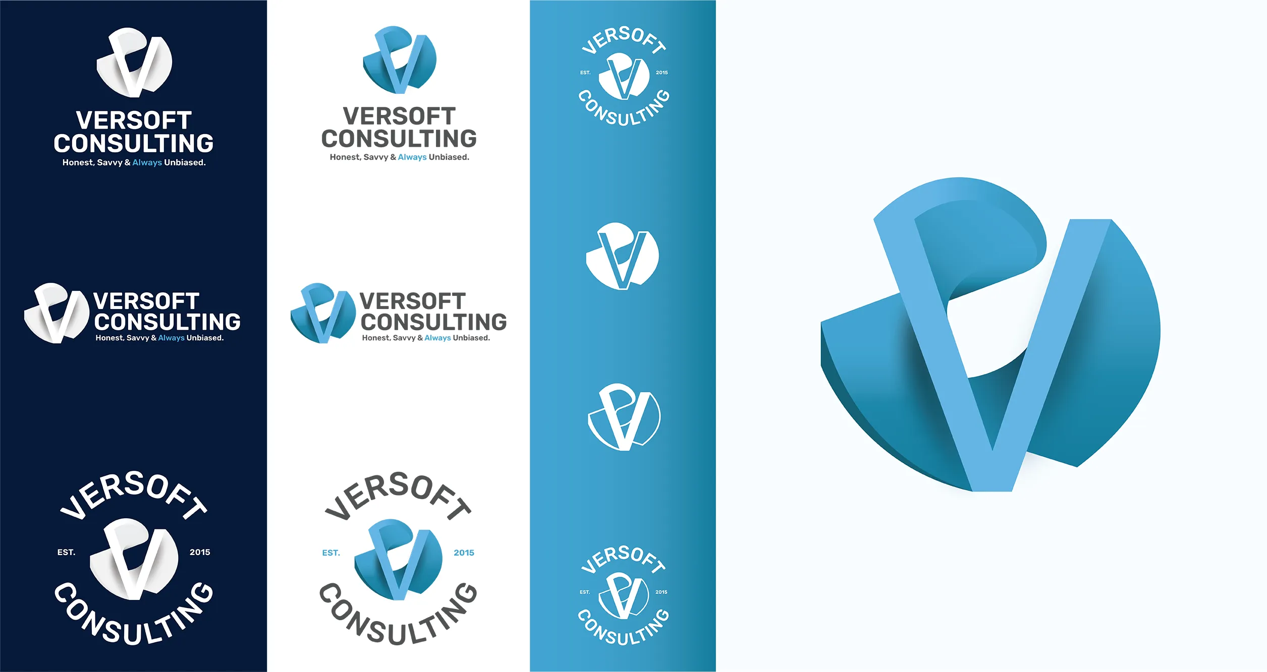
For Versoft Consulting, the challenge was building a visual identity that bridged two worlds: the analytical demands of financial services and the need to be human enough to earn a first meeting. The dimensional V mark does that, drawing from architectural geometry to feel structured and credible without being cold or closed off.
We designed the system for real-world complexity. Applications range from high-resolution digital environments to laser-etched corporate gifts and branded apparel. Each lockup configuration serves a specific purpose, and the full set gives the Versoft brand total coverage across every format it occupies.
View Project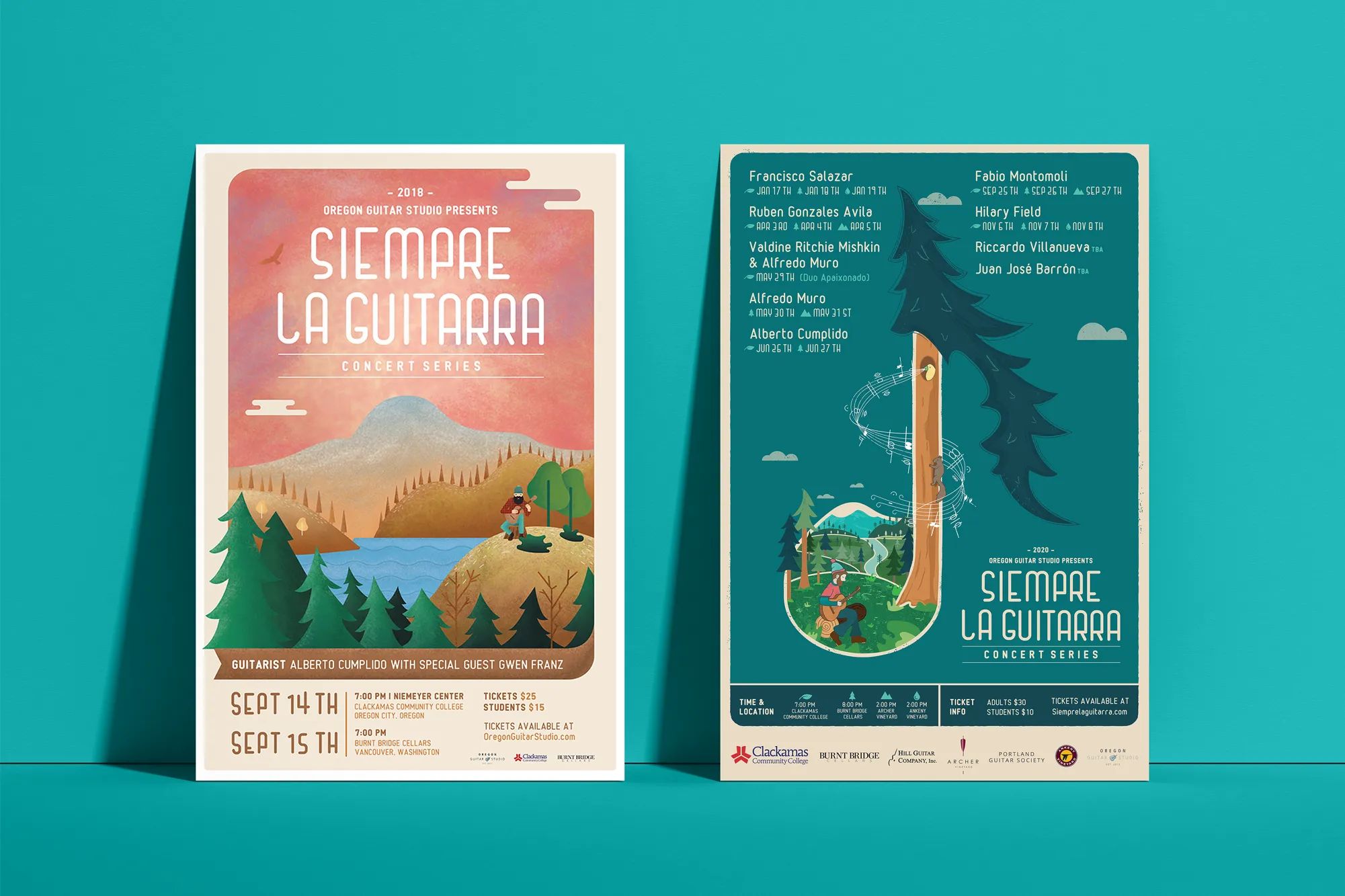
Music Visual Identity
Siempre La Guitarra
For Siempre La Guitarra, a classical guitar concert series with a dedicated following across the Pacific Northwest, the identity we built had to work at a level of artistry that reflected the performances. We grounded the entire system in original illustration rather than reaching for standard design elements.
The seasonal structure of the series required a system that could adapt without losing its identity. We built that adaptability in from the start, establishing a visual framework that gives each season its own expression while maintaining the core identity the audience recognizes. Merchandise followed naturally: posters, apparel, guitar picks, and nail files that made the brand tangible beyond the performance.
View ProjectWhy Happy Valley Businesses Need a Brand System Now
In a fast-growing market, the businesses that define their visual identity early build recognition that compounds over time. Here is what a complete system makes possible for a Happy Valley business.
- Claim Your Position Early: Happy Valley is still defining its business landscape. A cohesive visual identity establishes your presence before the market gets more crowded, making recognition harder to achieve.
- Grow Without Rebuilding: A defined brand system scales with your business. New locations, new services, new marketing channels all draw from the same visual foundation without starting over each time.
- Build Trust in a New Market: In a newer community, customers are still forming brand preferences. A consistent and polished visual identity signals that you are established, intentional, and here to stay.
Tea Visual Identity
Cup of Tea
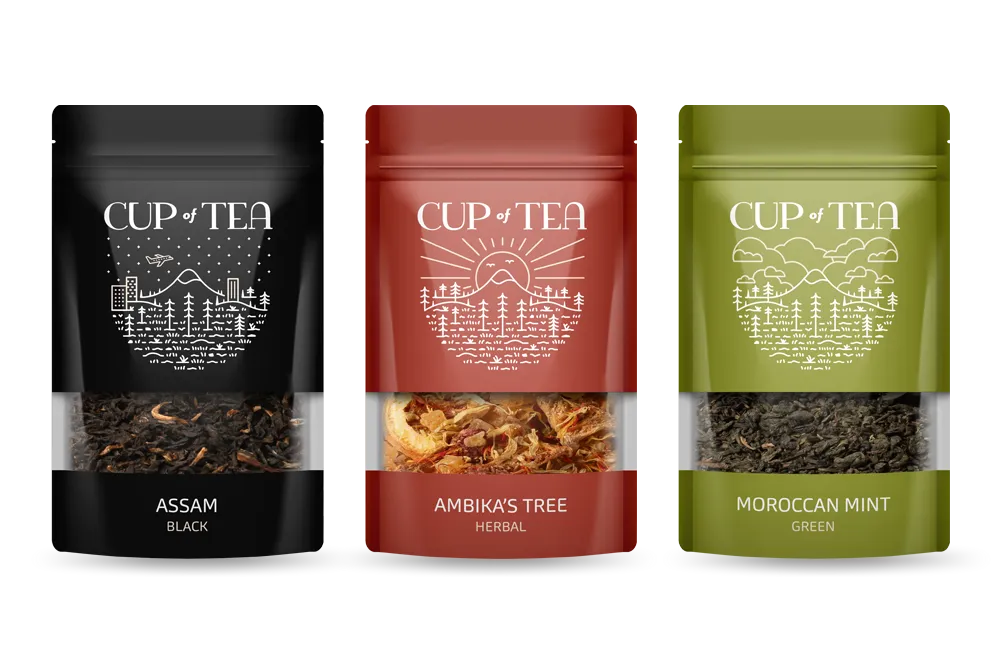
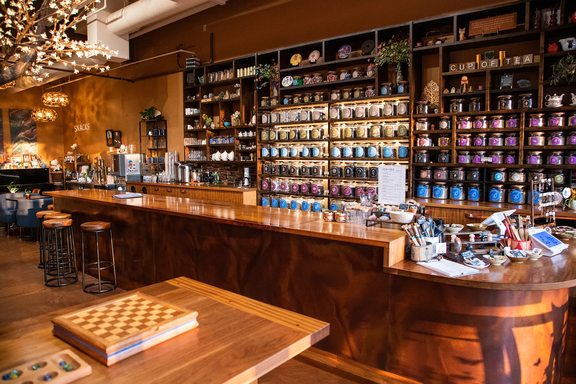
For Cup of Tea, the identity challenge was scale. With more than 150 loose-leaf varieties, the shop needed a visual system that could organize their range without creating visual noise. We engineered a 9-color identity where each color is assigned to a tea genre, creating a navigable visual language customers could use without any instruction at all.
We applied that system broadly. Custom icon designs translated tea attributes into visual cues. Retail packaging carried the color architecture to every shelf and product label. Apparel expanded the brand into the community. The whole system works together as a functional and cohesive brand environment that is as useful as it is distinctive.
View ProjectOur Visual Identity Process
We take a holistic approach to design. We do not just pick colors that look nice. We build a system that works in the real world for Happy Valley businesses and beyond.
01.
Visual Audit & Discovery
We start by looking at what you have and where you want to go. We analyze your competitors and discuss the mood you want to evoke. We define the aesthetic direction before we design a single pixel.
02.
System Development
We build the complete toolkit. Primary and secondary color palettes that pass accessibility standards. Typography that is legible and distinct. Supporting elements like icons, patterns, and photography guidelines that add depth.
03.
The Deliverable: Brand Guidelines
We package everything into a comprehensive Brand Style Guide. This is your brand's instruction manual. It explains exactly how to use your logo, which fonts to use, and how to apply your colors so anyone who touches your brand stays on track.
Frequently Asked Questions
Ready to Look the Part?
Let's Chat