
Visual Identity Design in Tualatin
Tualatin Businesses Run the Corridor. Your Brand Should Too.
Tualatin sits at a geographic and commercial intersection that puts local businesses in front of a wider audience than most cities their size. That reach is an asset, but only if your brand presents consistently everywhere you show up. A scattered visual presence dilutes the advantage of that exposure and makes it harder for customers to connect the dots.
Graphicsbyte builds visual identity systems for Tualatin businesses that turn broad exposure into genuine brand recognition. A cohesive color palette, logo suite, and typography system that holds together across every platform and format your business uses to reach customers.
See More Identity Systems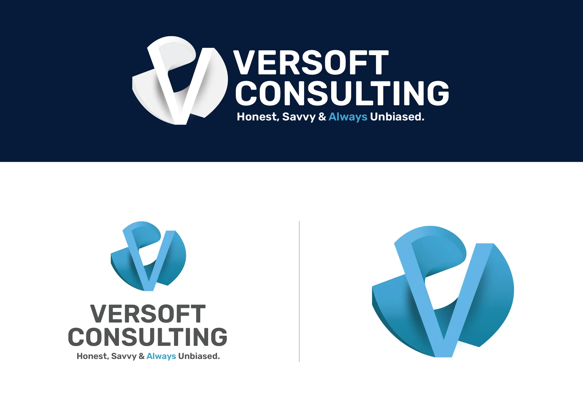
Visual Strategy
Versoft Consulting
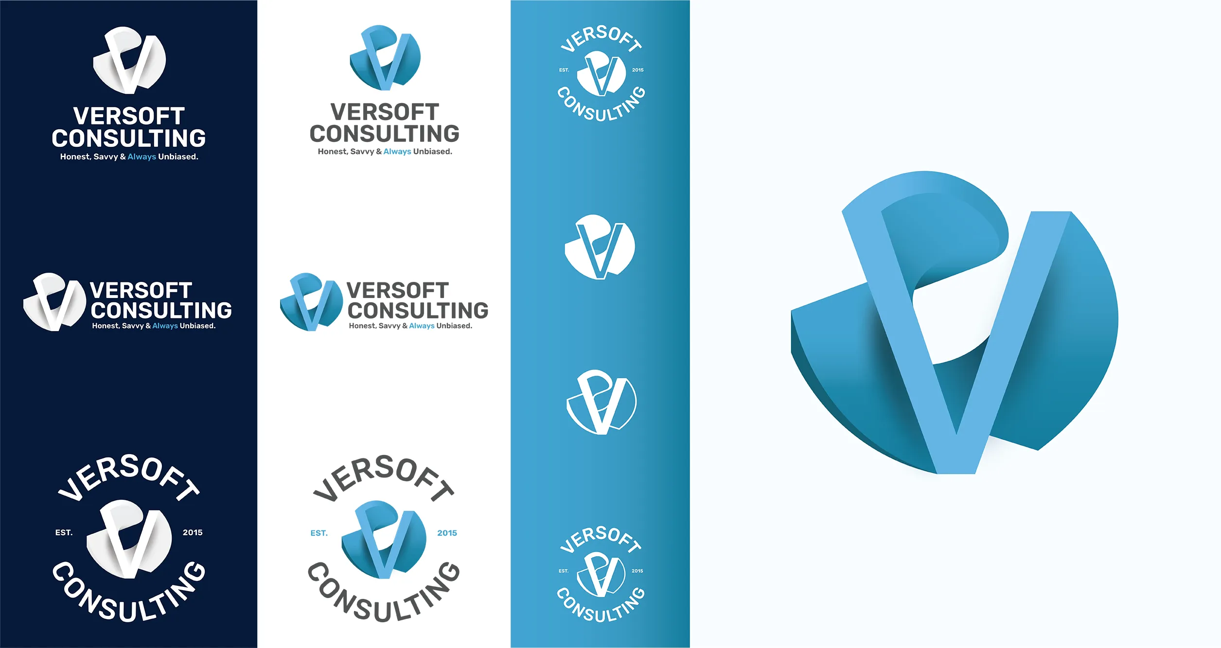
Versoft Consulting came to us with a clear goal: they wanted to look like the firm they already were, credible, technically precise, and not unapproachable. The dimensional V mark we built draws on architectural forms to achieve that balance, giving the brand weight and structure without sacrificing the warmth that closes deals.
We took the mark into a full identity system that accounts for the real range of applications a consulting firm like Versoft encounters. Flat laser-etch configurations for merchandise, circular badge lockups for apparel, and a complete guidelines framework that makes applying the brand simple and consistent regardless of who is doing it.
View Project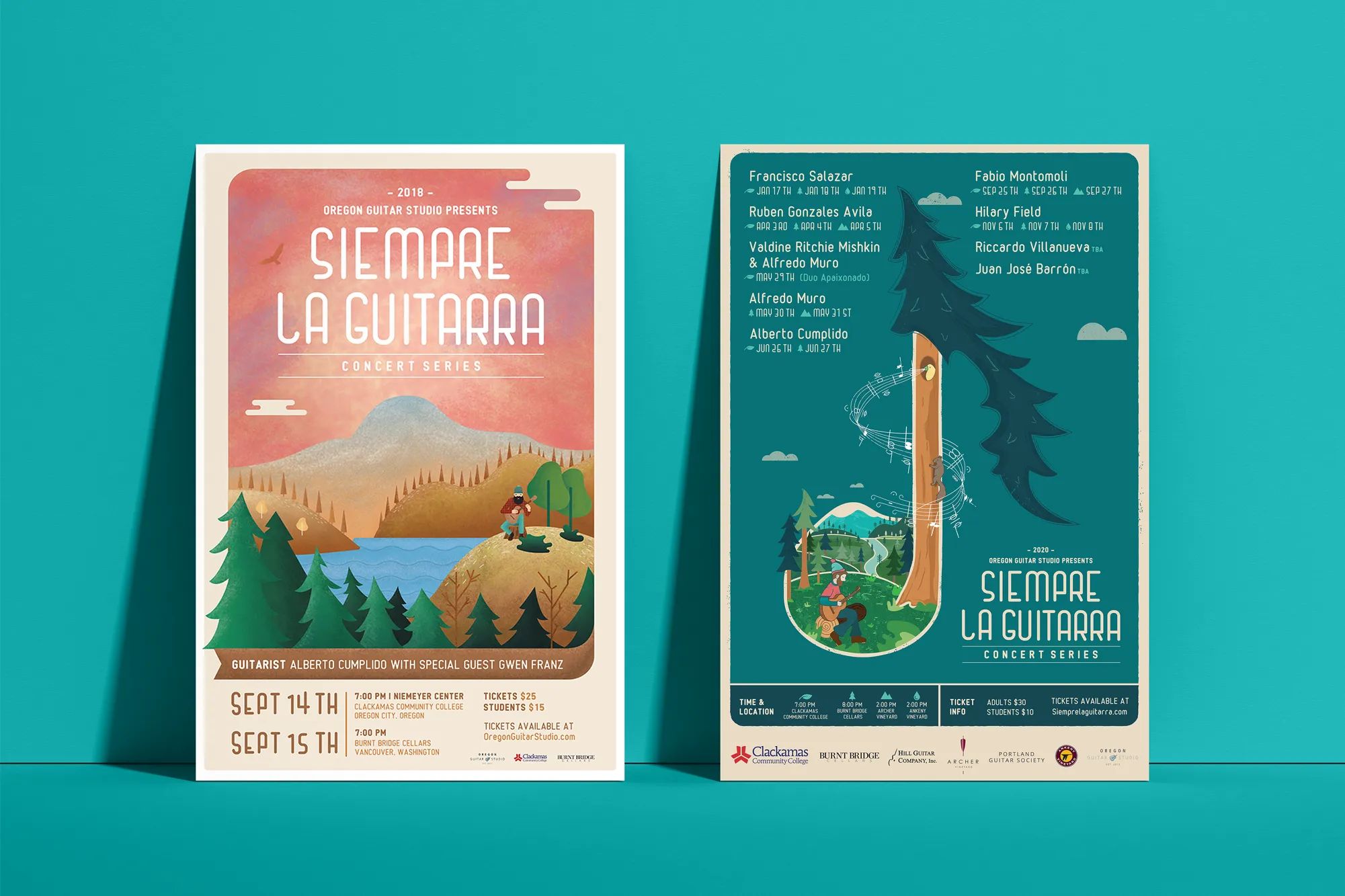
Music Visual Identity
Siempre La Guitarra
For Siempre La Guitarra, a classical guitar concert series with a Pacific Northwest audience that spans multiple seasons, the identity needed to carry both artistic integrity and operational flexibility. We built it around custom illustration, establishing a visual depth that graphic templates and stock elements simply cannot replicate.
The seasonal nature of the series required a system that could refresh without starting over each time. We built a visual framework that accommodates a new artistic direction for each performer while keeping the series identity consistent across every season. That system extended into a full merchandise line: concert posters, apparel, guitar picks, and nail files that gave the brand a collectible dimension.
View ProjectWhy Tualatin Businesses Need a System Behind Their Presence
A visual identity system gives your Tualatin business a brand presence that works across a wider geographic reach without losing coherence or recognition.
- Make Every Impression Count: Tualatin businesses reach customers from a broader area than many local markets. A consistent visual identity ensures that every touchpoint, regardless of channel or location, reinforces the same brand.
- Scale Across Channels Without Chaos: A defined visual system makes it practical to apply your brand to new formats and platforms. Colors, fonts, and mark configurations are already established, so expansion never means starting over.
- Build Recognition in a Mixed Market: Tualatin attracts both industrial and retail customers. A cohesive visual identity communicates clearly to both audiences without changing what your brand fundamentally is.
Tea Visual Identity
Cup of Tea
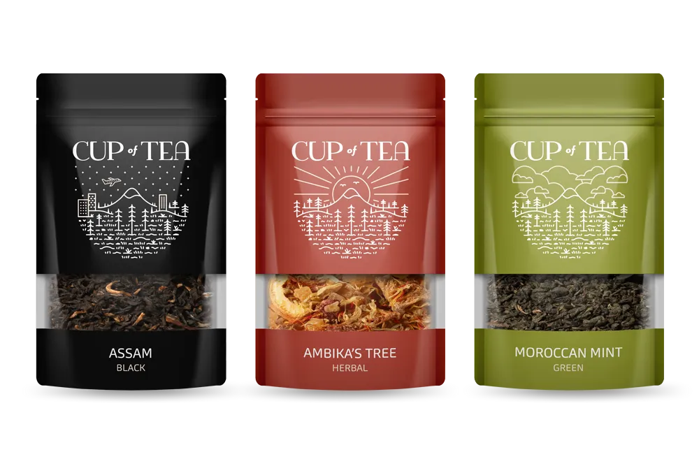
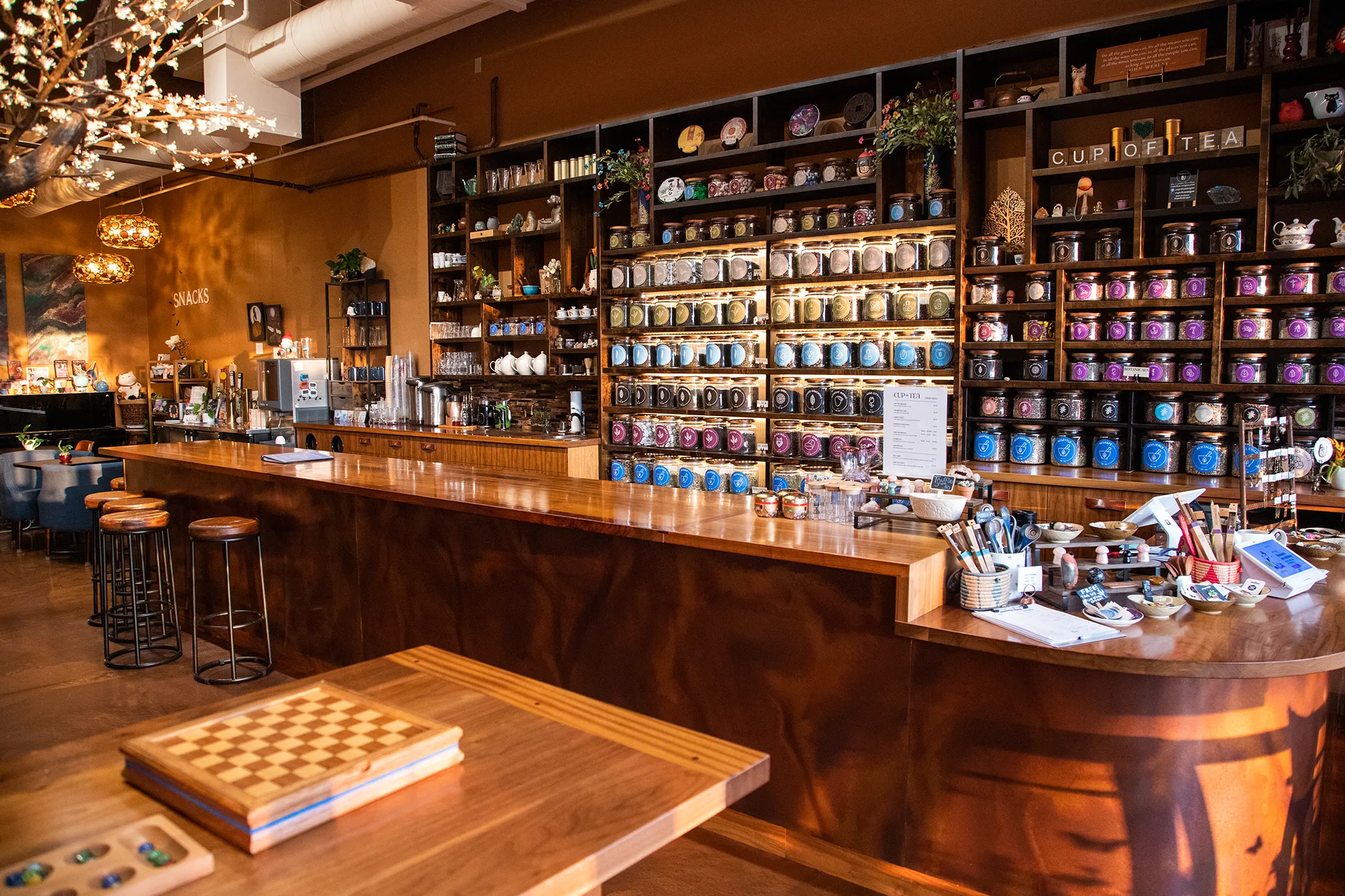
The visual identity for Cup of Tea had to solve a real problem before it could solve an aesthetic one: how do you help a customer navigate more than 150 loose-leaf tea varieties without overwhelming them? We built the answer into the color system itself, assigning each of nine hues to a specific category of tea and letting the palette do the organizational work.
That color architecture extended across every format the shop uses. A custom icon deck gave each tea type a visual shorthand customers could read at a glance. Retail packaging carried the system onto every shelf label. A branded apparel line brought the identity into the world beyond the store. What emerged was a lifestyle brand built on a genuinely functional foundation.
View ProjectOur Visual Identity Process
We take a holistic approach to design. We do not just pick colors that look nice. We build a system that works in the real world for Tualatin businesses and beyond.
01.
Visual Audit & Discovery
We start by looking at what you have and where you want to go. We analyze your competitors and discuss the mood you want to evoke. We define the aesthetic direction before we design a single pixel.
02.
System Development
We build the complete toolkit. Primary and secondary color palettes that pass accessibility standards. Typography that is legible and distinct. Supporting elements like icons, patterns, and photography guidelines that add depth.
03.
The Deliverable: Brand Guidelines
We package everything into a comprehensive Brand Style Guide. This is your brand's instruction manual. It explains exactly how to use your logo, which fonts to use, and how to apply your colors so anyone who touches your brand stays on track.
Frequently Asked Questions
Ready to Look the Part?
Let's Chat