
Visual Identity Design in Beaverton
Beaverton Businesses Compete in a Serious Market
Beaverton is home to some of the most competitive and visible businesses in the Portland metro. With major corporate neighbors setting a visual standard that smaller businesses feel every day, showing up with a scattered brand is not just a missed opportunity. It is a credibility gap that customers notice before they ever read a word about what you do.
Graphicsbyte builds visual identity systems for Beaverton businesses that establish a credible, consistent presence at every touchpoint. A complete logo system, color palette, typography, and usage guidelines designed to hold up in a market where the visual bar is genuinely high.
See More Identity Systems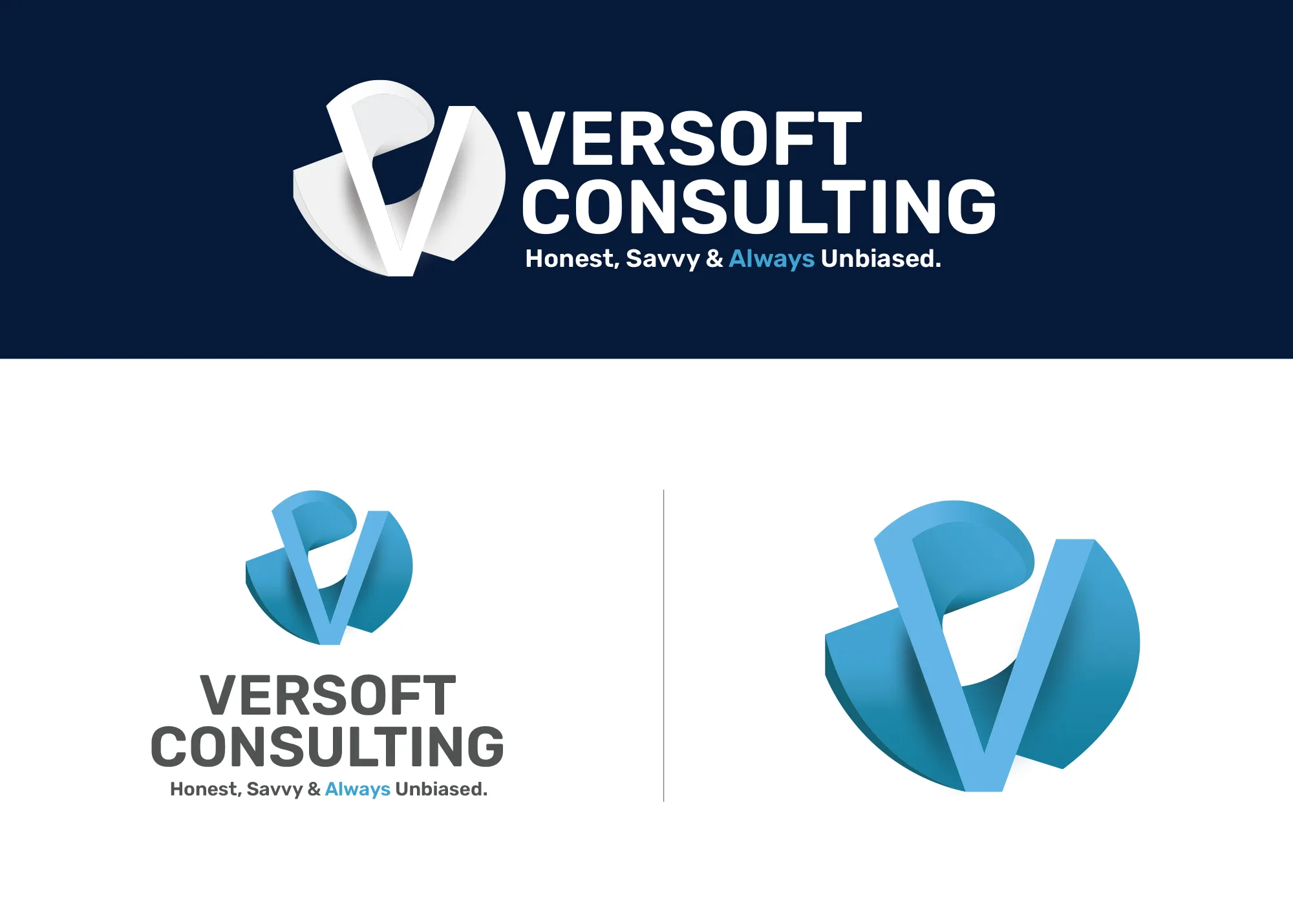
Visual Strategy
Versoft Consulting
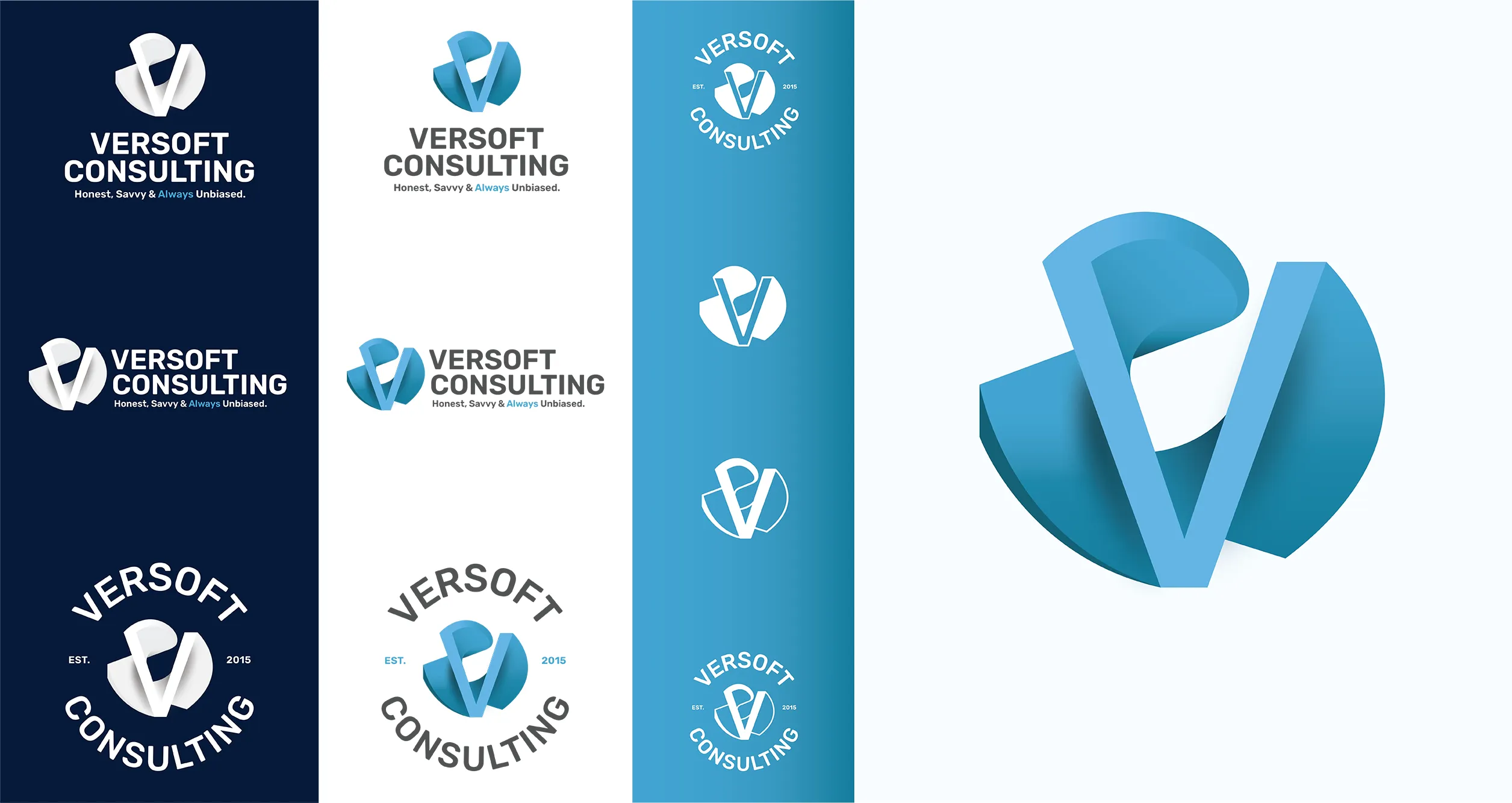
Versoft Consulting competes in markets where the brand signals something before a word is said. We built them a dimensional V mark derived from architectural geometry, a form that communicates constructed precision and reinforces the technical credibility their clients look for when choosing a consulting partner for a serious engagement.
The identity system was designed with real-world applications in mind. Flat laser-ready lockups for etched merchandise, circular badge configurations for branded apparel, and a complete guidelines framework that ensures every application maintains brand integrity regardless of format, scale, or the material it is printed or etched on.
View Project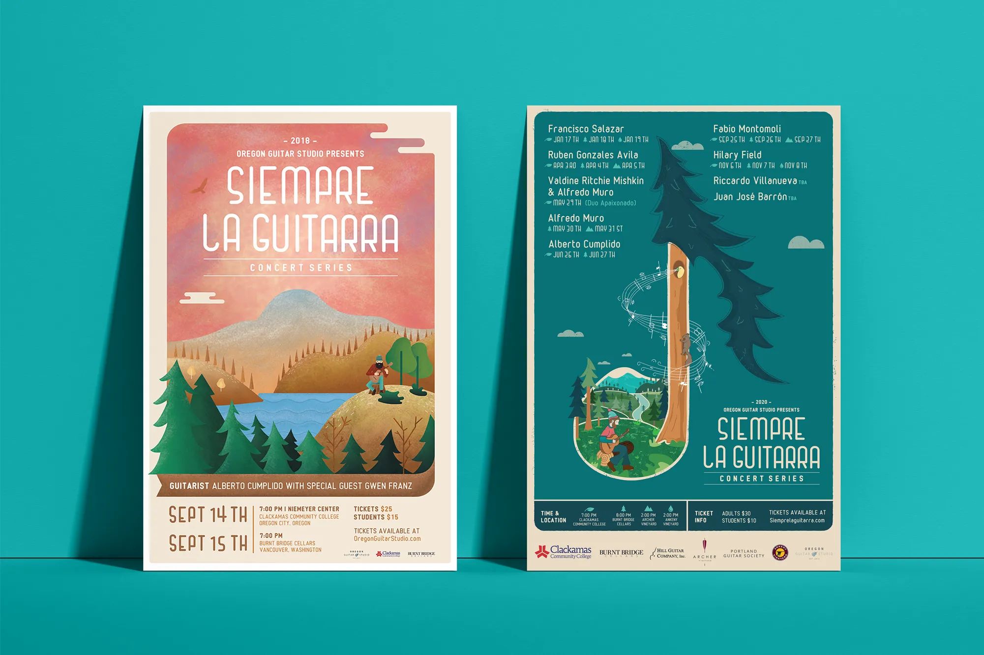
Music Visual Identity
Siempre La Guitarra
Siempre La Guitarra brings classical guitar to Pacific Northwest audiences with a level of programming care that demanded the same from their visual identity. We anchored the system in custom illustration, committing to handcrafted visual depth as the foundation rather than relying on typefaces and color palettes alone.
The challenge was building a system that could move by season without losing coherence or audience recognition. We established a visual framework that gives each new performer a distinct artistic expression while keeping the identity structurally intact for an audience that returns every season. That system extended into a full merchandise line: posters, apparel, guitar picks, and nail files that made the brand worth collecting.
View ProjectWhy Beaverton Businesses Need a Professional Visual Identity
A complete visual identity system gives your Beaverton business the brand infrastructure to compete with larger, more established players in one of the most active commercial markets in the metro.
- Compete With Larger Neighbors: Beaverton businesses share a market with some of the most recognizable brands in the country. A cohesive and polished visual identity closes the credibility gap between an independent business and its larger competition.
- Build Recognition in a Busy Market: Beaverton customers have options. A consistent visual identity makes your business the one they remember across every channel, from the road to social media to search results.
- Look the Part for a Sophisticated Buyer: The Beaverton customer base includes a significant professional and tech-sector demographic. A refined, intentional visual identity signals that your business operates at that same level.
Tea Visual Identity
Cup of Tea
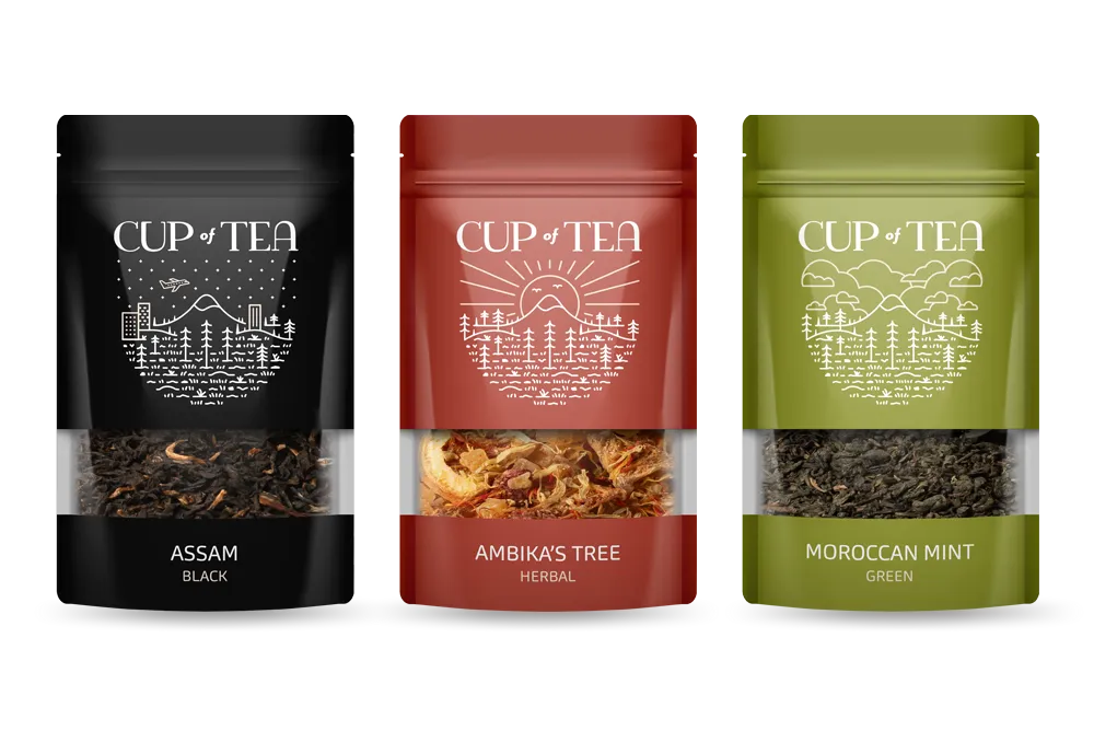
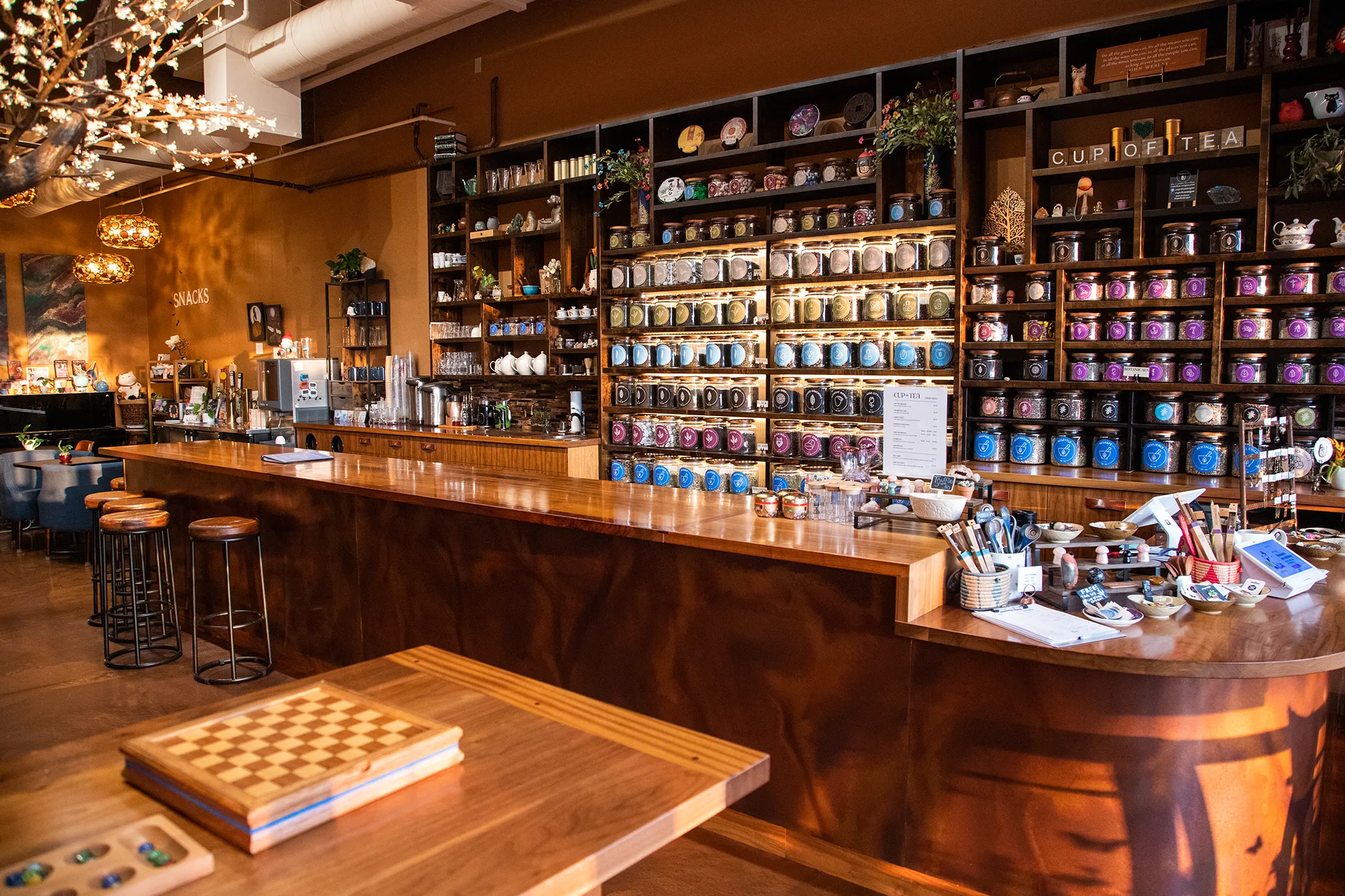
For Cup of Tea, the visual identity needed to do something most brand systems are never asked to do: serve as a navigation system for a product line of more than 150 loose-leaf teas while still operating as a compelling lifestyle brand. We built a 9-color identity that handles both, assigning each hue to a tea category so the color becomes functional as well as visual.
We extended that foundation across every channel the brand touches. A custom icon deck communicates individual tea qualities without text. Retail packaging carries the color system to every shelf label. Branded apparel and merchandise extend the identity beyond the shop floor. The final system is coherent, functional, and recognizable from the street to the social feed.
View ProjectOur Visual Identity Process
We take a holistic approach to design. We do not just pick colors that look nice. We build a system that works in the real world for Beaverton businesses and beyond.
01.
Visual Audit & Discovery
We start by looking at what you have and where you want to go. We analyze your competitors and discuss the mood you want to evoke. We define the aesthetic direction before we design a single pixel.
02.
System Development
We build the complete toolkit. Primary and secondary color palettes that pass accessibility standards. Typography that is legible and distinct. Supporting elements like icons, patterns, and photography guidelines that add depth.
03.
The Deliverable: Brand Guidelines
We package everything into a comprehensive Brand Style Guide. This is your brand's instruction manual. It explains exactly how to use your logo, which fonts to use, and how to apply your colors so anyone who touches your brand stays on track.
Frequently Asked Questions
Ready to Look the Part?
Let's Chat