
Visual Identity Design in Gresham
Gresham Businesses Are Earning Their Own Recognition
Gresham is the fourth largest city in Oregon, and it has spent too long being defined by its relationship to Portland rather than on its own terms. The businesses here are building something real, and they deserve a brand that reflects that. A scattered visual presence in a city this size does not just mean missing customers. It means ceding ground to competitors who are paying attention to how they look.
Graphicsbyte builds visual identity systems for Gresham businesses that give them a clear, consistent presence across every touchpoint. A complete brand system built to communicate who you are and what you stand for, whether a customer finds you locally or discovers you from across the metro.
See More Identity Systems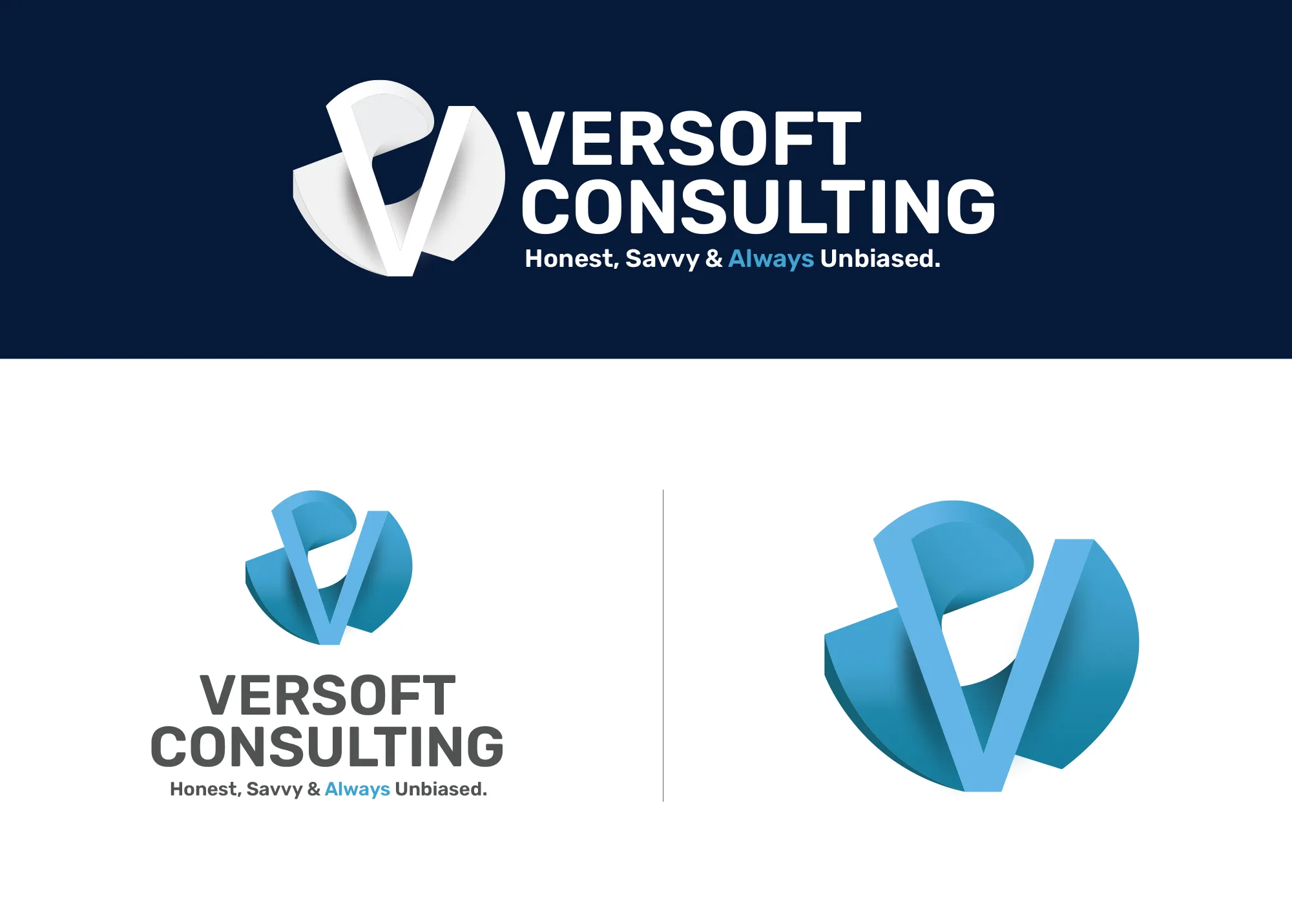
Visual Strategy
Versoft Consulting
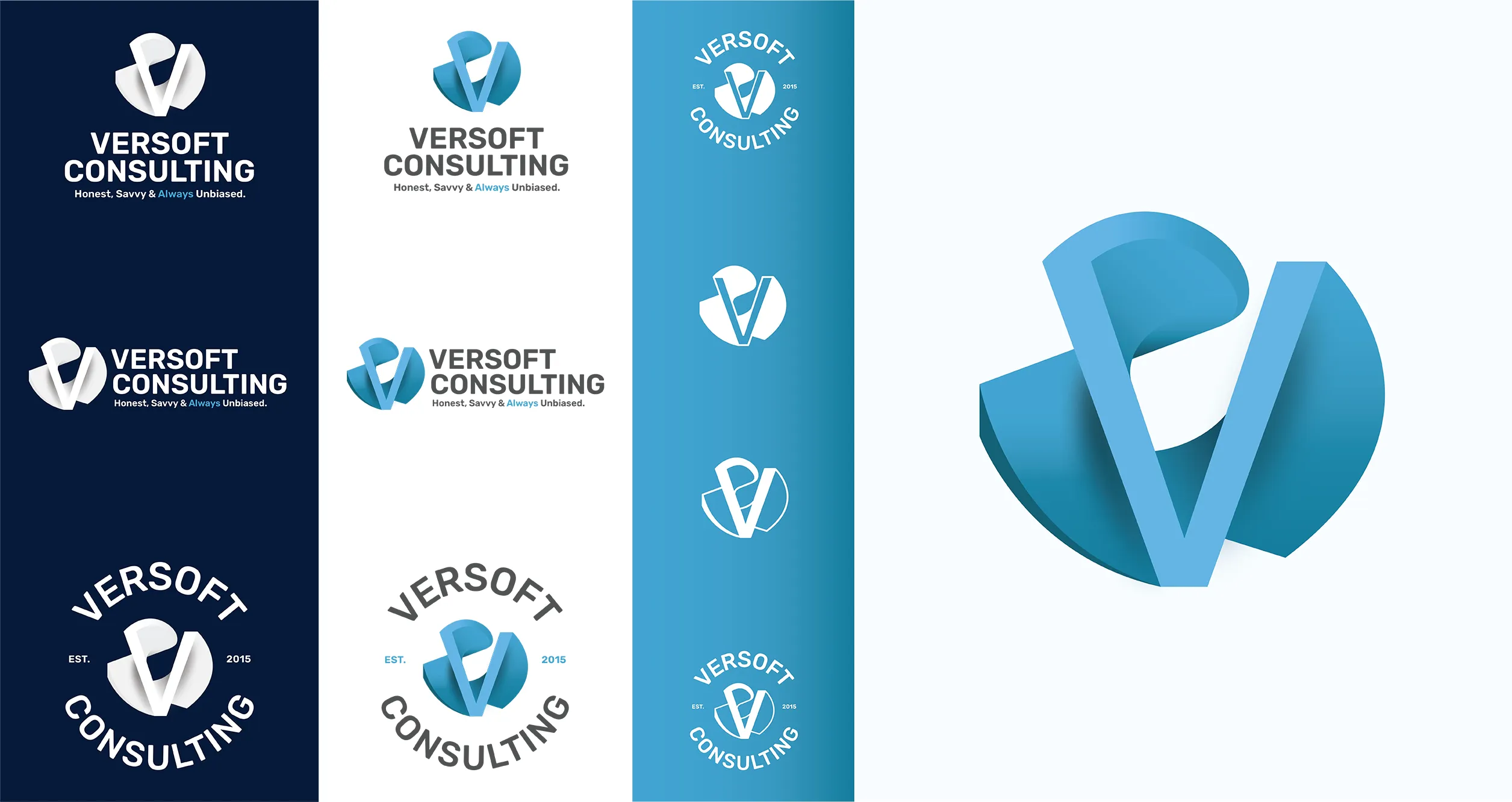
Versoft Consulting needed a visual identity that could hold its own in rooms where credibility is scrutinized. We built a dimensional V mark from architectural geometry, a form that reads as precise and deliberate while avoiding the sterile quality that makes some professional brands feel closed off to the people they are trying to reach.
We built the system for operational use, not just as a visual statement. Flat configurations handle laser-etched merchandise and screened print applications. Circular badge lockups cover apparel and branded goods. The full set of lockups gives Versoft a brand that works wherever they show up, without having to start from scratch each time something new comes up.
View Project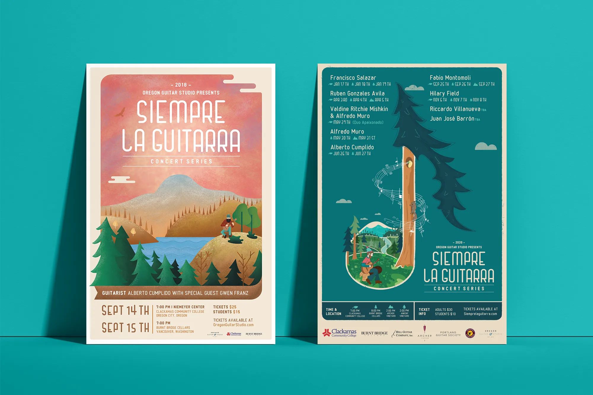
Music Visual Identity
Siempre La Guitarra
Siempre La Guitarra is a classical guitar concert series whose loyal Pacific Northwest following has grown season by season. That loyalty deserved an identity built with the same care as the performances themselves. We built it on custom illustration, creating a visual language that reflects artistic intent rather than falling back on what is easy or expected.
We structured the system for longevity. Each season brings a new visual expression within the Siempre framework, with illustration and color adapting to each performer while the underlying identity keeps the series recognizable across years of programming. The system extended into a full merchandise line: concert posters, apparel, guitar picks, and nail files that audiences actually want to hold on to.
View ProjectWhy Gresham Businesses Need a Defined Visual Identity
A visual identity system gives your Gresham business a brand foundation that builds recognition in a large and diverse market.
- Stand Out in a Large Market: Gresham is big enough that visual consistency is a real differentiator. A cohesive and polished visual identity makes your business identifiable and memorable across a city where plenty of others are competing for the same customers.
- Build a Brand That Travels: Many Gresham businesses serve customers from across the east Portland metro. A defined visual system ensures your brand presents the same way no matter where a customer encounters it.
- Earn Trust in a Diverse Community: Gresham has one of the most diverse customer bases in the region. A clear and confident visual identity communicates professionalism and credibility across every segment of that community.
Tea Visual Identity
Cup of Tea
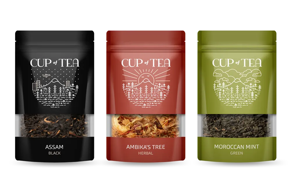
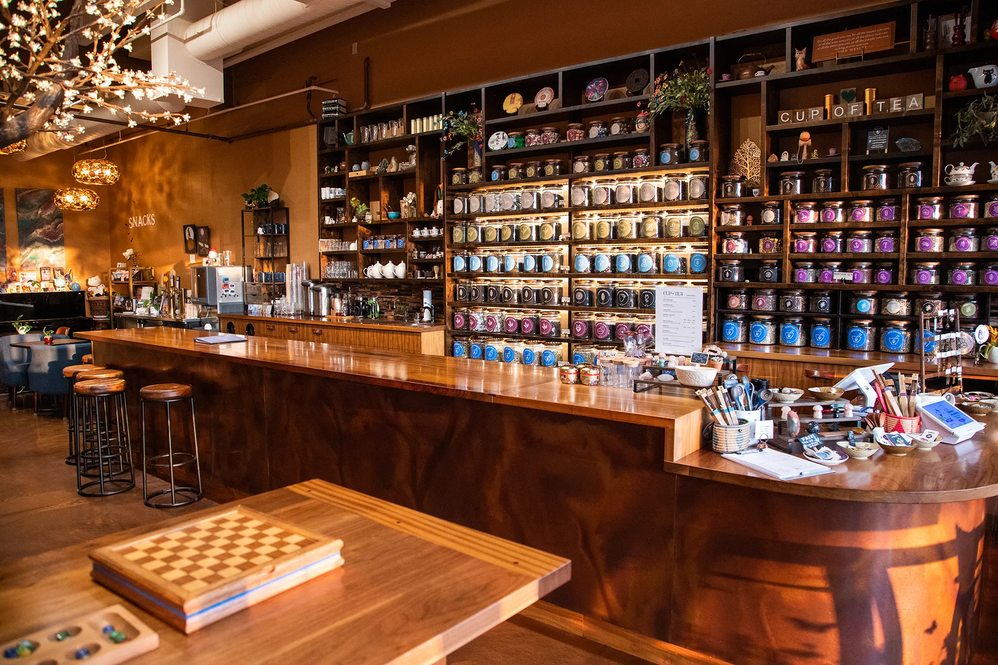
Cup of Tea is a specialty tea shop with over 150 loose-leaf varieties and an identity problem to match: how do you give customers a navigable experience without visual chaos? We built a 9-color system where each hue maps to a specific type of tea, turning the brand palette into a functional wayfinding tool embedded directly into the identity itself.
We applied that logic across every format. Custom icon sets make individual tea qualities readable at a glance on packaging and signage. Retail labels carry the color system onto every shelf. Apparel extends the brand into daily life. What emerged is a visual system that is as practical as it is distinctive, making the shop experience clearer and the brand more memorable.
View ProjectOur Visual Identity Process
We take a holistic approach to design. We do not just pick colors that look nice. We build a system that works in the real world for Gresham businesses and beyond.
01.
Visual Audit & Discovery
We start by looking at what you have and where you want to go. We analyze your competitors and discuss the mood you want to evoke. We define the aesthetic direction before we design a single pixel.
02.
System Development
We build the complete toolkit. Primary and secondary color palettes that pass accessibility standards. Typography that is legible and distinct. Supporting elements like icons, patterns, and photography guidelines that add depth.
03.
The Deliverable: Brand Guidelines
We package everything into a comprehensive Brand Style Guide. This is your brand's instruction manual. It explains exactly how to use your logo, which fonts to use, and how to apply your colors so anyone who touches your brand stays on track.
Frequently Asked Questions
Ready to Look the Part?
Let's Chat