
Visual Identity Design in Clackamas
Clackamas Businesses Have Volume. Make Sure They Have Recognition.
Clackamas is a commercial crossroads. High traffic, dense retail, and a mix of businesses competing for the same customers in the same corridors. In that environment, looking like everyone else is the default. A disjointed visual identity gets absorbed into the background the same way a generic storefront does. The businesses that get remembered are the ones with a consistent, recognizable brand.
Graphicsbyte builds visual identity systems that give Clackamas businesses a clear visual presence across every channel. A unified color palette, typography, logo system, and usage guidelines that make your brand consistent whether a customer finds you in store, online, or in their feed.
See More Identity Systems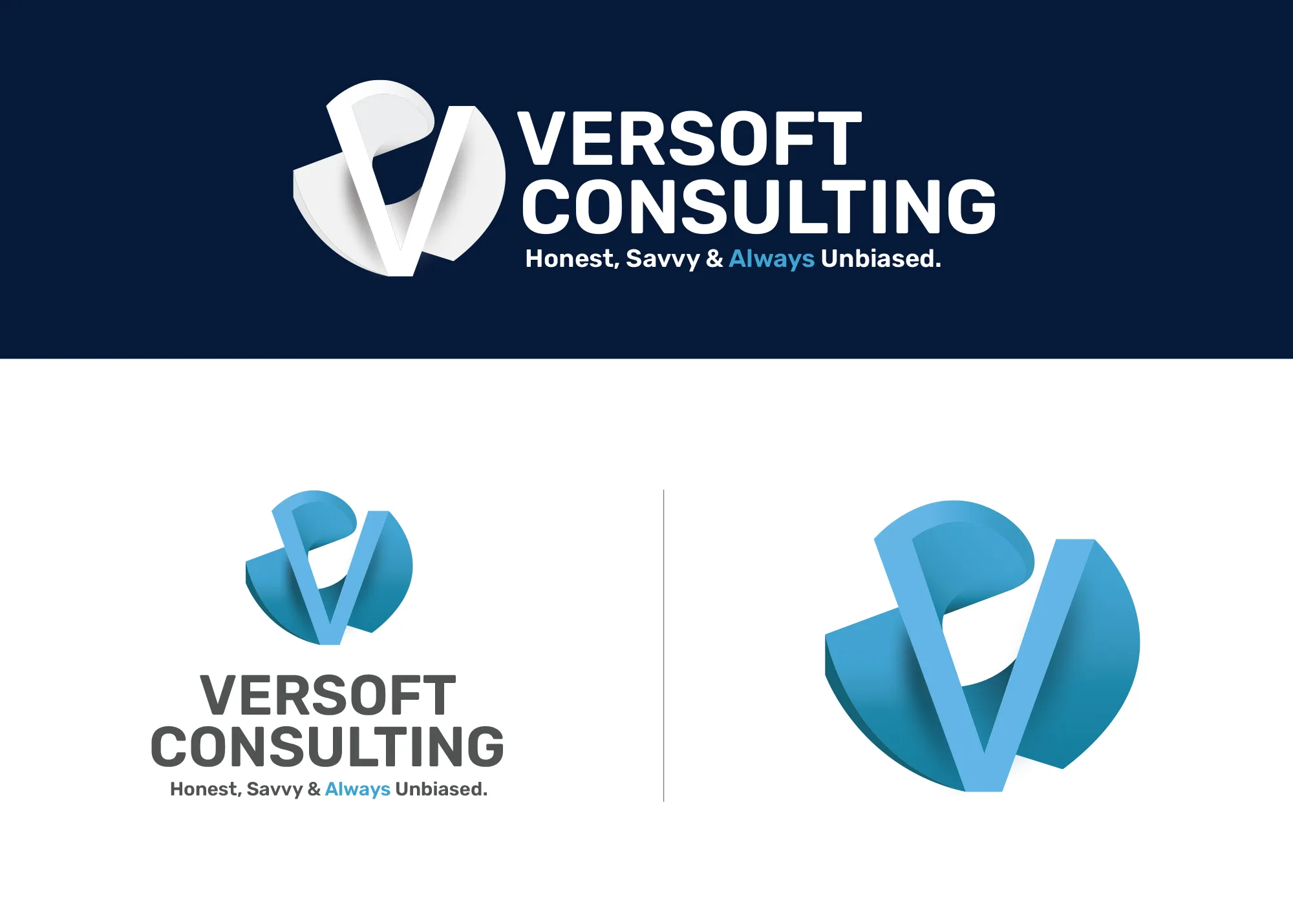
Visual Strategy
Versoft Consulting
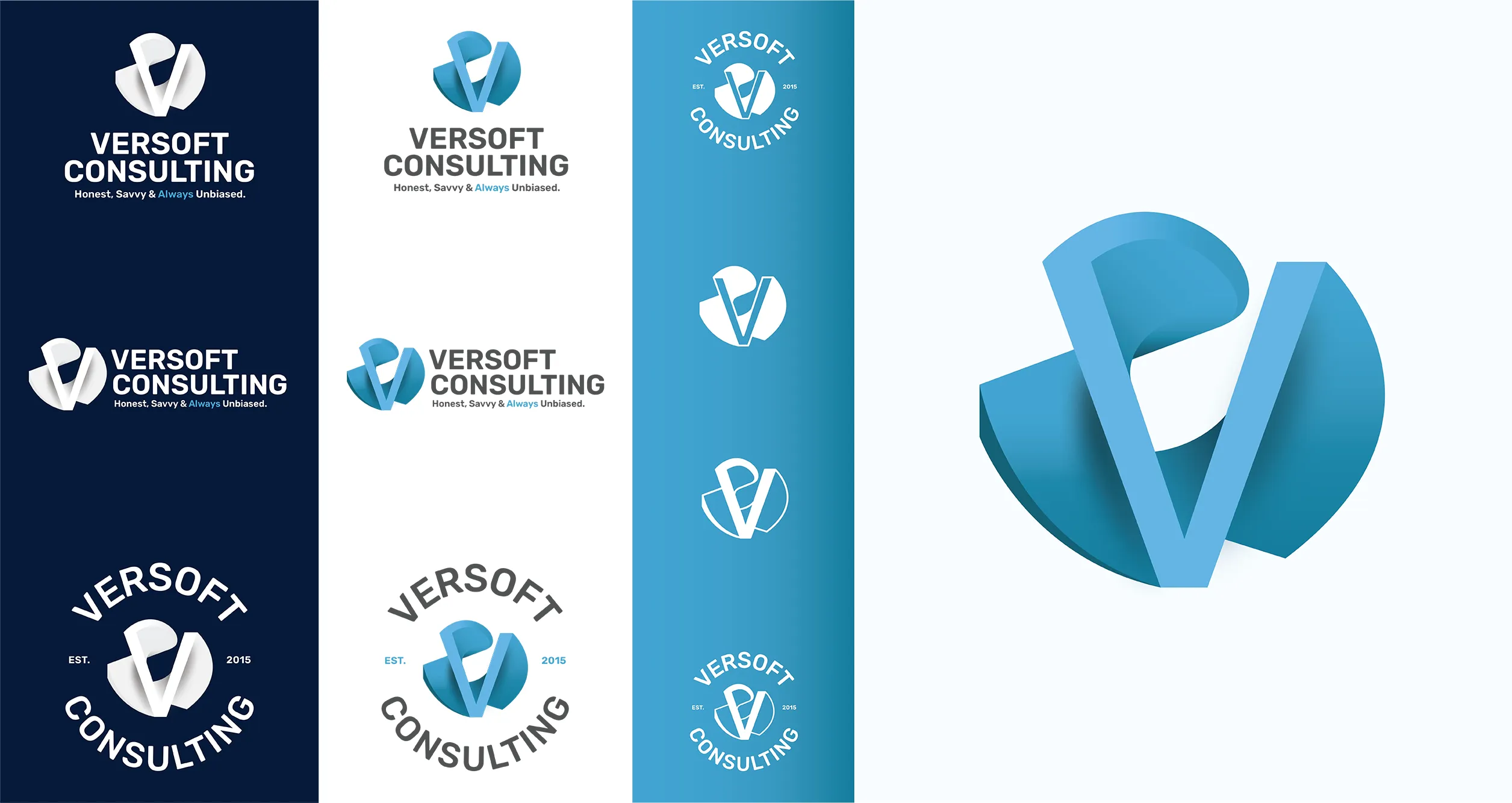
Versoft Consulting sits in a market that rewards credibility. Their clients make decisions based on trust, and a brand that looks imprecise undermines the message before a conversation starts. We built a dimensional V mark grounded in architectural geometry, a form that communicates structural thinking and attention to detail without feeling cold.
The identity system covers every application from screened office signage to laser-etched hardware to embroidered apparel. Flat configurations handle materials that require clean silhouettes. Circular badge forms work for merchandise and branded clothing. The system holds up across formats without needing adaptation every time something new comes up.
View Project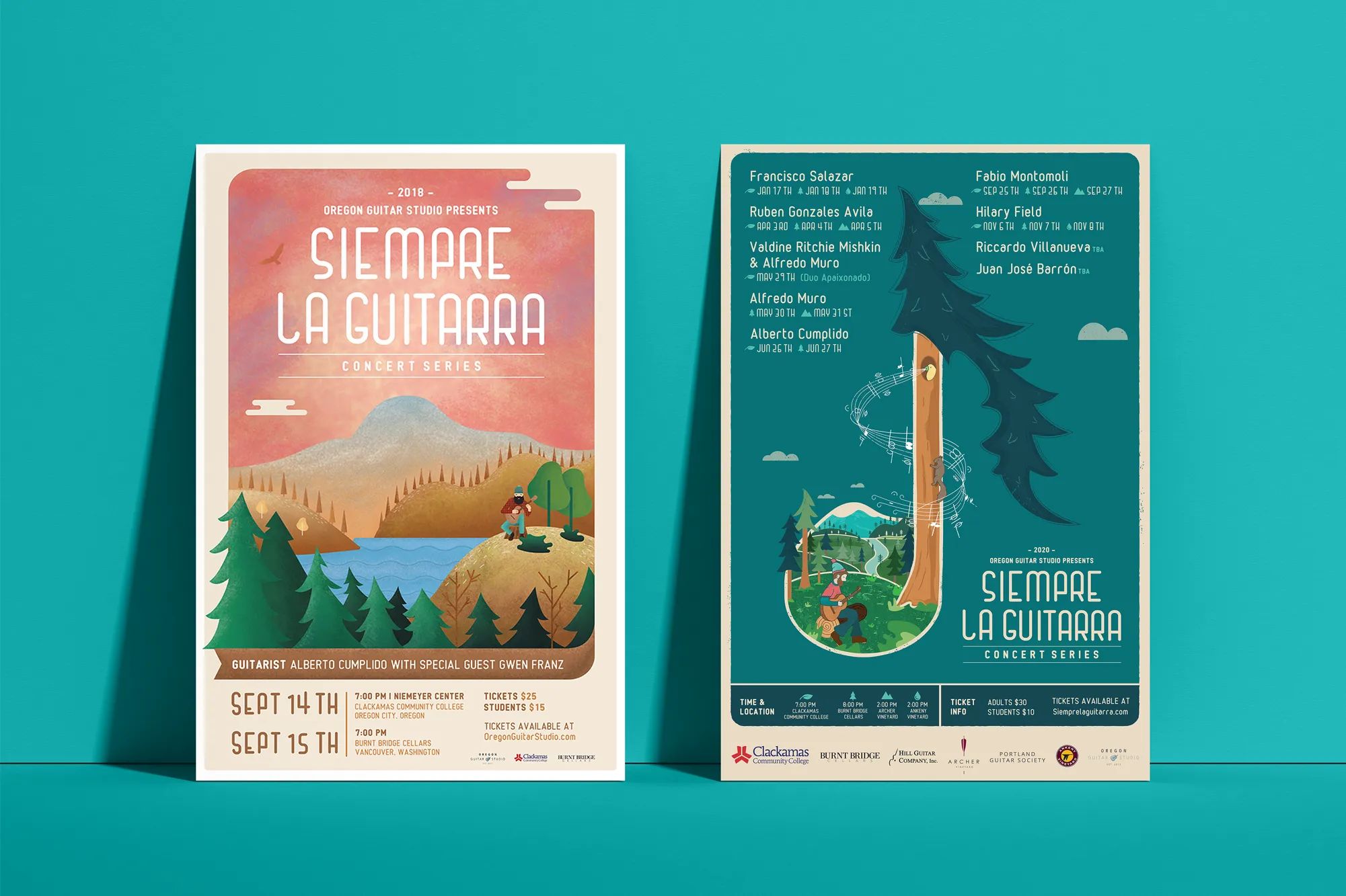
Music Visual Identity
Siempre La Guitarra
Classical guitar concert series Siempre La Guitarra needed a visual identity that matched the depth of what they do. Generic design elements were not going to work here. We built the system on original custom illustration, giving the brand the kind of visual complexity that earns a second look and holds up across years of programming and seasonal change.
The identity was built to grow with the series. Each season gets a distinct visual expression within the framework, adapting illustration style and color to reflect each new performer while the underlying system keeps everything recognizably Siempre. We took that system into a full merchandise line including posters, clothing, guitar picks, and nail files.
View ProjectWhy Recognition Matters in a High-Traffic Market Like Clackamas
A cohesive visual identity gives your Clackamas business the kind of presence that cuts through commercial noise and turns foot traffic into repeat customers.
- Cut Through Commercial Density: Clackamas has no shortage of businesses competing for the same customers. A sharp, consistent visual identity makes your brand immediately recognizable in a crowded market where most brands blend together.
- Turn Exposure Into Recognition: High traffic means nothing if your brand is forgettable. A defined visual system makes each impression build on the last, turning passing awareness into genuine recognition.
- Create Consistency Across Locations and Channels: Whether a customer sees you on the highway, at the mall, or on social media, the experience should feel like the same brand. A visual identity system makes that consistency automatic.

Tea Visual Identity
Cup of Tea
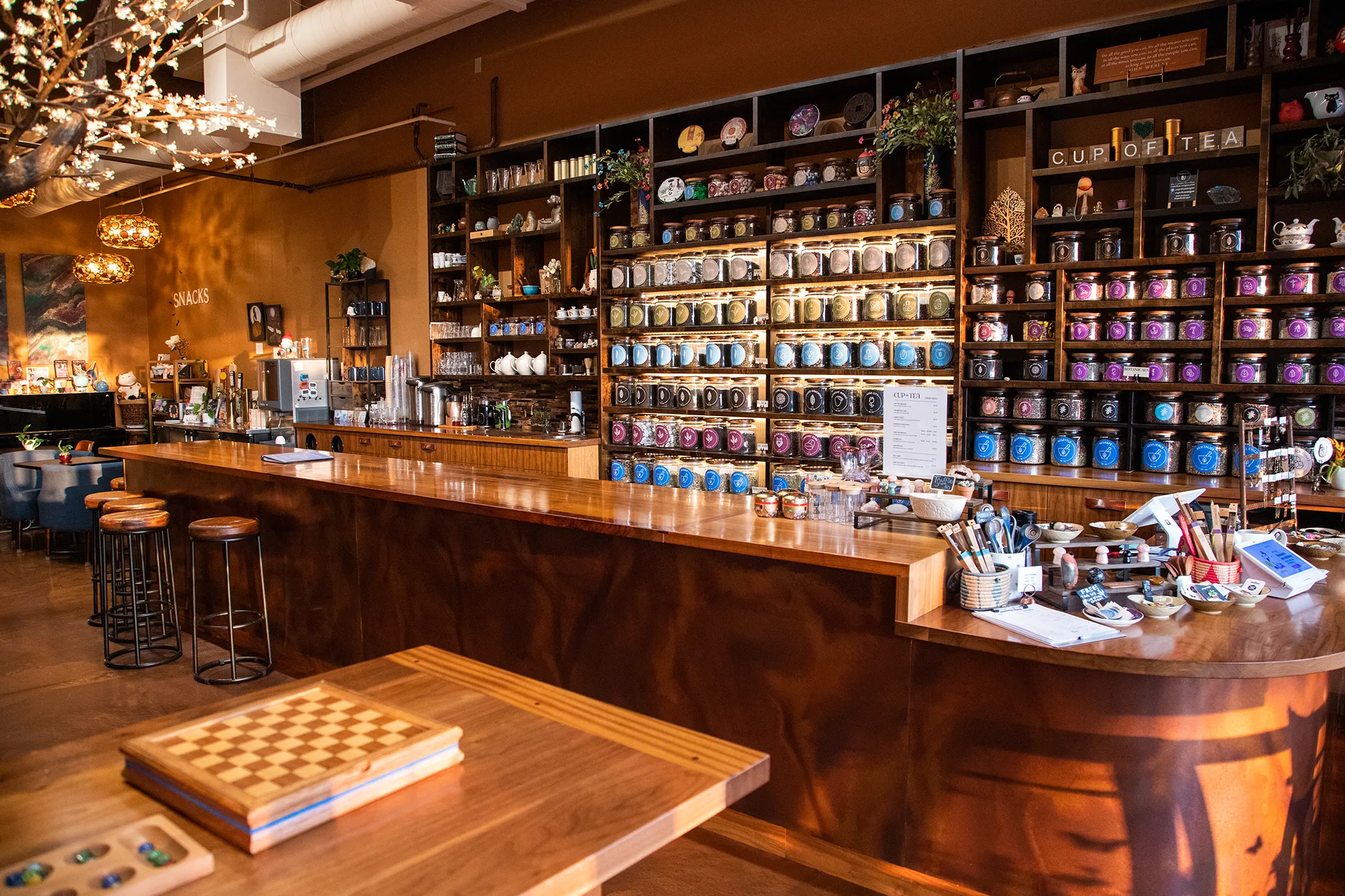
Cup of Tea is a specialty tea shop with a product range that most visual systems would struggle to hold together. We approached it as an organizational design problem: how do you build a brand that makes 150-plus loose-leaf teas feel navigable rather than overwhelming? The answer was a 9-color identity system, each color assigned to a specific tea category.
The color system formed the backbone, and we built outward from there. A custom icon deck translated individual tea qualities into visual shorthand for packaging and signage. Retail packaging applied the full color system to every product label on the shelf. Apparel extended the brand beyond the shop floor. The result is a brand that functions as a tool and a lifestyle simultaneously.
View ProjectOur Visual Identity Process
We take a holistic approach to design. We do not just pick colors that look nice. We build a system that works in the real world for Clackamas businesses and beyond.
01.
Visual Audit & Discovery
We start by looking at what you have and where you want to go. We analyze your competitors and discuss the mood you want to evoke. We define the aesthetic direction before we design a single pixel.
02.
System Development
We build the complete toolkit. Primary and secondary color palettes that pass accessibility standards. Typography that is legible and distinct. Supporting elements like icons, patterns, and photography guidelines that add depth.
03.
The Deliverable: Brand Guidelines
We package everything into a comprehensive Brand Style Guide. This is your brand's instruction manual. It explains exactly how to use your logo, which fonts to use, and how to apply your colors so anyone who touches your brand stays on track.
Frequently Asked Questions
Ready to Look the Part?
Let's Chat