
Visual Identity Design in Tigard
Tigard Has the Traffic. Your Brand Needs to Convert It.
Tigard is one of the most commercially active suburbs in the Portland metro. The density of businesses here means customers have options, and the ones they choose are not always the best. They are the most recognizable. A business with a clear, consistent visual identity has a structural advantage over competitors still working with a scattered brand presence.
Graphicsbyte builds visual identity systems for Tigard businesses that make recognition work for you. A complete brand system, from your logo suite and color palette to your typography and guidelines, designed to present the same story everywhere your customers find you.
See More Identity Systems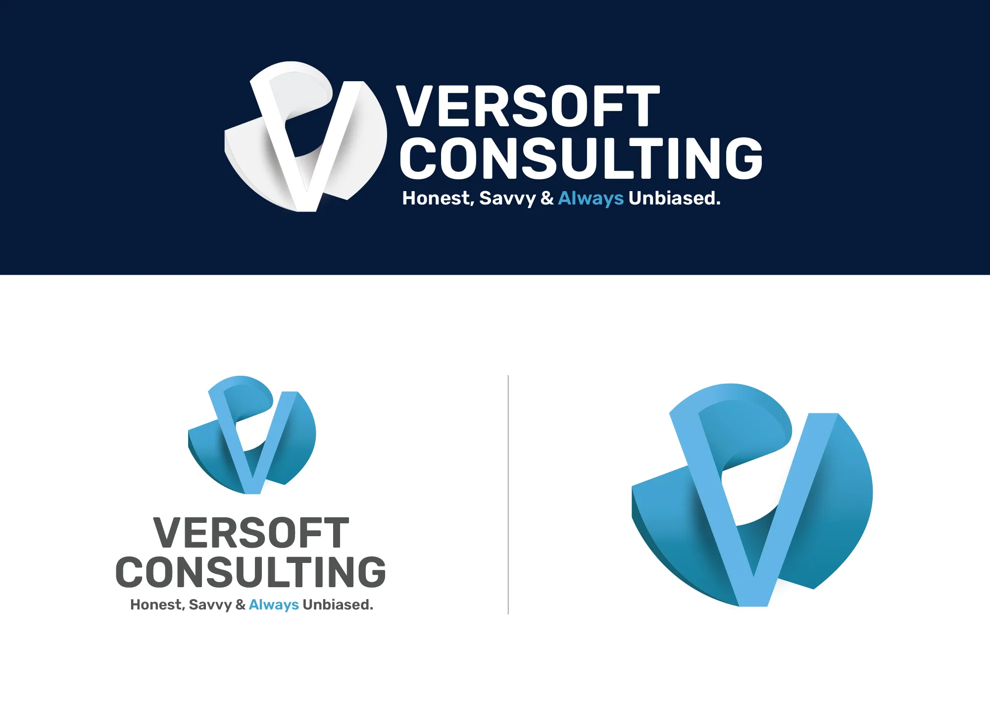
Visual Strategy
Versoft Consulting
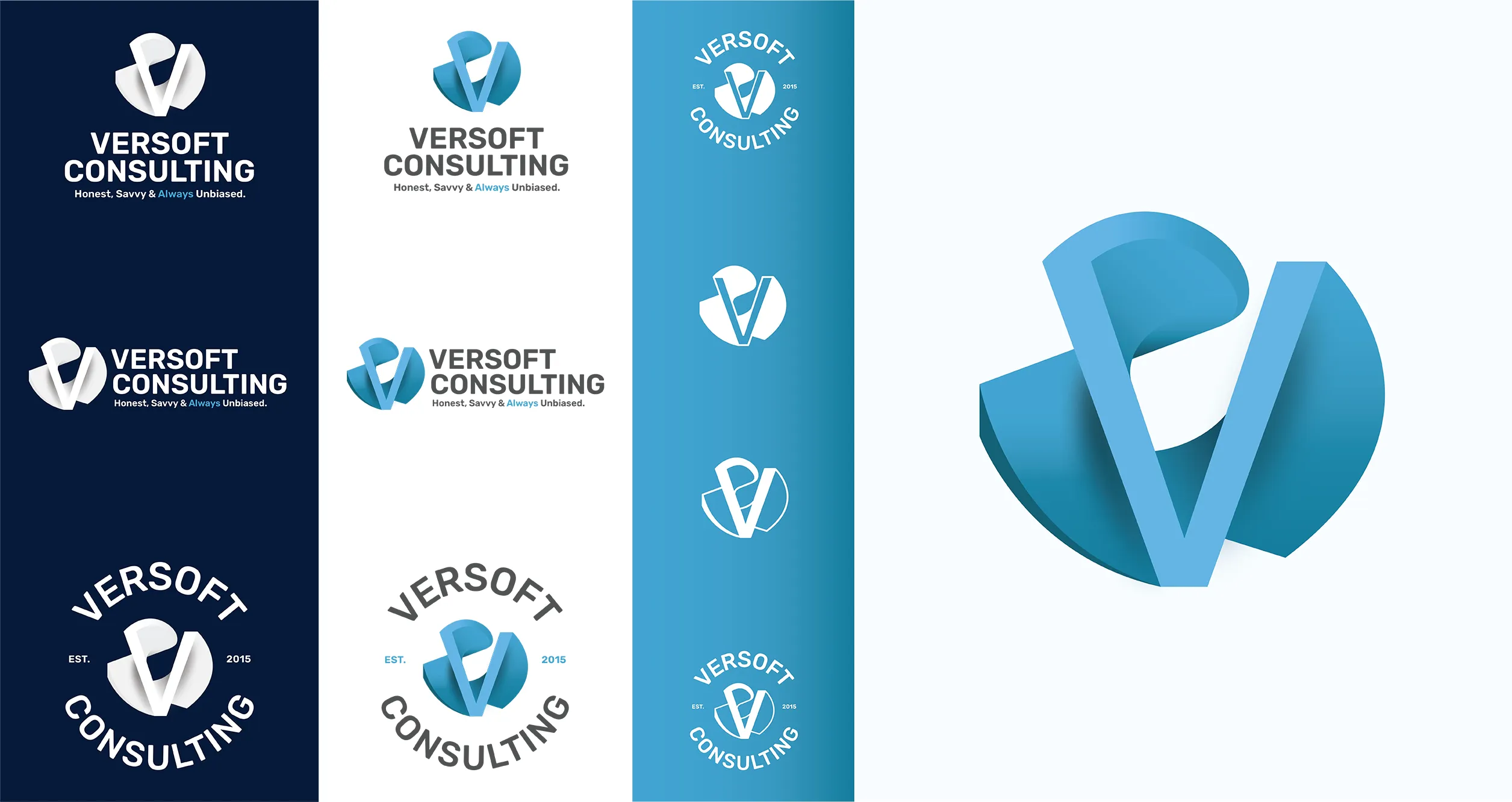
The Versoft Consulting identity needed to do two things simultaneously: earn trust in financial and technology sectors while remaining approachable to new clients who are still deciding. We solved that with a dimensional V mark built from architectural geometry, precise in its construction and considered in proportion from every angle.
Versatility was built into the system from the start. The full lockup suite includes configurations optimized for digital display, for laser etching applications, and for apparel and merchandise. Each version maintains the integrity of the mark regardless of scale, format, or material it is applied to.
View Project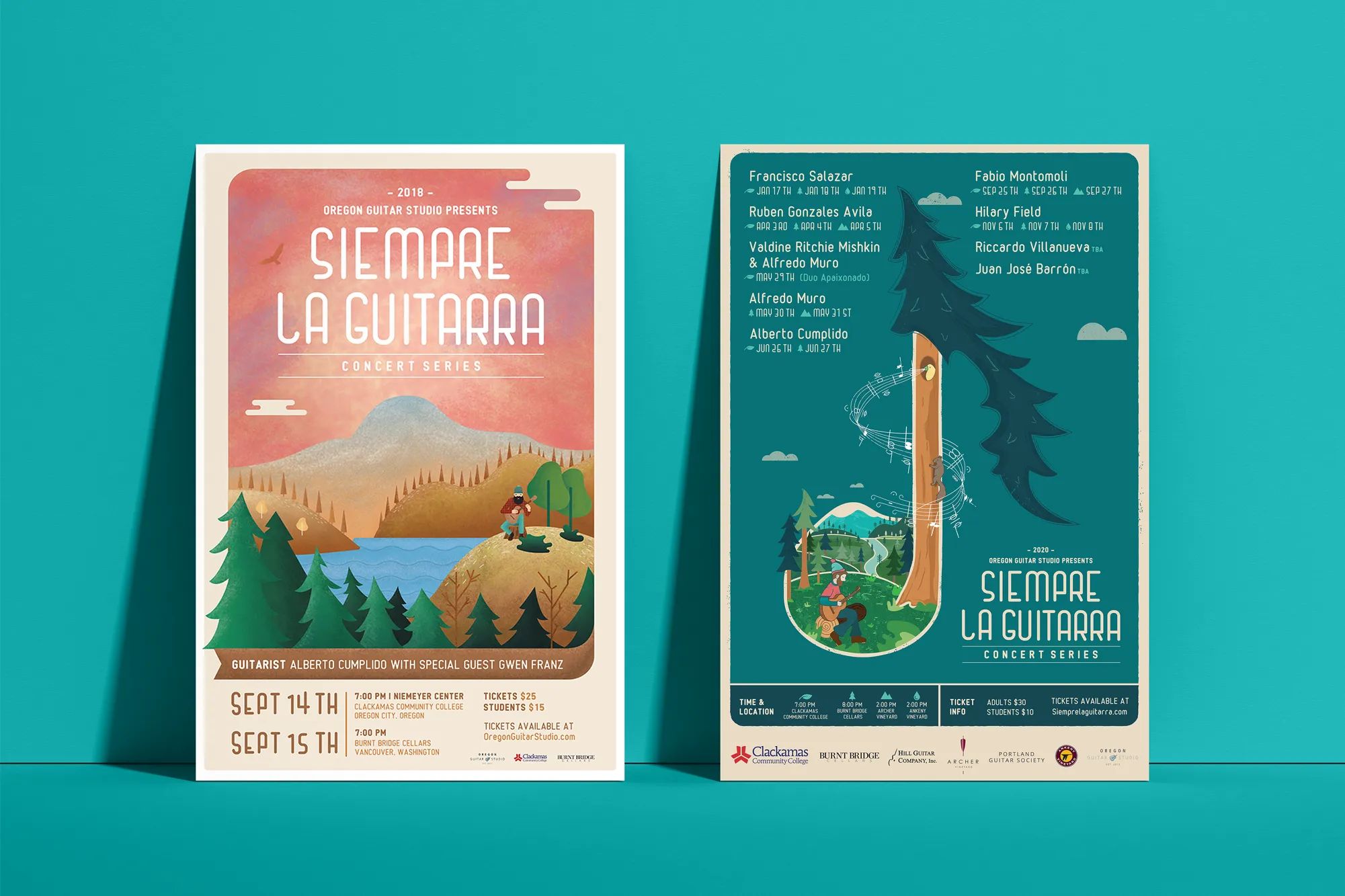
Music Visual Identity
Siempre La Guitarra
Siempre La Guitarra is a classical guitar concert series that brings Pacific Northwest audiences something worth returning to season after season. A one-size-fits-all visual approach would have flattened that loyalty rather than rewarding it. We built the identity on custom illustration, creating a visual system that reflects the same level of craft the series brings to its programming.
The challenge was building a system that could move by season without losing coherence. We established a visual framework that gives each new performer a distinct artistic expression while keeping the identity structurally intact for an audience that returns every season. That system extended into full merchandise: concert posters, apparel, guitar picks, and nail files.
View ProjectWhy Tigard Businesses Need a Complete Visual Identity
In a dense, competitive market like Tigard, a visual identity system is not a luxury. It is the infrastructure that makes your brand work consistently across every customer interaction.
- Win the First Impression: Tigard customers move fast and have plenty of choices. A consistent and polished visual identity makes your business the one that registers, whether they see you on the road, online, or walking past your location.
- Build Loyalty Through Consistency: Customers come back to brands they recognize and trust. A cohesive visual system makes every interaction feel familiar, which builds the kind of loyalty that is hard for competitors to replicate.
- Create a Brand That Works Across Channels: From dense commercial corridors to social media and search, Tigard businesses reach customers in multiple contexts. A defined visual identity makes sure every channel tells the same story.
Tea Visual Identity
Cup of Tea
Siempre La Guitarra has a performing arts audience that brings real aesthetic expectations to every touchpoint. We built their visual identity around custom illustration, a choice that immediately communicated the artistic investment the series makes in everything it does.
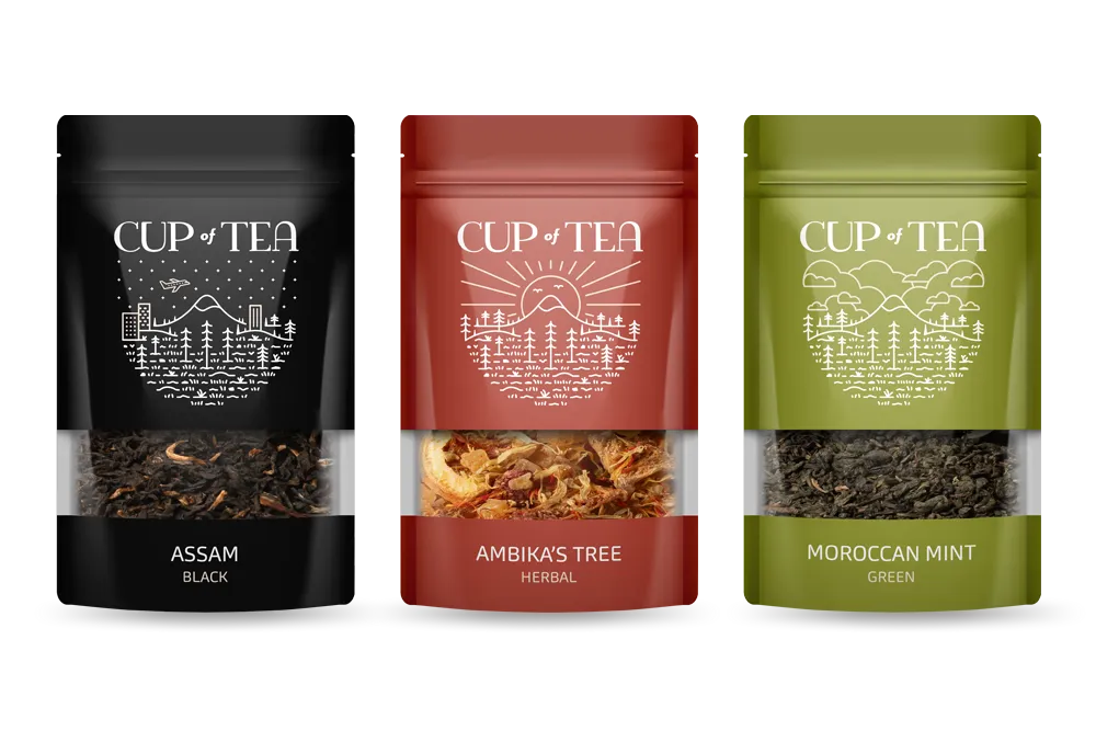
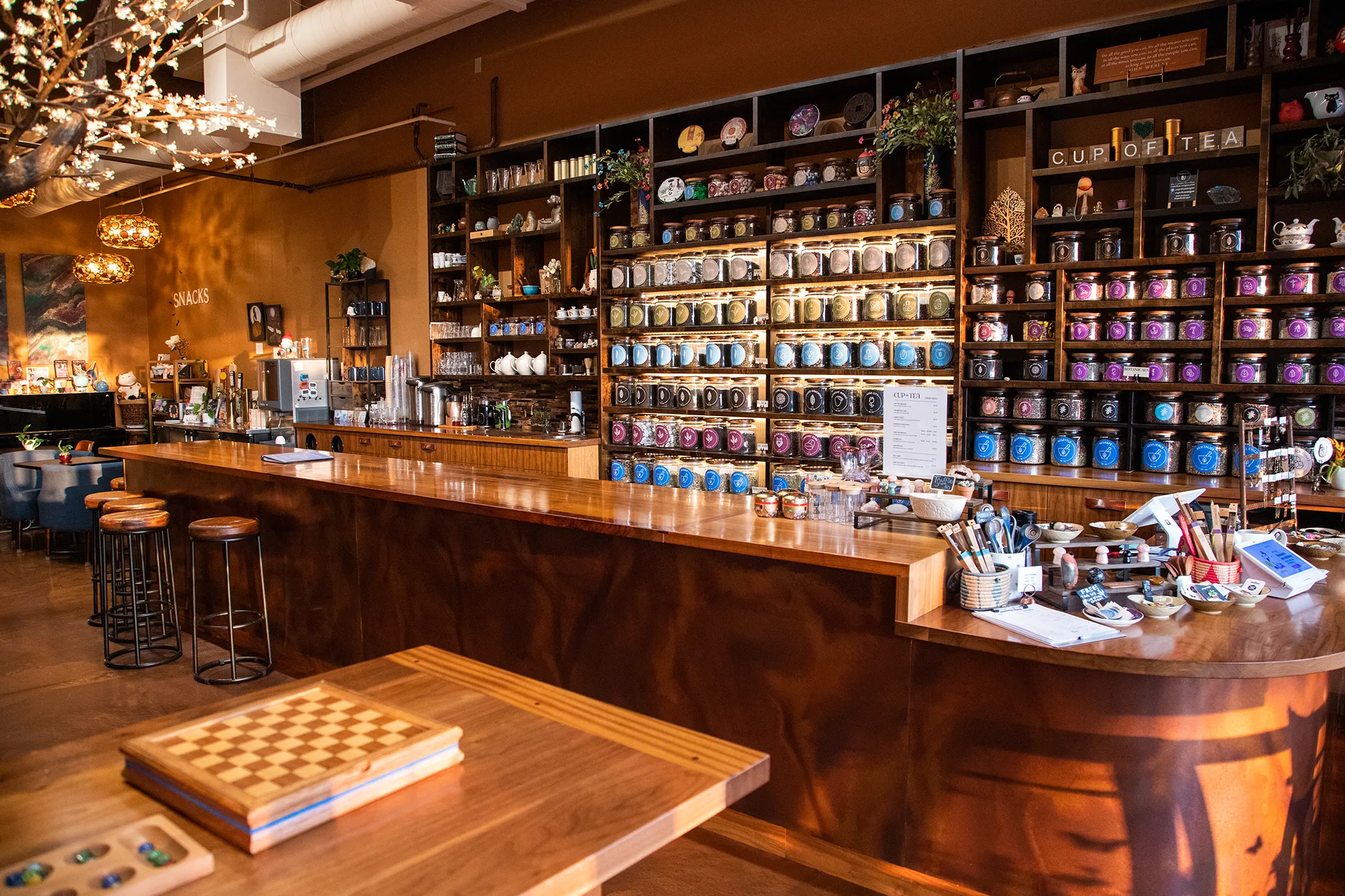
Cup of Tea needed a visual identity that could hold together a product line of over 150 loose-leaf varieties without forcing customers to work to understand it. We built a 9-color system where each color is mapped to a tea genre, creating an intuitive visual index that makes the selection process feel natural. Custom icon sets, retail packaging, and branded apparel extended the system across every touchpoint the shop occupies.
View ProjectOur Visual Identity Process
We take a holistic approach to design. We do not just pick colors that look nice. We build a system that works in the real world for Tigard businesses and beyond.
01.
Visual Audit & Discovery
We start by looking at what you have and where you want to go. We analyze your competitors and discuss the mood you want to evoke. We define the aesthetic direction before we design a single pixel.
02.
System Development
We build the complete toolkit. Primary and secondary color palettes that pass accessibility standards. Typography that is legible and distinct. Supporting elements like icons, patterns, and photography guidelines that add depth.
03.
The Deliverable: Brand Guidelines
We package everything into a comprehensive Brand Style Guide. This is your brand's instruction manual. It explains exactly how to use your logo, which fonts to use, and how to apply your colors so anyone who touches your brand stays on track.
Frequently Asked Questions
Ready to Look the Part?
Let's Chat