
Visual Identity Design in Lake Oswego
Lake Oswego Businesses Compete at a Higher Level
The bar is higher in Lake Oswego. Customers here are discerning, and the businesses that earn their trust look the part before they say a word. A mismatched brand in this market is more than an aesthetic problem. It signals that attention to detail stops at the surface, which is exactly the wrong message for a business built on quality.
Graphicsbyte builds visual identity systems for Lake Oswego businesses that reflect the standard your customers expect. A cohesive logo suite, refined color palette, and consistent typography applied across every touchpoint so your brand presence matches the level of work you actually deliver.
See More Identity Systems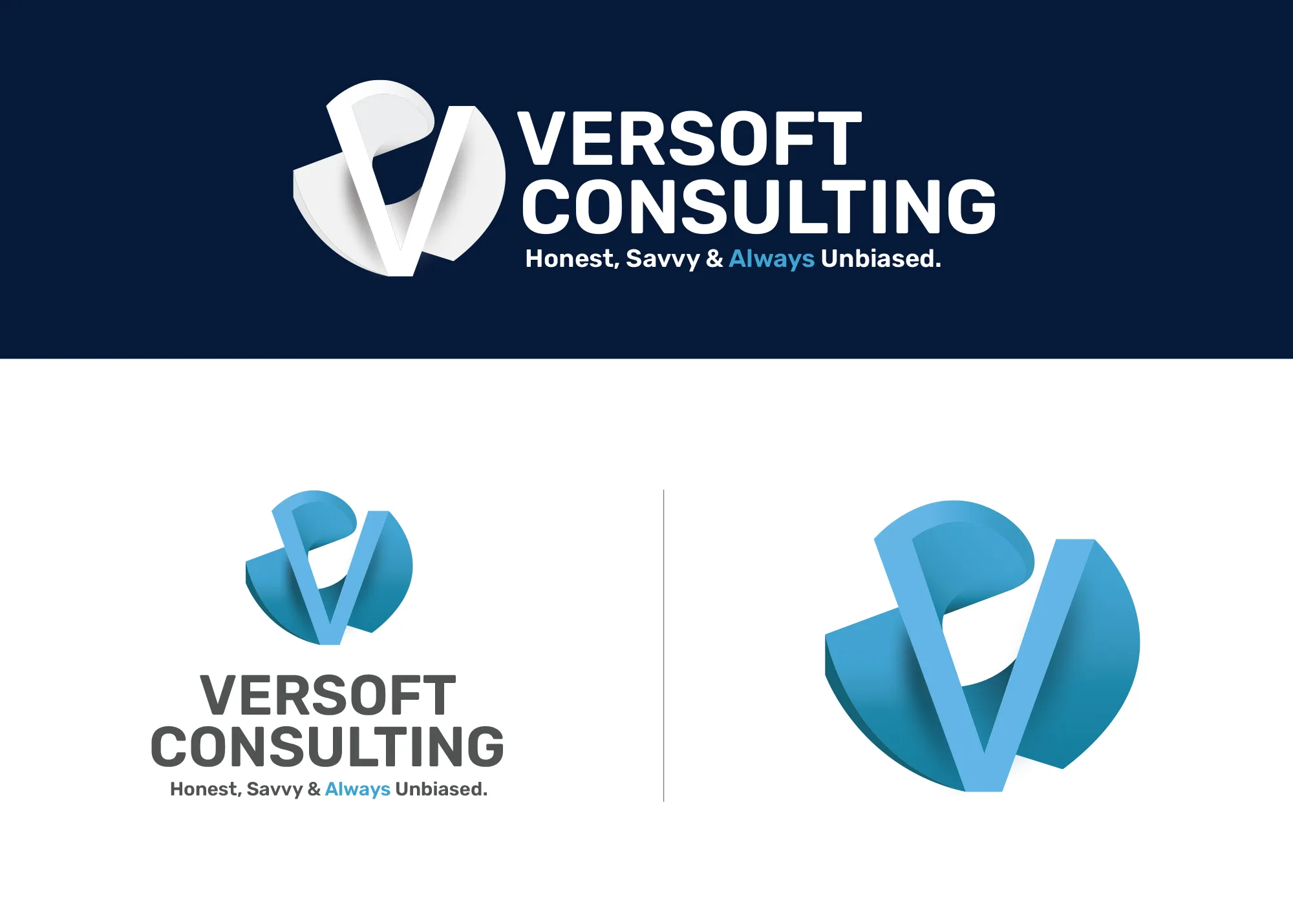
Visual Strategy
Versoft Consulting
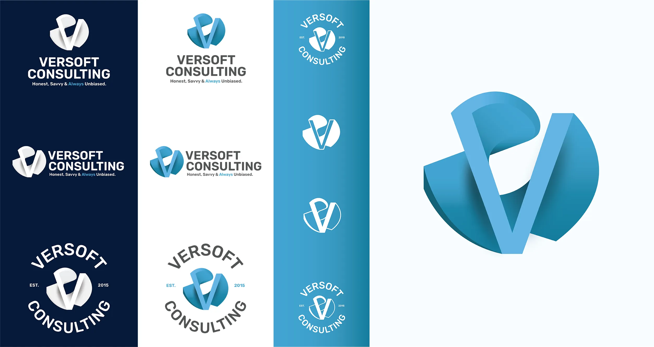
The Versoft Consulting identity started with a brief that is harder than it sounds: sophisticated enough for financial clients, approachable enough to not intimidate. The solution was a geometric V mark pulled from architectural forms, dimensional in its construction and neutral enough to carry weight in any professional context.
We built the system to flex. Multiple lockup configurations handle every application cleanly. Laser-etch-ready flat versions for corporate merchandise, circular badge forms for apparel, and a complete set of usage specifications so the brand holds up without micromanagement at every step.
View Project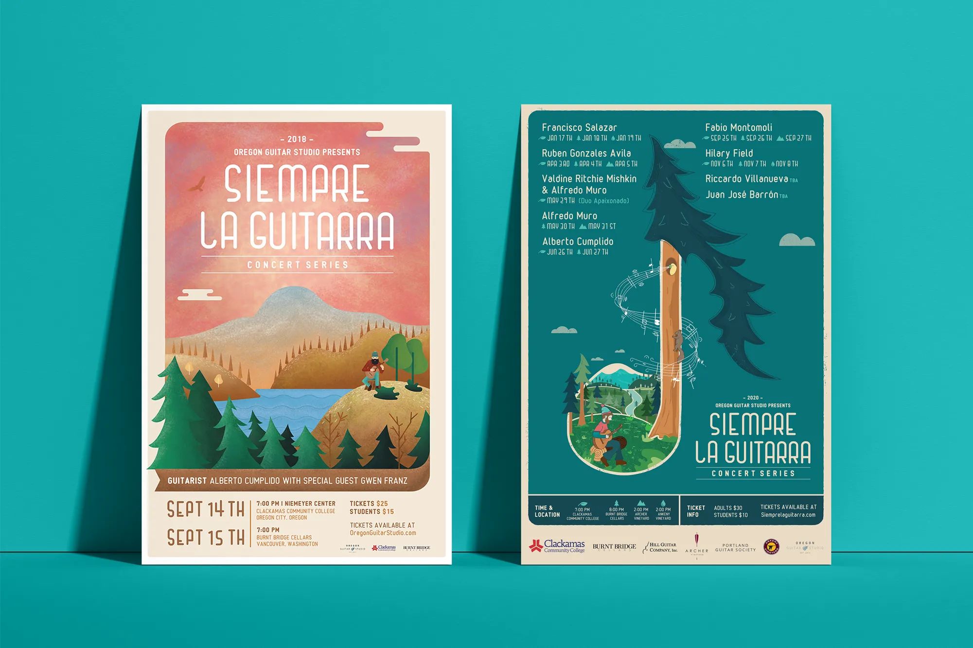
Music Visual Identity
Siempre La Guitarra
For Siempre La Guitarra, a Pacific Northwest classical guitar concert series, the visual identity needed to match the artistry of the performances themselves. We centered the system around original illustration, giving the brand a handcrafted depth that stock visuals could never achieve.
The system was designed to flex by season. Each new performer brings a new visual expression within the same brand framework, so the identity stays fresh without losing the thread of recognition that their audience has developed over years. We extended everything into merchandise: posters, apparel, guitar picks, and nail files that turned the brand into something fans want to own.
View ProjectWhy Lake Oswego Businesses Invest in Visual Identity
In a market where reputation travels fast and first impressions carry real weight, a complete visual identity system gives your Lake Oswego business a competitive edge that compounds over time.
- Match the Standard Your Market Expects: Lake Oswego buyers are experienced and they notice the difference between a polished brand and a patchwork one. A consistent visual identity positions your business at the level your work deserves.
- Support Premium Positioning: A refined visual identity reinforces the value behind your price point. When your brand looks intentional and considered, customers are more confident in what they are paying for.
- Stand Out Before the Conversation Starts: In a referral-driven market, your brand often gets seen before you do. A strong visual identity makes sure that first impression works in your favor.
Tea Visual Identity
Cup of Tea
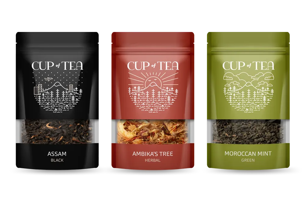
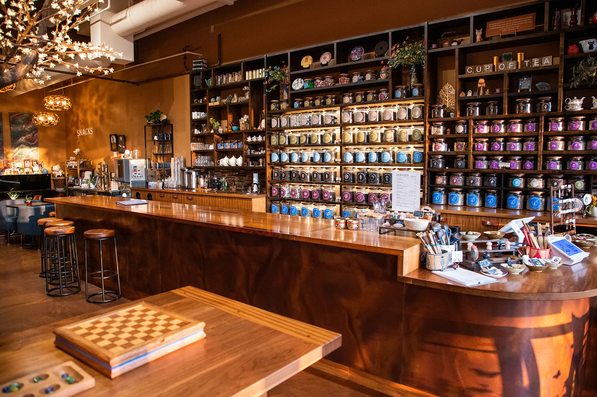
Cup of Tea carries over 150 loose-leaf tea varieties and needed a visual identity that could bring order to that scope without making the experience feel clinical. We built a 9-color system where each color corresponds to a specific type of tea, giving customers an intuitive way to find what they are looking for before they read a single word of text.
We extended that color architecture across every touchpoint: custom icon decks that communicate tea characteristics visually, retail packaging that carries the system to the shelf, and a full apparel line that brought the brand into the everyday lives of their regulars. What started as a color organization system became the backbone of an entire brand world.
View ProjectOur Visual Identity Process
We take a holistic approach to design. We do not just pick colors that look nice. We build a system that works in the real world for Lake Oswego businesses and beyond.
01.
Visual Audit & Discovery
We start by looking at what you have and where you want to go. We analyze your competitors and discuss the mood you want to evoke. We define the aesthetic direction before we design a single pixel.
02.
System Development
We build the complete toolkit. Primary and secondary color palettes that pass accessibility standards. Typography that is legible and distinct. Supporting elements like icons, patterns, and photography guidelines that add depth.
03.
The Deliverable: Brand Guidelines
We package everything into a comprehensive Brand Style Guide. This is your brand's instruction manual. It explains exactly how to use your logo, which fonts to use, and how to apply your colors so anyone who touches your brand stays on track.
Frequently Asked Questions
Ready to Look the Part?
Let's Chat