
Visual Identity Design in West Linn
West Linn Businesses Build on Reputation
West Linn runs on word of mouth. It is a community where people talk, where recommendations travel from one neighbor to the next, and where a business that looks put-together earns a longer look. When your visual identity is scattered, that reputation gap costs you before you ever have a conversation.
Graphicsbyte builds visual identity systems for West Linn businesses that make every touchpoint work as hard as you do. From your logo suite and color palette to your typography and usage guidelines, every piece of the system reinforces the same clear impression of who you are and what you stand for.
See More Identity Systems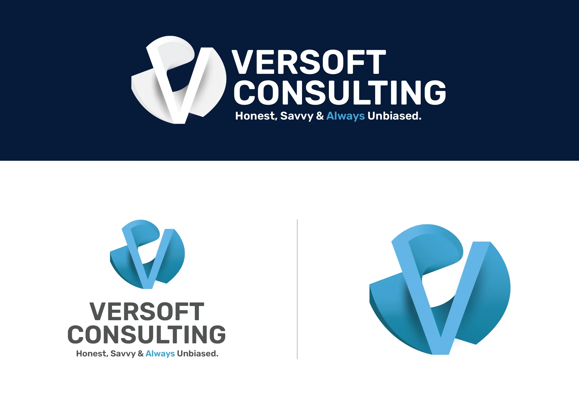
Visual Strategy
Versoft Consulting
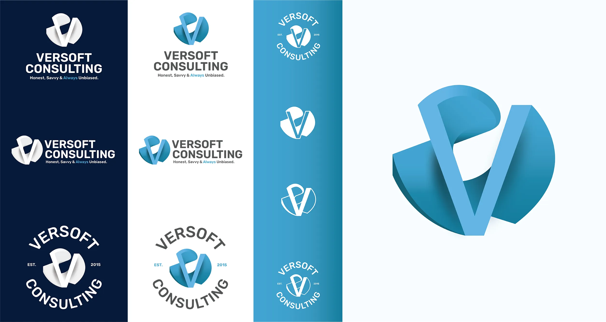
Versoft Consulting needed to communicate expertise without putting up walls. The V mark we built is rooted in architectural geometry, giving it structure and depth while staying accessible. It reads as precise to a technical audience and considered to everyone else who encounters it.
The versatility of the system is what makes it work long-term. Flat laser-ready versions for etched merchandise, circular lockups for branded apparel, and a full identity toolkit that covers the range from digital screens to physical objects without losing coherence or requiring reinvention each time.
View Project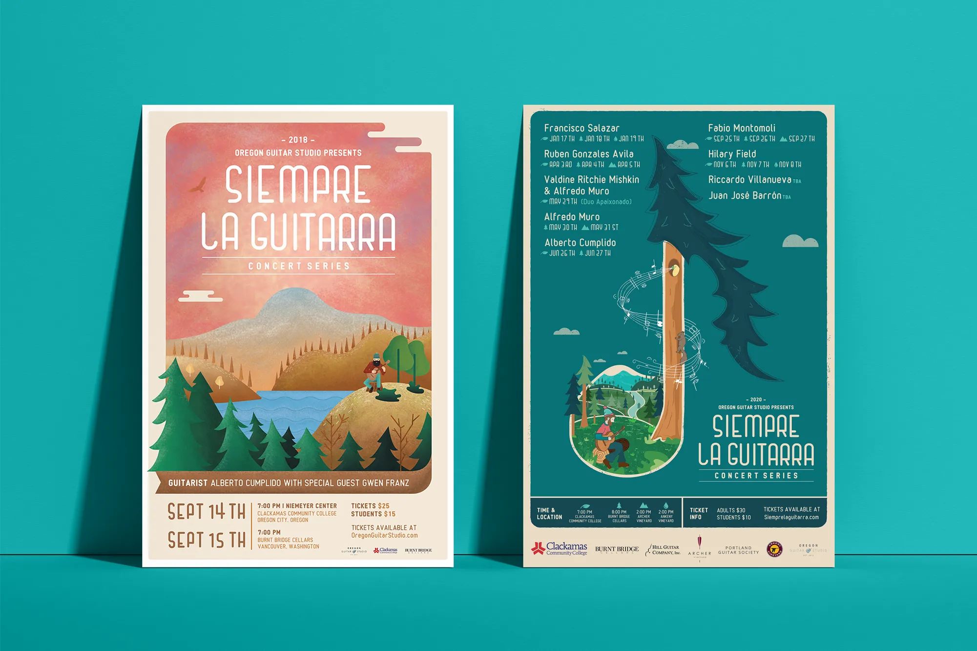
Music Visual Identity
Siempre La Guitarra
West Linn runs on word of mouth. It is a community where people talk, where recommendations travel from one neighbor to the next, and where a business that looks put-together earns a longer look. When your visual identity is scattered, that reputation gap costs you before you ever have a conversation.
Siempre La Guitarra is a classical guitar concert series that its Pacific Northwest audience returns to season after season. Their identity needed to reward that loyalty with something that felt worth collecting. We built the system around custom illustration, creating a visual foundation that could carry genuine artistic weight and flex with each new performer and program.
View ProjectWhy West Linn Businesses Benefit from a Visual System
A complete visual identity gives your West Linn business a brand presence that works even when you are not in the room. Here is what a defined system makes possible.
- Strengthen Word-of-Mouth Referrals: When someone recommends your business in West Linn, the next thing that person does is look you up. A consistent and polished visual identity makes sure what they find matches the recommendation they received.
- Look Established From Day One: A cohesive visual system signals credibility and longevity even for newer businesses. West Linn customers respond to brands that look like they know who they are.
- Create Consistency Across Every Channel: Whether a West Linn customer finds you on social media, drives by your location, or picks up your business card, the visual experience should be the same. A defined identity system makes that consistency automatic.
Tea Visual Identity
Cup of Tea
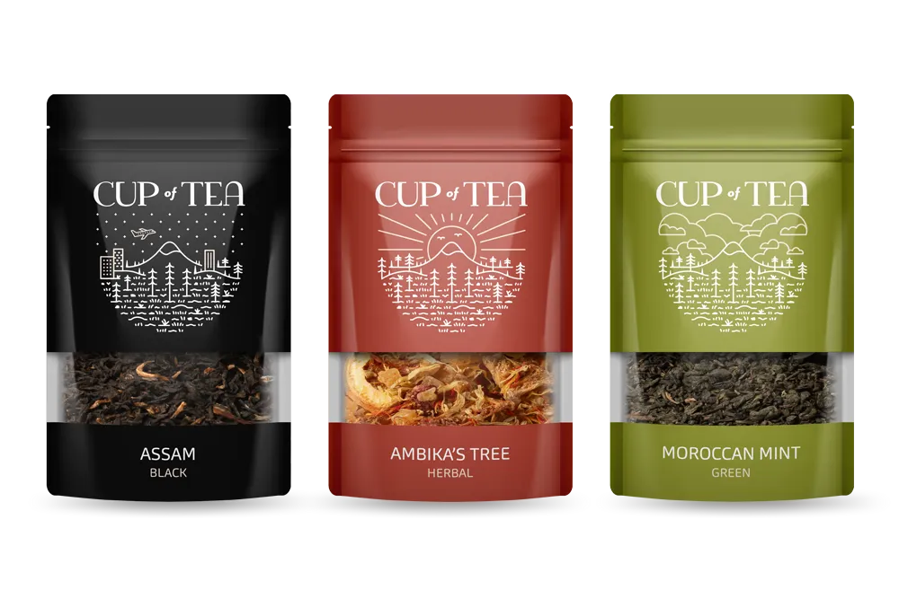
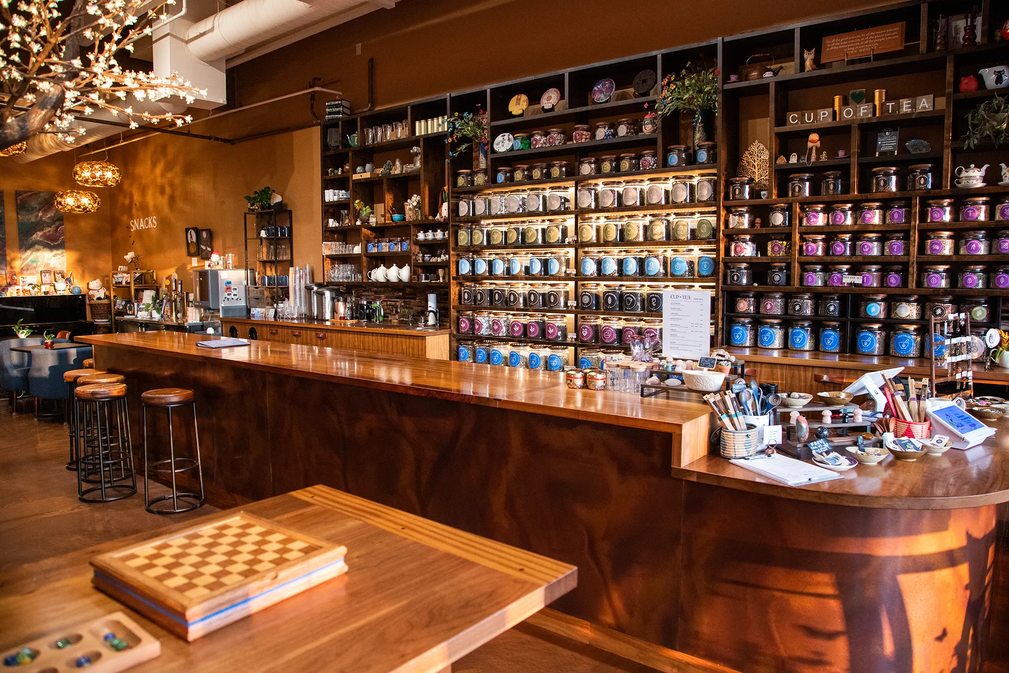
Cup of Tea presented a specific challenge: how do you build a visual identity system around a product line with 150-plus varieties without making it feel like a catalog? The answer was color architecture. We built a 9-color identity where each hue corresponds to a tea category, giving the system both organizational function and real visual personality.
Custom icon sets went alongside the color system, translating the sensory qualities of individual teas into visual shorthand customers could read immediately. Retail packaging carried the full system to the shelf. An apparel line extended the brand into the everyday. The result was a brand that turned a broad product range into a coherent, navigable world.
View ProjectOur Visual Identity Process
We take a holistic approach to design. We do not just pick colors that look nice. We build a system that works in the real world for West Linn businesses and beyond.
01.
Visual Audit & Discovery
We start by looking at what you have and where you want to go. We analyze your competitors and discuss the mood you want to evoke. We define the aesthetic direction before we design a single pixel.
02.
System Development
We build the complete toolkit. Primary and secondary color palettes that pass accessibility standards. Typography that is legible and distinct. Supporting elements like icons, patterns, and photography guidelines that add depth.
03.
The Deliverable: Brand Guidelines
We package everything into a comprehensive Brand Style Guide. This is your brand's instruction manual. It explains exactly how to use your logo, which fonts to use, and how to apply your colors so anyone who touches your brand stays on track.
Frequently Asked Questions
Ready to Look the Part?
Let's Chat