
Visual Identity Design in Canby
Canby Businesses Earn Their Reputation the Hard Way
Canby is not the kind of market where a business coasts on foot traffic from a major corridor. Every customer is earned. That makes the visual impression you leave more important, not less. A disjointed brand in a smaller, close-knit market gets noticed, and not in the way you want. Canby customers have long memories, and first impressions carry weight.
Graphicsbyte builds visual identity systems for Canby businesses that put their best visual foot forward across every touchpoint. A complete brand system built around your specific business, not a template, so the impression you leave is consistent, intentional, and worth remembering.
See More Identity Systems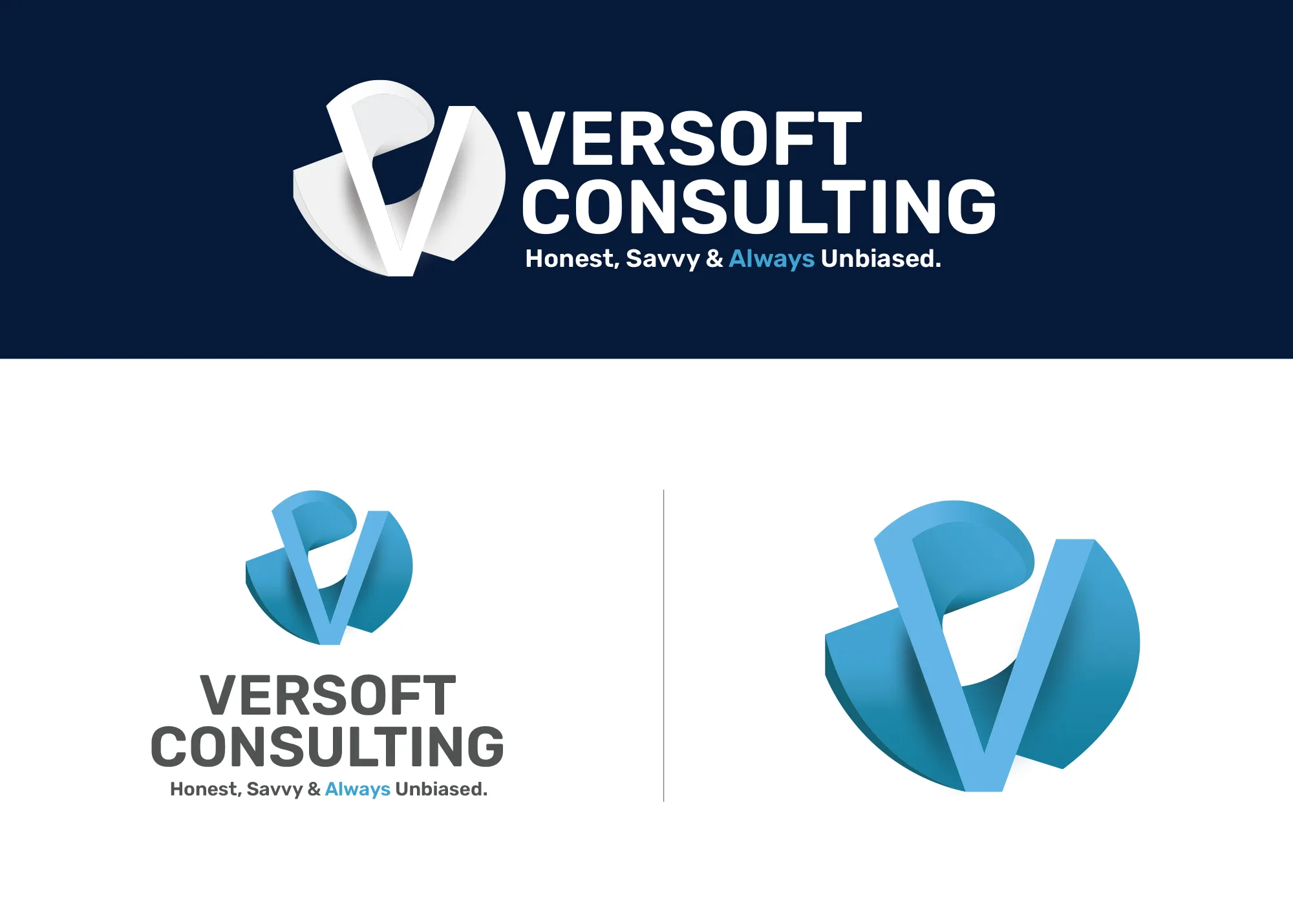
Visual Strategy
Versoft Consulting
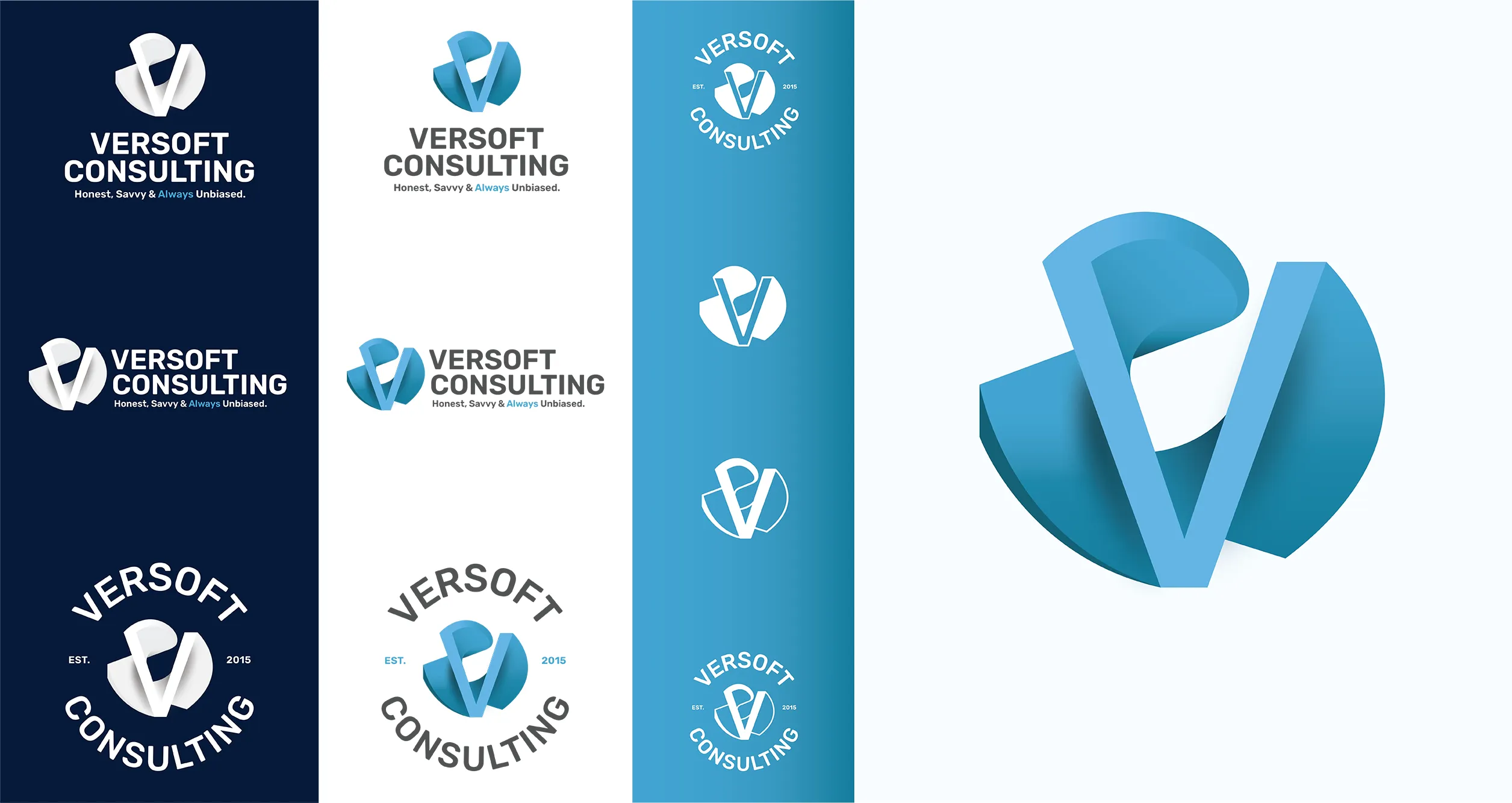
Versoft Consulting operates in a field where the visual presentation of expertise is part of the service itself. We built a dimensional V mark from architectural forms, giving the identity a sense of constructed precision that speaks to the financial and technology sectors they serve without feeling inaccessible to anyone outside those worlds.
The final system includes a full range of lockup configurations built for the formats a consulting firm actually uses: flat silhouettes ready for laser etching, circular badge forms for branded clothing and merchandise, and usage specifications that give the brand consistency across every physical and digital context it occupies.
View Project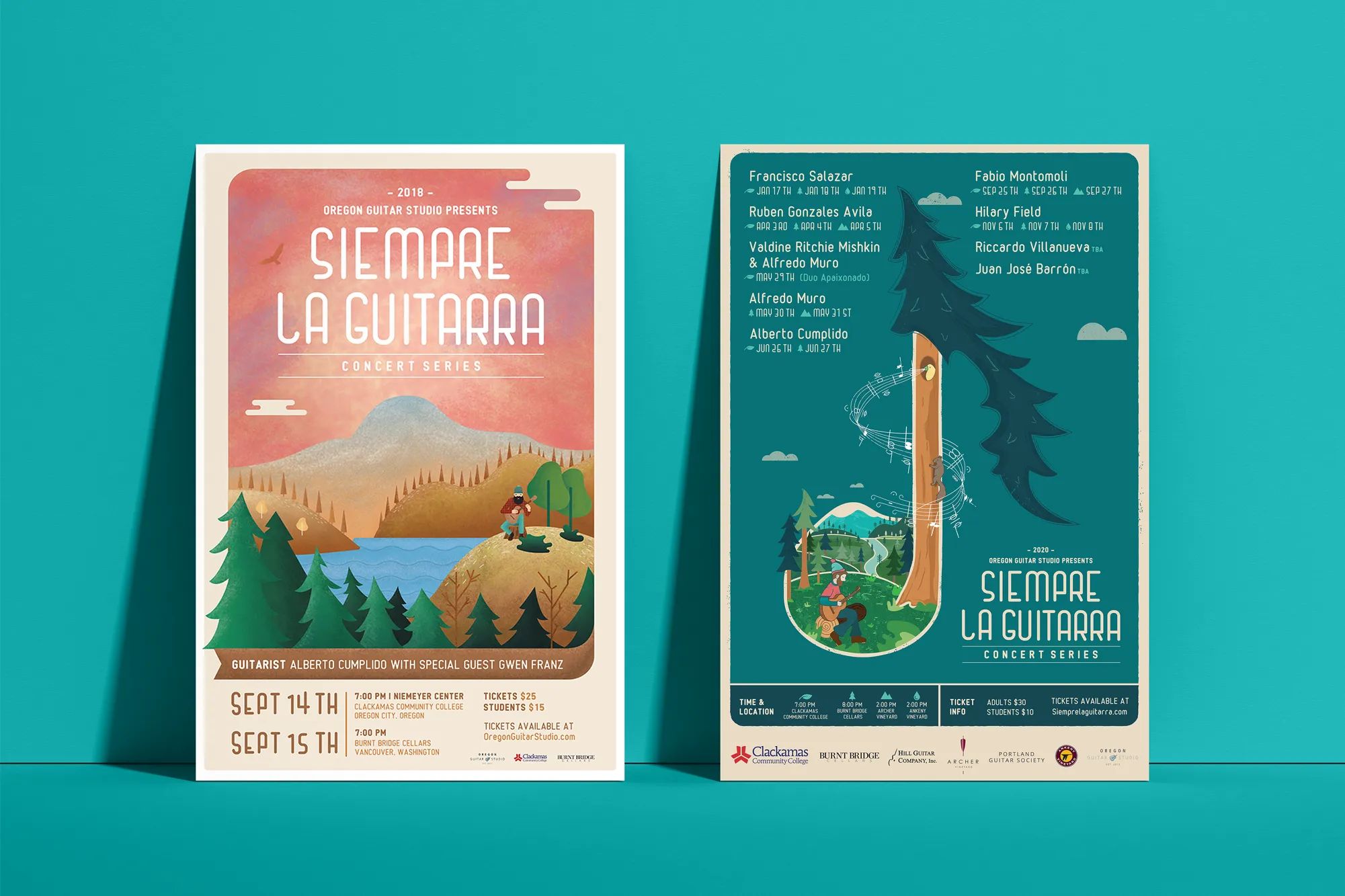
Music Visual Identity
Siempre La Guitarra
The visual identity for Siempre La Guitarra, a Pacific Northwest classical guitar concert series, was built around the idea that art programs deserve brand systems that reflect their ambition. We started with original illustration, anchoring the system in visual craftsmanship that standard design approaches do not reach.
What the series needed was an identity that could evolve by season without becoming unrecognizable. The framework we built gives each performer a distinct visual moment, adapting color and illustration direction, while keeping the system structurally consistent enough that audiences recognize the series at a glance. Merchandise followed: posters, clothing, guitar picks, and nail files that made the brand a collectible part of the experience.
View ProjectWhy Canby Businesses Invest in a Visual Identity System
In a community like Canby, where relationships and reputation drive business, a consistent visual identity does more than look good. It reinforces the trust you are already building through your work.
- Make Reputation Visible: In Canby, word travels fast. A polished and consistent visual identity makes your business look as good as your reputation says you are, reinforcing the recommendation before the customer even reaches out.
- Compete Beyond the Local Market: Canby businesses that want to attract customers from neighboring cities need a brand that looks credible at that scale. A cohesive visual identity removes any doubt about your level of professionalism.
- Build Something Worth Handing Down: A well-built visual identity is an asset. For Canby businesses with longevity in mind, a professional brand system is something you build once and refine over time, not something you replace every few years.
Tea Visual Identity
Cup of Tea
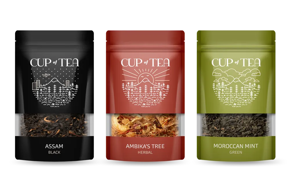
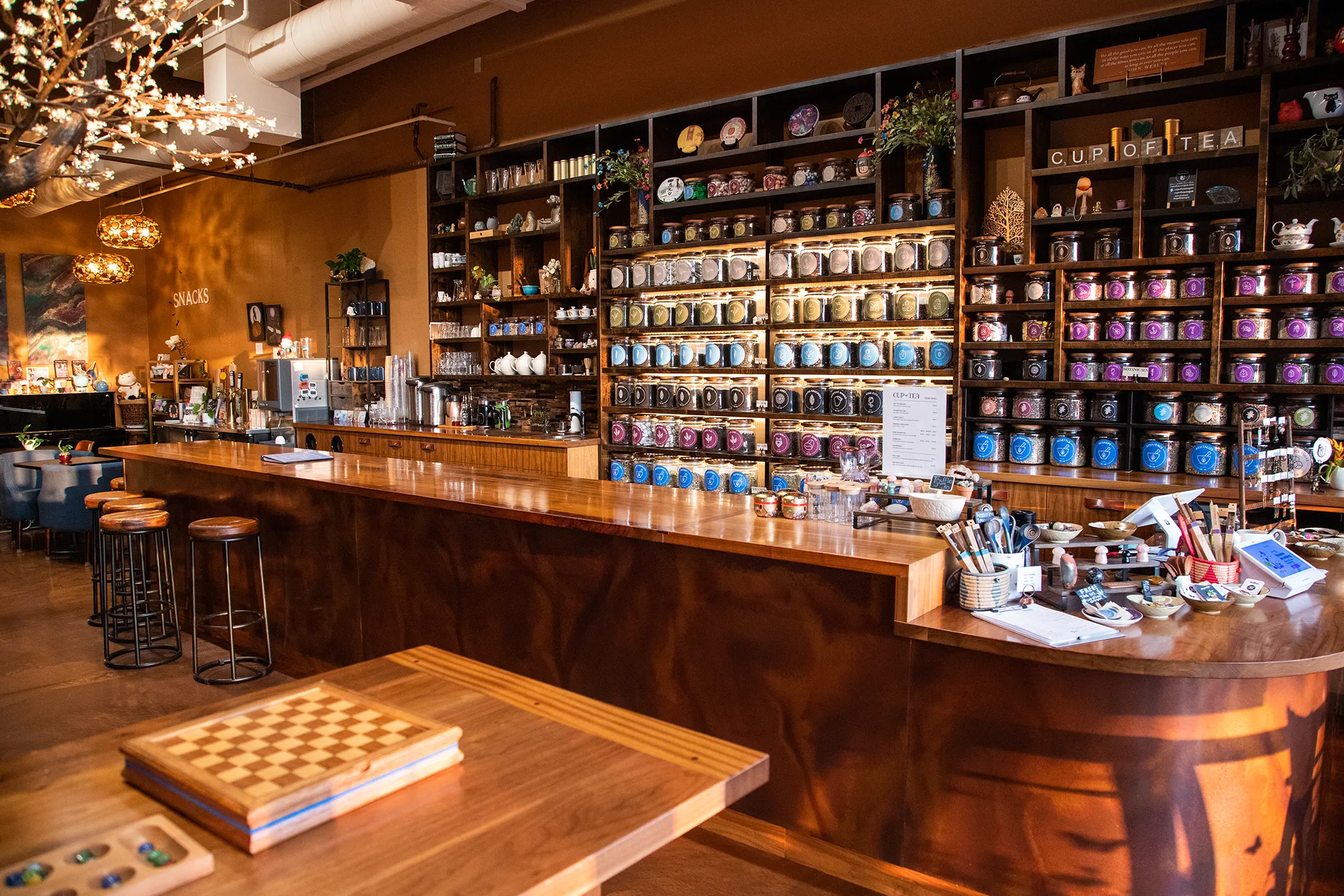
Cup of Tea had an organizational problem that most brands never face: more than 150 loose-leaf tea varieties and a customer base that needs to find what they want quickly and intuitively. We built the visual identity around that challenge, engineering a 9-color system where each color corresponds to a tea genre and the palette itself becomes the organizing logic of the entire brand.
We extended the system into every customer-facing format. A custom icon deck made tea attributes visible at a glance. Retail packaging translated the color architecture to every product label on the shelf. A full line of branded apparel brought the identity out of the store and into daily life. The brand that emerged functions as both a practical system and a recognizable lifestyle.
View ProjectOur Visual Identity Process
We take a holistic approach to design. We do not just pick colors that look nice. We build a system that works in the real world for Canby businesses and beyond.
01.
Visual Audit & Discovery
We start by looking at what you have and where you want to go. We analyze your competitors and discuss the mood you want to evoke. We define the aesthetic direction before we design a single pixel.
02.
System Development
We build the complete toolkit. Primary and secondary color palettes that pass accessibility standards. Typography that is legible and distinct. Supporting elements like icons, patterns, and photography guidelines that add depth.
03.
The Deliverable: Brand Guidelines
We package everything into a comprehensive Brand Style Guide. This is your brand's instruction manual. It explains exactly how to use your logo, which fonts to use, and how to apply your colors so anyone who touches your brand stays on track.
Frequently Asked Questions
Ready to Look the Part?
Let's Chat