
Visual Identity Design in Portland
Your Portland Brand Is More Than Just a Logo
A logo might open the door, but your visual identity is what keeps people in the room. For businesses in Portland, where competition is visible on every block and every scroll, a disjointed brand is a liability. When your colors, fonts, and imagery tell different stories depending on where a customer finds you, trust erodes before a word is read.
Our Visual Identity service builds a comprehensive design system around your brand. We move beyond the single mark to create a cohesive visual language that makes your Portland business instantly recognizable across every touchpoint from your storefront and social feed to your packaging and website.
See More Identity Systems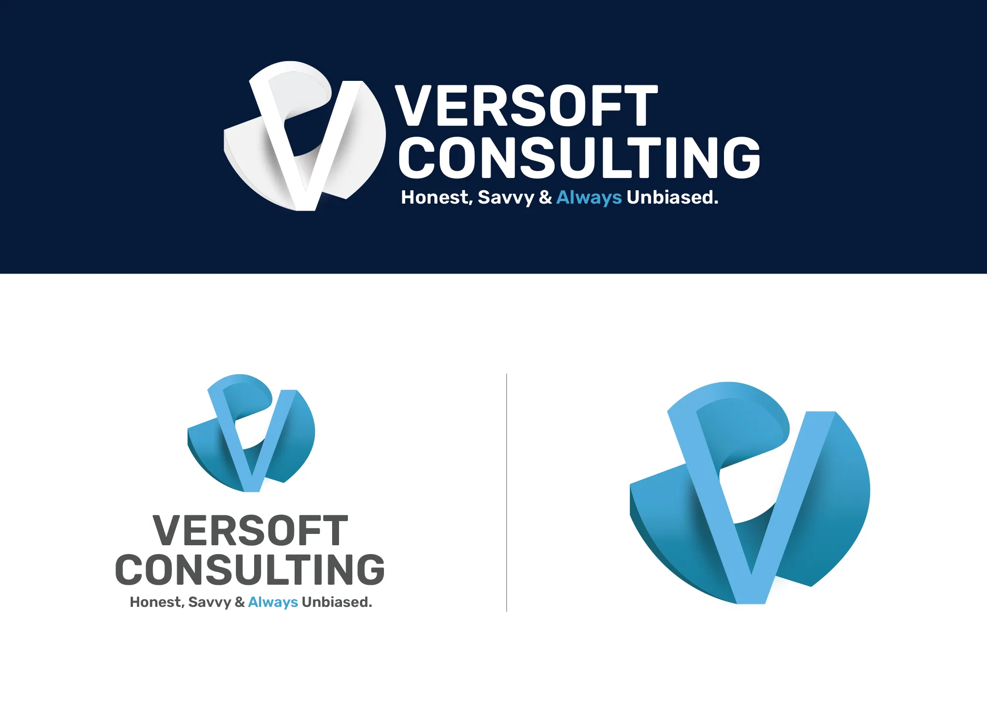
Visual Strategy
Versoft Consulting
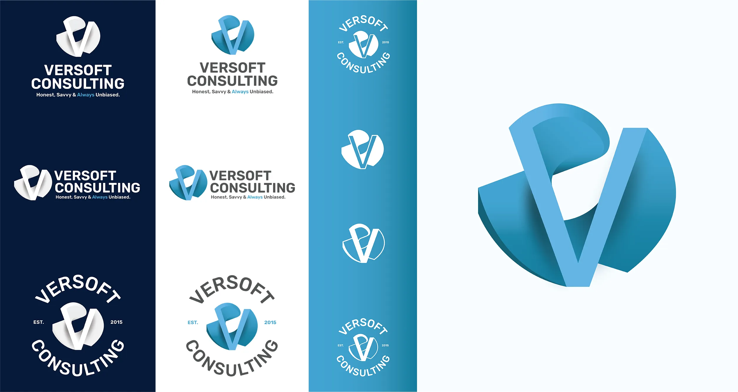
Versoft Consulting needed a brand that could communicate technical precision and financial-sector credibility without feeling cold or inaccessible. We built a dimensional V mark inspired by architectural geometry, then evolved it into a complete visual identity system built for maximum versatility across every application.
We developed a suite of adaptable lockups including flat versions for laser etching and circular badges for apparel. The expanded toolkit ensures the brand communicates trust and innovation whether it appears on a high-definition screen or a physical piece of merchandise.
View Project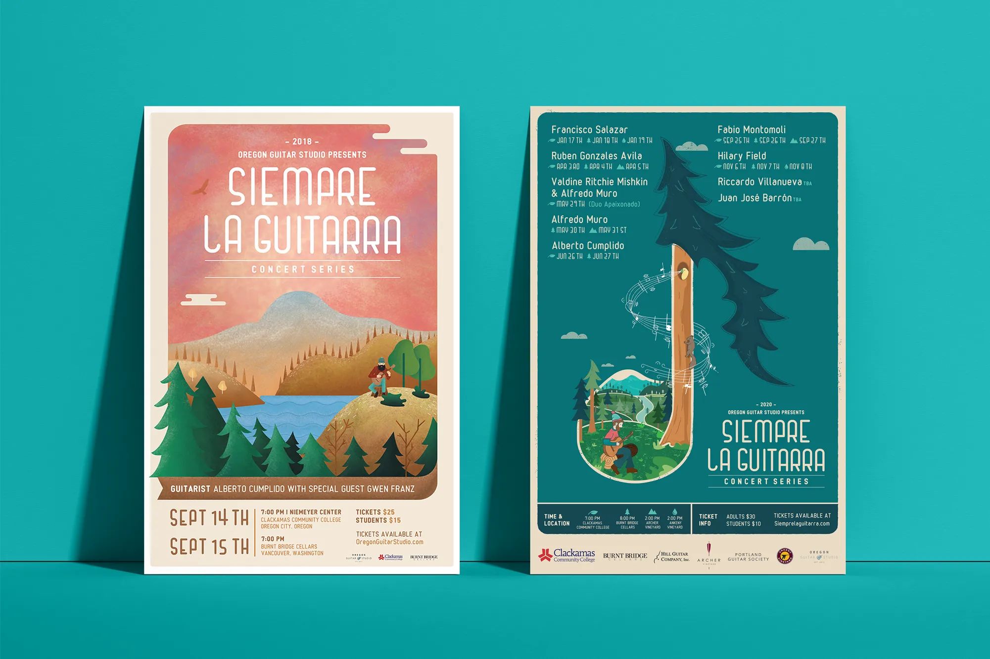
Music Visual Identity
Siempre La Guitarra
For Siempre La Guitarra, a classical guitar concert series with a loyal Pacific Northwest following, we developed an immersive visual identity centered around custom illustration. Rather than a static look, we built a seasonal system that adapts for each new performer while maintaining brand cohesion across every show.
We extended this artistic direction into a full merchandise line, designing everything from concert posters and clothing to custom guitar picks and nail files. The result turned their visual identity into a collectible brand experience that grew more valuable with every season.
View ProjectWhy Portland Businesses Need a System, Not Just a Symbol
A complete visual identity transforms your Portland business from a company with a logo into a recognizable brand. Here is what that system makes possible.
- Build Trust Through Consistency: When your visuals are consistent across every touchpoint, you signal reliability. Portland customers trust brands that look polished and put-together, especially when they are comparing you to competitors in the same market.
- Scale Your Marketing: A defined system makes growth easy. You do not have to start from scratch for every new campaign or piece of collateral. You simply apply your established colors, fonts, and patterns and keep moving.
- Stand Out in the Feed: A logo is small, but a color palette and visual style take up space. A strong identity grabs attention in a crowded Portland social media feed before the user even reads your caption.
Tea Visual Identity
Cup of Tea
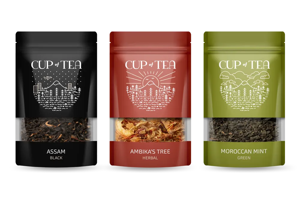
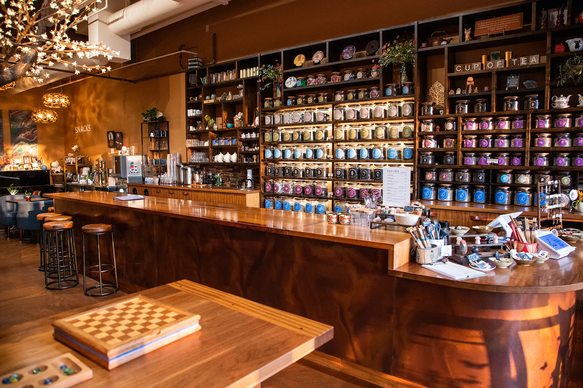
To elevate Cup of Tea from a simple product into a vibrant lifestyle brand, we engineered a comprehensive 9-color identity system. Each hue was strategically chosen to categorize a specific tea genre, creating an intuitive visual language that lets customers navigate the shop by color, mood, and flavor.
We extended this system across every touchpoint, designing custom icon decks, retail packaging, and a full line of apparel. The result is a highly functional, cohesive brand world that is instantly recognizable on the shelf and on the street.
View ProjectOur Visual Identity Process
We take a holistic approach to design. We do not just pick colors that look nice. We build a system that works in the real world for Portland businesses and beyond.
01.
Visual Audit & Discovery
We start by looking at what you have and where you want to go. We analyze your competitors and discuss the mood you want to evoke. We define the aesthetic direction before we design a single pixel.
02.
System Development
We build the complete toolkit. Primary and secondary color palettes that pass accessibility standards. Typography that is legible and distinct. Supporting elements like icons, patterns, and photography guidelines that add depth.
03.
The Deliverable: Brand Guidelines
We package everything into a comprehensive Brand Style Guide. This is your brand's instruction manual. It explains exactly how to use your logo, which fonts to use, and how to apply your colors so anyone who touches your brand stays on track.
Frequently Asked Questions
Ready to Look the Part?
Let's Chat