
Visual Identity Design in Milwaukie
Milwaukie Businesses Deserve a Brand That Does the Work
Milwaukie has built a reputation as a city that works. The businesses here are not chasing trends. They are showing up, doing the job, and building something worth trusting. But a hardworking business with a scattered visual presence is leaving recognition on the table. When your logo, your signage, and your social feed all look like they came from different companies, customers notice.
Graphicsbyte builds visual identity systems for Milwaukie businesses that close that gap. We create a unified brand language across every touchpoint so the quality you put into your work shows up in everything your customers see. Color, typography, mark, and usage rules built to stay consistent whether it is a business card or a building wrap.
See More Identity Systems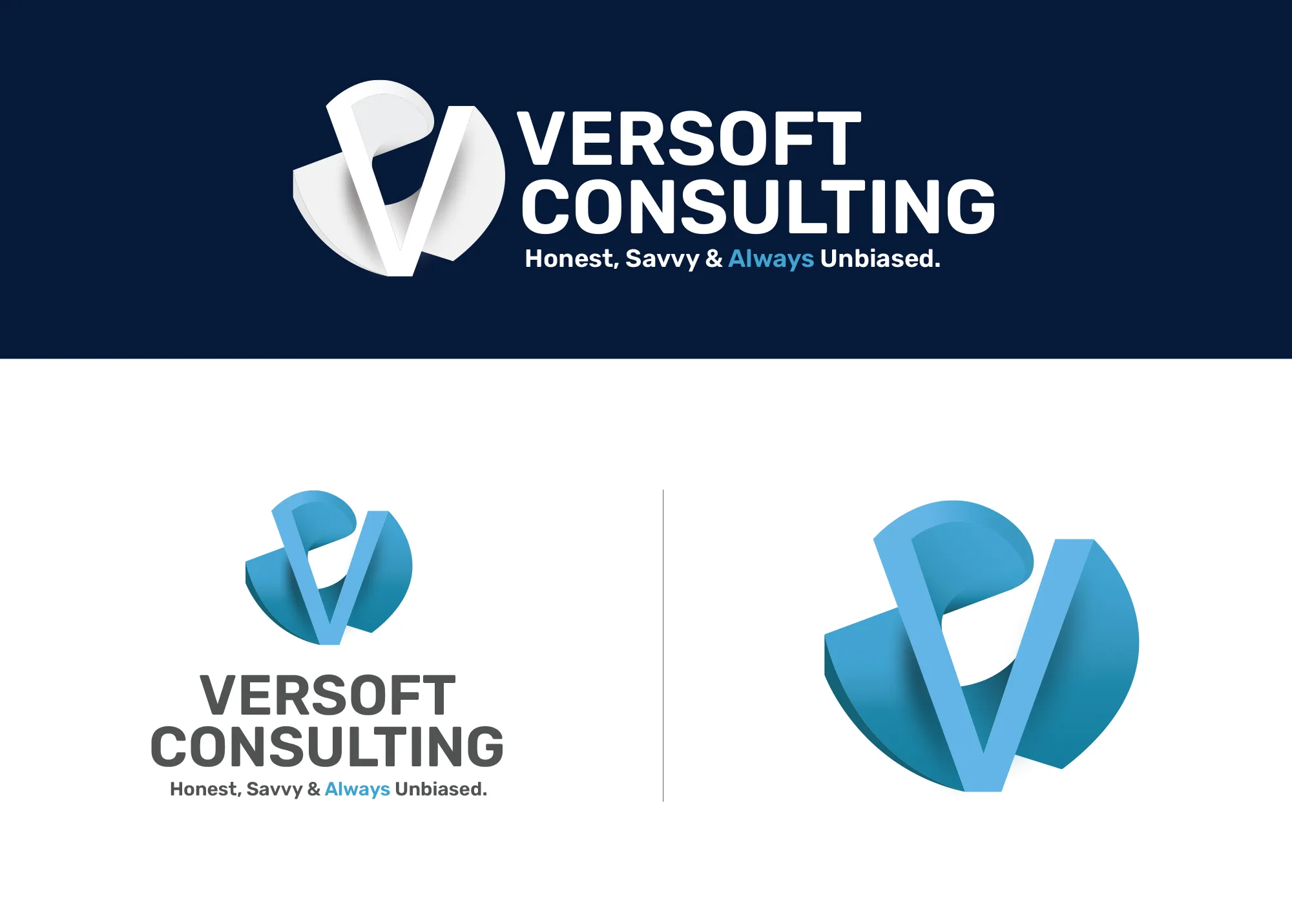
Visual Strategy
Versoft Consulting
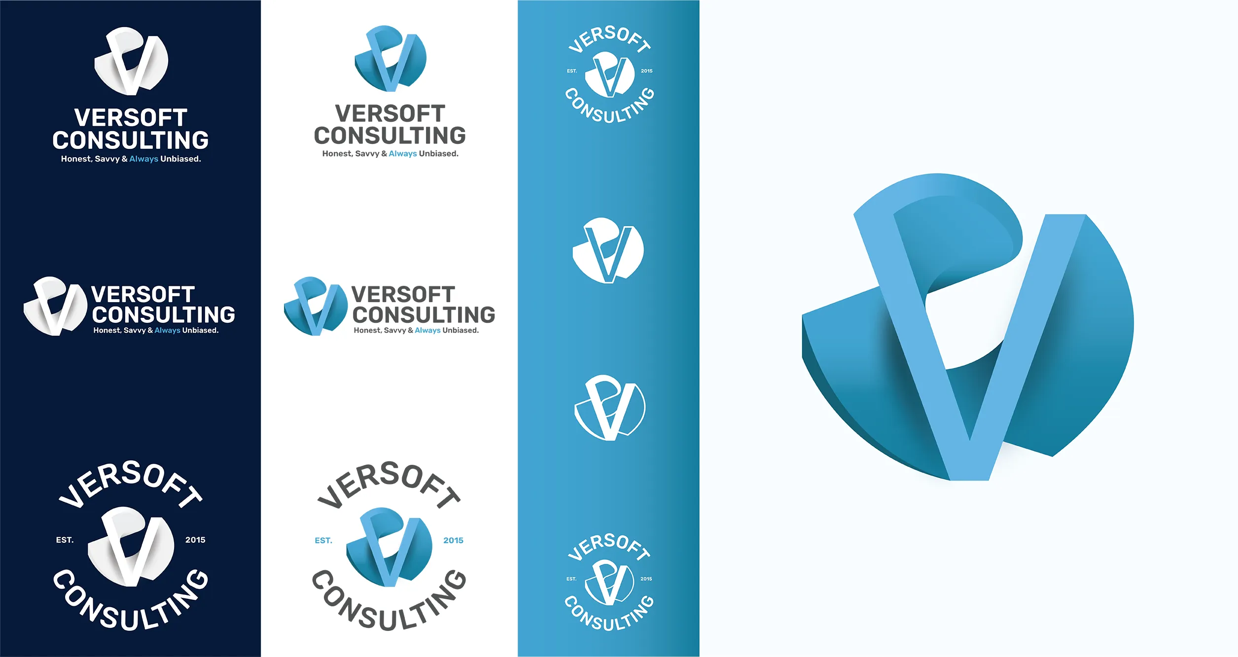
Versoft Consulting operates at the intersection of technology and enterprise finance, a space where precision matters but approachability is what closes deals. We started with a structural V mark drawn from architectural principles, built to feel dimensional and grounded without tipping into sterile territory.
From there we developed a complete suite of lockups engineered for every format the brand would need. Flat configurations for laser etching, circular badge versions for apparel, and adaptable arrangements that scale from a business card to a trade show backdrop without losing integrity.
View Project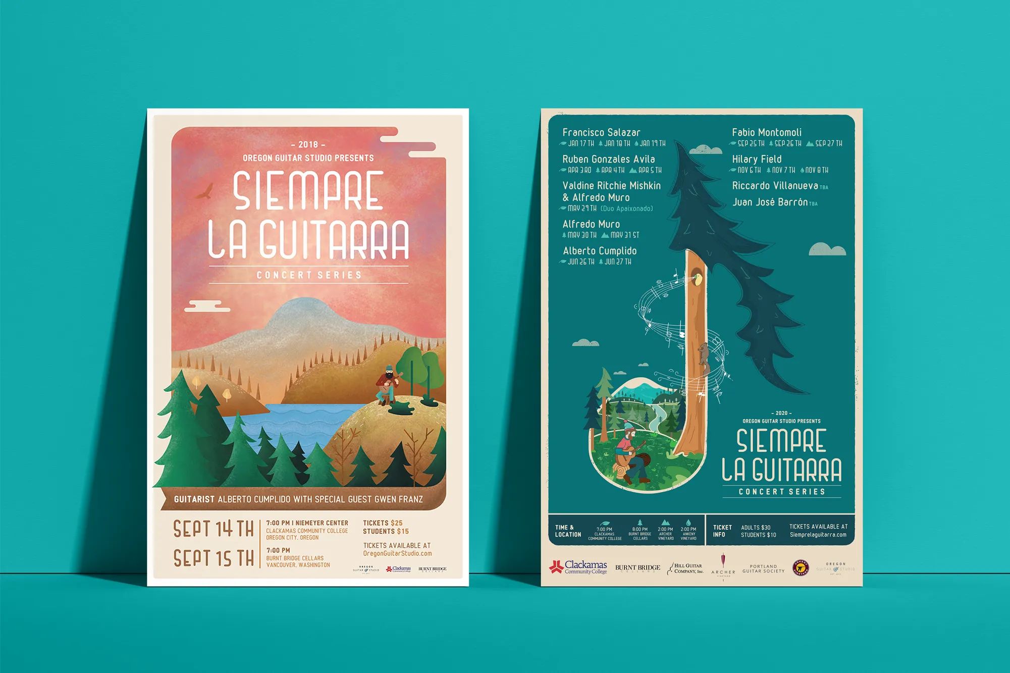
Music Visual Identity
Siempre La Guitarra
Siempre La Guitarra is a classical guitar concert series with a following that has built over seasons. The identity challenge was not to build something static that could hold one season. It was to build a system that could evolve with each new performer and program while remaining immediately recognizable as Siempre.
Custom illustration was the foundation, but the structure is what makes it work. Each season gets its own visual expression within the system, adapting the artwork and color direction while keeping the identity coherent. We extended it into a full merchandise line of posters, clothing, guitar picks, and nail files that gave audiences something to bring home.
View ProjectWhy a Milwaukie Business Needs More Than a Logo
A visual identity system gives your Milwaukie business the kind of consistency that turns one-time customers into regulars. Here is what a complete system builds.
- Recognition That Compounds: Every consistent impression your brand makes builds on the last one. Milwaukie customers who see the same visual language across your storefront, your packaging, and your feed start to recognize you faster and trust you sooner.
- A Brand That Scales With You: When your visual system is defined, growing is simpler. New signage, new products, new campaigns all draw from the same source. You spend your energy on the business, not reinventing how it looks.
- Presence That Holds Its Own: Milwaukie sits close enough to Portland that your business competes with a much larger market than your zip code. A cohesive visual identity makes sure you look the part in any context.
Tea Visual Identity
Cup of Tea
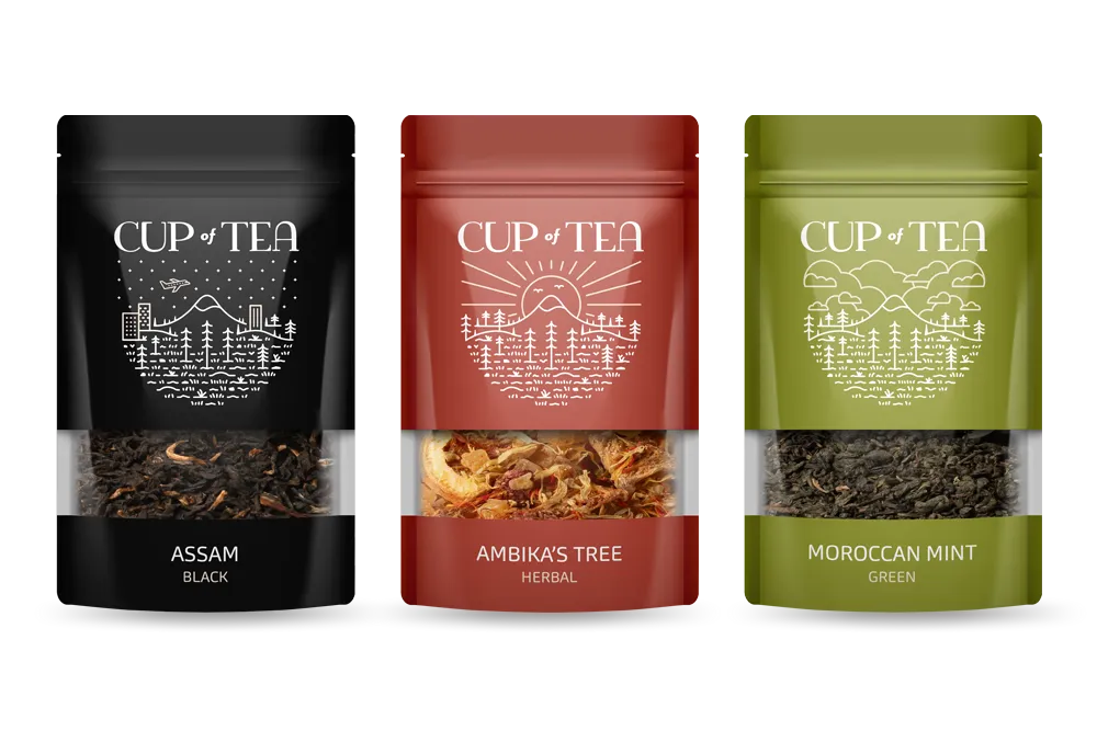
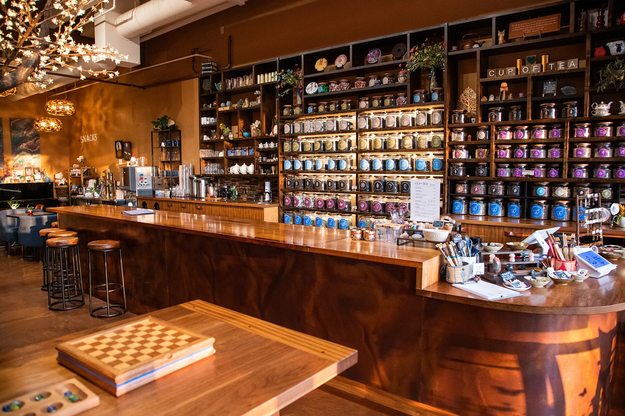
Cup of Tea is a specialty tea shop with over 150 loose-leaf varieties that needed a visual system capable of organizing that range without overwhelming a customer walking through the door. We built a 9-color identity where each hue maps to a specific category of tea, turning the color palette itself into a navigation tool.
The system extended across every surface the shop touches. Custom icon sets communicate individual tea qualities at a glance. Retail packaging carries the color system to the shelf. Apparel brings the brand into the world beyond the shop floor. The result is a brand that functions as well as it looks.
View ProjectOur Visual Identity Process
We take a holistic approach to design. We do not just pick colors that look nice. We build a system that works in the real world for Milwaukie businesses and beyond.
01.
Visual Audit & Discovery
We start by looking at what you have and where you want to go. We analyze your competitors and discuss the mood you want to evoke. We define the aesthetic direction before we design a single pixel.
02.
System Development
We build the complete toolkit. Primary and secondary color palettes that pass accessibility standards. Typography that is legible and distinct. Supporting elements like icons, patterns, and photography guidelines that add depth.
03.
The Deliverable: Brand Guidelines
We package everything into a comprehensive Brand Style Guide. This is your brand's instruction manual. It explains exactly how to use your logo, which fonts to use, and how to apply your colors so anyone who touches your brand stays on track.
Frequently Asked Questions
Ready to Look the Part?
Let's Chat