Table of Contents
A strong brand identity system is the complete set of visual and verbal rules that determine how a brand looks, sounds, and presents itself across every touchpoint. It is more than a logo. It is the structure that keeps your colors, typography, imagery, voice, and design choices aligned whether someone encounters your brand on a product label, a website, a social post, or a trade show display.
When a brand identity system is working nobody notices it. The brand just feels coherent, professional, and recognizable. When it is missing or incomplete the brand feels scattered, even if the individual pieces are well designed. The logo might be strong. The website might look good. But if they do not speak the same visual language the brand feels like it was assembled by different people who never talked to each other. Because it usually was.
This guide covers what a complete brand identity system actually includes, why it matters, how to build one that holds up, and what the difference looks like in practice through real client examples.
What a Brand Identity System Actually Includes
A complete identity system covers every element that shapes how a brand looks and feels in the real world. These elements do not exist in isolation. They work as a system, which means the decisions made for one element affect all the others.
Logo System:
A logo is not a single file. It is a family of marks designed to work together across different contexts. A complete logo system includes a primary mark for standard use, a secondary or simplified version for constrained spaces, a horizontal lockup for wide formats like email headers and website banners, and an icon or monogram for small applications like favicons, app icons, and profile images.
Each version should be available in full color, single color, reversed for dark backgrounds, and black and white. A brand that only has one logo file is not operating with a system. It is operating with a placeholder.
Color Palette:
A defined color palette specifies which colors belong to the brand and exactly how to reproduce them. This means RGB values for digital use, hex codes for web, CMYK values for print, and Pantone references for situations where precise color matching matters like signage or branded merchandise.
A complete palette typically includes two to three primary colors, one to three secondary colors for supporting use, and neutral tones for backgrounds, text, and breathing room. The guidelines specify not just which colors exist but how they combine, which combinations are approved and which are not, and how colors should be weighted across different applications.
Without this specificity colors drift. The teal on the website becomes slightly different from the teal on the business card becomes slightly different from the teal on the packaging. Each drift is small. The cumulative effect is a brand that looks like it cannot decide what color it is.
Typography:
Typography rules define which typefaces the brand uses, how they relate to each other, and how they get applied across different contexts. A complete typography system includes a primary typeface for headlines and display use, a secondary typeface for body copy and supporting text, rules for hierarchy including heading levels, sizing ratios, and weight usage, and guidance on acceptable pairings and combinations.
Typography is one of the most overlooked elements of brand identity systems. Many brands have a logo and a color palette but no defined type system, which means every new piece of collateral involves someone making a fresh decision about which font to use. That decision compounds into inconsistency over time.
Layout and Spacing:
Grid systems, margin rules, and spacing guidelines define how design elements relate to each other on a page or screen. These are the invisible rules that make a brand feel organized and considered versus cramped or random.
A brand without layout guidelines will have materials that look inconsistent not because the wrong colors or fonts were used but because the underlying structure varies from piece to piece. Spacing rules are among the most impactful and most underspecified elements in most small business brand systems.
Iconography:
If a brand uses icons in its communications, those icons need to follow a consistent visual language. Line weight, corner radius, proportions, and level of detail all need to be defined so icons from different contexts and different contributors feel like they belong to the same family.
A mix of icons from different sources, some rounded, some geometric, some illustrated, some flat, is one of the fastest ways to make a brand feel assembled rather than designed.
Illustration Style:
When illustration is part of a brand’s identity, the style needs to be defined with enough specificity that it can be applied consistently. This is more complex than most other brand elements because illustration style is harder to reduce to a simple rule.
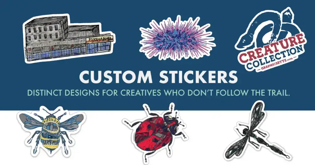
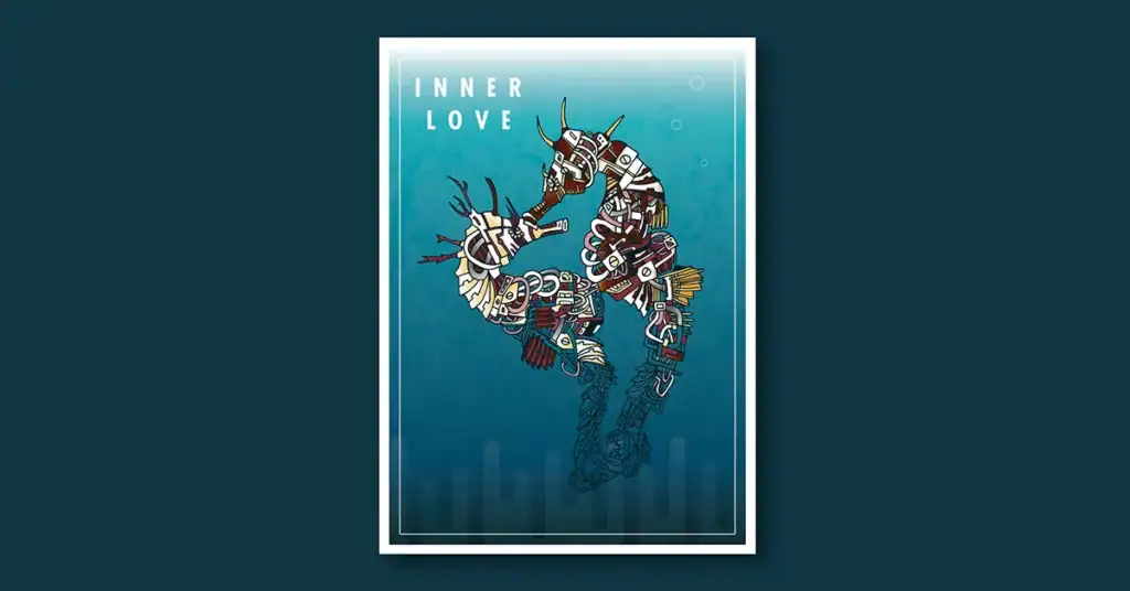
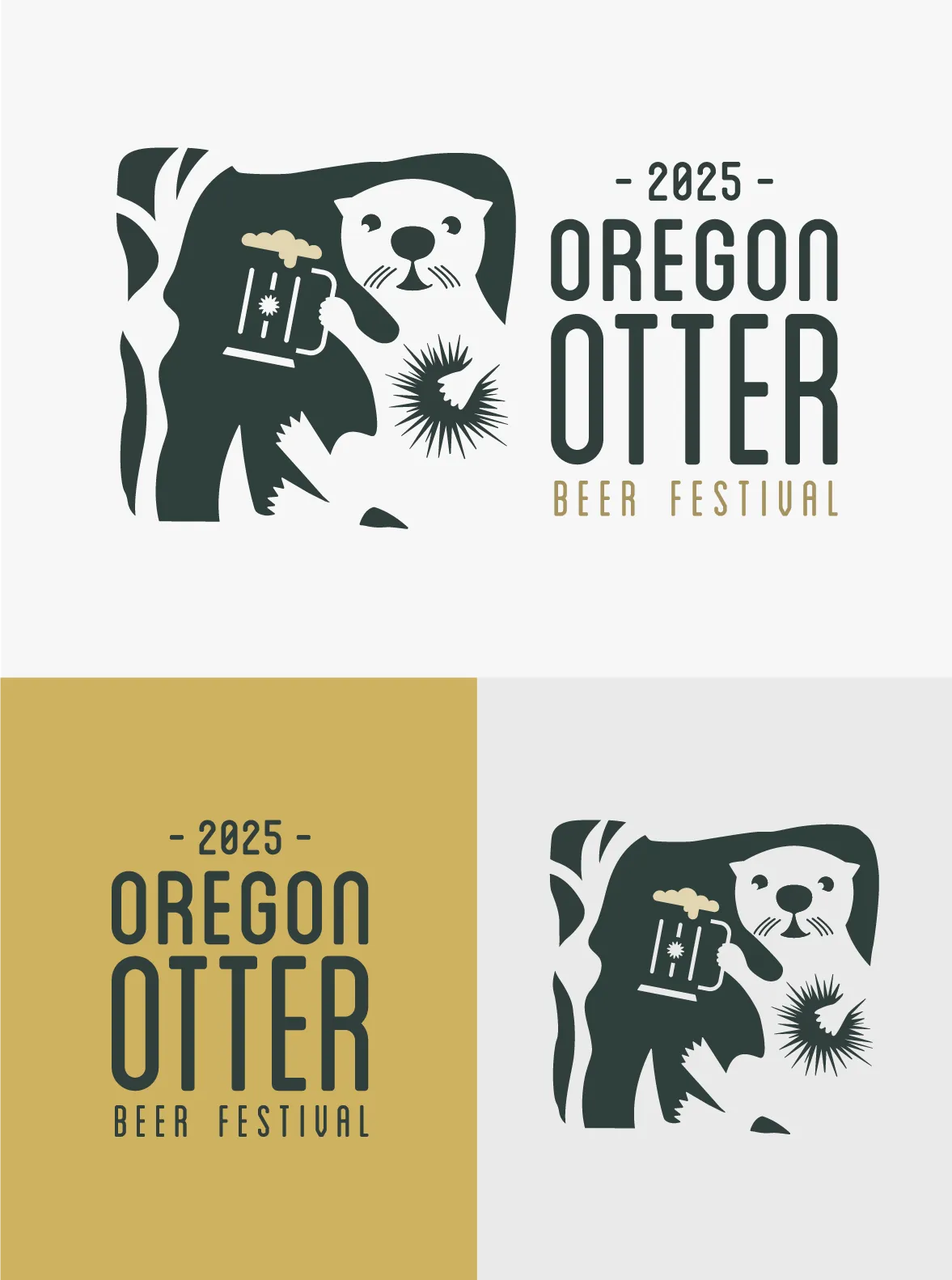
The illustration work developed for the Elakha Alliance used a specific biomechanical aesthetic that connected the conservation mission to a surreal visual language. That approach was defined at the project level and applied consistently across the event poster, the beer festival logo, and supporting materials. Without that definition each piece would have drifted toward whatever felt right in the moment.
Photography Direction:
Photography guidelines establish the visual language for any photography used in brand communications. This includes lighting direction, color grading preferences, subject matter, composition approaches, and the overall mood or feeling photographs should convey.
Photography direction is especially important for brands that use stock photography, because the range of available stock imagery is enormous and without clear direction the choices will be inconsistent. A brand that wants to feel warm and human but pulls cold, corporate, high-contrast stock photography is undermining its own identity.
Voice and Tone Basics:
Visual identity and verbal identity are part of the same system. A brand that looks polished and professional but writes in a rambling, inconsistent voice has a split identity problem. Voice guidelines define how the brand communicates, what language it uses, what it avoids, and how the tone adjusts for different contexts.
Why a Brand Identity System Matters
The most common argument against investing in a brand identity system is that it is a luxury for larger companies. That argument gets it exactly backwards. Large companies have teams that can absorb inconsistency. A small business with one or two people producing all its brand communications has no buffer. Every inconsistency is visible.
Consistency builds trust:
Buyers evaluate professionalism through dozens of small signals before they make a purchasing decision. A brand that looks coherent across every touchpoint signals that the business behind it is organized, reliable, and worth trusting. A brand that feels scattered signals the opposite before a word of the actual pitch is heard.
Recognition compounds over time:
Every consistent interaction a customer has with a brand adds weight to their mental image of it. Over hundreds of interactions the cumulative effect is recognition that happens below conscious awareness. The color alone triggers recall. The typeface feels familiar. That familiarity is built one consistent touchpoint at a time and it is undermined by every inconsistency.
It makes content creation faster.:
Teams that work with a defined identity system make fewer decisions per project because the decisions have already been made. Which color goes here. Which typeface at what size. What photography style. A system converts those decisions into rules and rules compress the production cycle.
It protects the brand as it grows:
A brand that grows without a system gets harder to manage over time. More people touching more assets in more contexts without a shared reference creates drift that is very difficult to reverse without a formal brand refresh. A system established early makes growth easier to manage.
Real Brand Identity System Examples From the Graphicsbyte Portfolio
I have been building brand identity systems for over a decade. The work recognized in LogoLounge Books 10, 13, 14, and 15 represents a consistent standard applied across very different industries and audiences. Here is what complete identity systems look like in practice.
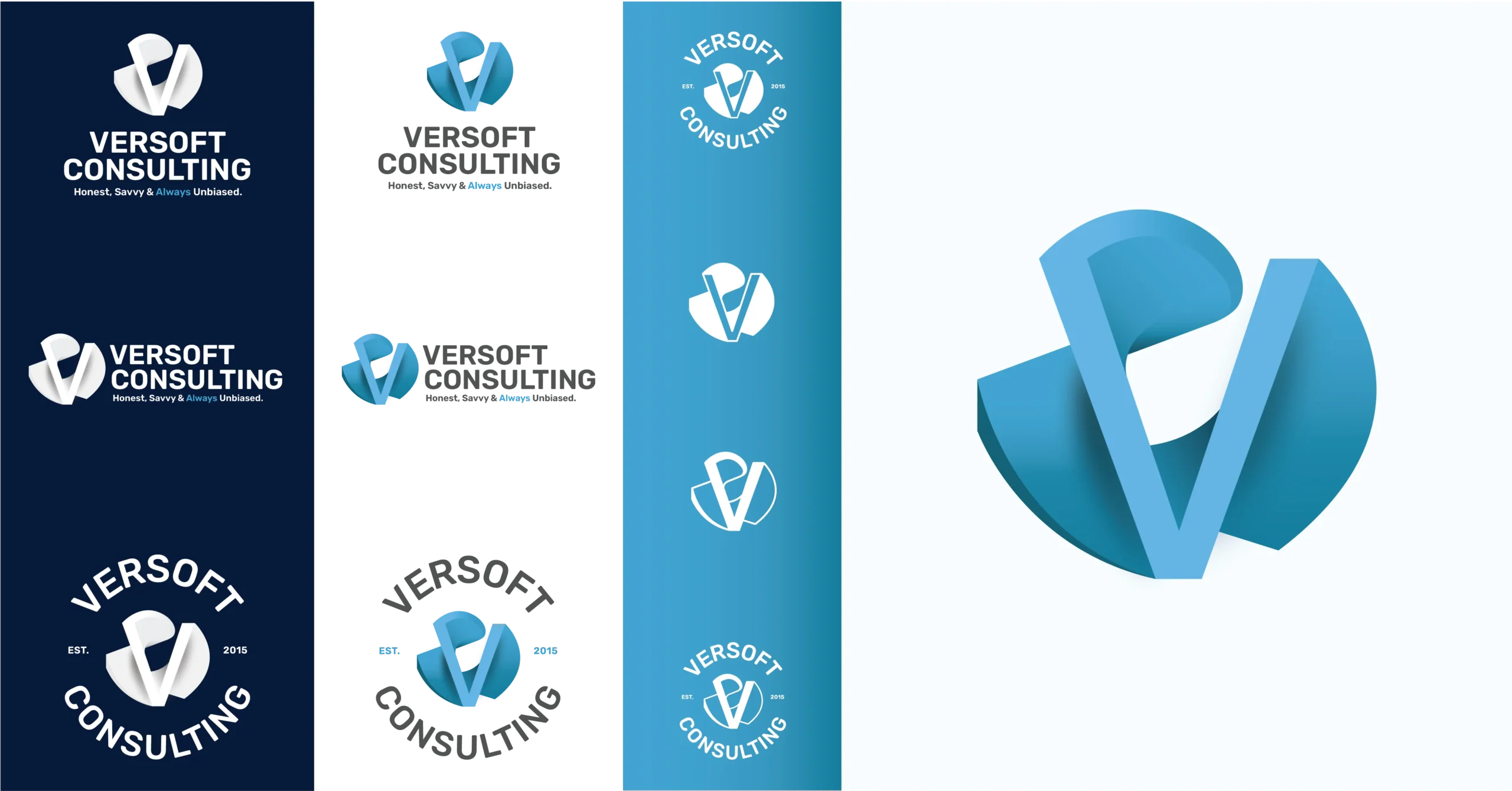
Versoft Consulting
Versoft Consulting helps investment firms maximize the value of their portfolio management software. The brand needed to communicate technical precision and financial sector credibility without feeling cold or inaccessible.
The identity system started with a dimensional V mark built on architectural geometry. That mark was then developed into a full system including flat versions for laser etching, circular badge configurations for apparel and event materials, and a complete brandbook specifying color values, typography, and usage rules across every application.
Over a decade of working relationship the brandbook has been the reference point that kept the identity coherent through multiple website updates, new marketing materials, and evolving business focus. That continuity is what a well-built system makes possible.

Cup of Tea
Cup of Tea is a community tea house in Clackamas, Oregon with over 150 loose-leaf blends. The identity system needed to solve a specific organizational problem. How do you help customers navigate 150 products by flavor, mood, and color without a staff member present to guide them.
The solution was a nine-color identity system where each hue corresponds to a specific tea category. The colors became a navigation tool built into the brand itself. That system extended across custom packaging for three product lines, over ninety custom icons for the bulk tea wall, apparel, and a custom WordPress website where the color coding carried through to the digital experience.
The identity system here was not just visual consistency for its own sake. It was a functional system that solved a real operational problem for the business.
Siempre La Guitarra
The Siempre La Guitarra concert series ran from 2018 to 2023 and presented a specific challenge. A classical guitar concert series needed to attract younger audiences without abandoning the tradition behind the music.
The identity system was built around a fictional Pacific Northwest lumberjack character with a passion for classical guitar. That character anchor allowed the system to evolve season by season through new poster designs, new merchandise, and new applications while maintaining visual coherence across six years of materials. Concert posters at 16 by 24 inches, t-shirts, stickers, guitar pick packs, and the website all pulled from the same visual language because the system defined it clearly enough to be applied consistently.

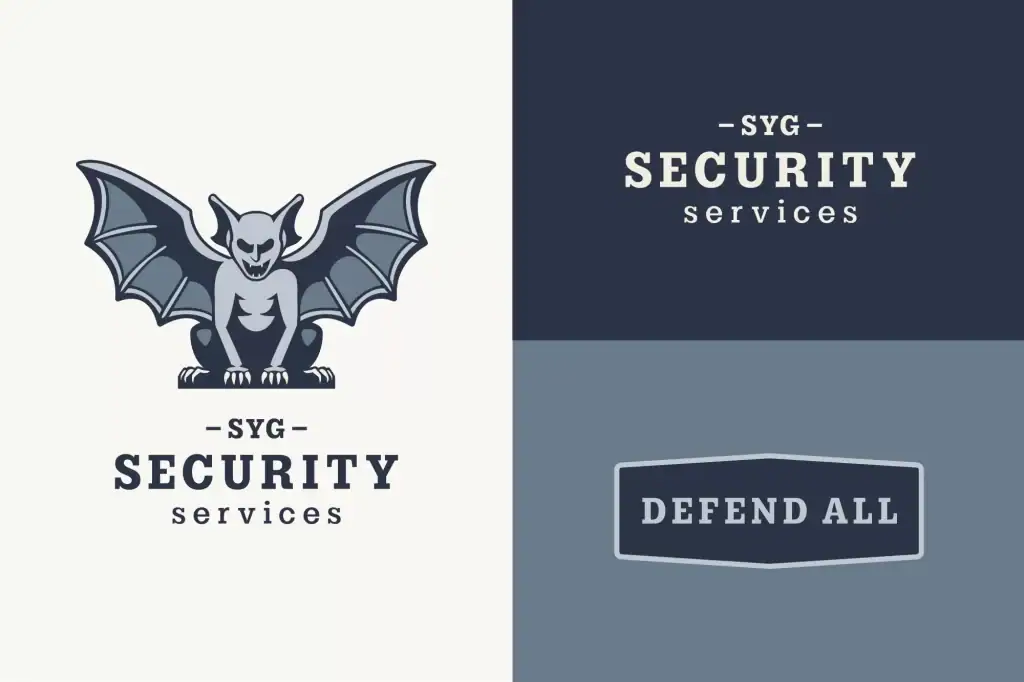
SYG Security Services
A focused identity system with a clear logo structure and brandbook that defined how the mark adapted across vehicle graphics, uniforms, and digital communications. This project is a strong example of how even a straightforward service business benefits from defined rules. Without a system security companies tend to drift toward generic military aesthetics. The defined system gave this brand a clear and ownable visual direction.
How to Build a Brand Identity System That Works
Building a brand identity system is not a linear process but it does have a logical sequence. Decisions made early constrain and inform decisions made later which is why the order matters.
Step 1: Define the Strategic Foundation:
Before designing anything establish what the brand needs to communicate and to whom. Who is the target audience and what do they value. What is the brand’s positioning relative to competitors. What personality does the brand need to project. What does success look like for this brand in three to five years.
These strategic inputs shape every visual decision that follows. A brand positioning itself as a premium technical solution for enterprise clients requires a different visual language than a community-focused food and beverage brand. The strategy determines the direction. The design executes it.
Step 2: Develop the Logo System:
With the strategic foundation established the logo development begins. This is not just designing a mark. It is designing a mark family that will work across every application the brand needs to serve.
The process involves exploring multiple conceptual directions, developing the strongest into refined marks, and then building out the complete system of variations, configurations, and file formats. Color versions, single color versions, reversed versions, and size-specific optimizations all need to be considered.
Step 3: Build the Color System:
Color selection follows from the brand strategy and the logo direction. The palette needs to work with the logo, reflect the brand personality, perform well across both digital and print contexts, and be distinctive enough that it contributes to recognition rather than blending into category conventions.
Specify every value in every relevant color model. RGB, hex, CMYK, and Pantone at minimum for most brands. Document the approved combinations and the rationale behind them.
Step 4: Select and Specify Typography:
Typography selection should reflect the brand personality and complement the logo rather than compete with it. The type system needs to include at least a headline typeface and a body text typeface, with clear rules for how each is used.
License considerations matter here. Many typefaces require commercial licenses for use in brand materials and on websites. The licensing situation for every typeface in the system should be confirmed before it is specified in the guidelines.
Step 5: Define Supporting Elements:
Iconography style, illustration direction, photography guidelines, pattern systems, and any other recurring visual elements get defined in this phase. Not every brand needs all of these. The goal is to define the elements that the brand actually uses in its communications.
Step 6: Document Everything in a Brandbook:
The brandbook or brand guidelines document is what transforms a collection of design decisions into a usable system. It needs to include every specified element, examples of correct usage across real applications, examples of incorrect usage for the most common errors, and enough context that someone who was not involved in the design process can use it correctly.
The brandbook is not a branding exercise. It is a practical tool. Its value is measured by how reliably people use the brand correctly when they consult it.
Step 7: Test Across Real Applications:
Before finalizing the system apply it to the contexts where the brand will actually appear. Website mockups, business card layouts, social post templates, packaging dielines if relevant, and any other high-frequency touchpoints. Testing reveals problems that are invisible in the abstract but obvious in context.
Conservation Logo Design
Ready to Build Your Visual Identity?
A complete brand identity system starts with understanding your business, your audience, and what your brand needs to communicate. Graphicsbyte builds visual identity systems for businesses across Portland Oregon and nationally. Every project is handled directly by Mark.

Ready to Build Your Visual Identity?
A complete brand identity system starts with understanding your business, your audience, and what your brand needs to communicate. Graphicsbyte builds visual identity systems for businesses across Portland Oregon and nationally. Every project is handled directly by Mark.

Need a Logo That Works as Part of a System?
A logo built in isolation is a starting point, not a solution. Graphicsbyte designs logo systems built to work across every application your brand needs to serve, from business cards to billboards to embroidery.
Need a Logo That Works as Part of a System?
A logo built in isolation is a starting point, not a solution. Graphicsbyte designs logo systems built to work across every application your brand needs to serve, from business cards to billboards to embroidery.
Common Brand Identity System Mistakes
Treating the logo as the entire identity: The logo is one element. Without the surrounding system it is just a mark.
Overcomplicating the color palette: More than five or six colors in active use creates a system that is hard to apply consistently. Simplicity is a feature.
Skipping typography specifications: No defined type system means every piece of collateral involves a fresh font decision. Those decisions accumulate into inconsistency.
Building guidelines nobody reads: A brandbook that is too long, too complex, or too abstract does not get used. Practical examples of real applications are more valuable than abstract principles.
Not specifying digital and print separately: Colors behave differently on screen and in print. A system that only specifies hex values will produce color drift in print materials.
Ignoring small-scale applications. A logo that looks strong at full size but breaks down at sixteen pixels as a favicon was not designed as a system.
Building the system and never updating it: Brands evolve. The identity system needs to be reviewed when the business grows significantly, when the audience changes, or when the visual direction no longer reflects where the brand is going.
START A LOGO CONVERSATION
Serving the Portland Oregon area in:
Lake Oswego · Oregon City · Milwaukie · West Linn · Happy Valley · Tualatin · Tigard · Wilsonville · Canby · Beaverton
When to Update Your Brand Identity System
A brand identity system is not permanent. The right time to review and update it includes when the business adds new service lines or product categories that the current system does not accommodate, when the target audience has shifted and the current identity no longer resonates with who the brand is actually trying to reach, when the visual identity feels dated relative to where the brand is positioned, when team members or vendors consistently struggle to apply the system correctly, or when a significant business milestone like an acquisition, partnership, or major pivot creates a need to signal change.
A refresh does not always mean a full rebrand. Sometimes the logo is strong and the colors are right but the typography needs updating. Sometimes the overall direction is correct but the guidelines need to be rewritten in a more practical format. Understanding what is and is not working requires an honest assessment before deciding on the scope of any update.
About the Designer
Mark Boehly is the founder of Graphicsbyte, a branding and web design studio based in Gladstone Oregon just outside Portland. His logo design work has been recognized in LogoLounge Books 10, 13, 14, 15 and in The LogoLounge Guide to Iconic Branding by Bill Gardner. He has been building brand identity systems for clients across industries including cannabis, food and beverage, nonprofit, tech consulting, construction, and music for over a decade. Every client works directly with Mark.
What is a brand identity system?
A brand identity system is the complete set of rules that define how a brand looks and communicates across every touchpoint. It includes the logo system with all its variations, color palette with exact values for print and digital, typography specifications, layout and spacing rules, iconography style, illustration direction if applicable, photography guidelines, and voice and tone guidance. The system exists to ensure that every time the brand appears somewhere it looks and feels like the same brand.
Why does my business need a brand identity system?
Without a defined system every piece of brand collateral involves fresh decisions about colors, fonts, and visual direction. Those decisions accumulate into inconsistency that erodes brand recognition and signals disorganization to potential customers. A system converts those recurring decisions into rules that can be applied by anyone touching the brand without requiring the original designer to be involved every time.
What does a full brand identity system include?
A complete system includes a logo family with primary, secondary, simplified, and icon versions in multiple color configurations, a color palette with exact values in RGB, hex, CMYK, and Pantone, typography specifications for headline and body typefaces with hierarchy rules, layout and spacing guidelines, iconography style if applicable, illustration direction if applicable, photography guidelines, and a brandbook document that makes all of these elements usable in practice.
How is a brand identity system different from a logo?
A logo is one mark. A brand identity system is the complete visual language that the logo lives within. The logo identifies the brand. The system defines how everything surrounding the logo looks, which colors appear with it, which typefaces accompany it, how it scales and adapts across applications, and what the overall visual impression is when all the elements work together.
When should I update my brand identity system?
Update your system when the business has grown or pivoted significantly from where it was when the system was built, when the target audience has changed, when the visual direction feels dated or inconsistent with current positioning, when team members and vendors consistently struggle to apply it correctly, or when a major business milestone signals that the brand needs to communicate something meaningfully different than it did before.