Cabinet Cures is from Portland, Oregon. Their specialty is to transform old or worn-out cabinets into modern masterpieces. We got the chance to help shape their entire brand.
Strategy
Research
Brand Strategy
Positioning
Visual Identity
Brand Collateral
Website Design
Cabinet Cures
Restyle • Redesign • Reface
Cabinet Cures is from Portland, Oregon. Their specialty is to transform old or worn-out cabinets into modern masterpieces. We got the chance to help shape their entire brand.
Strategy
Research
Brand Strategy
Positioning
Visual Identity
Brand Collateral
Website Design
Backstory
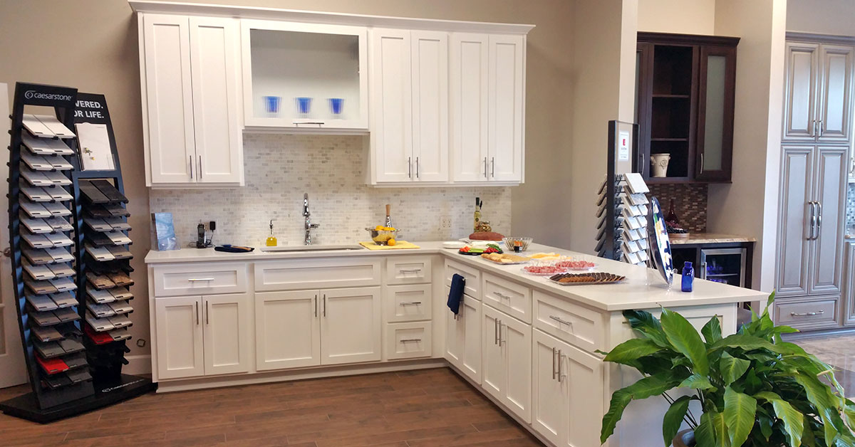
Cabinet Cures is a cabinet refacing and refinishing company. They have four locations around the United States. They are known for their custom stains and tinted liquors, with over 35 different options to choose from. Each stain is hand applied so it will never hide the natural beauty of the wood grain.
During 2014–2020 we worked with Velare Media and helped develop all the company websites, graphics, photography and various print projects. Everything below is displayed in chronological order from when it was created.
Backstory
Cabinet Cures is a cabinet refacing and refinishing company. They have four locations around the United States. They are known for their custom stains and tinted liquors, with over 35 different options to choose from. Each stain is hand applied so it will never hide the natural beauty of the wood grain.
During 2014–2020 we worked with Velare Media and helped develop all the company websites, graphics, photography and various print projects. Everything below is displayed in chronological order from when it was created.
Updating the Brand
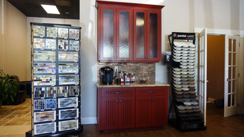
In 2019 the owners of Cabinet Cures wanted to overhaul their brand. The old brand used a red tone with an arch over the cc initials. The client wanted to keep the same typography but update the cabinet door to something they actually sell.
We photographed raw cabinet door samples and scanned their wood grain patterns. The chosen door style is called Sussex. It’s a cherry cabinet door with a Harvest stain. The logo update became optional. Currently only two franchises and the new catalog use the updated brand.
Updating the Brand
In 2019 the owners of Cabinet Cures wanted to overhaul their brand. The old brand used a red tone with an arch over the cc initials. The client wanted to keep the same typography but update the cabinet door to something they actually sell.
We photographed raw cabinet door samples and scanned their wood grain patterns. The chosen door style is called Sussex. It’s a cherry cabinet door with a Harvest stain. The logo update became optional. Currently only two franchises and the new catalog use the updated brand.
WordPress Web Design
The first Cabinet Cures website was developed in WordPress. The site was then ported into Hubspot. In 2017 the company put in a request to be moved back to WordPress. All the franchises received a website overhaul. New photos, text and graphics were applied. This made each site more personable to their local audience. All the websites are still using this model.
Cabinet Photography
The best way to sell a kitchen online is though high quality photography. We took several trips to the Cabinet Cures showroom and captured the wood from different angles. These photos were then applied to the Portland and Inc websites. They were also used in different social media posts. We also took photos of all the cabinet doors to show the wood grains before stains and lacquers are added.
The Catalog
Shortly after updating the brand we received another request to overhaul the company catalog. Our goal was to build a design that complemented the websites. The last catalog was used for almost a decade before receiving an update. Our design needed to be timeless!
The catalog talks about all the products Cabinet Cures has to offer. It also has client testimonials and additional info about the company. The book has 20 pages designed around negative space.
Learn more about the Cabinet Cures Website Evolution.
Have you ever wanted to visit an alien world full of metal? Truax Designs is an experience where people not only interact with sculpture but take a piece home.
Strategy
Visual Identity
Brand Collateral
Illustration
Website Design
Truax Designs
The Metal Sculpture Expirence
Have you ever wanted to visit an alien world full of metal? Truax Designs is an experience where people not only interact with sculpture but take a piece home.
Strategy
Visual Identity
Brand Collateral
Illustration
Website Design
Two friends that built an alien world.
Several years before Graphicsbyte was formed Mark Boehly took a sculpture class at Clackamas Community College. In the class, he met a student named Christopher Truax. The two became good friends but eventually lost contact. In 2013 the two randomly reconnected at an art gallery in Portland. The show featured Christopher’s metal sculpture. He had articulated robots, tall animals inspired by Salvador Dali, a robotic DJ, and even a flying toaster. As a solo act, it was nice to see an old friend living the dream as a master sculptor.
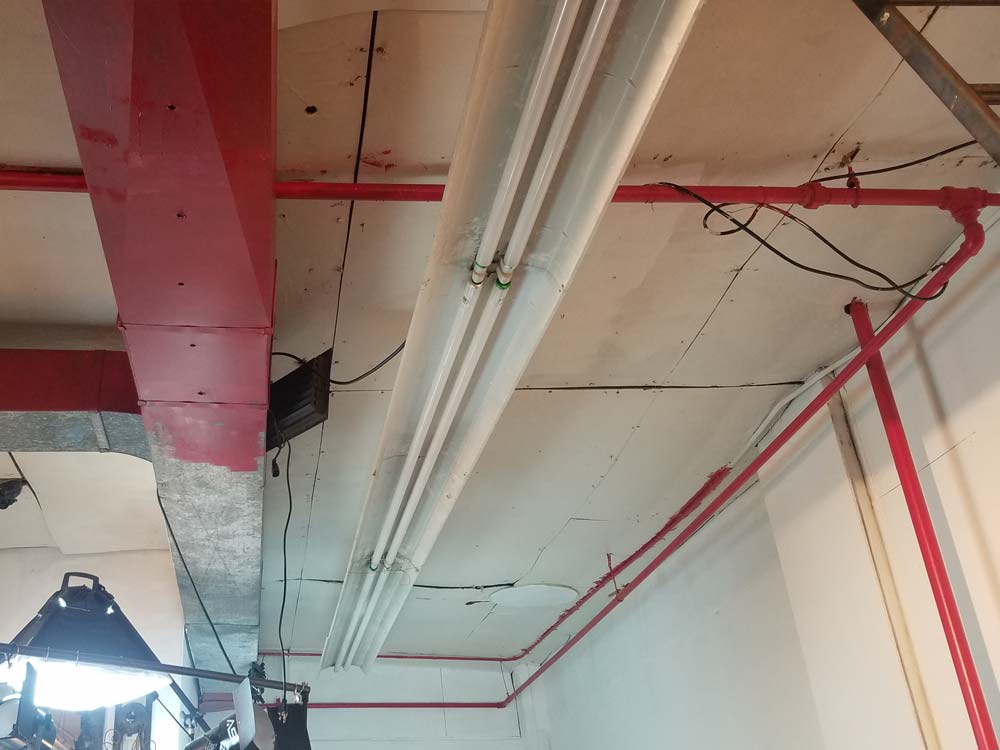
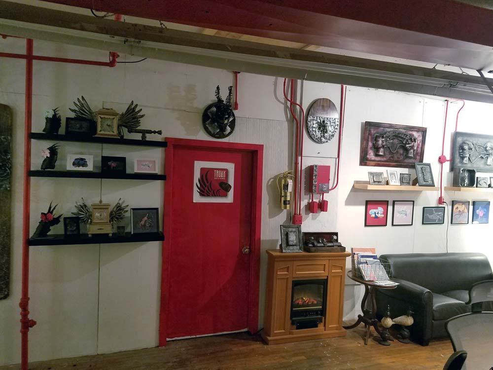
The gallery event took place a few weeks after Mark graduated from Portland State University. This was a good time to look for new opportunities. He agreed to build Christopher a website and a logo. The payment was a trade for a custom piece of sculpture. Before the website and brand were finished Christopher shared a prototype where objects were infused in metal. The sculpture looked like it came straight out of a science fiction movie. Instantly Mark knew this was something worth exploring. Mark decided to join the team and learn how to build his own sculptures. He then agreed to market the new product know known as “Karbon Kast.” (The sign in the photo on the left uses this process.) Together Christopher and Mark formed a creative friendship and still continue to produce new works of art to this day.
Two friends that built an alien world.
Several years before Graphicsbyte was formed Mark Boehly took a sculpture class at Clackamas Community College. In the class, he met a student named Christopher Truax. The two became good friends but eventually lost contact. In 2013 the two randomly reconnected at an art gallery in Portland. The show featured Christopher’s metal sculpture. He had articulated robots, tall animals inspired by Salvador Dali, a robotic DJ, and even a flying toaster. As a solo act, it was nice to see an old friend living the dream as a master sculptor.
The gallery event took place a few weeks after Mark graduated from Portland State University. This was a good time to look for new opportunities. He agreed to build Christopher a website and a logo. The payment was a trade for a custom piece of sculpture. Before the website and brand were finished Christopher shared a prototype where objects were infused in metal. The sculpture looked like it came straight out of a science fiction movie. Instantly Mark knew this was something worth exploring. Mark decided to join the team and learn how to build his own sculptures. He then agreed to market the new product know known as “Karbon Kast.” (The sign in the photo on the left uses this process.) Together Christopher and Mark formed a creative friendship and still continue to produce new works of art to this day.
Logo Design
In Early 2014 Truax Designs reveled a new product called Karbon Kast at the AFRU Gallery in Portland. It was an instant hit. Over 60 items sold on the opening night and a dozen more throughout the week. When the event was over Mark and Chris started to produce hundreds of sculptures. They were preparing for their next show at the Portland Expo called America’s Largest Christmas Bazaar.
This event was also a huge success. Karbon Kast attracted dozens of new fans and this was when we presented the company logo for the first time.
The brand was designed after a robotic angel named Lily. She is fully articulated and was built for stop-motion animation. Mark designed an enclosure logo that showcases the robots most iconic features. Red became the brands primary color because it matches Lily’s brother Apollo who is also an articulated robot in the series. The physical color of the two robots together are both light and dark. This formed a Yin & Yang in the color palette.
A condensed san serif typeface was created to fit in the enclosures negative space. Today that type has become the brand’s main focal point. Wings are a common element found in the brands metal sculptures. So it only made since to add graphic wings to print media such as business cards and flyers.
Truax Designs Postcards
Gen 1 – Business Cards
Mark Presenting Truax Logo
Gen 2 – Business Cards
Truax Studio Flyers
Gen 3 – Sticker Business Cards
Website Evolution
Truax Designs has gone through several website iterations as the studio has grown. The earliest versions served as a portfolio for co-founder Christopher Truax, focusing on his individual metal sculpture work. As the team expanded and the brand matured, the website evolved to reflect a broader, more collaborative identity.
The most recent version of the website is centered around e-commerce and engagement. While Etsy remains the primary sales platform, the site now includes a shop for direct purchases—especially for higher-end sculptures. Visitors can also submit intake forms to request custom pieces, making the site a tool for both sales and commissions.
A major feature of the new site is the Karbon Kast case study, which showcases the success of our cast resin product line. This section highlights the growing impact of the brand, including celebrity collectors and media recognition, positioning Karbon Kast as a standout offering within the Truax Designs portfolio.
The homepage also includes a section to browse upcoming shows and events, allowing visitors to connect with the team in person and experience the work firsthand.
Creating the art is one of the best perks of working with Truax Designs. In 2017 we started to create 3D printed prototypes. These prints were infused in the metal and turned into success stories at events like Comic Con. We also created some mixed-media hybrids using Graphicsbyte art as the focal point. The Karbon Kast was then used as a secondary texture.
Karbon Kast & Illustrated Hybrids
Creating the art is one of the best perks of working with Truax Designs. In 2017 we started to create 3D printed prototypes. These prints were infused in the metal and turned into success stories at events like Comic Con. We also created some mixed-media hybrids using Graphicsbyte art as the focal point. The Karbon Kast was then used as a secondary texture.
Weird Al Yankovic & Truax Designs
Mini Star Wars – Karbon Kast
Lou Ferrigno – Hulk Karbon Kast
Bumblebee Hybrid
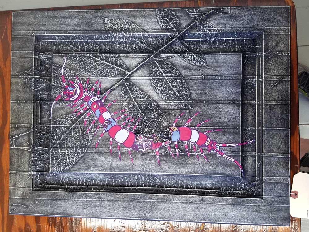
Steelhead Hybrid
Centipede Hybrid
Jason Momoa Aquaman & Truax Designs
Steel Bridge – Karbon Kast
Family Bear – Karbon Kast
The Pop-Up Gallery
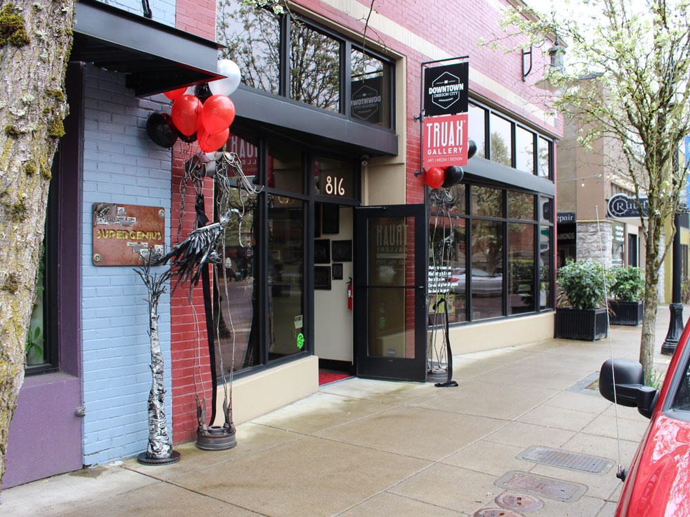
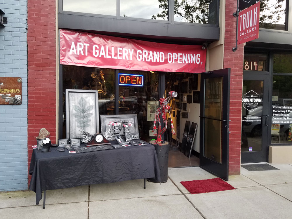
Towards the end of 2017 Truax Designs created a pop up gallery in Oregon City called Truax Gallery. Mark and Chris spent a year here selling metal sculptures to the general public. About three months into the project we needed another line of art. Graphicsbyte received an opportunity to sell prints and sticker packs. This added a splash of color to the gallery and attracted a different audience.
The Pop-Up Gallery
Towards the end of 2017 Truax Designs created a pop up gallery in Oregon City called Truax Gallery. Mark and Chris spent a year here selling metal sculptures to the general public. About three months into the project we needed another line of art. Graphicsbyte received an opportunity to sell prints and sticker packs. This added a splash of color to the gallery and attracted a different audience.
Gallery Ribben Cut
Sign Hanging
Located Downtown Oregon City
Grand Opening
Wall Covered In Art
Outdoor Display
Predator – Karbon Kast
Xenomorph – Karbon Kast
Black Panther – Karbon Kast
Inside The Gallery
Karbon Kast Hybrid Outdoor Display
Prints & Sculpture
Chapter 2
Truax Studio Gallery
Even though the Oregon City gallery was short lived the experience was everything the artists hoped for. The following year the crew packed up and moved to West Linn. The new location had a storefront connected to the same building the Truax Designs workshop is in. This move was going to speed up production… Soon as we were getting ready to officially launch the second chapter of the gallery Coivid-19 came to Oregon. We were forced to cancel the project. Truax Designs still has a workshop in the West Linn building but it’s not open to the public.
Steampunk Maniacs needed a logo that captured their unique identity, blending Victorian elegance with industrial grit.
We developed a memorable mark that reflected the brand’s steampunk aesthetic and helped them stand out in a niche market. To support their growing presence, we also designed a matching website that functioned as both a portfolio and an eCommerce shop.
Strategy
Visual Identity
Brand Collateral
Website Design
Steampunk Maniacs
Steampunk Maniacs needed a logo that captured their unique identity, blending Victorian elegance with industrial grit.
We developed a memorable mark that reflected the brand’s steampunk aesthetic and helped them stand out in a niche market. To support their growing presence, we also designed a matching website that functioned as both a portfolio and an eCommerce shop.
Strategy
Visual Identity
Brand Collateral
Website Design
Steam Power Branding
Our client creates one-of-a-kind costumes and accessories that look like they’ve stepped out of a science fiction world, rich with gears, brass, and ornate detailing. Steampunk, inspired by 19th-century industrial steam-powered machinery, is equal parts function and fantasy.
To reflect the genre’s Neo-Victorian charm, we crafted a logo that blends filigree, clockwork, and old-world elegance. Two contrasting ornate typefaces were combined, intentionally clashing, to evoke a bold, vintage-meets-retro aesthetic that feels both handmade and theatrical.
A Site Built for Show and Sell
The client came to us with an existing website, but it lacked the flexibility and function they needed. We redesigned the entire layout with a fully responsive structure and improved user experience. Custom icons were created to represent each shop category, reinforcing the brand’s distinct visual style.
To simplify shop management, we integrated the site with their Etsy store, making product updates seamless. We also added dedicated galleries to showcase past leatherwork, props, and custom costumes, transforming the site into both a storefront and portfolio.
Nestled in the trees of Parrett Mountain, this scenic wine-tasting lodge offers visitors a serene escape into Oregon wine country. After several on-site photography sessions capturing the natural beauty and rustic charm of the space, we helped develop a website that reflects the warmth and elegance of the brand, inviting guests to explore wines, events, and more.
Strategy
Website Design
Photography
Parrett Mountain Cellars
Nestled in the trees of Parrett Mountain, this scenic wine-tasting lodge offers visitors a serene escape into Oregon wine country. After several on-site photography sessions capturing the natural beauty and rustic charm of the space, we helped develop a website that reflects the warmth and elegance of the brand, inviting guests to explore wines, events, and more.
Strategy
Website Design
Photography
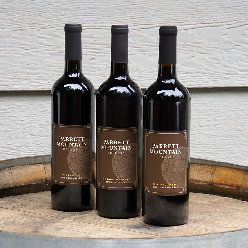
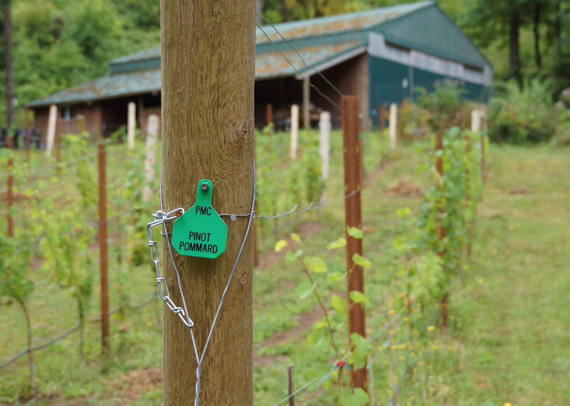
Bold Oregon Wine
Parrett Mountain Cellars is a small-batch winery and tasting room run by a husband-and-wife duo in Oregon wine country. Specializing in bold reds and Pinot Noir, their wines are produced in limited annual runs. When we first connected, their new lodge-style tasting room was still in its early stages of construction, and they were preparing to grow their brand presence.
Winemaking is their labor of love, and they needed a website that reflected the care and craftsmanship behind every bottle. In collaboration with Velare Media, we transformed their DIY GoDaddy site into a fully custom WordPress experience, built to showcase their wines, promote events, and grow with their future.
Photography
When we began the project, Parrett Mountain Cellars had very few photos—most were low-resolution and not usable for a professional website. To elevate their visual presence, we scheduled an on-site shoot at their original tasting room and winery. We captured updated imagery of their wines, small vineyard, and the tasting room environment.
At the time, the new lodge was still under construction, so these photos served as a crucial foundation for their updated brand and online presence.
Inside Parrett Mountain Cellars
Parrett Mountain Cellars Balcony
Parrett Mountain Cellars Entrance
2014 Barbera
Parrett Mountain Grapes
2015 Pinot Noir Reserve
Guardian of Parrett Mountain Cellars Grapes
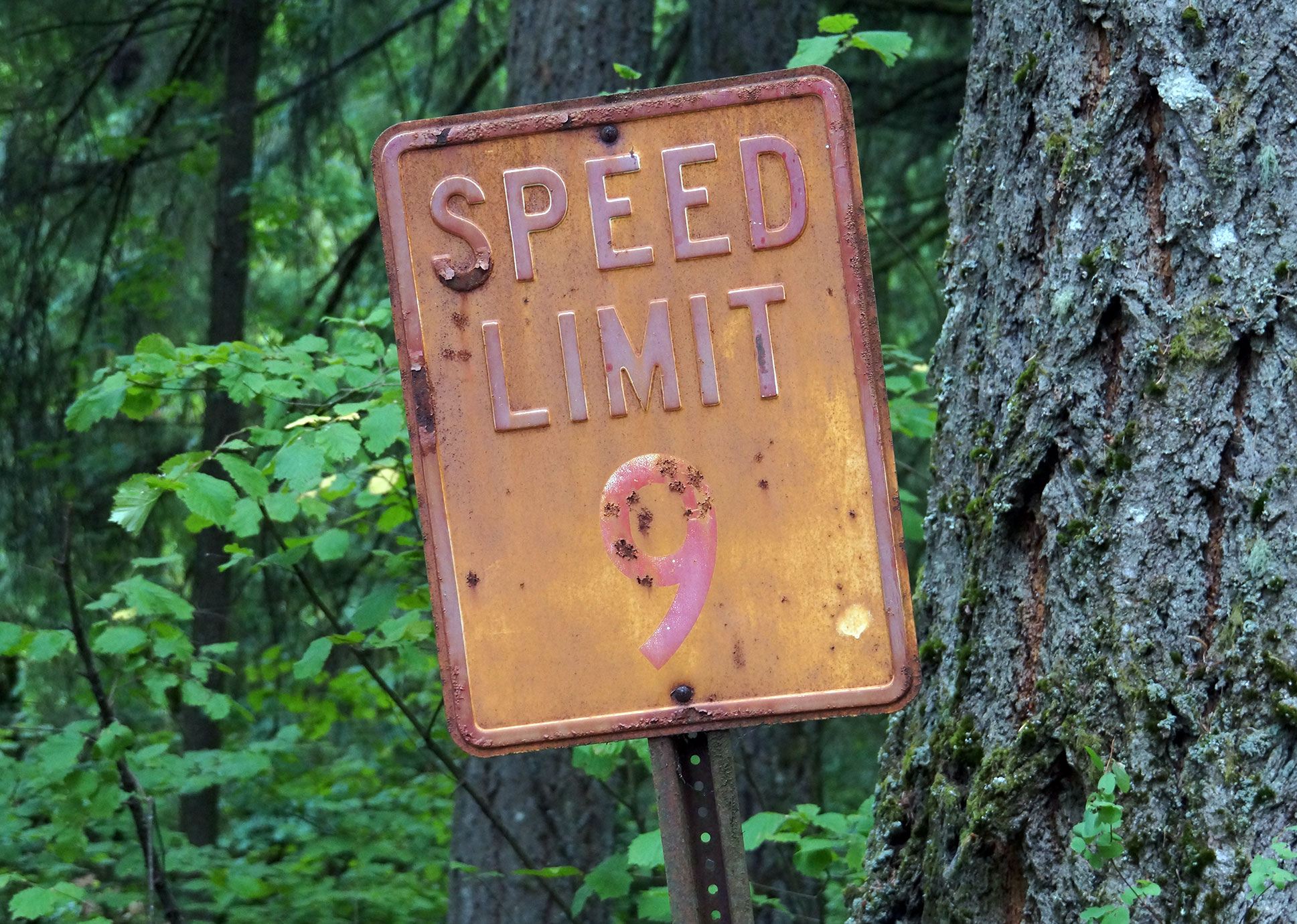
Have you ever seen a 9 mph sign?
Parrett Mountain Grape Row
Website – Wine Club & eCommerce
Parrett Mountain Cellars sells a significant portion of their wine directly through their website, so we built a fully integrated eCommerce experience using WooCommerce. The storefront allows visitors to browse and purchase bottles with ease while maintaining the rustic charm of the brand.
We also developed a built-in wine club with Silver and Gold membership tiers, offering exclusive benefits and seasonal shipments. The entire system is designed to be easy for the client to manage and seamless for customers to join, shop, and stay connected.
Western Industrial Ceramics, Inc. specializes in advanced thermal management solutions for high-temperature environments. They serve industries that demand precision and performance, such as aerospace, foundries, and power generation.
We were brought in to redesign their outdated website and capture custom photography that better reflects their capabilities, materials, and scale of operation.
Strategy
Website Design
Photography
Western Industrial Ceramics Inc.
Western Industrial Ceramics, Inc. specializes in advanced thermal management solutions for high-temperature environments. They serve industries that demand precision and performance, such as aerospace, foundries, and power generation.
We were brought in to redesign their outdated website and capture custom photography that better reflects their capabilities, materials, and scale of operation.
Strategy
Website Design
Photography
About WIC
Western Industrial Ceramics is an industry leader in thermal management and refractory solutions for high-temperature applications. Since 1971, they have expanded to serve clients across ten Western states in the U.S. With locations in Portland, OR, and Los Angeles, CA, they offer comprehensive refractory contracting, manufacturing, and stocking services.
Website & Color Palette
The original Western Industrial Ceramics website relied on a stark black, red, and white color scheme, paired with low-resolution imagery that didn’t fully convey the company’s scale or capabilities. When rebuilding the site, we saw an opportunity to create a more immersive and organized experience.
We introduced a muted mustard yellow as the foundation of a new, more intentional color system. Supporting tones of orange, blue, green, and red were used to represent specific service categories across the site:
Orange for refractory installation services
Blue for solid refractory products and supplies
Yellow for soft refractory products like textiles
These colors were layered over hero imagery and assigned to key content sections, providing both visual structure and clarity—transforming the site into a vibrant, cohesive brand experience.
Photography
To bring authenticity and scale to the new website, we conducted a custom photography session at Western Industrial Ceramics’ Sherwood, Oregon facility. Granted full access to the warehouse and production areas, we focused on capturing the texture, scale, and precision of their operations.
The resulting photography not only elevated the site’s overall design but also highlighted the company’s advanced capabilities in thermal management and refractory solutions, helping communicate the story of a business built on expertise, scale, and quality.
Rick’s Printing is a cutting-edge trade printer known for quality, expertise, and fast turnarounds. Their team delivers high-volume print solutions with precision and pride. To match their reputation, we developed a website that not only reflects their capabilities but also captures the energy of their shop.
Through custom photography and thoughtful design, we built a visual experience that showcases their craft, speed, and commitment to excellence.
Strategy
Website Design
Photography
Rick's Printing
Rick’s Printing is a cutting-edge trade printer known for quality, expertise, and fast turnarounds. Their team delivers high-volume print solutions with precision and pride. To match their reputation, we developed a website that not only reflects their capabilities but also captures the energy of their shop.
Through custom photography and thoughtful design, we built a visual experience that showcases their craft, speed, and commitment to excellence.
Strategy
Website Design
Photography
Press to Pixel
Founded in 2001, Rick’s Printing is a trusted trade printer in Portland known for high-quality print work, quick turnaround times, and long-standing relationships built largely through word of mouth. As the industry evolved and new competitors emerged, the one area they needed to catch up was their online presence.
We partnered with their team to design and develop a sharp, modern website that reflects the precision and professionalism of their print work. The new site highlights their capabilities, streamlines the user experience, and reinforces the brand’s commitment to quality at every level.
One-Page Scroll Website
Rick’s Printing came to us with a barebones website and a clear request: keep it simple. They didn’t want to stray far from what was already familiar, just a smarter, sharper version of it. We proposed a streamlined, single-page scrolling website that delivers everything at a glance.
The new layout puts their industrial printers front and center, featuring bold images, key machine stats, and a looping intro video that shows their equipment in action. It’s clean, direct, and built for speed, just like their print work.
Photography
To bring the story of Rick’s Printing to life, we conducted an on-site photoshoot at their Portland printshop. The goal was to capture the energy of the crew, the scale of the equipment, and the precision behind every print job.
We photographed their team in action, highlighted the details of their printing presses, and documented the day-to-day hustle that defines their operation.
Have you ever wanted to ask everyday people what they would change about America? Dear America: What Would You Change? is a public art project rooted in conversation.
We interviewed people from all walks of life, gathering their thoughts on the country’s future, one voice at a time. Each response was then transformed into hand-drawn, stacked typography, giving every opinion a unique visual identity.
In 2013, while studying Graphic Design at Portland State University, I (Mark Boehly) focused my senior thesis on the power of graffiti and public art. I was particularly inspired by artist Steve Powers and his series A Love Letter for You, where he painted fifty murals across West Philadelphia. Each mural formed part of a fictional love story told through rooftop messages—an artistic dialogue with the city and its people.
For my own thesis, I created a public art campaign rooted in real voices and current events. Drawing from my daily commute on Portland’s Green Line MAX, I began asking fellow passengers a simple but provocative question: “If you could change one thing in America, what would it be?” Over fifty people responded. As I read through their answers, a pattern of shared concerns and hopes began to emerge.
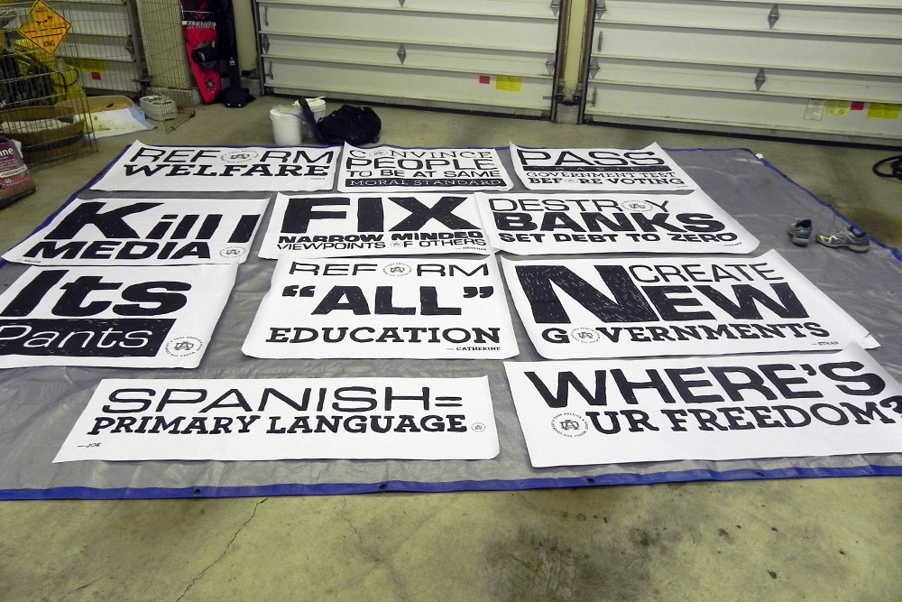
I selected the most resonant responses and translated them into a series of typographic posters—each hand-drawn in a stacked style to preserve the raw, expressive quality of street art. I developed a visual identity for the campaign, including a DA monogram and the project’s central question as a tagline. The logo was subtly embedded in each poster, allowing them to stand alone or work as a collective.
Each design was printed at a large, four-foot scale in black and white. To maintain the spirit of street art, I created homemade wheatpaste and mounted the posters onto tarps—making the project both portable and true to its urban influence.
Typography as Protest
In 2013, while studying Graphic Design at Portland State University, I (Mark Boehly) focused my senior thesis on the power of graffiti and public art. I was particularly inspired by artist Steve Powers and his series A Love Letter for You, where he painted fifty murals across West Philadelphia. Each mural formed part of a fictional love story told through rooftop messages—an artistic dialogue with the city and its people.
For my own thesis, I created a public art campaign rooted in real voices and current events. Drawing from my daily commute on Portland’s Green Line MAX, I began asking fellow passengers a simple but provocative question: “If you could change one thing in America, what would it be?” Over fifty people responded. As I read through their answers, a pattern of shared concerns and hopes began to emerge.
I selected the most resonant responses and translated them into a series of typographic posters—each hand-drawn in a stacked style to preserve the raw, expressive quality of street art. I developed a visual identity for the campaign, including a DA monogram and the project’s central question as a tagline. The logo was subtly embedded in each poster, allowing them to stand alone or work as a collective.
Each design was printed at a large, four-foot scale in black and white. To maintain the spirit of street art, I created homemade wheatpaste and mounted the posters onto tarps—making the project both portable and true to its urban influence.
A Wall for the People
Originally, I planned to display each opinion separately in various neighborhoods across Portland. But due to legal limitations around public posting, I shifted to a single large-format installation. I stitched the posters together into a single tarp banner, allowing all the voices to appear side by side, unified, yet distinct.
The final location was near the Lloyd Center in Portland, Oregon, chosen intentionally as the main MAX stop where the original surveys were conducted. A nearby fence provided ideal visibility, facing both daily commuters on the train and foot traffic in the area. The installation transformed a common transit hub into a public canvas for shared expression.