Named after the Roman goddess of the moon, Luna is a vibrant food and smoothie booth based at the Portland Saturday Market. We worked with the team to create a logo that reflects the brand’s fresh, celestial energy, along with clean, eye-catching menu signage to draw in market-goers.
Strategy
Visual Identity
Brand Collateral
Luna Food & Smoothies
Named after the Roman goddess of the moon, Luna is a vibrant food and smoothie booth based at the Portland Saturday Market. We worked with the team to create a logo that reflects the brand’s fresh, celestial energy, along with clean, eye-catching menu signage to draw in market-goers.
Strategy
Visual Identity
Brand Collateral
Astrological Branding
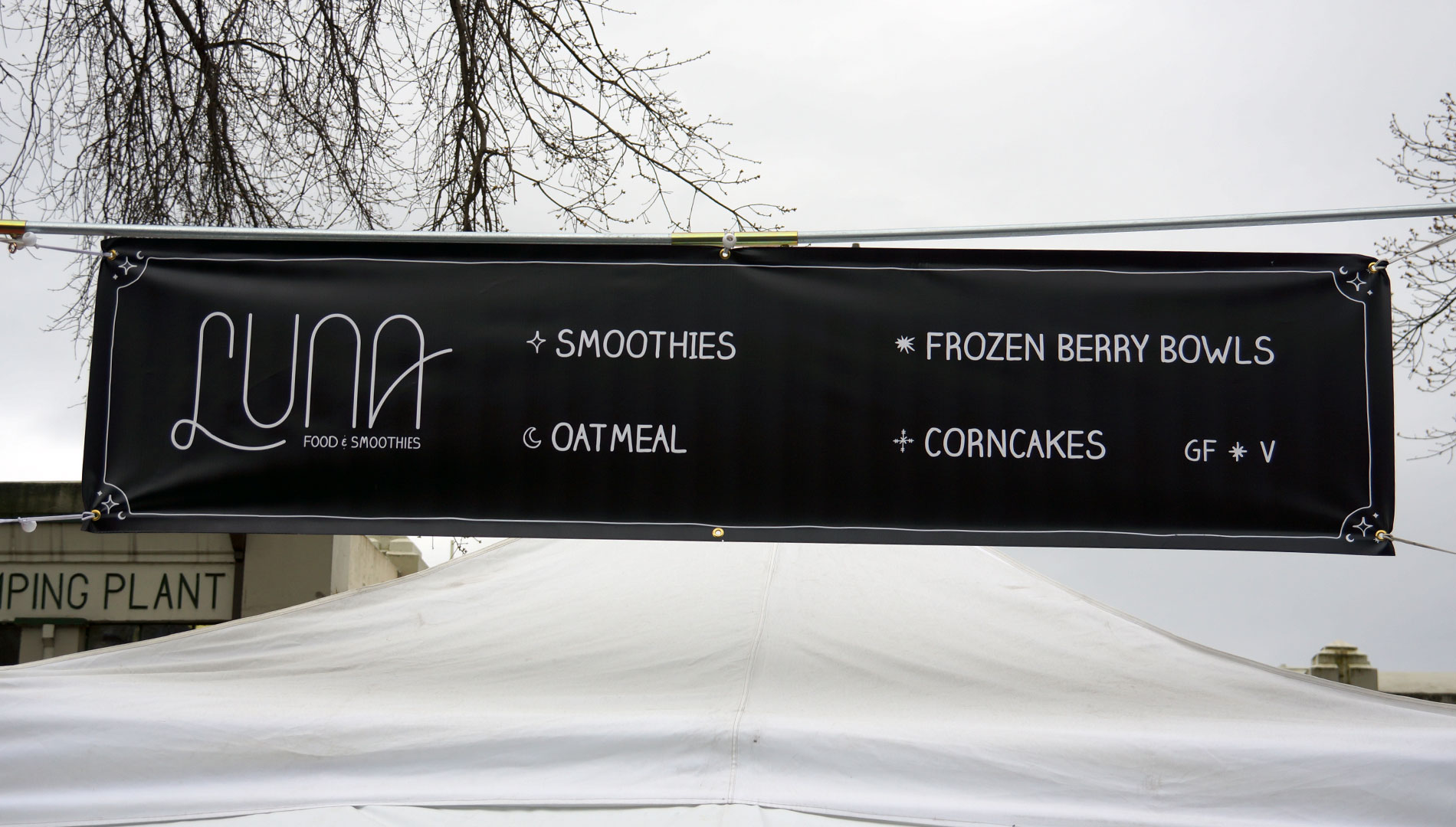
Luna is a vegan and gluten-free food and smoothie booth located at the Portland Saturday Market. When we first met the client, they were primarily looking for a chalkboard-style menu, something that felt hand-drawn, approachable, and celestial. We ran with that vision, designing signage with custom borders featuring whimsical stars and moons.
Although a logo wasn’t originally part of the plan, we pitched one anyway a custom, monoline wordmark featuring hand-drawn typography. The client instantly connected with the design, and it quickly became the centerpiece of the brand’s visual identity.
To bring everything together, we crafted business cards and menus that matched the booth’s handmade vibe. All signage was set in a typeface that mimics chalk lettering, giving the entire brand a cohesive, approachable, and memorable presence.
Astrological Branding
Luna is a vegan and gluten-free food and smoothie booth located at the Portland Saturday Market. When we first met the client, they were primarily looking for a chalkboard-style menu, something that felt hand-drawn, approachable, and celestial. We ran with that vision, designing signage with custom borders featuring whimsical stars and moons.
Although a logo wasn’t originally part of the plan, we pitched one anyway a custom, monoline wordmark featuring hand-drawn typography. The client instantly connected with the design, and it quickly became the centerpiece of the brand’s visual identity.
To bring everything together, we crafted business cards and menus that matched the booth’s handmade vibe. All signage was set in a typeface that mimics chalk lettering, giving the entire brand a cohesive, approachable, and memorable presence.