Table of Contents
The Best Logos Look Simple. Getting There Is Not.
A great logo is deceptively simple. The marks that feel effortless are usually the result of hundreds of decisions made and discarded before the right solution emerged. That simplicity is not accidental. It is the outcome of applying principles that designers have refined over decades.
Understanding what makes a great logo helps business owners make better decisions when they invest in one. It also explains why the cheapest option rarely produces the strongest result.
What Makes a Great Logo: The Core Principles
Simplicity
The most enduring logos in the world are built on simple shapes, clean lines, and minimal complexity. Simplicity is not about being boring. It is about removing everything that does not contribute to the idea.
A simple logo works at any size. It reproduces cleanly in one color. It translates to embroidery, signage, and a favicon without losing its integrity. Complexity creates friction. Simplicity creates recognition.
Memorability
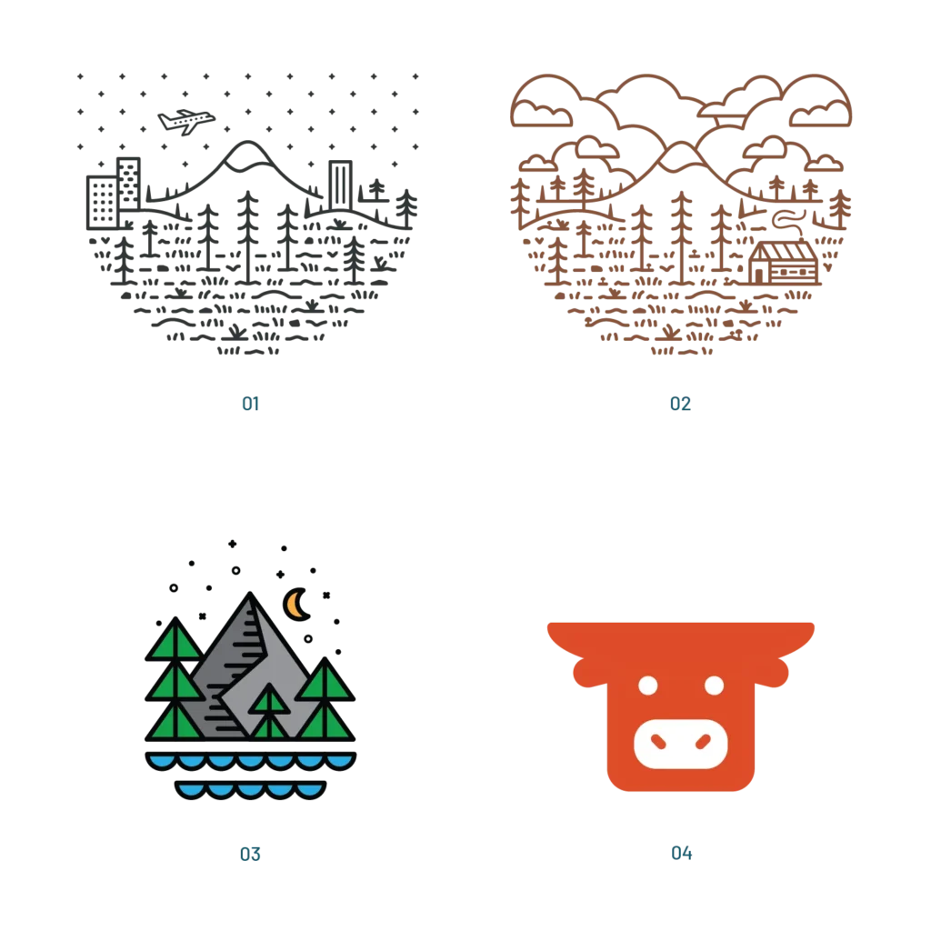
A great logo should leave an impression. For some brands that comes from a distinct and simple shape that can be recalled after a single glance. For others it comes from a richly detailed illustrative mark that rewards closer inspection and builds a visual world around the brand.
Neither approach is wrong. What matters is that the design makes a deliberate choice and builds a system around it. A complex primary mark needs supporting elements to carry the brand at smaller sizes where detail becomes noise. A simplified icon, a secondary lockup, or a standalone monogram gives the brand flexibility without abandoning the richness of the full mark.
The brands that get this right are memorable at every scale. The full mark does the heavy lifting on packaging, signage, and large format applications. The simplified version handles the favicon, the social profile, and the embroidered hat. Both feel like the same brand because the system was designed to hold together.
Timelessness
Timeless logo design ignores trends. A logo built around a current visual style will look dated within a few years. A logo built around a strong idea will remain relevant for decades.
This is one of the most important logo design principles and one of the most difficult to apply. It requires resisting the temptation to follow what looks current in favor of what will hold up over time. The brands with the most recognizable marks in the world rarely redesigned from scratch. They refined.
Versatility
A professional logo design needs to work across every surface it will ever touch. Print and digital. Large format and small. Color and black and white. Horizontal and stacked.
This is why logo design for small business almost always involves a system rather than a single mark. A primary logo, a secondary version, a stacked variation, and an icon give a brand the flexibility to show up consistently across packaging, signage, websites, social profiles, and apparel without compromise.
Appropriateness
A great logo feels right for the brand it represents. The visual language, the weight of the letterforms, the color choices, all of it should reflect the audience, the industry, and the personality of the business.
A construction company and a wellness brand are both legitimate businesses with legitimate logo needs. But the marks that serve them best look nothing alike. Appropriateness is what makes a logo feel like it belongs rather than like a template that was applied without thought.

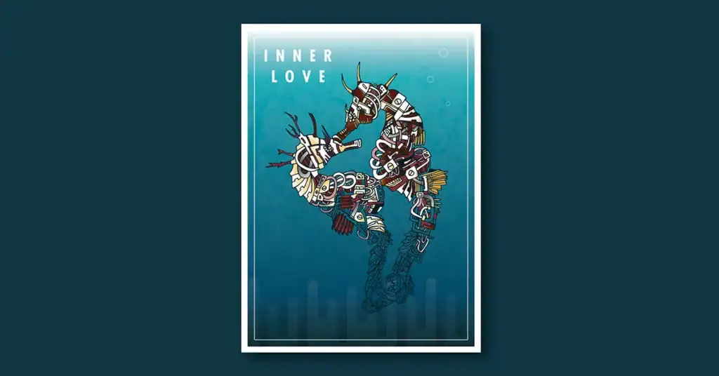
Exclusive Logo for Sale
Tiki Bar Identity Ready to Own
This is what logo design principles look like applied to a fully realized mascot identity. The Tiki Grills logo is a one of a kind mark built for a Hawaiian themed bar and grill, available exclusively to a single buyer who wants a complete brand ready to launch.
The Role of Color in Logo Design Principles
Color is one of the most powerful tools in logo design and one of the most misunderstood. The instinct for many business owners is to choose colors they personally like. The better question is what colors communicate the right feeling to the right audience.
A strong logo typically includes a black and white version as part of the system. Single color reproduction matters for embroidery, certain print applications, and situations where color is not available. But designing in black and white first is a traditional approach, not a universal requirement. Some brands are inherently color driven and the identity is stronger for it. What matters is that the decision is intentional and the system accounts for how the mark performs across the applications the brand actually uses.
Color palettes in professional logo design are intentional. Primary and secondary colors are chosen for contrast, accessibility, and emotional resonance. They are documented and protected so the brand stays consistent across every application.
Typography and What Makes a Great Logo
When a logo includes type, the font choice is a design decision with real consequences. Custom lettering, modified typefaces, and carefully selected fonts all communicate different things about a brand.
Generic system fonts in a logo signal that no real design decision was made. Custom or modified typography signals that someone thought carefully about how this brand communicates through every detail including the shape of its letters.
Type in a logo also needs to work at small sizes. A beautiful script font that becomes illegible at business card scale is the wrong choice regardless of how it looks at full size.
Why Timeless Logo Design Requires a Brief
The best logos come from a clear brief. Before a single sketch is made, a strong designer asks about the brand’s audience, competitors, values, and long term vision. That information shapes every decision that follows.
A logo designed without strategic context is just decoration. A logo designed with that context is a business asset.
This is especially true for logo design for small business where the mark needs to carry a lot of weight. A small business does not have the marketing budget of a large corporation to make a mediocre logo familiar through sheer exposure. The logo has to do more work from day one.
What Separates a Professional Logo From a Generic One
The difference between a professional logo design and a generic mark comes down to a few things.
A professional logo is original. It was not pulled from a stock library or generated by a tool that produces the same visual language for thousands of other brands simultaneously.
A professional logo is scalable. It was built in vector format, which means it can be reproduced at any size without losing quality.
A professional logo comes with a system. Logo files, color codes, font documentation, and usage guidelines give a business the tools to stay consistent long after the initial design is complete.
A professional logo was designed for a specific brand. Not adapted from a template. Not built around what the designer personally prefers. Built around what the brand and its audience actually need.
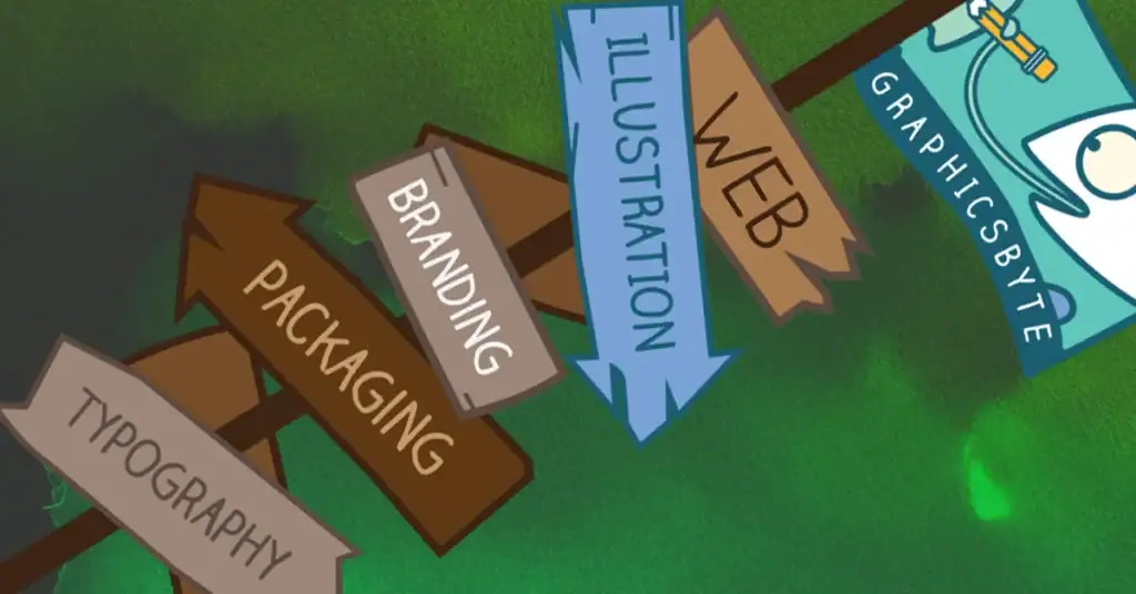
Logo Design
Worth Your Investment
These principles do not exist in theory alone. The Graphicsbyte logo design collection spans over a decade of client work across industries, audiences, and brand types. Each mark was designed with intention, delivered as a complete system, and built to last.
Several projects in the collection include in-depth case studies that walk through the strategy and thinking behind the final design. Browse the full collection and see what professional logo design looks like in practice.
How Many Versions Does a Logo Need?
A complete logo system for most businesses includes at minimum a primary mark, a horizontal version, a stacked version, and a standalone icon or monogram. Some brands need more depending on how many surfaces the mark needs to appear on.
Each version serves a specific purpose. The primary mark is the full expression of the brand. The horizontal version works in headers and banners. The stacked version works on square formats and packaging. The icon works at small sizes where the full mark becomes unreadable.
Delivering a single logo file without variations is an incomplete job. A logo that cannot adapt is a logo that will eventually be misused.
The Investment Behind a Great Logo
Logo design for small business is often where budget conversations get difficult. The market has been flooded with cheap options, logo generators, and crowdsourced platforms that promise professional results at minimal cost.
What those options cannot deliver is strategic thinking, original ideas, and a designer who understands your specific business and audience. According to the American Institute of Graphic Arts, professional logo design involves research, strategy, concept development, refinement, and file delivery, a process that takes real time and real expertise.
The investment in a professionally designed logo pays back over the lifetime of the brand. A weak logo costs money every time it has to be replaced, every time it fails to make the right impression, and every time a business owner has to apologize for how their brand looks.
Final Thoughts
What makes a great logo is not a single quality. It is the combination of simplicity, memorability, timelessness, versatility, and appropriateness working together. When all of those principles are present the result is a mark that earns recognition, builds trust, and serves the brand for years.
A logo is often the first thing a potential customer sees. It sets the tone for everything that follows. Getting it right from the start is one of the most valuable investments a business can make.

mark
Share this post:
What makes a great logo design?
A great logo combines simplicity, memorability, timelessness, versatility, and appropriateness. It works at any size, in any color, and across every surface the brand appears on.
What are the most important logo design principles?
The core principles are simplicity, memorability, timelessness, versatility, and appropriateness. These principles guide every decision from shape and color to typography and layout.
How many versions of a logo does a business need?
Most businesses need at minimum a primary mark, a horizontal version, a stacked version, and a standalone icon. Each version serves a specific application so the brand stays consistent everywhere.
What is the difference between a professional logo and a generic one?
A professional logo is original, scalable, delivered in vector format, and comes with a complete system including color codes and usage guidelines. A generic logo is often templated, low resolution, and designed without strategic context.
How much should a small business spend on logo design?
The investment varies based on complexity and scope but professional logo design for small business involves research, strategy, concept development, and a complete file system. The cost reflects the expertise and time required to do it correctly.