Table of Contents
Most businesses mistake a logo for a brand identity
It is an easy mistake to make. The logo is the most visible piece. It goes on the business card, the website header, the sign above the door. It feels like the thing.
But brand identity design is a system, not a single asset. The logo is the entry point. What surrounds it, supports it, and gives it context is what actually does the work of building recognition, trust, and consistency across every place a business shows up.
This post breaks down what visual identity actually includes, how the pieces connect, and why getting it right matters more than most businesses realize until they are trying to fix it later.
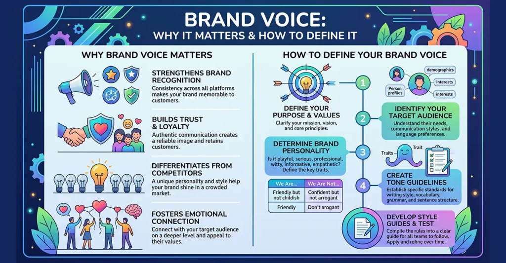
What Brand Identity Design Actually Is
Brand identity design is the visual language of a business. It is the complete set of designed elements that communicate who a company is, what it stands for, and how it wants to be perceived, without a word of copy required.
That language includes more than most people expect when they first start thinking about it.
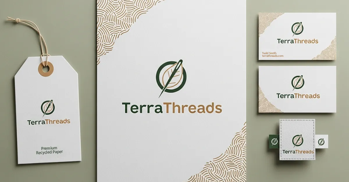
Logo System:
A professional logo is not a single file. It is a system. A primary mark for standard use, a secondary or stacked version for constrained spaces, an icon or monogram for small applications like favicons and profile images, and clear rules for how each version gets used.
A logo built without that system in place will get stretched, recolored, and misapplied the moment someone needs it in a format it was not designed for. The system prevents that.
Color Palette:
Color is one of the most powerful tools in visual identity graphic design. It triggers recognition faster than shape or type. It carries emotional weight that audiences absorb without being aware of it.
A brand color palette goes beyond a primary color and a neutral. It includes primary colors, secondary colors, and defined rules for how they combine. It specifies exact values across print and digital formats so the colors stay consistent whether they appear on a billboard or a mobile screen.
Typography:
The typefaces a brand uses carry personality. A serif communicates something different than a geometric sans-serif. A display font used in a headline sets a tone that body copy reinforces or undermines depending on whether the choices were made deliberately.
A complete logo and brand identity system defines a primary typeface for headlines, a secondary typeface for body copy, and hierarchy rules that guide how type gets used across applications. Without that, every new piece of collateral becomes a fresh decision instead of a consistent execution.
Imagery Style:
Photography, illustration, iconography, and graphic elements all contribute to visual identity. A brand that uses high-contrast documentary photography communicates something entirely different from one that uses bright lifestyle imagery or custom illustration.
Defining an imagery direction means those choices get made once and applied consistently rather than defaulted to whatever looks good in the moment. Consistency across imagery is one of the clearest signals of a brand that has been designed with intention.
Layout and Composition:
How a brand uses space, proportion, and visual hierarchy across its materials is part of the identity. The spacing between elements, the way a page breathes, the relationship between text and image. These are not accidental and they are not arbitrary. They are decisions that accumulate into a visual signature over time.
Why a Logo Alone Is Never Enough
A logo without a supporting identity system is a mark without a language. It can look strong in isolation and fall apart the moment it needs to show up across multiple contexts.
Consider what a business actually needs to function. A website. Business cards. Social profiles. Email signatures. Proposals or presentations. Packaging if physical products are involved. Signage. Print collateral. Each of those touchpoints is an opportunity to either build recognition or chip away at it.
When the colors on the website do not match the colors on the business card. When the font in the proposal is different from the font on the site. When the logo gets placed on a busy background with no clear rules about what is acceptable. Each inconsistency is small. Together they signal a brand that was not built with a plan.
The businesses that build lasting recognition are the ones that make consistent decisions across every surface, not because they are obsessively controlling every pixel, but because the system they built makes the right decision the easy decision.
Brand Identity Design vs. Brand Strategy
These two things are related but not the same, and confusing them leads to problems.
Brand strategy is the thinking. Who are you, who do you serve, what do you stand for, how are you positioned relative to competitors, what do you want people to feel when they encounter your business. Strategy is the foundation.
Brand identity design is the expression of that thinking. It translates the strategy into a visual language that communicates the right things without requiring explanation.
A strong visual identity built on a weak or undefined strategy is decoration. It may look polished but it will not connect. A clear strategy without a well-executed identity means the right ideas never land because the visual execution does not carry them.
The most effective brand work starts with strategy and moves into design. Not the other way around.
What a Complete Brand Identity Delivers
When brand identity design is done well, a few things happen that are difficult to achieve any other way.
Recognition compounds. Every consistent touchpoint reinforces the same visual signals. Over time, audiences begin to recognize the brand before they consciously register it. Color, type, and composition do the work before the logo even registers.
Trust builds faster. A cohesive identity signals that a business is professional, intentional, and stable. Buyers make judgments about credibility based on visual cues before they read a word. A polished consistent identity accelerates the trust that drives buying decisions.
Internal decisions get easier. When the system exists, every new marketing piece, every new vendor, every new application has a clear reference. The brand does not drift because there is something to come back to.
What to Look for in a Brand Identity Designer
Brand identity design is a specific discipline. A designer who does excellent production work is not automatically the right person for identity work. The process requires strategic thinking, typography knowledge, color theory applied to real-world applications, and the ability to build systems rather than single pieces.
Questions worth asking before hiring a brand identity designer:
Do they start with strategy or jump straight to concepts?
A process that skips the strategic foundation is a red flag regardless of how strong the portfolio looks.
Do they deliver a system or just files?
Deliverables should include a brand guidelines document that covers usage rules, not just a folder of logo variations.
Have they worked across industries?
The ability to adapt a visual language to different audiences and contexts is a meaningful capability. A portfolio that only shows one type of client suggests limited range.
Do they have a point of view?
A designer who agrees with everything and presents unlimited concepts is not guiding the work. The best identity designers bring a perspective and can defend their decisions.
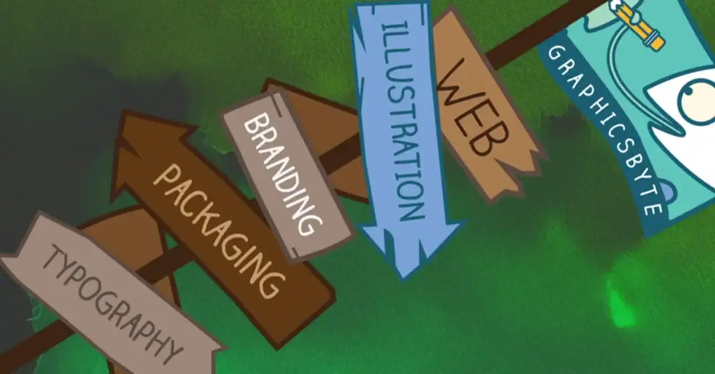
Brand Identity Design at Graphicsbyte
Graphicsbyte has built visual identities across industries including cannabis, food and beverage, nonprofit, industrial, tech consulting, construction, music, and more. The chameleon in the Graphicsbyte logo is not decorative. It reflects genuine range across audiences and contexts.
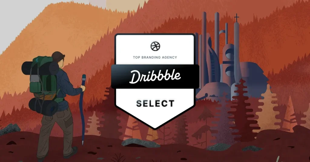
Logo design work from the studio has been recognized in LogoLounge Books 10, 13, 14, and 15. That recognition reflects a consistent standard applied across client work that spans more than a decade.
Every identity project at Graphicsbyte is handled directly by Mark. The same person building the strategy is the same person designing the system and delivering the final files. That continuity matters when the work requires holding a consistent vision from brief through execution.
What is the difference between a logo and a brand identity?
A logo is a single mark. A brand identity is the complete visual system that surrounds and supports it, including color palette, typography, imagery direction, layout principles, and usage rules. A logo alone cannot create consistent recognition across multiple touchpoints. The full identity system is what makes consistency possible.
What does a brand identity design project typically include?
A complete brand identity project generally includes a logo system with primary, secondary, and icon variations, a defined color palette with exact values for print and digital use, typography selection with hierarchy rules, imagery direction, and a brand guidelines document that covers how everything gets applied. The scope varies by project but those components form the core deliverable.
How long does brand identity design take?
A thorough brand identity project typically takes four to eight weeks depending on the scope, the number of revision rounds, and how quickly decisions get made on the client side. Projects that include a discovery and strategy phase before design begins take longer but produce stronger results because the visual work has a clear foundation.
Do I need brand identity design if I already have a logo?
It depends on what exists around the logo. If you have defined colors, typography, and usage rules that get applied consistently across your materials, you may have more of a system than you realize. If the logo is being used inconsistently, the colors vary depending on who created the file, and every new piece of collateral requires starting from scratch, a full identity build is worth considering.
How much does brand identity design cost?
Pricing varies based on scope and the experience level of the designer. Entry-level identity work from less experienced designers starts lower but often lacks the strategic foundation and system thinking that makes the investment hold up over time. Professional brand identity design from an experienced designer typically starts in the mid-thousands and scales up based on complexity. The right question is not what is the cheapest option but what will this need to do and how long does it need to last.