Have you ever wanted to ask everyday people what they would change about their country?
Dear America: What Would You Change? was a public art project rooted in conversation. In 2013, we interviewed people from all walks of life to gather their thoughts on the country’s future. Each response was then transformed into hand drawn typography. This gave every opinion a unique visual identity and turned a simple survey into a massive mobile art installation.
While studying Graphic Design at Portland State University, I (Mark Boehly) focused my senior thesis on the power of graffiti and public art. I was particularly inspired by artist Steve Powers and his series A Love Letter for You. He painted fifty murals across West Philadelphia to form a fictional love story told through rooftop messages. It was an artistic dialogue with the city and its people.
For my own thesis, I created a campaign rooted in real voices and current events. Drawing from my daily commute on Portland’s Green Line MAX, I began asking fellow passengers a simple but provocative question.
“If you could change one thing in America, what would it be?”
The Process
Designing the Voice
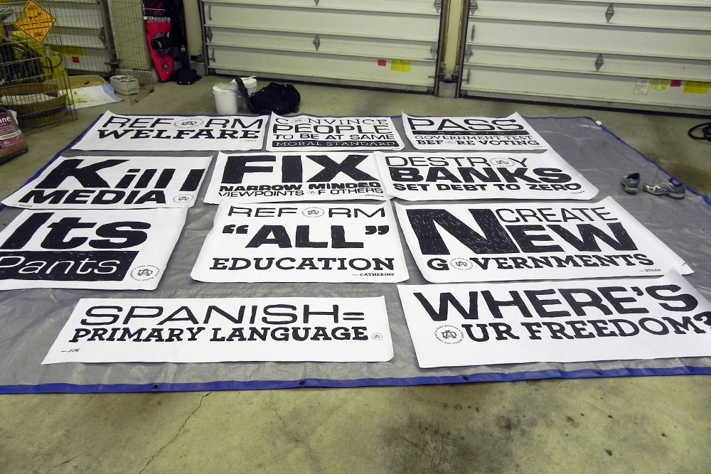
Over fifty people responded to the survey. As I read through their answers, a pattern of shared concerns and hopes began to emerge.
I selected the most resonant responses and translated them into a series of typographic posters. Each piece used hand drawn typography in a stacked style to preserve the raw and expressive quality of street art. I developed a visual identity for the campaign that included a “DA” monogram and the central question of the project as a tagline.
The logo was subtly embedded in each poster. This allowed them to stand alone as individual pieces of art or work together as a collective statement.
Execution
Wheatpaste and Tarps
To maintain the spirit of street art, I avoided glossy prints. Each design was printed at a large four-foot scale in high-contrast black and white. I created homemade wheatpaste, a traditional adhesive used by graffiti artists, and mounted the paper posters onto heavy tarps.
This technique gave the work a gritty texture and made the project portable. It remained true to its urban influence while allowing for a temporary installation that would not damage public property.
The Installation
A Wall for the People
Originally, I planned to display each opinion separately in various neighborhoods across Portland. However, due to legal limitations around public posting, I shifted to a single large-format installation.
I stitched the posters together into a single tarp banner. This allowed all the voices to appear side by side. They were unified in style yet distinct in message.
The final location was near the Lloyd Center in Portland, Oregon. This spot was chosen intentionally as it was the main MAX stop where the original surveys were conducted. A nearby fence provided ideal visibility. It faced both the daily commuters on the train and the foot traffic in the area. The installation successfully transformed a common transit hub into a public canvas for shared expression.
Wheatpaste is a liquid adhesive made from vegetable starch and water. It has been used for centuries for various crafts, but in modern times it is most commonly associated with street art and placing paper posters on outdoor surfaces.
What was the goal of the Dear America project?
The goal was to take the internal thoughts of everyday citizens and make them visible. By using large-scale hand drawn typography, the project gave weight and visual power to the opinions of regular commuters on the Portland transit system.
Where was the installation located?
The final installation was located at the Lloyd Center MAX station in Portland, Oregon. It was displayed on a fence facing the train tracks to ensure the people who participated in the survey could see the final artwork during their commute.