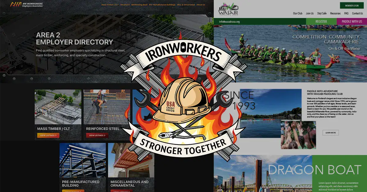
Graphicsbyte occasionally works alongside other creative agencies on a contracted basis. Carpe Viam Group is one of those partnerships. When their project needs align with my skill set, I step in to help bring the work to life. The three projects below came through that working relationship.
NW Ironworkers Employers Association
Custom WordPress Theme
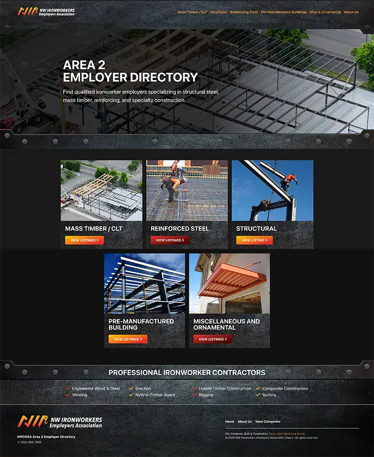
The NW Ironworkers Employers Association is a contractor directory serving ironworkers across the Pacific Northwest. The site needed a full layout redesign built on a custom WordPress theme. Carpe Viam provided the mockup and I was tasked with bringing it to life in WordPress.
The visual concept was metal. The entire site needed to feel like it was fabricated from industrial materials. To achieve that I created custom metal and rebar graphics that were used as framing elements throughout every page. The images were built to cradle the content and the photography, giving the layout a structural quality that matched the industry.
The previous version of the site had no header navigation and no footer. It was a bare skeleton with content and nothing else. The redesign introduced a full header menu, a complete footer, and a consistent page structure that gave the site a professional presence it did not have before.
The metal graphic treatment also had to be fully responsive. Each element was sized and adjusted across WordPress breakpoints so the fabricated metal framing held together correctly on tablets and phones as well as desktop. Getting decorative structural graphics to behave consistently across breakpoints takes more planning than it might appear. Every element had to be tested at each screen width and adjusted individually until the layout felt intentional at every size.
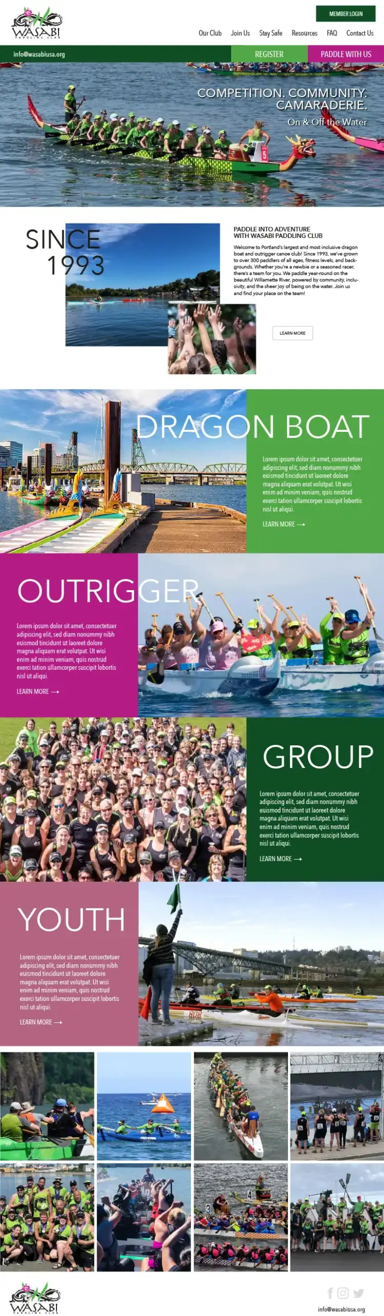
Wasabi Paddling Club is Portland’s largest dragon boat and outrigger canoe club, founded in 1993 and active on the Willamette River year round. The project involved building out the homepage and several interior pages from a Carpe Viam mockup.
The design direction leaned into full bleed photography and large scale typographic sections. Text overlaps between sections for visual interest, a layout technique that requires careful z-index management in WordPress to execute cleanly without breaking at different screen sizes.
Each page also incorporates custom scroll animation. Elements activate as the user scrolls down the page, which adds energy to the layout and rewards engagement without feeling gimmicky. Building scroll animation in WordPress requires finding the right combination of tools and testing behavior across browsers and devices to make sure nothing misfires on load.
During the build I researched dragon boat racing extensively to understand the content. The club has a strong safety culture and specific programming across dragon boat, outrigger, group, and youth paddling. Understanding that structure helped inform how the pages were organized and how the content hierarchy was built.
I explored creating custom graphics for the site but the photography was strong enough to carry the design on its own. Sometimes the right design decision is recognizing when less is more and letting the existing assets do the work.
This project has no connection to the NW Ironworkers Employers Association above. The subject matter overlaps but the client and industry are entirely different. Ironworkers USA Credit Union is a financial institution serving union ironworkers and their families across the country.
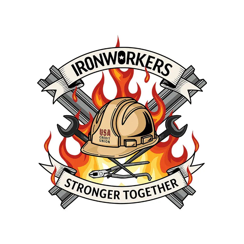
Carpe Viam provided a brief and a moodboard. The client wanted a skull and crossbones concept using rebar and fire as the primary visual elements. During the sketching phase I recognized a problem with that direction. A skull in the identity of a credit union sends the wrong message regardless of how well executed the illustration is. Financial institutions need to project trust and stability. A skull undercuts that before a single word of copy is read.
I flagged the concern and redirected the sketch toward a construction hard hat as the central element. The crossbones theme the client wanted was preserved twice over. Crossed rebar beams appear at the top of the composition and crossed spud wrenches sit below the hard hat. The brief’s energy and attitude came through without the imagery working against the brand’s purpose.
The first version had fire present but the flames were not truly interacting with the surrounding elements. After discussions about composition, text placement, and asset relationships the final version was refined. The fire in the final illustration wraps around and through every element in the composition. It does not sit behind the image. It belongs to it.
The client’s brand font was used in the banner ribbons and the credit union logo was incorporated directly onto the hard hat, pulling the institutional identity into the illustration without it feeling like an afterthought.
After file handoff a teammate at Carpe Viam extended the illustration into additional applications including a drink voucher designed to look like currency for a union event. Seeing an illustration move from a brief into a printed event collateral piece is one of the more satisfying parts of contracted design work even when the original job is already done.
Final Thoughts
White label and contracted work is a normal part of how creative studios operate. These three projects represent different industries, different deliverables, and different kinds of problem solving. That range is part of what keeps the work interesting.
If you are an agency or creative studio looking for a contracted WordPress designer or illustrator, the Graphicsbyte contact page is the place to start. Every project, direct or contracted, gets the same level of attention.
White label web design is when a designer or studio completes work on behalf of another agency under that agency’s brand. The end client works with the agency while a contracted specialist handles the execution.
What is Carpe Viam Group?
Carpe Viam Group is an online creative agency. Graphicsbyte occasionally contracts with them to bring WordPress and design projects to life for their clients on a white label basis.
What types of projects does Graphicsbyte take on as contracted work?
Contracted work through partner agencies can include custom WordPress theme development, page builds with scroll animation, illustration, and brand collateral depending on the project needs.
Can agencies hire Graphicsbyte for contracted or white label work?
Yes. Graphicsbyte is available for contracted WordPress design, illustration, and brand collateral work through agency partnerships. Use the contact page to start a conversation.
What is custom WordPress theme development?
Custom WordPress theme development involves building a website design from scratch in WordPress rather than using an existing template. According to WordPress.org, themes control the visual presentation and layout of a WordPress site and can be fully customized to match any design direction.