We helped transform a family-owned construction company into a brand as solid and dependable as the structures they build. The foundation? A modular logo system inspired by their initials—designed to be as flexible and functional as the company itself.
Strategy
Visual Identity
Brand Collateral
Dorsing Construction
We helped transform a family-owned construction company into a brand as solid and dependable as the structures they build. The foundation? A modular logo system inspired by their initials—designed to be as flexible and functional as the company itself.
Strategy
Visual Identity
Brand Collateral
Constructing the Brand Mark
Remember the childhood joy of building block towers? Now imagine turning that feeling into the foundation of a brand identity. That’s exactly what we did for Dorsing Construction, a local builder with big dreams.
Ditching the typical blueprint clichés, we embraced their creative spirit and designed a lowercase, geometric monogram, a tribute to squares and quarter circles. Look closer, and you’ll find a subtle “d” and “c” tucked inside, a clever nod to their family legacy.
This isn’t just a logo, it’s a building block for their future. Modular, bold, and ready to stack into any project with confidence and charm.
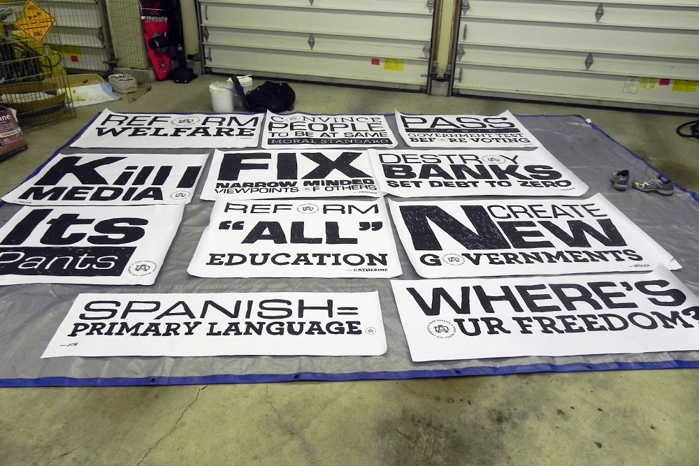
Have you ever wanted to ask everyday people what they would change about America? Dear America: What Would You Change? is a public art project rooted in conversation.
We interviewed people from all walks of life, gathering their thoughts on the country’s future, one voice at a time. Each response was then transformed into hand-drawn, stacked typography, giving every opinion a unique visual identity.
In 2013, while studying Graphic Design at Portland State University, I (Mark Boehly) focused my senior thesis on the power of graffiti and public art. I was particularly inspired by artist Steve Powers and his series A Love Letter for You, where he painted fifty murals across West Philadelphia. Each mural formed part of a fictional love story told through rooftop messages—an artistic dialogue with the city and its people.
For my own thesis, I created a public art campaign rooted in real voices and current events. Drawing from my daily commute on Portland’s Green Line MAX, I began asking fellow passengers a simple but provocative question: “If you could change one thing in America, what would it be?” Over fifty people responded. As I read through their answers, a pattern of shared concerns and hopes began to emerge.
I selected the most resonant responses and translated them into a series of typographic posters—each hand-drawn in a stacked style to preserve the raw, expressive quality of street art. I developed a visual identity for the campaign, including a DA monogram and the project’s central question as a tagline. The logo was subtly embedded in each poster, allowing them to stand alone or work as a collective.
Each design was printed at a large, four-foot scale in black and white. To maintain the spirit of street art, I created homemade wheatpaste and mounted the posters onto tarps—making the project both portable and true to its urban influence.
Typography as Protest
In 2013, while studying Graphic Design at Portland State University, I (Mark Boehly) focused my senior thesis on the power of graffiti and public art. I was particularly inspired by artist Steve Powers and his series A Love Letter for You, where he painted fifty murals across West Philadelphia. Each mural formed part of a fictional love story told through rooftop messages—an artistic dialogue with the city and its people.
For my own thesis, I created a public art campaign rooted in real voices and current events. Drawing from my daily commute on Portland’s Green Line MAX, I began asking fellow passengers a simple but provocative question: “If you could change one thing in America, what would it be?” Over fifty people responded. As I read through their answers, a pattern of shared concerns and hopes began to emerge.
I selected the most resonant responses and translated them into a series of typographic posters—each hand-drawn in a stacked style to preserve the raw, expressive quality of street art. I developed a visual identity for the campaign, including a DA monogram and the project’s central question as a tagline. The logo was subtly embedded in each poster, allowing them to stand alone or work as a collective.
Each design was printed at a large, four-foot scale in black and white. To maintain the spirit of street art, I created homemade wheatpaste and mounted the posters onto tarps—making the project both portable and true to its urban influence.
A Wall for the People
Originally, I planned to display each opinion separately in various neighborhoods across Portland. But due to legal limitations around public posting, I shifted to a single large-format installation. I stitched the posters together into a single tarp banner, allowing all the voices to appear side by side, unified, yet distinct.
The final location was near the Lloyd Center in Portland, Oregon, chosen intentionally as the main MAX stop where the original surveys were conducted. A nearby fence provided ideal visibility, facing both daily commuters on the train and foot traffic in the area. The installation transformed a common transit hub into a public canvas for shared expression.